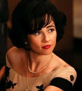
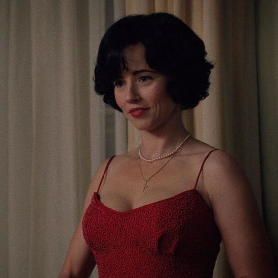
But in a previous post about the actors on Mad Men, I typed Cardellini as a True Winter. I thought she was gorgeous on that show in very dark hair and Winter colors. I especially liked her in black and white, which is excellent on True Winters.
So I've been asking myself, was I wrong about Linda Cardellini?
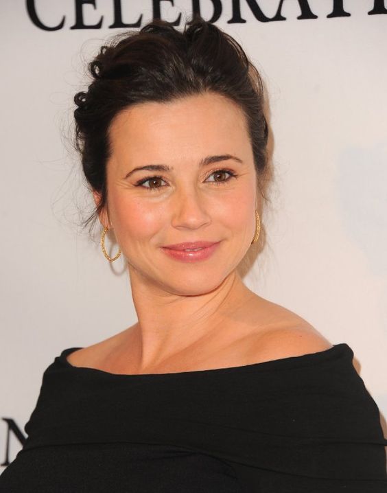
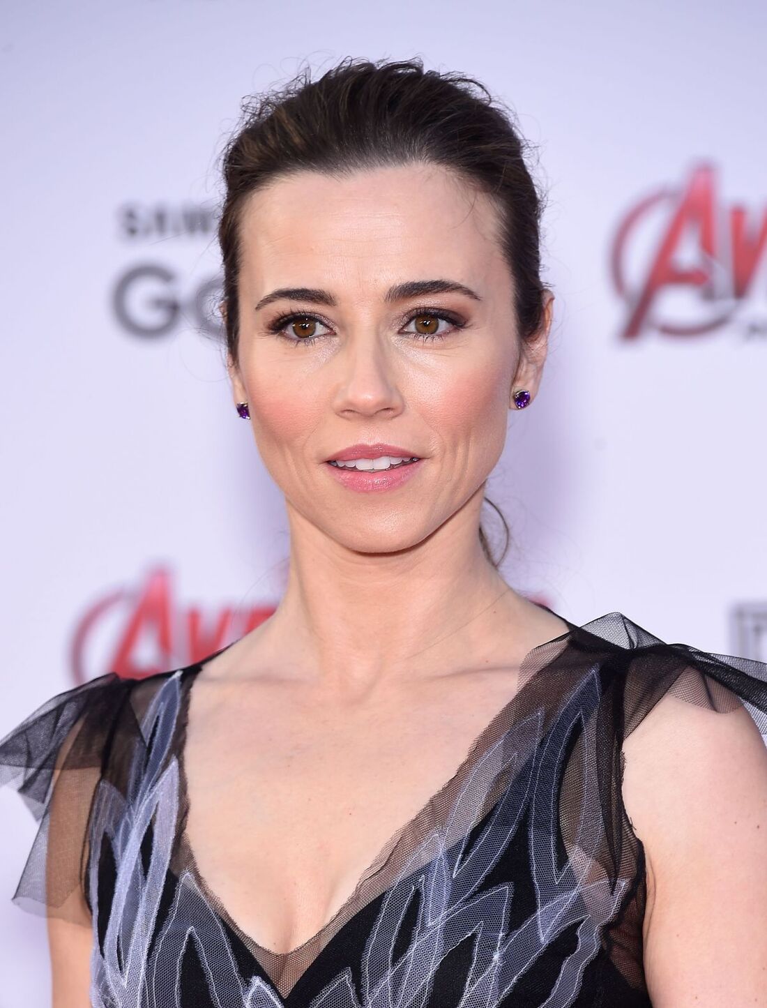
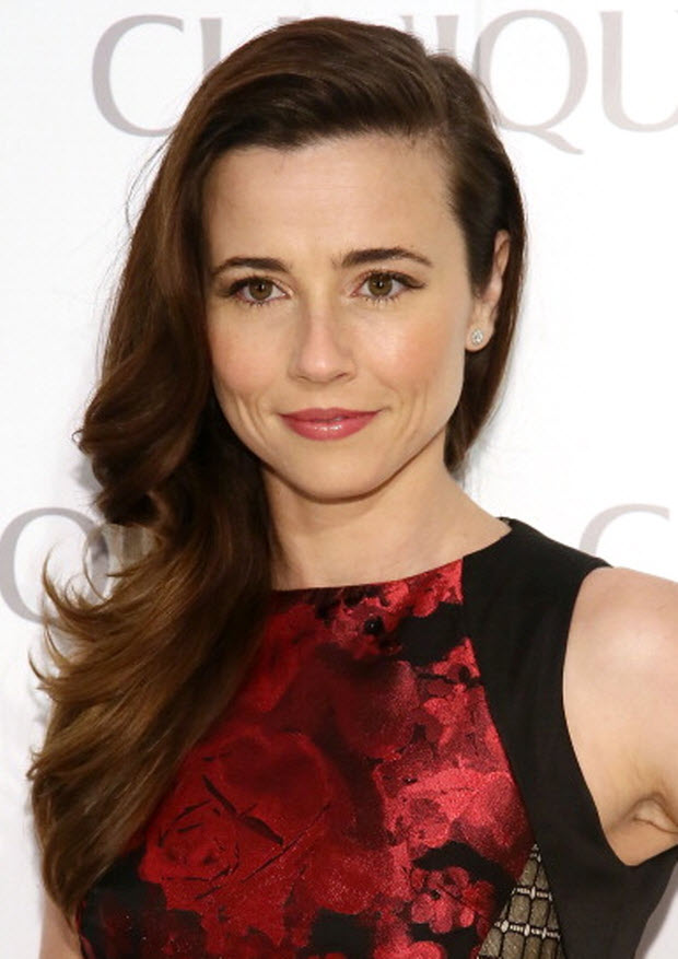
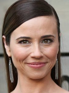
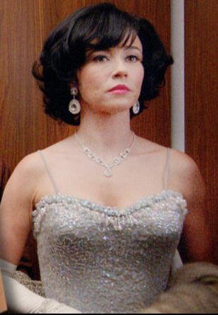
She's beautiful on both shows. But at least one of these shows is successfully presenting her in colors that aren't her best. (An actor can look lovely in the wrong colors if her costume, hair, makeup, and lighting work together to create the false impression; see Light Summer Cate Blanchett passing as an Autumn in The Aviator. Notice how orange the lighting is! That's necessary to make a cool-toned actor like Blanchett look warm.) To figure out actor Linda Cardellini's actual color season, we need to focus on real-life pictures of her. I like using pictures from premieres, because those pics are generally taken outdoors, with a lot of light. First, we find pictures where Cardellini looks healthy and alive, not tired and not overly made-up. Then we try to identify the color season of her clothes and makeup in the flattering pics. I think she looks really good here:
The first thing I notice as a color analyst is that she's not overwhelmed by this big block of black right under her face. Her skin looks healthy, not blurry or washed out. We're seeing her, not her dress. So I feel confident she's one of the five seasons that can handle black -- the three Winters, Bright Spring, and Dark Autumn. All three Winter seasons are cool-toned, while Dark Autumn and Bright Spring are warm-toned. (You can see this more easily if you just look at the reds and pinks.)
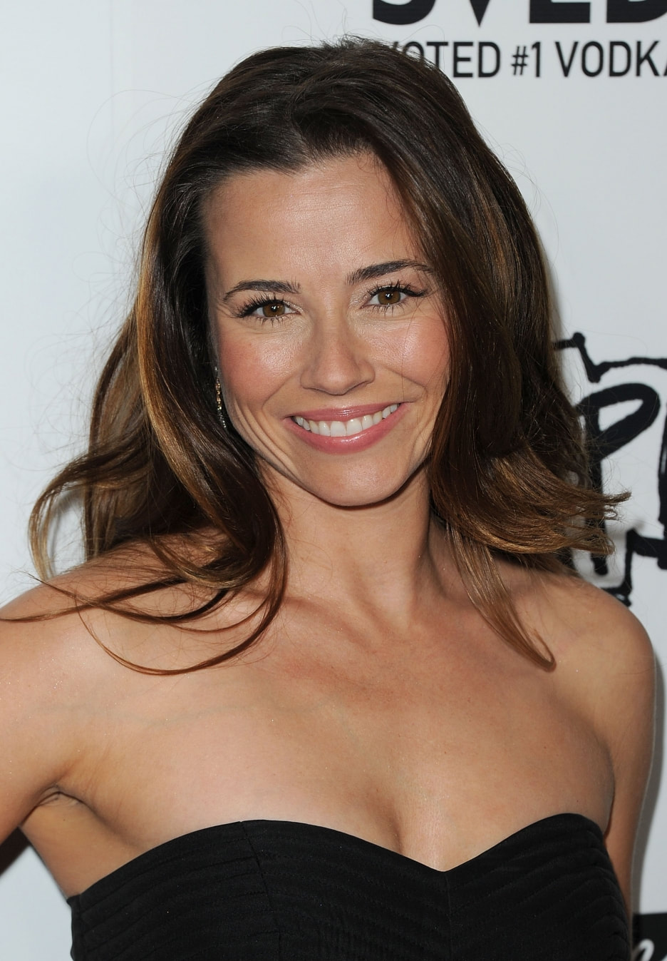
I really like her here in a cool-toned pink lippie and a black, white, and grey dress. That makes me think Winter. Here she is again in black, but with warmer makeup and warmer hair. Are these pictures as good?
I do think she's a Winter. Perhaps she's a Dark Winter instead of a True Winter; sometimes Dark Winters can look almost right in the colors of neighboring Dark Autumn.
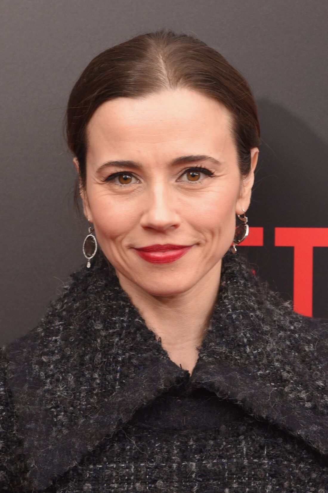
Here are more pics of Cardellini that I think are color harmonious. What do you think? Is she a Winter? If so, which one? If not, what do you think is her correct season?
14 Comments
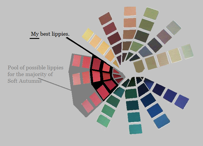
Last week I talked about the fact that, though all of your palette colors are gorgeous on you somewhere, they don't all look natural on your lips. Now I want to describe a good way to figure out which of your palette colors are best on your lips. In a nutshell, the colors that will look most natural on your lips are - your MLBB, - darker versions of your MLBB, and - a handful of colors very close in hue and value to these Your MLBB is your "my lip but better" lip color. You may already have a lippy in your stash that you know is your MLBB. If you don't, stand in front of a mirror with your palette and locate the peach, pink, red, or violet that is precisely as dark as your lip and the closest to it in warmth or coolness. (Your natural lip color will be less saturated than any of these palettte colors; you're basically finding the more saturated version of your natural lip.) A lippy that's an MLBB will always look natural on you. Additionally, colors that are the same hue as your MLBB but darker will also look natural on you. Going very dark within your MLBB hue might be your evening lip, but it won't look unnatural. In general, avoid opaque colors that are lighter than than your MLBB. This usually looks unnaatural. The other colors that will look most natural on your lips will be the colors closest in hue to your MLBB, and as dark or darker. So if you're a Bright Spring whose MLBB is on your fuchsia strip, you may indeed be able to wear one of Bright Spring's violets as a lippy; the violets are close in hue to the fuchsias. You will find less luck with one of BSp's orange lippies, because orange is pretty far from fuchsia. My MLBB is a neutral Soft Autumn pink that's medium-dark. I'll wear other pinks and reds that are very close to this color in hue, but I won't go all the way to a Soft Autumn brown -- even though those lippies exist. Also, I'll go darker than my MLBB, but not lighter. A lippie lighter in than your natural lip rarely looks natural.
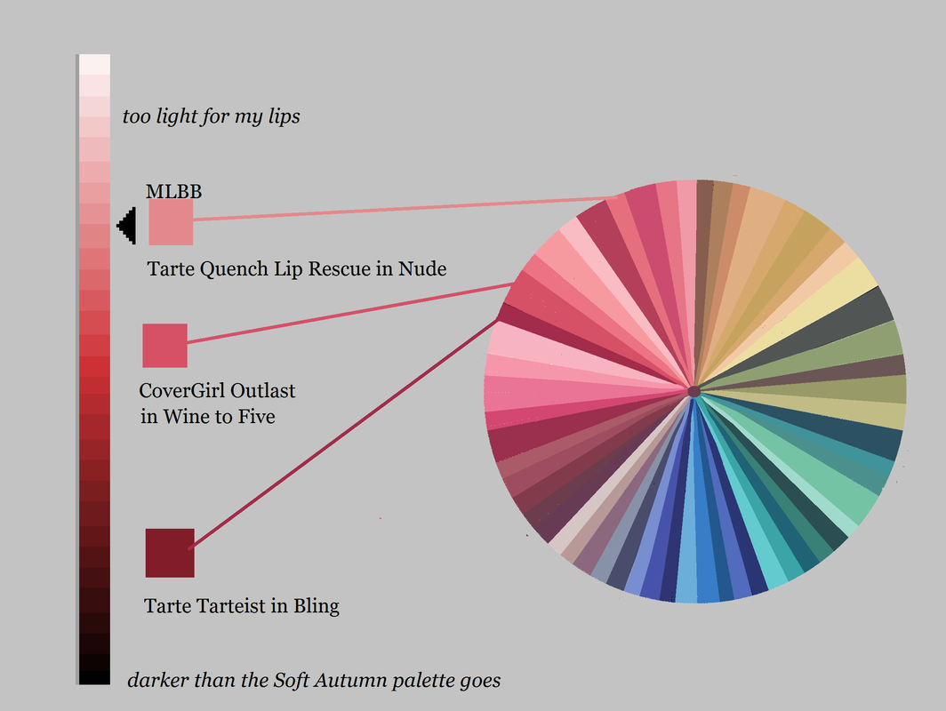
Tarte Quench Lip Rescue in Nude is an MLBB for me. It's easy to throw on when I want some moisture but I don't feel like bothering too much with makeup. CoverGirl Outlast in Wine to Five is a slightly darker version of my MLBB. It's been my staple daytime lippy for about five years; I order it in bulk on eBay or Amazon. My sexy lippy these days is Tarte Tarteist in Bling, which is a very deep version of my MLBB. It's a Soft Autumn red lip -- which means it's striking on me, and would be rather blah on most other seasons. :-) Though they vary quite a bit in value, all three of these lippies are similar in hue. If I feel like it, I''ll go somewhat warmer or somewhat cooler within my palette. But I won't stray super-far from this central MLBB hue, and I won't go lighter in value, unless it's a gloss.
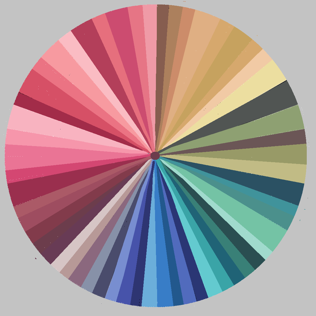
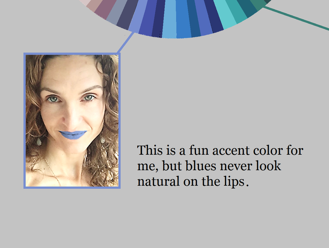
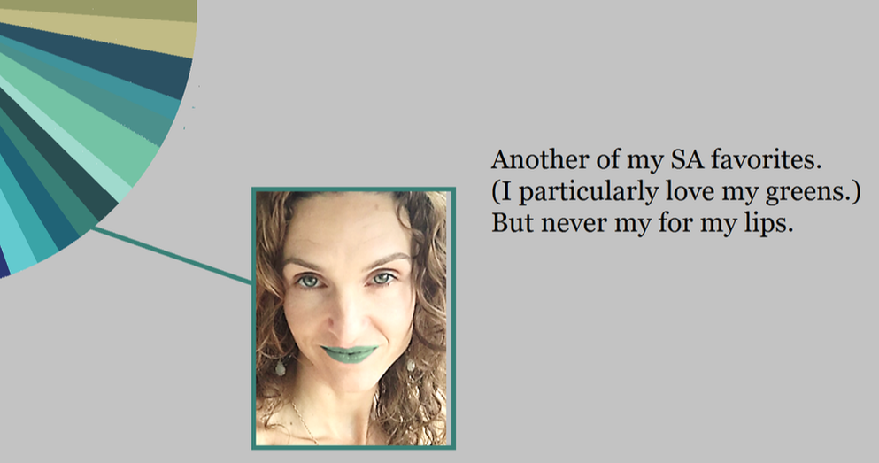
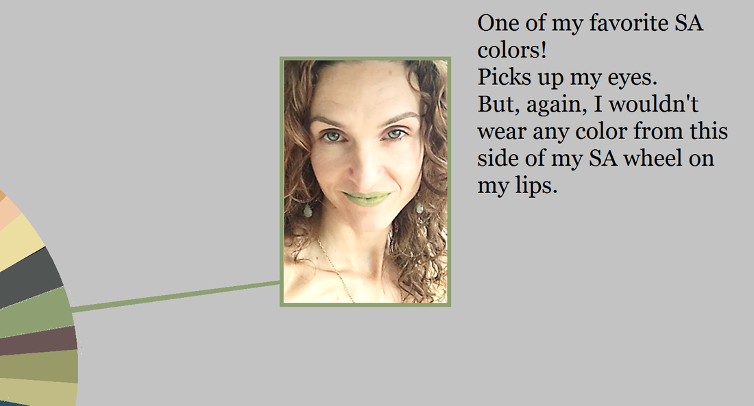
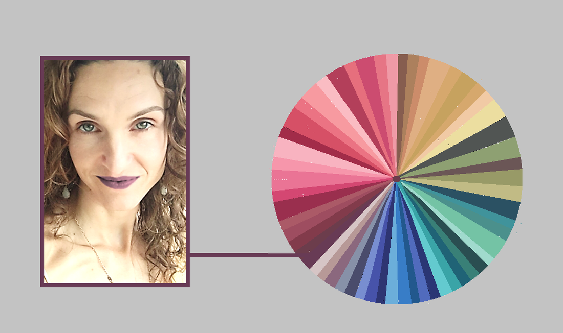
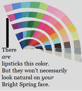
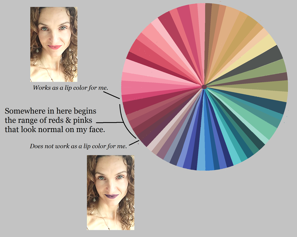
And this is what I recommend you do as well: Find the hue that looks most natural on your lips, and choose lippies that stay relatively close to that hue. For example, if your MLBB is an orange, experiment with your reds -- but don't stray all the way to a violet, unless you want to make a statement. :-) And if your MLBB is a violet, experiment with your reds and purples -- but don't stray all the way to orange. When you know your MLBB, use your seasonal makeup list and a computer to find the lippies from the list that will look the most natural on your face. (Computer images aren't completely color-accurate, but you don't need them to be if you have the seasonal makeup list; if it's on the list, it's a color from your season.) Just check the computer image to make sure the hue and value of the lippy seem right for your lips. Then buy it! This post was originally published in March of 2017. In seasonal discussion groups, women spend a lot of time working out which palettte-matching lipsticks and glosses are their best colors. Why should they have to spend time answering this question? Aren't all of the peaches, pinks, reds and violets in your palette automatically good lip colors for you? Not exactly. Every color in your palette is a color that harmonizes with your natural coloring somehow. But not every color will actually look good on your lips. Your right colors look right because they look natural. So if you wear them in an unnatural way, they won't look right. Consider my Soft Autumn palette: All of these colors look amazing on me. But not every one of these colors would look natural on my lips. Would I wear the greens or blues on my lips? No way. It would look completely unnatural. That goes without saying, right? So far, these decisions seem self-evident. But let's move around the wheel into the range where we expect to find our lip colors: the purples, pinks, peaches and reds. Here's me wearing one of my dark purple-browns as a lippie: This color, though gorgeous on me as an evening gown, still isn't natural on my lips... despite the fact that I can find lippies in the drugstore that swatch this color. Now, if I want to make a statement with my lippy, this could be a good choice for me... but most of the time, I just want to look like the most beautiful verison of myself. And this lippy's not helping me do that. Every peach, pink, red and purple in your palette looks natural on you somewhere. But not every peach, pink, red and purple in your palette looks natural on your lips. This is where many of us -- Winters and Bright Springs in particular -- can get lost. For example, there are plenty of lipsticks that match Bright Spring's violets. But a Bright Spring who expects a BSp violet lippy to look natural on her lips may be disappointed. (Soft Autumn's dark purple sure doesn't look natural on my lips!) The peaches, pinks, reds and purples in your palette that will look natural on your mouth are a smaller subset of your total set of peaches, pinks, reds and purples. It can be tough to know where the line is. My unnatural-looking brownish- purple isn't really that far away from my natural-looking pink: So you're probably wondering, "How can I know which of my peaches, pinks, reds and purples will actually look natural on my lips?"
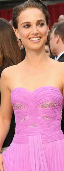
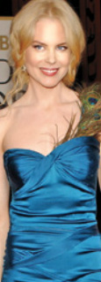
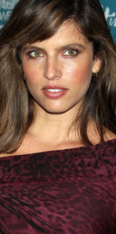
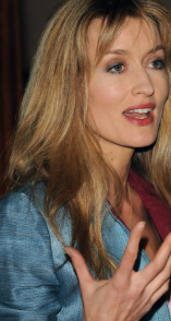
It's not too difficult. This post is getting long, so I'll publish the second half, in which I describe how to find the best colors for your lips, next week. :-) This post was originally published in February of 2017. Not all of the colors in your correct seasonal palette will be your absolute favorites. Depending on your depth of coloring, your level of contrast, and the specific colors of your body, some will be more useful to you than others, and in different ways. A dark-skinned Winter, for example, might use black as an accent, while a fair-skinned Winter might wear it in large blocks. But no color in your palette will be awful on you. The colors in your palette are all harmonious with each other, and if it's your proper palette, they'll all be harmonious with you too. So for those of you still searching for your season, I give you colors that are seasonal deal-breakers. If the given color absolutely doesn't work for you, the deal's off. Move this season to the end of the list. You can't use this list to identify your single best season. But you can use it to rule seasons out. If you can't rock hot pink, rule out Bright Spring. Bright Spring has a handful of pinks in this general vicinity. You may not associate pink with Spring. But moving Spring reds toward Winter means making them both darker and brighter. Reds that are both deep and very bright are purple-reds. So in Bright Spring, we find hot pinks. If you think you're a Spring but hot pink is no good for you, True Spring may be your home. If you're not fabulous in lime green, rule out Bright Winter. Taking True Winter's greens lighter and brighter, all the way into Bright Winter, moves them toward yellow. One of the results is a sort of fluorescent lime. On Bright Winters, this color is amazing. It contrasts beautifully with both very dark and very light skin. If this color's not right for you, but you think you're a Winter, try Dark Winter next. If you can't wear clear lemon yellow, rule out True Winter. Be careful applying this one. I'm not talking about a golden yellow, or a pastel yellow, or a yellow-orange. True Winter's few yellows don't show a bit of brown or orange or grey. They're the pure, clear complements of TW's vivid sapphire blues. If you need a more moderated yellow that's still vivid, try Dark Winter. If you don't look great in mint green, rule out True Summer. A handful of the seasons have some sort of mint. True Summer's is not a pure, saturated mint that's close to aqua. Instead it's a delicate and slightly hazy mint. It's lovely with a delicate fuchsia lip. If this feels all wrong to you, perhaps vivid mint is beter? You might be a Winter. If you wouldn't call your good yellow "goldenrod," rule out Dark Winter. Dark Winter yellows are tricky. They're not clear and pure like True Winter's. They're not blindingly bright. They're just slightly warmed, a little rich - but not Autumn rich. Penelope Cruz is lovely here in what looks like one of Dark Winter's elusive yellows. If you need your yellows purer, try one of the other Winters. And if you need a more delicate yellow, try one of the Summers. If you can't wear this medium warmed violet, rule out Dark Autumn. This Dark Autumn color always surprises me. Call it orchid or begonia perhaps. It's not a color I would label Dark Autumn if I saw it in a pile of a hundred other colors. Yet it's gorgeous with the intense dark olives and vivid teals of the season. Dark Autumn Natalie Portman's been photographed in three or four dresses in something like this color. They're all great on her. If it's not great on you, perhaps try True Autumn or Bright Spring. If a light olive-khaki is not a good neutral for you, rule out Light Spring. Was it Christine Scaman who said Light Spring colors are popsicle colors? It's true. But every season has neutrals, of course. This unusual Light Spring color is like your usual khaki, but with a suggestion of green and gold. On a Light Spring, it may pick up tones in the eye or hair. If this color's a no-go on you, perhaps look at Light Summer instead. If you're not flattered by light pinky coral, rule out Light Summer. Light Summer doesn't get very warm, but in the pinks it does go as far as a pinky coral. It's a bit pinker than what you see here, but still warmish. On a Light Summer it picks up healthy color in the face. If you think you're a Summer but can't wear this light, delicate, warm tone, look at True Summer. If you're not beautiful in bright blue, rule out True Spring. True Spring's colors are Crayola colors. You can see them in this picture of Nicole Kidman: blue dress, yellow hair, red-orange lips. In these simple primaries, True Spring is gorgeous. If you struggle to articulate the names of your best colors, they're not True Spring's. You might consider Summer or Autumn. If rich burgundy isn't gorgeous on you, rule out True Autumn. True Autumn has a few beautiful burgundies that go beautifully with the rich greens and oranges of the season. You can see all those colors here, in Noa Tishby's face. Those burgundies make good lippies too. If this burgundy overwhelms you, try something from Soft Autumn. If you're not lovely in cocoa brown, rule out Soft Summer This is not a warm golden brown or a milk chocolate brown. If you're a Summer, none of those browns will work for you. Browns are generally bad for Summers, as a rule. But if you're a Soft Summer, you will be lovely in cocoa brown. It's a brown that looks both slightly greyed and slightly purpled. It may pick up tones in your hair. If this color just isn't right for you, try True Summer next. If you can't do dusty medium blue, you're not a Soft Autumn. This blue feels both rich and muted, and quite medium - neiher purpley nor greenish. I's similar to the color you get if you Google "French blue." Though it's a subtle color, on Soft Autumn skin it's just as powerful as it needs to be. Notice how rich it looks on Natascha McElhone. If you need a blue that's much richer than this, you might try a Winter or a Spring. * * *
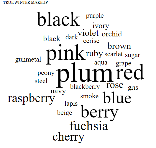
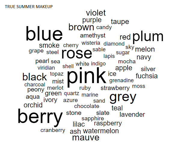
For any of these seasons, Google the season's name in quotes to see images of the palette. Images that say "Sci/Art" are usually quite accurate. Or order sheets of color from all 12 seasons to try the seasons out in person. As always, I hope this helps you find your correct season. :-) This post first ran in April of 2013. Every product on the True Winter makeup list has been swatched to match a color-accurate True Winter palette book. If you're a True Winter, these are your best makeup colors. They look natural and healthy on your skin. These colors are very vivid and very cold (bluish). Even the yellows are as cold as yellow can be -- you can't detect a bit of orange. On the makeup list, which has over 400 precisely matched products, you tend to see the same color names appear over and over. That happens on every list, because each color season represents a very specific section of color space. Here are the most frequently-occurring color words on the True Winter makeup list: Last week I said I love Dark Autumn because it's so complex. This week I find myself thinking that I love True Winter because it's so focused! (I guess I love all 12 palettes. :-) ) Above, compare True Winter, which is in the center, to True Summer on the left. They're both cool-toned, but see how important grey is for True Summer, while black is True Winter's biggest makeup neutral. Red is also very important for True Winter, but only shows up for True Summers as shades of berry. Also, compare True Winter to Dark Winter, on the right. Notice how Dark Winter stays intense, but brings in warmth with colors like brown, chocolate, moss, coral, and cinnamon. On True Winter skin, this makeup doesn't look shocking or extreme; it looks natural and healthy. Looking at these faces, you'd never guess how saturated and cold the makeup appears on a piece of white paper.
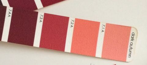
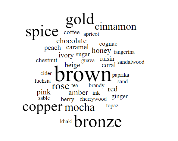
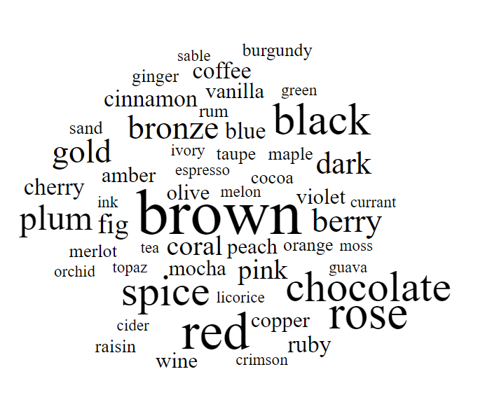
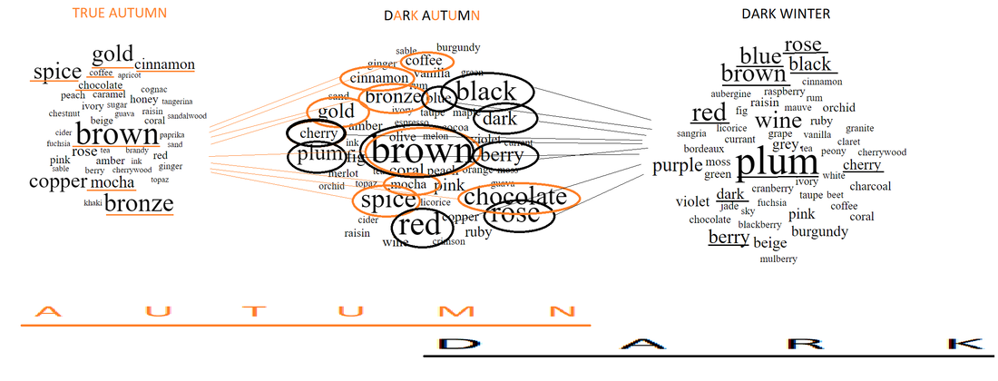
Where I live, the trees are still an Autumny orange and red, but the nights are cold, and it's dark more of the day than not. It's the perfect time of year to talk about Dark Autumn, one of my favorite seasons. Dark Autumn is Autumn verging on winter. Still Autumn, but darker and colder. Dark Autumn colors are mostly warm and rich, because it's an Autumn season. But they have a bit of added coolness, and they're also very dark. In fact, these colors are dark first and foremost; their warmth is a secondary quality. (Hence the name: Dark Autumn, sometimes known as Deep Autumn) (The light colors you see in Dark Autumn's palette actually make sense as darks as well: they're deepened versions of what would be a tinted white in another palette. Dark Autumn gets a white too; it's an ivory, though, not a pure white.) When you're a Dark Autumn, your makeup colors all come right from your color palette. For years now, I've been keeping a list of makeup products that are precisely matched to the Dark Autumn color palette. If you want to spare yourself the trouble of rubbing makeup on white paper and comparing it to the Dark Autumn palette, my list is a good investment. It has hundreds of products on it. Because this palette (like all seasonal palettes) occupies a very precise section of color space, we see the same color words appear over and over on the makeup list. Here's the Dark Autumn makeup word cloud, which shows the most common color words. The size of the word indicates how often it appears on the list. What I love about Dark Autumn is its contradictions. Somehow, it seems more complicated than other neutral (not purely warm or cool) seasons. How do you put together pink, rose, and violet with brown, red, and chocolate? Dark Autumn, that's how. I love seeing gold, cherry, and plum right next to each other. Or amber, ink, and fig. So unexpected, yet Dark Autumn makes it work. Last week, I did the True Autumn makeup word cloud, and I did Dark Winter a while back. Here is True Autumn on the left, Dark Autumn in the middle, and Dark Winter in the right. (I actually redid the Dark Winter word cloud in font that's consistent with my more recent clouds.) I find it really interesting how Dark Autumn represents a middle place between a season that's very rich and warm, and a season that's coolish and very dark. Autumn foliage plus jewel tones! I had fun making this graphic showing how Dark Autumn color words combine important words from both True Autumn and Dark Winter. Isn't that fun to look at? This season makes more sense when you see it on a human being. These Dark Autumns beautifully combine warmth and coolness. You see greys, blacks, navies, and purples with oranges, browns, olives, and rusts. You who are Dark Autumns, do you enjoy the contradictions of your palette? Or do you even experience your palette that way? Maybe this is your normal! :-)
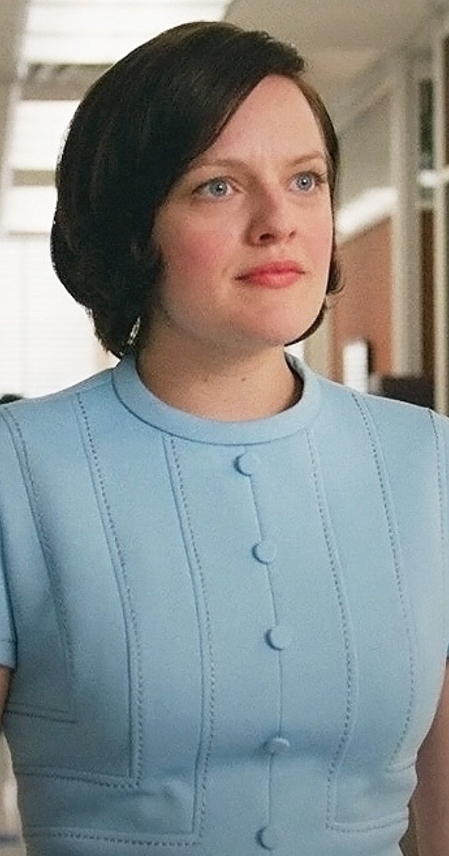
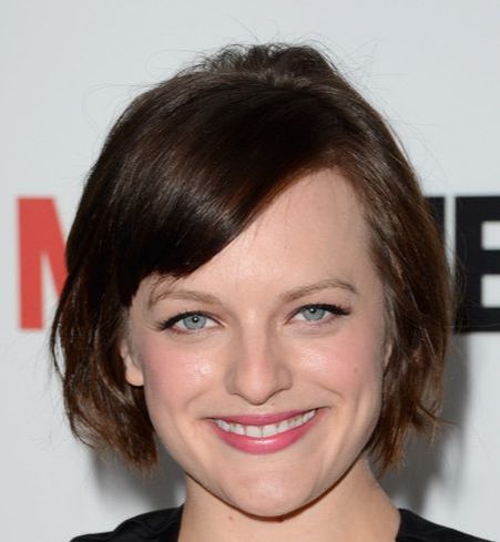
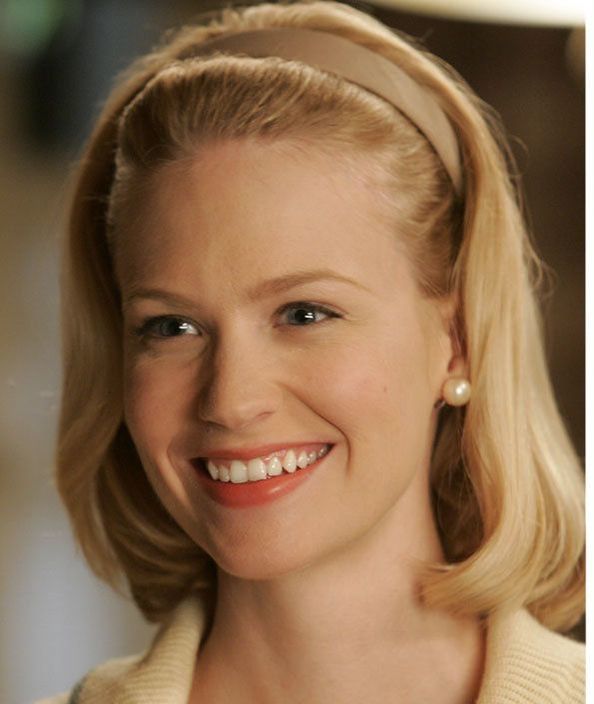
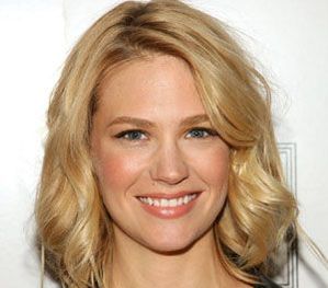
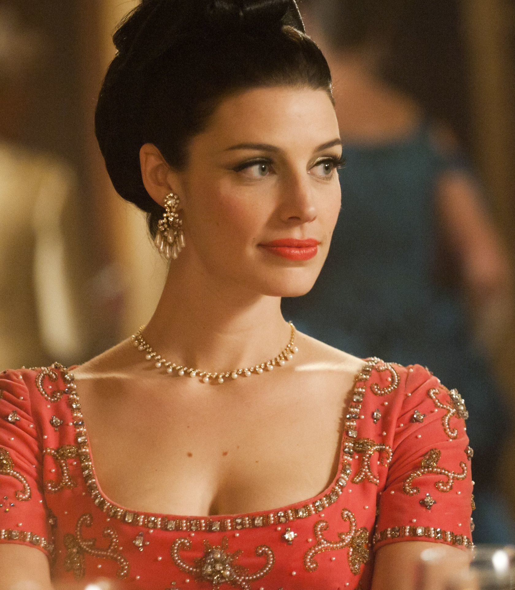
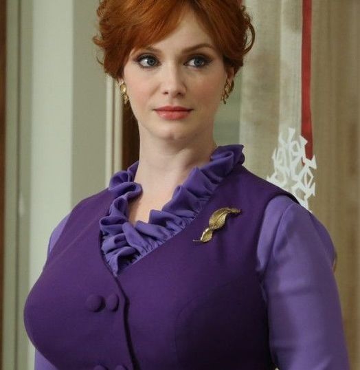
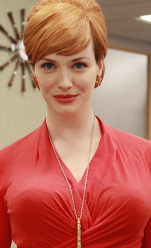
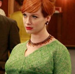
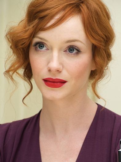
Yes, I know I'm late to this party! But I don't have network TV, and I have two kids. I'm just now catching up with the rest of the world TV-wise. Anyway, here are the color seasons of several of the actors on Mad Men, as best I can tell. Elisabeth Moss: True Summer Her best colors aren't particularly dark, but they're very cool. Soft Summer is also a possibility for her, but what really convinced me of True Summer was seeing how pink her lipstick can get. The pinker it is, the prettier she looks. Most seasons can't wear those super-pink lippies. Jon Hamm: Dark Winter His best colors are certainly cool, and quite dark. They're not vivid enough to be Bright Winter colors, and they have the "sooty" quality (as Christine Scaman puts it) that characterizes Dark Winter colors. January Jones: Light Spring Her best colors are warm, clear, and rather light and delicate. I don't think True Spring is impossible for her, but I think it's unlikely; it's telling to me that her very worst colors are dark (remember when Betty dyed her hair black?) I also find some colors to be too clear and warm for her; pure orange and bright red are not great. Jessica Pare: Bright Spring This woman was obviously a Bright from her first moment on screen. I decided on Bright Spring rather than Bright Winter because so many warm, clear colors are glorious on her, and because too-cool colors can make her look a bit goth. I love how often she's costumed in her best colors. It's a joy to behold. Linda Cardellini: True Winter What a gorgeous example of a True Winter. The way black, white and grey make this skin look amazing -- it's just beautiful. Although I know it will disappoint some people, I have to say that I can't accurately type Christina Hendricks. :-( You might be thinking, "She's obviously a Bright, or a True Spring!" But don't let yourself get distracted by the colors she's costumed in as Joan -- they're generally very bright colors, but they're also brighter than she is. Your best colors should let us see you; Joan's colors force us to just see lips, hair, and curves. Which is probably the point.: the colors make her into a cartoon. I suspect that, IRL, Christina Hendricks is probably a Soft Autumn, or just maybe a True Autumn; warmth seems to be good for her, but she needs less saturation than she's given on Mad Men.
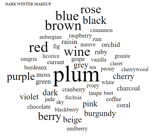
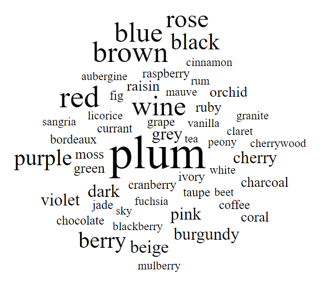
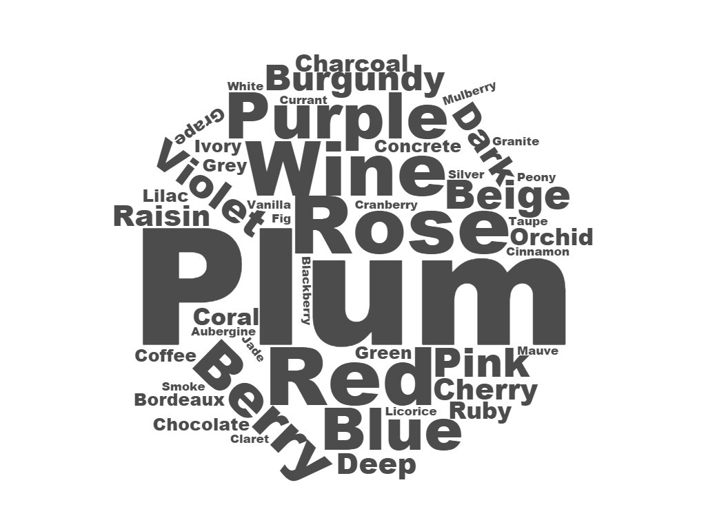
What do you think? Any ideas about Christina Hendricks' color season? Do you think I've missed the mark on any of the other characters? Let me know! In last week's post, I shared my Bright Spring makeup list word cloud. This week, I want to show you the word cloud I made for Dark Winter. The Dark Winter makeup list has hundreds of cosmetics that have been matched to color-accurate Dark Winter fans. As you page through the list, you'll notice that certain color words pop up again and again. Here are the colors words you'll find most frequently on the Dark Winter list: "Plum" is the clear winner, huh? Dark Winters are indeed all about the plums. Dark Winter makeup is cool-toned, rather saturated, and generally pretty dark (as you'd imagine!) Of course, on a Dark Winter, these colors don't look dark -- they look exactly right. If you don't yet own a Dark Winter makeup list, you might still get lucky at the drugstore if you focus on cosmetics with words like "plum," "wine" and "burgundy" in title.
And if you're not sure what your color season is, consider trying the affordable at-home draping cards. When you know your color season, you save a ton of time and money because you buy the right makeup every time. :-) Check out my new Dark Winter makeup store!
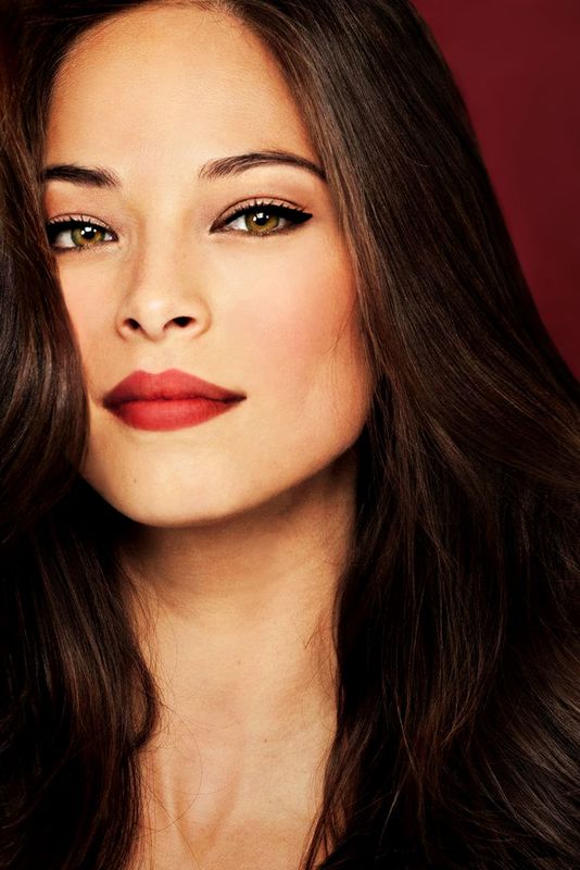
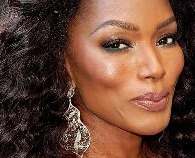
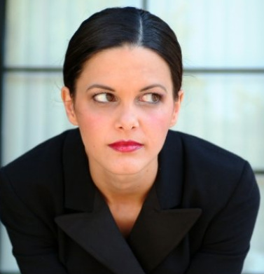
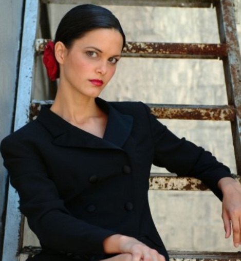
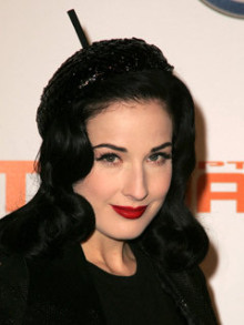
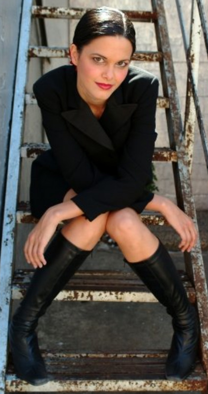
You'll find a selection of makeup matched to the Dark Winter palette. I hope to have stores for all 12 seasons up soon, so check back often. Happy shopping! All of the lippies in this series are recs from the ladies of the 12 Blueprints Facebook page, Christine Scaman, or my own swatches. If you're a Dark Winter, most of these colors will work on your lips - and your cheeks too, if you use them as blush. Some may be a touch too warm, too cool, too light or dark. This is normal, because the variation of human coloring within a season means that not all women in a season wear the same colors on the face equally well. Some of these are discontinued. Check eBay. Try before you buy, if possible. Please do share feedback on the recs, or additional recs, in the Comments section. :-) Benefit Breathless Benefit Good To Go Benefit No Competition Body Shop 05 Burt's Bees Fig Burt's Bees Raisin (can be bright though) Clinique Black Honey lip gloss Clinique Heartfelt Covergirl Lipslicks in Hipster Covergirl's Natureluxe gloss balm in Cabernet Elizabeth Arden Sugar Plum Shimmer (or TW? or SSu?) Estee Lauder Berry Truffle Estee Lauder Double Wear in CranberryEstee Lauder Double Wear in Ruby Lancôme Aubergine Velvet Laura Mercier Dry Rose (Ssu also?) Laura Mercier Shimmer lipstick in Plum Wine Loreal Color Juice gloss in Candy Apple MAC Slimshine in Scant (discontinued) Maybelline's Summer Sunset Merle Norman Amber Rose (may be light) Merle Norman Claret Crème Merle Norman Stolen Kisses NARS Dolce Vita Sheer lipstick and lipgloss Revlon Black Cherry (may be too sat for daytime though) Revlon Blackberry (may appear too bright red) Revlon ColorBurst Lipstick Plum Revlon Rose Velvet Revlon Superlustrous Plumalicious Rimmel Stay Glossy in All Night Long Stila's Longwear in Paramour L'oreal Pure Burgundy MAC lipliner in Half-Red Revlon's Colorburst in Crimson Estee Lauder Maple Sugar MAC Can't Resist? Dior Addict Stiletto Dior Addict Fourreau It's useful, and also fun, to see unexpected representatives of the seasons. It expands our understanding of both personal color analysis and variety in human coloring. But it's also instructive to see more typical examples. Textbook cases like these two dark-eyed, dark-haired Dark Winters may not be unexpected, but they're certainly not boring. When you see someone in his or her perfect colors, you want to look and look and look. The eye delights. See what I mean? You can't stop staring. This is my beautiful sister. Before analyzing her in person, Dark Autumn had crossed my mind, but Dark Winter did not surprise me. Yellow tones I had often observed in her skin could have been mistaken for warmth -- but Dark Winter colors cleared them. She posed for these pics several years ago, as a favor for a makeup artist friend. This isn't her normal daytime look. But it's fabulous, isn't it? All black, with red lips... so few women can pull this off. Which reminds me of one of my personal color analysis shortcut rules: If It Looks Goth, It's Not Winter. A good example: This is Dita von Teese doing her beautiful-goth-girl thing. She's probably not a Winter. She might not have a career if she were. It's hard to make Winters look goth, you see. Dark clothing and dark lippies bring them to life, which is the opposite of the goth aesthetic. My sister wasn't a goth girl. I was, though. I suppose I was lucky that my Soft Autumnness allowed me to achieve a corpselike effect with black clothes and burgundy lips, thereby effectively communicating my inner turmoil to the world without having to actually speak. Think of all the poor Winter teenagers who struggle vainly to express their angst through their appearance! Imagine their frustration when they look in the mirror and discover that blood-red lips and head-to-toe black make them look less depressed, not more. Poor things. But I digress. "Though I can digress with the best of them, I am nothing in my soul if not obsessive. " -- Donna Tartt, The Secret History (one of my favorite novels) Anyway... here's another gorgeous Dark Winter. Wow, look at that smile! I analyzed this friend virtually and later IRL. I tried very hard during the draping to stay open to possibilities other than Dark Winter, but of course I was gratified that my virtual analysis turned out to be correct. This shirt may be DW's icy blue. Color matters for men too. Personal color is about power. A man in his true colors radiates power. He's unapologetically himself, and if you don't like it, tough.
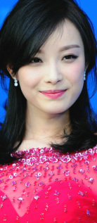
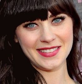
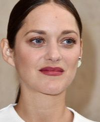
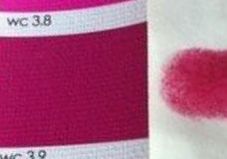
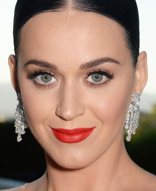
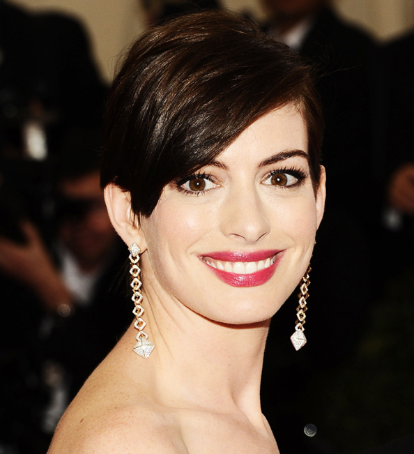
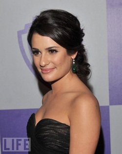
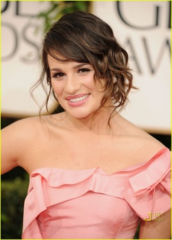
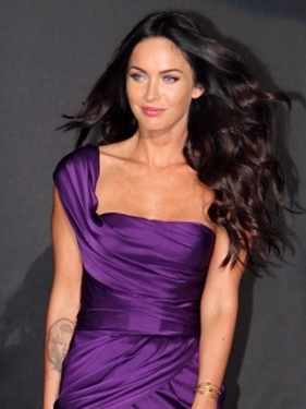
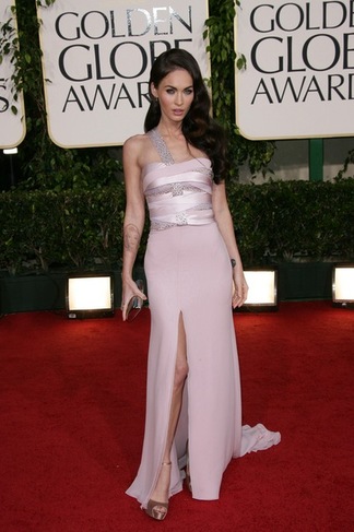
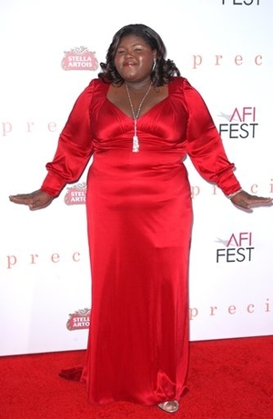
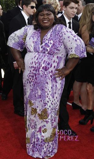
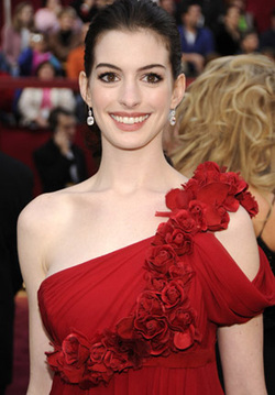
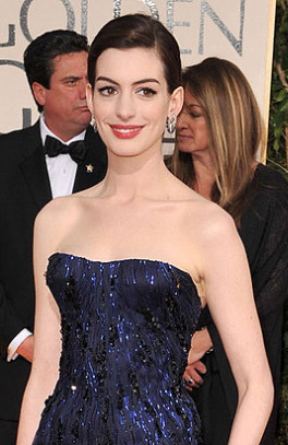
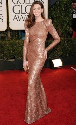
I've said that personal color is about authenticity, and it is that as well; to be centered in the truth of oneself is to be powerfully positioned. (Doesn't that sound romantic?) From talking and listening to Winter women, particularly on the 12 Blueprints Facebook page, I've learned that deep, vivid Winter colors can take some getting used to. It can be difficult for a newly identified Winter to see past the intensity of the color in a swatchbook and imagine how normal it will look on a Winter face. Even seeing the color on the lip, it can be hard for a Winter woman to take in how the color is balancing the rest of the face. Let's start with True (Cool) Winters.  The beauty industry has trained us to believe that a natural lip will necessarily be a medium peachy-beige color. Hence all the tubes of this shade that are called Nude Something. A True Winter might believe such a color is the only hue that can create a natural look. Nude = natural, right? 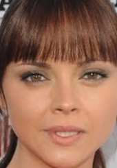 Not in your case, True Winters. On a woman who needs both coolness and depth, this color looks anything but natural. What will read as natural on you is a color you might not expect:  You know those cool, fairly bright, medium pinks in your swatchbook? The ones that look like Barbie cars? They look absolutely normal on a True Winter face. Match the swatch; don't be afraid. In the tube it may seem very, very pink, but on your lip it will be natural. 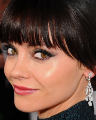 Christina Ricci Christina Ricci Doesn't this look loads more normal? True Winter, when you see a shade that's supposedly "nude" or "flesh-toned," stay away from it. That's not your natural look. (Probably it's True (Warm) Autumn's. Seems like all their best lippies are called Creamy Nude, Rosy Nude, Nude in the Afternoon, Nude at Breakfast, etc. A very sexy season, apparently.) ______________________________________________ Now, Dark (Deep) Winter... you are a Winter of another sort altogether. A light lip won't cut it for you.  Consider this particular light, cool pink. It might look natural on a Light Summer: Color-wise, Winter celebs at the 2011 Golden Globes weren't winners. Most of the beautiful Wintry women I saw failed to embrace the full drama and elegance that is their season's gift, and ended up looking bo-ring. Consider Lea Michele. Here she is, at last year's Golden Globes, in colors that bring her to life. And here she is this year, in wimpy pink that drains her spirit. The intensity in the eyes hints at what she's capable of, but everything else looks lifeless. The next big disappointment is the usually stunning Megan Fox. Here she is embracing her Winter colors in 2009: ...but at this year's GGs, she was barely recognizable. What the heck? Woman, why would you do this to yourself? You're entitled to the colors everyone else wants, and you steal from Summer? Like Lea, Megan has disappeared here. Next is Gabourey Sidibe. She may not be a size 4, but in her best colors she radiates undeniable charisma and power. So who convinced her that this wishy-washy palette flattered her? I'm not sure that dress would suit any season. Finally, Anne Hathaway - a woman who embodies a kind of delicate, exquisite beauty only found in Winter. At her best, she's almost unearthly: And here - incredible: So what was she thinking on the 2011 GG red carpet? Many fashionistas praised the gown, but notice how Anne's rare beauty is completely absent: Now, instead of looking like a moon goddess gracing mere mortals with her presence, she's just another pretty actress. Sure, the gown is elegant. But it belongs on Angelina.
For me, the lesson is this: even women with more money than most of us will ever see, and access to the best stylists and the best clothes, may still lack either the information or the self-awareness needed to know what their own authentic beauty looks like. Next: Autumnal Errors. |
About Me...I'm passionate about helping people become their most authentic and beautiful selves. Categories
All
|
- home
- Blog
-
-
- Book your virtual style analysis
- ♂ DRAMATIC style type
- ♂ NATURAL style type
- ♂ GAMINE style type
- ⚥ CLASSIC style type
- ♀ INGENUE style type
- ♀ ROMANTIC style type
- ♀ ETHEREAL style type
-
- ⚥ ♂ Classic Gamine -- The Prep Schooler
- ⚥ ♀ Classic Ingenue -- The Class President
- ⚥ ♂ Dramatic Classic -- The Art Critic
- ♂ ♂ Dramatic Gamine -- The Punk Rocker
- ♀ ♂ Dramatic Ingenue -- The Childlike Czarina
- ♂ ♂ Dramatic Natural -- The Amazon Queen
- ⚥ ♀ Ethereal Classic -- The Delicate Sophisticate
- ♀ ♂ Ethereal Dramatic -- The Sorceress
- ♀ ♂ Ethereal Gamine -- The Sprite
- ♀ ♀ Ethereal Ingenue -- The Fairy
- ♀ ♂ Ethereal Natural -- The Earth Goddess
- ♀ ♂ Gamine Ingenue -- The Girlish Mod
- ⚥ ♂ Natural Classic -- The Prep
- ♂ ♂ Natural Gamine -- The Tomboy
- ♀ ♂ Natural Ingenue -- The Outdoorsy Sweetheart
- ⚥ ♀ Romantic Classic -- The Sexy Sophisticate
- ♀ ♂ Romantic Dramatic -- The Vamp
- ♀ ♀ Romantic Ethereal -- Aphrodite
- ♀ ♂ Romantic Gamine -- The Firecracker
- ♀ ♀ Romantic Ingenue -- The Demure Seductress
- ♀ ♂ Romantic Natural -- The Babe Next Door
-
- ⚥ ♀ ♂ Classic-Gamine-Ingenue
- ⚥ ♂ ♂ Dramatic-Classic-Gamine
- ⚥ ♀ ♂ Dramatic-Classic-Ingenue
- ♂ ♂ ♀ Dramatic-Gamine-Ingenue
- ⚥ ♂ ♂ Dramatic-Natural-Classic
- ♂ ♂ ♂ Dramatic-Natural-Gamine
- ♂ ♂ ♀ Dramatic-Natural-Ingenue
- ⚥ ♀ ♂ Ethereal-Classic-Gamine
- ⚥ ♀ ♀ Ethereal-Classic-Ingenue
- ⚥ ♀ ♂ Ethereal-Dramatic-Classic
- ♂ ♂ ♀ Ethereal-Dramatic-Gamine
- ♀ ♂ ♂ Ethereal-Dramatic-Natural
- ♀ ♀ ♂ Ethereal-Dramatic-Ingenue
- ♀ ♀ ♂ Ethereal-Gamine-Ingenue
- ⚥ ♀ ♂ Ethereal-Natural-Classic
- ♂ ♂ ♀ Ethereal-Natural-Gamine
- ♀ ♀ ♂ Ethereal-Natural-Ingenue
- ⚥ ♂ ♂ Natural-Classic-Gamine
- ⚥ ♀ ♂ Natural-Classic-Ingenue
- ♂ ♂ ♀ Natural-Gamine-Ingenue
- ⚥ ♀ ♂ Romantic-Classic-Gamine
- ⚥ ♀ ♀ Romantic-Classic-Ingenue
- ⚥ ♀ ♂ Romantic-Dramatic-Classic
- ♂ ♂ ♀ Romantic-Dramatic-Gamine
- ♀ ♀ ♂ Romantic-Dramatic-Ingenue
- ♂ ♂ ♀ Romantic-Dramatic-Natural
- ⚥ ♀ ♀ Romantic-Ethereal-Classic
- ♀ ♀ ♂ Romantic-Ethereal-Dramatic
- ♀ ♀ ♂ Romantic-Ethereal-Gamine
- ♀ ♀ ♀ Romantic-Ethereal-Ingenue
- ♀ ♀ ♂ Romantic-Ethereal-Natural
- ♀ ♀ ♂ Romantic-Gamine-Ingenue
- ⚥ ♀ ♂ Romantic-Natural-Classic
- ♂ ♂ ♀ Romantic-Natural-Gamine
- ♀ ♀ ♂ Romantic-Natural-Ingenue
- Shop
- Book a Virtual Style Analysis!
- Contact me
Connect with me!






























 RSS Feed