|
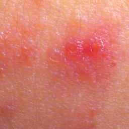
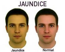
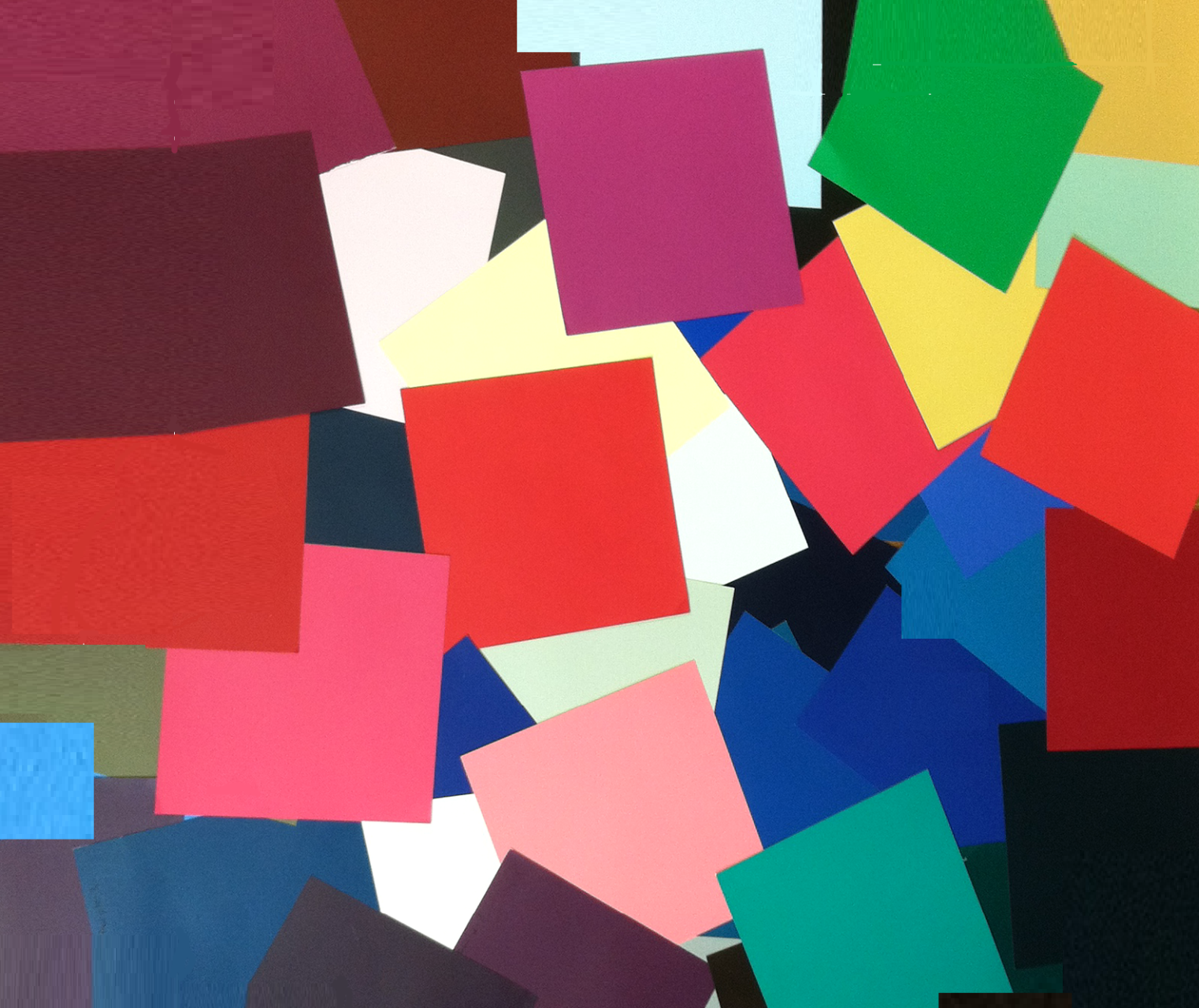
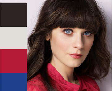
If you're like me, you're not satisfied to simply know what's true; you want to understand why it's true. So maybe you've heard it before: it's the effect of color on your skin that ultimately matters. Your eyes and hair are along for the ride. Colors that seem to "go with" your hair aren't doing you any good if that hair is framing dirty-looking or shadowed skin. Colors that seem to make your eyes pop aren't helping if those eyes are popping out of a washed-out face. But why is skin appearance the most important? Because when we look at other people, we use skin appearance - not hair or eye appearance - as our primary way of evaluating health. And health = beauty. The human animal seeks to maintain life and avoid death. To the human animal, health reads as beautiful because health is life. When you look at other people, you instantly and unconsciously evaluate their health, and you do it in large part using the appearance of their skin. If the skin looks right, the rest seems right too. Healthy looking skin = life = beauty. Baby skin is the ideal of skin beauty because babies are new life. And when we judge the health of another's skin, the most salient feature to that judgment is its color. Think about all the ways we use the language of color to describe the appearance of ill health in the skin. We speak of the yellow of jaundiced skin; the green of nauseated skin; the blue of frozen or oxygen-deprived skin; the purple of bruised skin; the red of burned or abraded skin; the white of bloodless skin; the grey of dead skin. The fact that there are so many ways that skin can look wrongly colored shows that skin color is crucial to our estimations of others' health -- and, therefore, of their beauty. But color is not objective. Color is context. For example, is "salmon" pink or orange? Here, I'd call it pink. Here, it looks closer to orange. The color of your skin is subjective too. Depending on what colors you place next to your own face, you can easily make the natural healthy color of your skin look too cool, too warm, too dark, too light, or too vivid - or disappear altogether. This looks unlovely because it looks unhealthy. When you know your the natural palette of your body, and put the colors of that palette next to your skin, your skin 's healthy color emerges. You look beautiful because you look healthy. First published February 2013.
66 Comments
A couple of nights ago, I took my shirt off and threw on a headband so I could wash my face before bed. This particular headband is from Free People, and I adore it because it's an abstract pattern in my Soft Autumn colors. I wish I could find a picture of it online. It's a little like this, but with warmer hues: Anyway, when I saw myself in the mirror, I was struck by how perfect the headband looked with my stretchy periwinkle bralette. The combination was gorgeous.
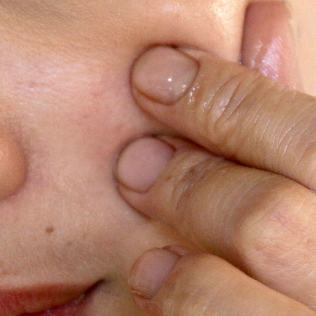
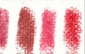
I actually spent about ten seconds trying to imagine an excuse to wear the headband and the bralette together somewhere. Just the bralette, mind you. No shirt. A music festival, maybe? I discarded that idea pretty quickly, LOL. But the feeling of happiness that I got from looking in the mirror and thinking, "That really looks beautiful!" stayed with me. One of the reasons that I love knowing my perfect colors is that I get those moments often. I look in the mirror and see perfect color harmony, and my day is a little brighter. Visual beauty brings us joy. Being able to look in the mirror and identify beauty there brings us joy. We all deserve to have more of that feeling. Is matching the color of a pinched cheek or pinched finger a good way to pick your lippy and blush colors? Well, the answer is a little complicated. The color of your pinched skin is usually the effect you're going for. That's true. But you won't achieve that effect by matching that color and then putting it on your skin. Why not? When you pinch your cheek or finger, you're seeing a color that combines the red of your blood with the brown of your skin tone. (All human skin is some variation of brown.) This is why your pinched-skin color is less saturated than the actual reds and pinks in your swatches. (Try it and you'll see.) If you choose a red or pink that you've matched to a pinched finger, it's already desaturated, because it's a combination of your body's red with your skin. As this matched color mixes with your skin color, it gets further desaturated -- most likely too desaturated for you. So, to create that same pinched-skin effect on your skin from the outside, you need to add a purer, less browned red or pink to the brownish tone of your skin. This is where your swatch reds and pinks come in. When you apply a purer red or pink from your swatches to your skin, the result that the viewer sees is a color that combines that red or pink with your skin. So the color you end up with is very similar to the pinched-skin color. That's the effect you're going for. It's a less saturated version of the pure swatch red or pink because it's blended with your skin color, and it looks perfect on your skin. That's how your palette reds and pinks are supposed to function. They shouldn't sit on top of your skin like red circles of blush on a Raggedy Ann doll, right? This is the same reason that matching makeup colors to your palette by swatching them on your skin is wrong, wrong, wrong. For purposes of matching your palette, makeup should only be swatched on white paper. If you "swatch" makeup on your skin, you're not learning what color it really is; you're learning what color it looks like mixed with your skin color. That information is interesting information. But it's not the information you need in order to know whether a pink or red matches your actual palette colors. You're looking to match those reds and pinks. I can only speak from anecdote and personal experience with regard to this question. (Looking forward to the day when I have the resources to do real research in this area!)
I don't think that parents' seasons have no effect on kids' seasons. Since skin tone is heritable, it makes sense that season would be heritable. But I don't believe we can predict with great accuracy a child's season from a parent's season-- just as we can't predict with great accuracy a child's hair or eye or skin color based on the parent's. We can make good guesses-- two Winters are probably likelier than average to have a kid who can wear black, don't you think? -- but we can't know for sure. I don't see clear patterns in the families I know. In my own family of origin, my mother and father -- a (probable) Bright Winter and a Soft Summer -- produced a Dark Winter daughter, which you might very well expect, and a Soft Autumn daughter, which you probably would not expect. In my family of generation, as they say, I combined my Soft Autumn genes with those of a Light Summer. We made two Light Springs. They're warm, like me, but they're more saturated than either of us. Who would have predicted it? What combinations do you see in your family? Share in the comments! :-) This is an interesting issue that Bright Spring and Bright Winter women often discuss -- whether the makeup can possibly be right, translated literally from the palette to the face. Women draped as Bright sometimes say the colors feel too saturated on the face. If this is you, I think there are a couple of things possibly going on: 1. A given color might be right in clothing, but not on a person's face. How far does a color have to be from red for it to no longer be a lip or cheek color? Bright Spring and Bright Winter have a lot of reds and pinks. They also have many purply pinks and orangey-reds. For some women, some of the pinks and reds are so close to purple or orange that they're no longer good as lippies (though they'd be fine as shirt colors, for example.) You can't wear every single palette color on your lips. Goodness knows not all True Autumns can wear pumpkin orange in a blush. 2. For some Brights, the intensity of the color just feels weird, even if it's objectively flattering. This is often true for women who are totally new to the palette. If you're accustomed to wearing very muted lippies, the reds and pinks of Bright Spring and Bright Winter might feel odd to you. The only cure for this is time. As weeks and months go by, you'll slowly grow accustomed to your palette, and you'll come to see how natural these supposedly bright colors look on you. 3. Unfortunately, some women draped as Bright aren't actually Bright. Draping is an art, and analysts do get it wrong sometimes. If you're a Bright, your reds and pinks should look natural on your face. They shouldn't look startling. I hate to sow the seeds of doubt! I know we are all looking for peace of mind. But if your reds and pinks consistently jump out of your face, that's not color harmony. 4. Some colors are too bright for anyone to wear as a lippie. The colors in your Bright Winter and Bright Spring palette aren't the brightest possible colors. There's a limit, it seems, to how saturated human coloring can get. There are definitely lippies for sale that are brighter than any Bright Spring or Bright Winter color. They won't look harmonious on anyone. (Color harmony isn't everyone's aesthetic.) If you're like me, you find it tough to match neutrals.
Matching neutral fabrics to your neutral color swatches can take a lot longer than matching reds, blues or greens. Here's the explanation, I believe: We think in language. But we lack an extensive vocabulary to talk about neutrals, so it's literally harder for us to think about what we're seeing when we look at a neutral. (Here's a cool Wikipedia page with more info about thinking about color.) For example, if you want to match a blue, you can tell yourself to look for a cadet blue or a Chinese blue or a sky blue. Each of those terms is perhaps attached in your mind to a specific kind of blue. But if you want to match a white, it's harder to articulate to yourself the kind of white you're looking for. We just don't have a ton of words to describe shades of white. What do we call white with green, or white with yellow, or white with pink? I mean, I have answers to some of those questions, but only because I've been thinking about color for a while now. The average person doesn't learn all of that vocabulary as part of normal life. So when you're looking for a matching white, you may not be able to talk to yourself about the kind of white you're looking for. And if you don't have language for a color, it's almost impossible to think about it. To get around this, I recommend asking yourself a couple of questions: 1. What basic hue seems to tint this neutral? 2.a. (for whites) Does it look more dirty and sooty, or more pure and clean? 2.b. (for other neutrals) Is it more light or more dark? (If it's not obvious, these questions are a way of getting at the hue, value, and saturation of a neutral.) If you ask and answer these questions about a particular white, you might call it "a dirty white with a bit of blue in it." Similarly, a grey can be light or dark, yellowish or blueish; a brown can have pink or yellow in it; etc. If you can identify a few adjectives to attach to your neutral -- in other words, if you can say, "a sooty, pinkish white" or "a light brown with some purple in it" -- you're much closer to being able to match that neutral. Say the words to yourself in your head. Having actual language for the color really helps! If you don't own your seasonal palette, color cards are an affordable way to get your hands on it! The short answer is, No way. People who look similarly don't all come into this world with similar personality traits. It's just not the case that all Winters are born serious, focused and determined. Frankly, this kind of thinking sounds racist to me. In a country where almost everyone has black hair, a cool skin tone, and brownish or black eyes, surely a good portion of those people would be some sort of Winter. Would that mean tons of people in that country would share the same basic personality traits? No. That's nuts. Other people do sometimes expect us to have certain personalities based on what we look like. For example,my sister is a Dark Winter. Growing up, people often seemed to expect my sister to be quiet, serious and determined. My son is a Light Spring, and people seem to expect him to be bouncy and cheerful. But the bottom line is this: you are you. Color analysis won't do a thing to reveal your personality to you. It will help you see your true physical beauty, though. That makes all kinds of personalities pretty happy. :-) Sometimes people ask me, "Is color analysis just for white people? Is it relevant for people of African descent or other people of color?" The answer is that color analysis is absolutely relevant for POC. 12-tone color analysis is applicable to people of every skin tone, from very light to very dark It's a sad fact that some websites and books about color analysis don't address people with very dark skin tones. But I'm striving to right that wrong here on my site. I'm also striving to correct some common misconceptions about color analysis for people with skin tones on the darker edge of the spectrum. For example, despite what you may have heard, not all people of color are Winters. In some systems, anyone with skin that's rather dark gets immediately shunted into the Dark Winter category. And it is true that many people with very dark skin will need a high-contrast palette to look their best. Often, that will be a Winter palette. But it won't always be Dark Winter -- and sometimes it won't be Winter at all. Other palettes with high contrast, such as Bright Spring and Dark Autumn, are certainly possibilities for people who need a lot of contrast. And many people of color have a gentler tone to their skin that is most flattered by muted colors. Here, I have examples of African-Americans and other people of color who are Dark Autumns, Soft Autumns, True Autumns, Light Springs, Brights Springs, True Winters, and Bright Winters.
Your color season doesn't depend on what box you check on a census form! Your color season depends entirely on which colors flatter your skin. That's it. Don't know your season? Try at-home draping! Figuring out the color season of a particular color in a store can be difficult.
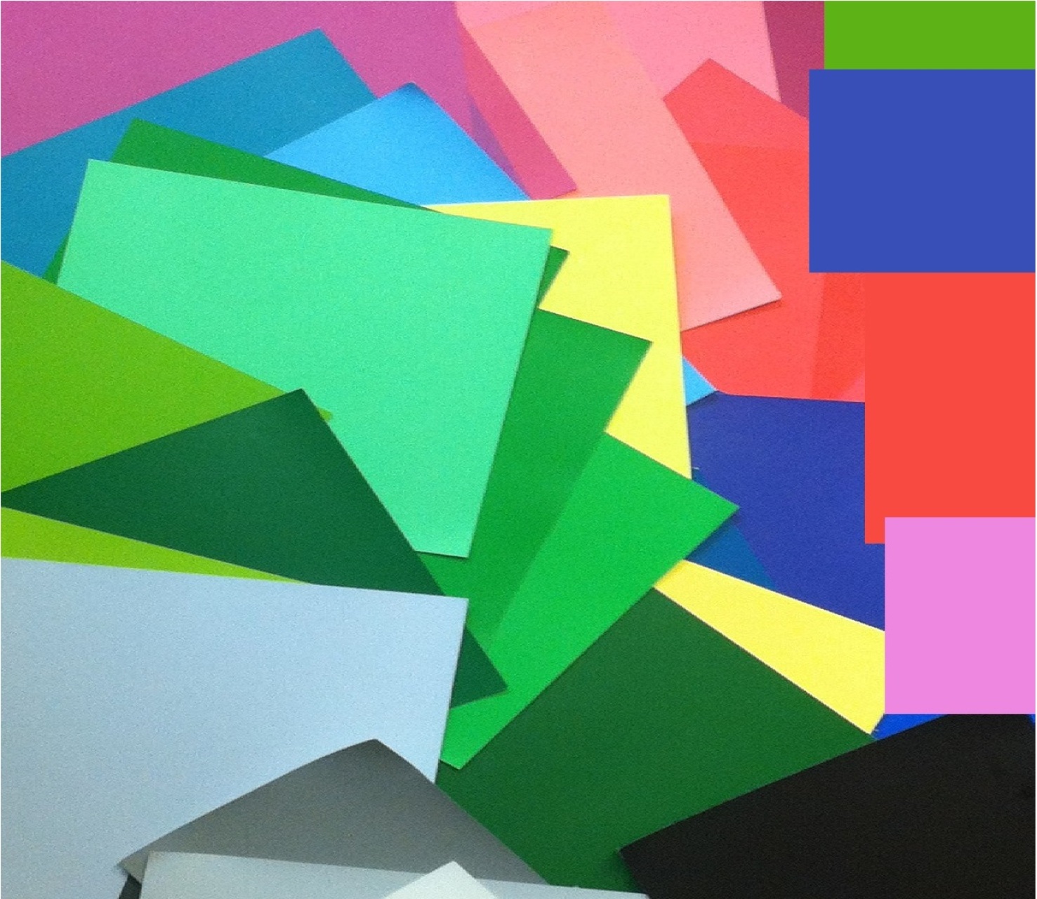
When I'm trying to figure out a color's season, and I don't have swatchbooks in front of me, I try going through the three dimensions of color one at a time. I ask myself "Is this bright or soft? Is it light or dark? Is it warm or cool?" Sometimes I'm stuck on one of those questions, but answering the other two makes things start to become clear. This is all harder to do with lights and neutrals, but in those cases I try imagining alternate versions: "Could this be dirtier? (More greyed?) What would that look like?" "Could this be purer? (Less greyed?) What would that look like?" "Could it have more yellow? What would a more yellowed version of this look like?" "Could it have more blue? What would a more blued version look like?" Warm and cool -- yellow/orange-tinted or blue/pink-tinted, to be simplistic about it -- can be tough to decide until you've memorized a warm and cool version of each hue. Once you have those mental images, it becomes easier to determine temperature because you can compare a sample to those mental images. For example, for brown I have memorized mental images of caramel, a warm brown, and cocoa, a cool brown. When I see a brown in a store, I can ask, "Is this closer to caramel or cocoa?" For blue, I have memorized mental images of aqua (a yellowed blue) and periwinkle (a purpled blue). I can analyze whites pretty easily without a swatchbook if I can first identify what the white is tinted with. So, for example, if I figure out a white is blue-tinted, I can ask myself, "Is that drop of blue more aqua-ish or more periwinkle-ish?" It's also a good idea to compare colors in a store to other nearby colors. See the red in front of you: is it the brightest red in the store? Or is it "dirtier"-looking than many other reds? Does it seem to have more orange in it than other reds, or does it seem to have more violet? Commercial products, like Coke cans, are great reference points for this kind of comparison because they are often purely saturated. If you're looking at a red that's as bright as a can of Coke, chanes are it's a Bright season red. Typically, your best colors make your features look clear and defined, right? And colors that are too saturated can make features look a little blurry, right? As they age, women sometimes gravitate to brighter colors precisely because of that effect -- the blurring of the features. It's a bit like one of those soft filters sometimes used in filming older actresses -- like the one used on Sybil Shepherd on Moonlighting. (Here, "old" is relative! She was younger than I am now, I'm sure. But in Hollywood, it seems like "old" for women means "over 25.") I don't necessarily recommend using brighter colors to create the Moonlighting effect. My aesthetic values authenticity above all
But when we know the effects of different color dimensions on our skin, we can use that knowledge to our advantage, if we like. Knowledge is power. So if you do want to wash yourself out, for whatever reason, highly saturated colors are the way to go. I'm not always comfortable tooting my own horn, but this letter from a reader made me feel so proud of the work I do that I want to share it.
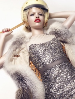
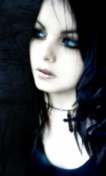
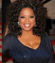
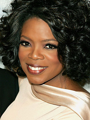
What she achieved is what I hope for all of you -- that you can use my tools and ideas to find your own authentic beauty. :-) - Rachel - - - - - - - - - - - - - - - - - - - - - - - - - - - - - - - - - - - - - About a year ago, I took a look in my closet and thought "What on earth is going on in here?" I owned nothing I liked, and nothing that suited me or my job. I decided that it was high time for me to "figure out my style." A bit of internet research and a free quiz or two later, I seemed to fit the profile of a Bright Winter Dramatic Classic. I had my doubts, but that sounded suitably corporate and bold. I attempted to dress as such. I spent a good bit of money on it, too. (Ugh.) Except... it didn't feel right. So I tried messing around with Natural Dramatic... No. Soft Dramatic? Surely I had to be some kind of dramatic, since I'm tall and on the lean side. Every free quiz said that I had to be dramaticish. Fast forward to a few months later when someone snapped a picture of me. I had on a sharp black blazer, a severe platinum bob, and chunky jewelry. And I just looked lost in that outfit. I also looked old. Back to the internet I went, now a lot less confident in the entire style-analysis process. I found your blog, Rachel, and each post seemed to click something into place. First up: dress for your face, you said. Well... yeah. That makes sense. Dramatic Classic clothes looked good on my body, but competed with my face. Then came your blog post about how ethereal elongation often gets mistaken for dramatic elongation. Light bulb moment for me. No wonder I look better in white linen than black pleather. I went on, using your explanation of color analysis and lipstick draping suggestions to find my right season (cool summer, so I wasn't that far off when I thought I was a winter). Armed with my 'right colors', I shocked my friends by dying my hair back to its original dark ash blonde. But then they all agreed it did look a lot better that way. I then took the plunge and got your style ID calculator. I felt pretty nervous about it, since all those free calculators had pegged me so wrong. Now, in using it, I wasn't just pleasantly surprised. I was giddy. First of all, I love the way it worked. It was a way to analyze myself against the clothes themselves - not against some standard set by the latest popular celebrities. I appreciated this, especially considering how so many celebs have had work done or are photoshopped or whatever. Further, I loved the lack of assumptions. Many other style calculators and blogs are western-centric, white-centric, and cis-gender-biased. Not only is that completely unhelpful and damaging for women who don't fit that stereotype, but it's not helpful for women who do. All my life I was told "Oh, well, you're tall and blonde, so you can wear anything." Only, I can't (and I'm not that blonde anyway) and I could never explain why I couldn't wear the 'in' clothes. I figured there must be something wrong with me - with my face and my body. But after using the style ID calculator, my view on that changed. There's nothing wrong with me. It was the clothes. Popular styles don't suit me at all - not when I was a kid and certainly not now. And without that knowledge, I didn't know how to describe what I needed. I walked away from the calculator realizing that I am best flattered by a complicated blend of styles - and that's not only okay - it's awesome! I need something quite different from what's at the mall - something uniquely my own. I've since stopped shopping at my old haunts, and instead found ways to revamp my current clothes or order things from niche internet shops that I'd never even heard of before. My work wardrobe is slowly transforming from a dull, aging uniform into a blend of 'work appropriate' and my own quirky self. I love that. Most of all, I've loved exploring your site. It's wonderful that you have a range of suggestions and insights for women of all body types, features, hair types and lengths, races, color seasons, and so on. This site didn't type me - it invited me to find myself. So thank you, Rachel. You've made me feel a lot more beautiful. And that is, itself, beautiful. aesthetic (n): a philosophical theory or idea of what is beautiful. I believe most of us, men and women, want to be beautiful. Beauty, though, is in the eye of the beholder. What's beautiful in one place or time, or in one individual's mind, isn't beautiful in another. For example, the aesthetic of editorial fashion photography tends to value what's unnatural or startling. Models in these kinds of photos are typically styled in a way that disguises or exaggerates, rather than reveals, the natural colors and shapes of their bodies. Most of us who read these magazines understand this aesthetic and can appreciate the images within that context. (Though the men in our lives are apt to peer over our shoulders and exclaim "Is that supposed to be pretty?") Goth culture has its own aesthetic, which prizes a dramatic, unnatural, high-contrast look that's simultaneously romantic and disturbing. Seasonal color analysis, by comparison, sees beauty in what looks authentic, balanced and harmonious. Seasonal color analysis is just one idea of what is beautiful. It's not the only one. That bears repeating: seasonal color analysis is not the only answer to the question "What is beautiful?" It's my answer, and it may be yours. But in the end it's still just one aesthetic. (And not everyone even wants to be beautiful, right? Some people couldn't care less, and I'm fine with that and so should everyone else be. Some people just want to look like everyone else. I won't judge that.) Personal color analysis is for women and men who want to be beautiful, and who see beauty in what's deeply real. It's for people who want to be strongly present as themselves in their lives. Oprah, who I think is a Dark Autumn. So good at being fully present in her colors. If you also want to look like your true, beautiful self, well, you share my aesthetic. Find out what season you are. I had occasion not long ago to drape a bunch of teenagers and adults in a group. I had my drapes with me and we were all sitting around, not doing anything in particular. Mass draping ensued.
I was surprised to discover that coming to the right decision was easy with so many other eyes watching. You wouldn't think that would be the case, but it was. What worked and what didn't work was apparent much more quickly because lots of people noticed it. Several drape-ees, I was able to figure out ridiculously fast - like, in under five minutes. Draping sure is easier when there's not much at stake. Most of these people didn't give a darn what their season was. So of course it was almost immediately obvious. (I was reminded of Christine Scaman telling herself "Let this be easy." Because it's so expensive, and because we're all such unique, special snowflakes, we think discovering our season has to be really hard. But sometimes season is actually... easy.) I saw several cases that were just what you'd predict: a couple of dark-skinned, dark-eyed Dark Winters; a pale, blonde Light Summer; a pale, blonde Light Spring (though the Light Spring's lightness was more intense, as if drawn in Crayons rather than painted in watercolors.) The most interesting cases, of course, were the surprises. One girl, a tall, thin, pale redhead, surprised the heck out of me when she turned out to be a Soft Autumn. I've been looking at her for two years and thinking she was a Dark Autumn. After draping her, I realized I'd perceived her as high-contrast because her lines are dramatic. But her coloring is not. A dark-eyed young man with an olive complexion and brownish-black hair seemed likely to be a Winter. In fact, Soft Summer was best for him. His hair was close to Soft Summer's charcoal. I was expecting a Korean-American friend to reveal herself as a True or Bright Winter, having seen her look great in saturated color and pretty good in black. She actually came out as a beautiful Bright Spring. Yet another case that gaves lie to the idea that only White women can be Springs. I saw a handful of True Springs. In a couple of them, I noticed a phenomenon I'd seen before: their faces were quite ruddy, and the proper True Spring drapes toned that ruddiness down a good deal. One friend who has medium brown hair that she highlights blonde (and I think wears pretty believably) came out as a Bright Winter. I'd suspected this for a while because she has strikingly dark, almost-black eyes combined with very fair skin that has a sort of opacity, as if she's wearing matte powder, that I associate with Winter. Even with blonde hair that doesn't look completely unnatural, she still pulls off super-bright colors. I hope that one day I'll get to see her in her natural hair color. (No pressure though, Friend!) We took a picture of us side by side, both wearing the Elea Blake lip drape color for Bright Winter. It was hilarious how different it looked on the two of us. On her, perfectly natural. On me, clownish - sort of like this. The best part of the day was finally figuring out the season of a special friend I'd mistyped about two years ago. Since that initial draping, I've been watching her in the Soft Summer colors I prescribed and experiencing a growing feeling that something was off. But I had personally observed how other drapes overwhelmed her, and I couldn't imagine what else she could be. Turns out, she is also a Bright Winter. What a relief to get it right! In the proper colors, she looked more alive than I'd seen her for a long time. How did I mistake a Bright Winter for a Soft Summer? The most likely explanation is that I just totally screwed up. After all, what do I know? Buuuut... she was also quite sick a couple of years ago, and has slowly regained her health since then. So maybe Soft Summer colors actually were her best when I draped her. Of course, I'd prefer this explanation. :-) Return to Your Natural Colours by Christine Scaman, of 12 Blueprints This long-awaited book is finally here, and however good you're expecting it to be, believe me - - it's better. This is *not* The Idiot's Guide to Seasonal Color Analysis. This is a book to study, to make notes in, to read and re-read and re-re-read. It feels like a B.A. in the 12 seasons of personal color. This book is important. KWIM? People are still going to be reading it years from now. And color-accurate palettes for all 12 seasons? Seriously, pinch me. Incredible. A treasure. And ridiculously affordable. Buy 6 and give them as gifts to the thoughtful women in your life. I don't know whether many film & t.v. costume designers have studied personal color analysis. But they apply the principles when they make costuming decisions for characters. Characters are presented in their proper colors to make them seem strong, sincere, or likable. Characters are shown in the wrong colors to make them appear weak, uncertain, uncomfortable, or phony. One of my guilty pleasures of the last year was Spartacus: Blood and Sand on Starz. Lucy Lawless's character, the crafty Lucretia, was almost always shown in completely wrong colors to emphasize her phoniness. Here's Lucy Lawless in good colors (as virtuous Xena, Warrior Princess): ...and Lawless as the scheming, unhappy Lucretia in Spartacus: If you've watched Spartacus (and I really think you should!), you may be thinking "But her husband, Batiatus, is just as wicked, and he looks pretty good." I agree. This is a actually a great example of a costume designer using personal color as a characterization tool to brilliant effect. Yes, Lucretia and Batiatus are both (mostly) wicked. Yes, they both plot and scheme. Yes, they're both insincere. The difference, and the reason Batiatus appears in his correct colors, is that he is sincerely insincere. He is a fearless, plotting, power-hungry schemer inside and out, and he revels in it. No weakness, no self-doubt. He's totally centered in himself. Lucretia, though, worries. She frets. She's not happy. She wants something more... it's not clear what. (A clue: just about the only time she looks halfway real is in a scene at the end of the season, when she's lying in bed, having just discovered she's pregnant. Hair's still wrong, but the ivory robe, soft light & natural makeup create a less artificial effect:) So in addition to the contrast between these crafty characters and the virtuous characters in the series, the narrative is enhanced by dramatic contrast between husband and wife. Batiatus is strong, centered and authentic; Lucretia is scattered and false. Their colors communicate this to us, probably without us realizing it. The characters, and the overall narrative, are made more complex and effective by a costume designer's understanding of personal color.
|
About Me...I'm passionate about helping people become their most authentic and beautiful selves. Categories
All
|
- home
- Blog
-
-
- Book your virtual style analysis
- ♂ DRAMATIC style type
- ♂ NATURAL style type
- ♂ GAMINE style type
- ⚥ CLASSIC style type
- ♀ INGENUE style type
- ♀ ROMANTIC style type
- ♀ ETHEREAL style type
-
- ⚥ ♂ Classic Gamine -- The Prep Schooler
- ⚥ ♀ Classic Ingenue -- The Class President
- ⚥ ♂ Dramatic Classic -- The Art Critic
- ♂ ♂ Dramatic Gamine -- The Punk Rocker
- ♀ ♂ Dramatic Ingenue -- The Childlike Czarina
- ♂ ♂ Dramatic Natural -- The Amazon Queen
- ⚥ ♀ Ethereal Classic -- The Delicate Sophisticate
- ♀ ♂ Ethereal Dramatic -- The Sorceress
- ♀ ♂ Ethereal Gamine -- The Sprite
- ♀ ♀ Ethereal Ingenue -- The Fairy
- ♀ ♂ Ethereal Natural -- The Earth Goddess
- ♀ ♂ Gamine Ingenue -- The Girlish Mod
- ⚥ ♂ Natural Classic -- The Prep
- ♂ ♂ Natural Gamine -- The Tomboy
- ♀ ♂ Natural Ingenue -- The Outdoorsy Sweetheart
- ⚥ ♀ Romantic Classic -- The Sexy Sophisticate
- ♀ ♂ Romantic Dramatic -- The Vamp
- ♀ ♀ Romantic Ethereal -- Aphrodite
- ♀ ♂ Romantic Gamine -- The Firecracker
- ♀ ♀ Romantic Ingenue -- The Demure Seductress
- ♀ ♂ Romantic Natural -- The Babe Next Door
-
- ⚥ ♀ ♂ Classic-Gamine-Ingenue
- ⚥ ♂ ♂ Dramatic-Classic-Gamine
- ⚥ ♀ ♂ Dramatic-Classic-Ingenue
- ♂ ♂ ♀ Dramatic-Gamine-Ingenue
- ⚥ ♂ ♂ Dramatic-Natural-Classic
- ♂ ♂ ♂ Dramatic-Natural-Gamine
- ♂ ♂ ♀ Dramatic-Natural-Ingenue
- ⚥ ♀ ♂ Ethereal-Classic-Gamine
- ⚥ ♀ ♀ Ethereal-Classic-Ingenue
- ⚥ ♀ ♂ Ethereal-Dramatic-Classic
- ♂ ♂ ♀ Ethereal-Dramatic-Gamine
- ♀ ♂ ♂ Ethereal-Dramatic-Natural
- ♀ ♀ ♂ Ethereal-Dramatic-Ingenue
- ♀ ♀ ♂ Ethereal-Gamine-Ingenue
- ⚥ ♀ ♂ Ethereal-Natural-Classic
- ♂ ♂ ♀ Ethereal-Natural-Gamine
- ♀ ♀ ♂ Ethereal-Natural-Ingenue
- ⚥ ♂ ♂ Natural-Classic-Gamine
- ⚥ ♀ ♂ Natural-Classic-Ingenue
- ♂ ♂ ♀ Natural-Gamine-Ingenue
- ⚥ ♀ ♂ Romantic-Classic-Gamine
- ⚥ ♀ ♀ Romantic-Classic-Ingenue
- ⚥ ♀ ♂ Romantic-Dramatic-Classic
- ♂ ♂ ♀ Romantic-Dramatic-Gamine
- ♀ ♀ ♂ Romantic-Dramatic-Ingenue
- ♂ ♂ ♀ Romantic-Dramatic-Natural
- ⚥ ♀ ♀ Romantic-Ethereal-Classic
- ♀ ♀ ♂ Romantic-Ethereal-Dramatic
- ♀ ♀ ♂ Romantic-Ethereal-Gamine
- ♀ ♀ ♀ Romantic-Ethereal-Ingenue
- ♀ ♀ ♂ Romantic-Ethereal-Natural
- ♀ ♀ ♂ Romantic-Gamine-Ingenue
- ⚥ ♀ ♂ Romantic-Natural-Classic
- ♂ ♂ ♀ Romantic-Natural-Gamine
- ♀ ♀ ♂ Romantic-Natural-Ingenue
- Shop
- Book a Virtual Style Analysis!
- Contact me
Connect with me!















 RSS Feed