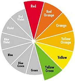
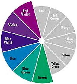
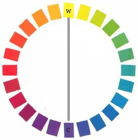
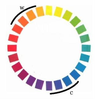
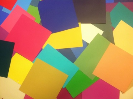
You've probably learned that reds, oranges and yellows are warm colors, while greens, blues and violets are cool colors.
True (Warm) Spring and True (Warm) Autumn have colors that one might call green, blue or violet; True (Cool) Winter and True (Cool) Summer have colors that one might call red, orange or yellow.
How can this be?
Let's first understand that there is no universally agreed-upon, exact warmest or coolest color. There is, though, a general consensus around approximately where "warmest" and "coolest" are found. Artists and theorists tend to agree that the warmest color is somewhere in the red-orange-yellow range, and the coolest color is somewhere in the green-blue-purple range.
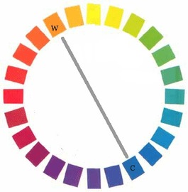
Some will say that blue is the coolest color, and its opposite, orange, is the warmest.
So what's the deal?
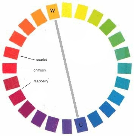
Think about it. You might call red a warm color. But some reds are warmer than others, right? Scarlet red is warmer than crimson, which is warmer than raspberry.
The best explanation I've found for how our brains decide whether one color is warmer than another is this:
We determine it by (unconsciously) deciding which is closer to the warmest color on our mental color wheel.
Let's call orange the warmest color, just for the sake of argument.
Of the three reds I mentioned, scarlet is physically closest to orange. Crimson is less close. Raspberry is even farther away.
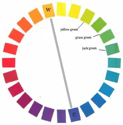
Consider green.
Is grass green a cool color? Not as cool as jade green, right? But cooler than yellow-green, surely.
The bottom line:
"Warm and cool" is not a continuous spectrum from one side of the color wheel to the other.
"Warm and cool" is a spectrum within each hue.
In the picture above, if we started at yellow and labeled the colors clockwise, we'd have
warm yellows
cool yellows
warm greens
cool greens
Somewhere in the range of the blues, we pass the coolest color. Then the order switches as we continue clockwise:
cool purples
warm purples
cool reds
warm reds
And then we're back to our warmest color.
There are several good web pages that talk about all of this in greater detail, but I haven't seen one I like more than the article "Color Temperature" on www.handprint.com. I owe much of my understanding of how warm and cool work to this article.
P.S. Muted cool colors are less cool than clear cool colors, and muted warm colors are less warm than clear warm colors. Can you guess why? Recall that to mute a color, we add its opposite color. For example, to mute a purple, we add yellow. By doing so, we draw it closer across the color wheel to the warmest color on the wheel. So since it's closer, it's warmer. Neat, huh?
COMING SOON - Home Draping Option 2: Any Six SeasonsDrape yourself at home! A red or pink, a yellow or gold, a green or blue-green, and a blue or violet from six seasons of your choice. Each cardstock sheet is at least 4 x 8 inches. Let me know which six seasons you'd like in a note at checkout. "I received my color cards and I absolutely love them! I was a little unsure about my coloring but seeing the cards, now I'm confident that I picked the right season." ** Unfortunately, shipping outside of the U.S. and Canada is currently not available.** |
COMING SOON - Home Draping Option 1: 12-Season Color Card SetDrape yourself at home! 48 cards in total:
from each of the 12 seasons. Each cardstock sheet is at least 4 x 8 inches. "I received my color cards and I absolutely love them! I was a little unsure about my coloring but seeing the cards, now I'm confident that I picked the right season." ** Unfortunately, shipping outside of the U.S. and Canada is currently not available.** |
