|
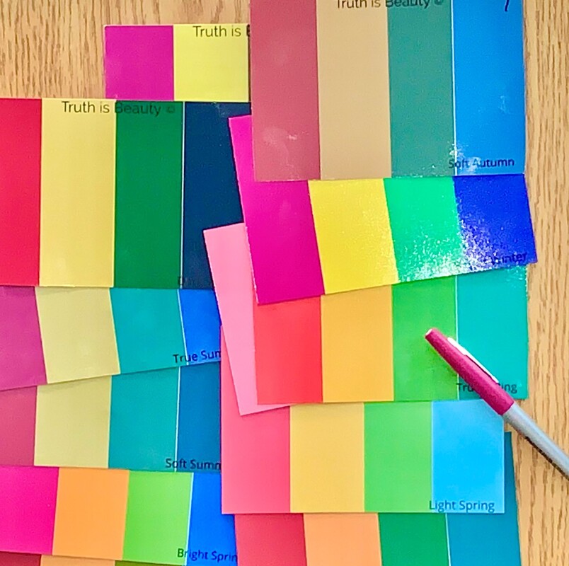
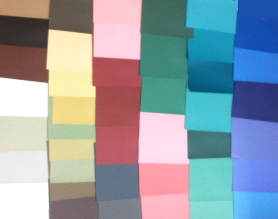
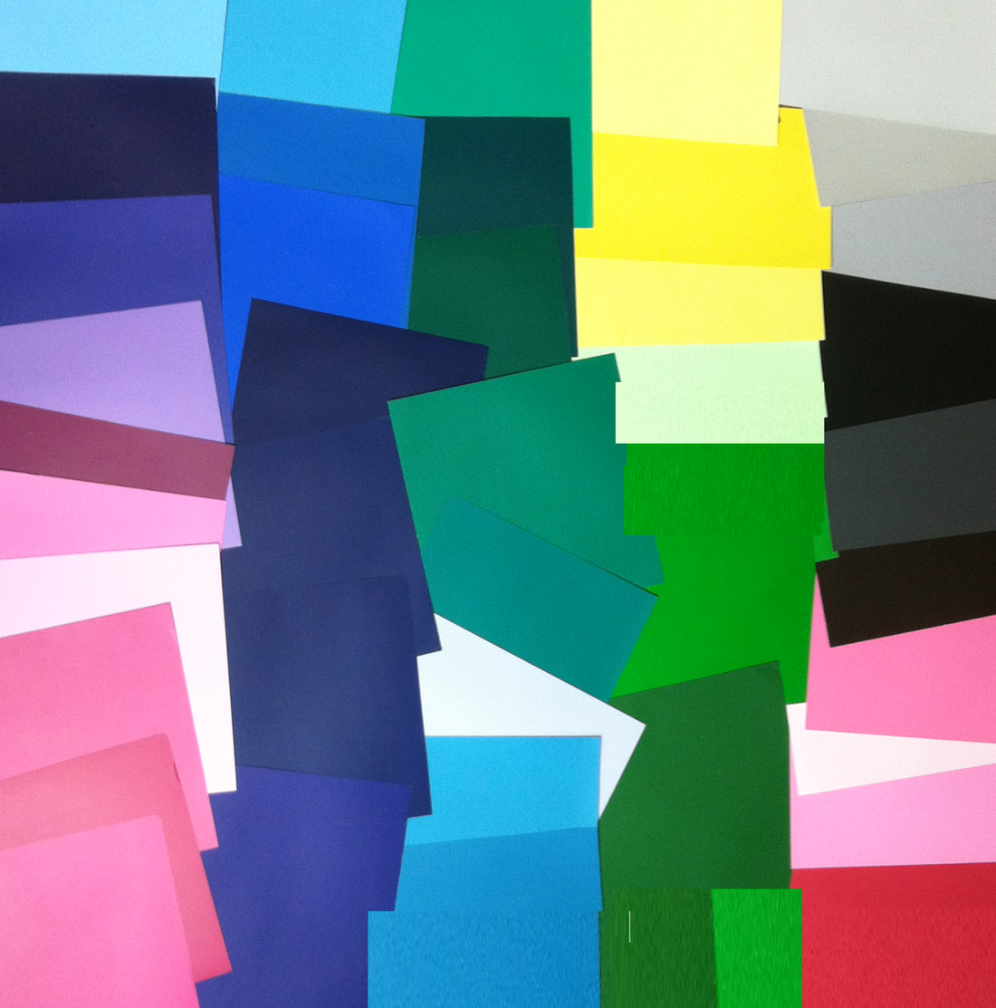
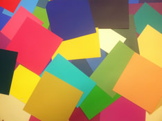
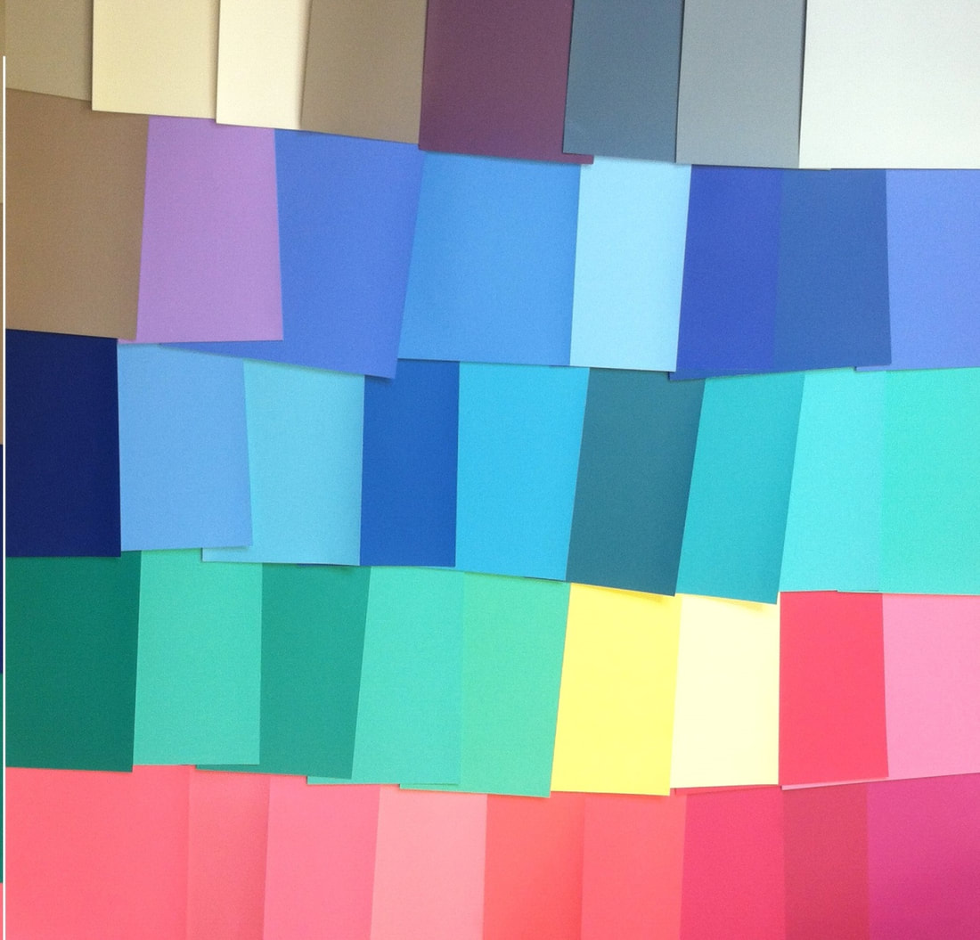
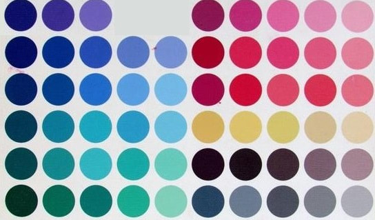
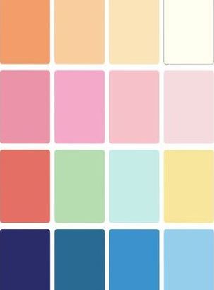
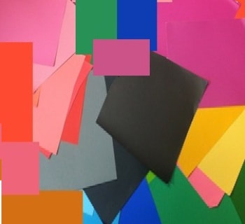
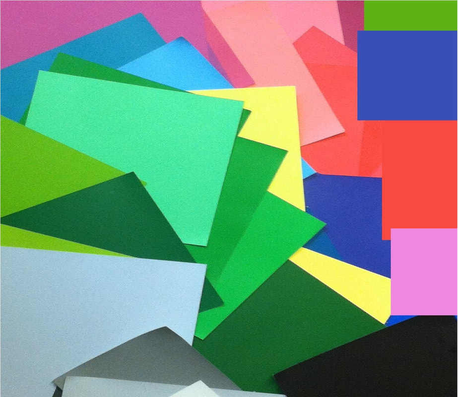
So many of you have requested color cards you can use to drape yourself at home and figure out your color season. I offered home draping cards years ago, and I'm finally able to offer them again! Edit: You can see a video of me using the cards on myself here: Each card is 4 inches by 6 inches and has four colors from a single season: a red or pink, a yellow, a green, and a blue. I've spent many hours making sure these colors are precise for each season. You can order as many or as few seasons as you like. For example, if you simply want to confirm that you're a Bright Spring, you can order just the Bright Spring card. If you know you're a Summer, but you don't know which type, you can order all three Summer cards. If you know for sure that you can wear black, you can order the three Winter cards, Dark Autumn, and Bright Spring. (These are the fve seasons with a true black in their palette.) Figure out your color season at home. To test a card, remove all of your makeup and cover your hair. look at a mirror reflection or a photo of yourself with the card held under your chin. Your correct season will make your skin look healthy and alive. Seasons that are wrong for you can have a variety of negative effects on your skin, depending on what your correct season is.
Click here to download more specific home draping instructions. Shipping in the contiguous U.S. typically takes about 8 to 10 business days. True Spring draping card
$9.99
A True Spring red, yellow, green, and blue on a thick, high-quality postcard. 4" x 6" Free shipping! True Summer draping card
$9.99
A True Summer red, yellow, green, and blue on a thick, high-quality 4" x 6" postcard. Free shipping! True Autumn draping card
$9.99
A True Autumn red, yellow, green, and blue on a thick, high-quality postcard. 4" x 6". Free shipping! True Winter draping card
$9.99
A True Winter red, yellow, green, and blue on a thick, high-quality postcard. 4" x 6" Free shipping! Light Spring draping card
$9.99
A Light Spring red, yellow, green, and blue on a thick, high-quality postcard. 4" x 6". Free shipping! Light Summer draping card
$9.99
A Light Summer red, yellow, green, and blue on a thick, high-quality postcard. 4" x 6". Free shipping! Dark Autumn draping card
$9.99
A Dark Autumn red, yellow, green, and blue on a thick, high-quality postcard. 4" x 6". Free shipping! Dark Winter draping card
$9.99
A Dark Winter red, yellow, green, and blue on a thick, high-quality postcard. 4" x 6". Free shipping! Bright Spring draping card
$9.99
A Bright Spring red, yellow, green, and blue on a thick, high-quality postcard. 4" x 6". Free shipping! Bright Winter draping card
$9.99
A Bright Winter red, yellow, green, and blue on a thick, high-quality postcard. 4" x 6". Free shipping! Soft Autumn draping card
$9.99
A Soft Autumn red, yellow, green, and blue on a thick, high-quality postcard. 4" x 6". Free shipping!
10 Comments
For many years, I have not offered virtual color analysis, because I have not felt confident that I could guarantee a correct answer about colors based just on photos. Sometimes I felt I all I could offer was my best guess.
But the truth is, I do think my best guess is right most of the time. And I hear every day from women who would like my best guess. So I'm now offering a package of virtual color analysis and a seasonal makeup list... with a catch. The catch is that I'm only offering this to women I can pre-screen. Here's how it works: You'll send me a ton of pics of yourself in as many different colors as you can find. Send these to the email [email protected] . If I believe I know your color season, I'll send you an invoice. You can choose whether to pay it. If you pay it, I'll send you your answer, along with a paragraph explaining how I arrived at my answer and your season's makeup list. At this point, I'm offering a bare-bones package: your season, plus the makeup list. It's $79. If you're looking for a color analysis that comes with info about your season, this isn't a good option for you. But if you just want a dang answer, this option may be what you've been waiting for. (And everything I would tell you about your season, I've already put here, on this website, for free!) If you're interested, send me lots and lots of pics of yourself at [email protected] .The more pictures you send, and the more different colors I see you in, the more likely it is that I'll be able to find an answer for you. You may not hear back from me. But if you do, you'll have the option to learn your answer. In my last few posts, I've talked about how to combine your personal color palette with your style type. There are 12 seasonal color palettes, and one of them is perfect for your skin. Every color in that palette will be harmonious on you. But some of them will be your personal go-to colors. Part of that will have to do with the unique way your individual body displays that palette. And part of it will have to do with your personal style type. Certain hues and certain combinations will send a message that coordinates with your style type. So if you're strongly Romantic, what colors in your palette should you focus on? A woman who is strongly Romantic may have a heart-shaped face, sexy eyes, a high forehead, a delicate nose, and full lips, If this is you, you'll look like yourself in in the deeper versions of your reds, violets, red -violets, rusts, fuchsias, and purples. Your season's version of black will usually be great on you as part of your overall ensemble, because it reads as mysterious. You can even pull off your season's black as a head-to-toe look, as long as the effect is mysteriously sexy, not intimidating or shocking. (Intimidating or shocking use of your black would read as Dramatic, not Romantic.) Making black look mysterious, not intimidating, won't be difficult if your garments are as detailed as Romantic garments ought to be; the profuse detail breaks up the black visually, so it doesn't feel like a huge block of startling color. In my experience, Romantic blends are a bit less common than other blended types. Are you a Romantic blend? If so, how have you combined your palette with your style type? Please share in the comments!
That is, do Light Summers and Light Springs have pale eyes, pale hair and pale skin? Often, but not always. Do Soft Summers and Soft Autumns look "soft? Are they visually very low-contrast? Often, but not always. Let's think about Light Spring and Soft Autumn, which I discussed here. The Light Spring palette is light, warm, and clear. The Soft Autumn palette is muted, warm, and medium-dark. Ultimately, what determines your season is how your skin reacts to color, not what your skin, hair, and eyes look like. So it's not precisely true to say, for example, that a Light Spring is herself light, warm, and clear; instead, we say that her best colors are light, warm, and clear. Both of my kids are Light Springs. It's true they're both fair-skinned, but they also both have hazely-brown eyes,, and my son has brown hair. The only way I know they're Light Springs is that their best colors are Light Spring colors. They are both gorgeous in light fuchsia, light lime green, light aqua, camel, light peach, and khaki. I'm a Soft Autumn. One could argue that my overall contrast level is higher then either of my kids', because I have fair skin but darker hair than either of them. Yet I know I'm a Soft Autumn because my best colors are Soft Autumn colors. I look my most lovely in warm, dusty rose, gentle olive, gentle yellow, muted turquoise, and dusty periwinkle. 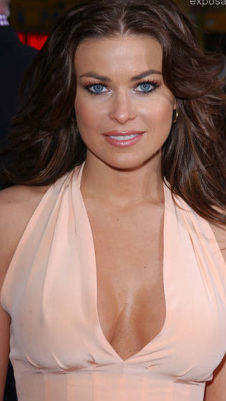 Carmen Electra's best colors are cool and very, very gentle. (So are Denise RIchards' best colors. I initially mislabeled this pic as Denise Richards, LOL! Thanks to those who pointed it out. ) Carmen Electra's best colors are cool and very, very gentle. (So are Denise RIchards' best colors. I initially mislabeled this pic as Denise Richards, LOL! Thanks to those who pointed it out. ) You can absolutely be a Soft season even if you don't think you look low-contrast. Many Soft Summers and Soft Autums have fair skin and dark hair.
The test is always which colors make your skin look the most healthy.
If you're not sure of your season, try the quiz! Once we turn the corner from July into August, I start to think about summer ending, and I feel a little bummed. Maybe you feel that way too. To cheer us all up, I'm discounting makeup lists 20% this week. :-) From now through August 19th, use the code SUMMERMAKEUP to get 20% off of your seasonal makeup list.
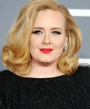
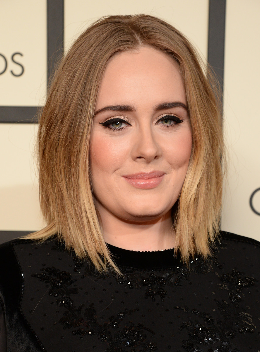
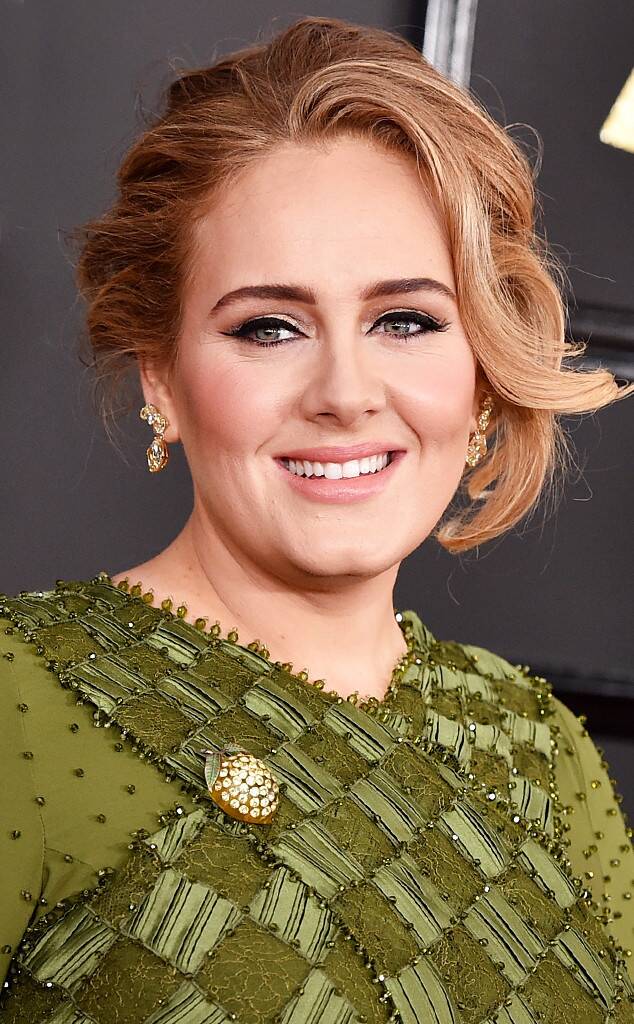
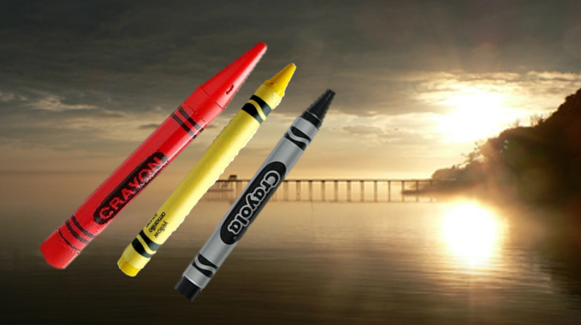
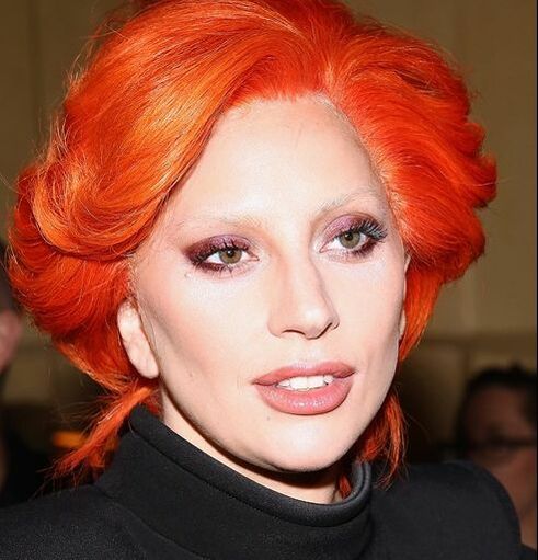
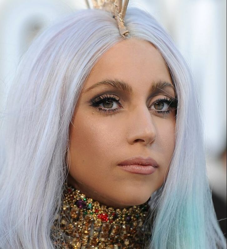
Remember -- use SUMMERMAKEUP to get 20% off, this week only! A version of this post was published in September 2012. I have an adorable memory of watching a video of Adele performing "Rolling in the Deep" seated next to my then-three-year-old son. He listened very carefully. When it was done, he turned to me and said, quite solemn, "Mommy, that lady has a fire in her heart." :-) A reader, C.T., asked me what season I believe Adele is. She pointed out that Adele's often in black but it's clearly not her best color. I have to agree. Certainly this look is not right for her. The woman is invisible; we only see the too-bright color. Yet she often gets her makeup right, don't you find? With the exception of the too-black eyeliner and mascara that are sadly de rigeur in show business, her lip and cheek are often natural and not overdone. Those lip and cheek colors lean warm, to my eye, and are definitely subtle and blended rather than bright or contrasting. Her coloring is so very delicate. The black of the dress and the eye does not belong. Here, again, eye and top are darker than she is, but not as painfully so. The rest is lovely. I see Autumn - don't you? Warm, blended, rich. Could she be a True Autunm? Hmm. These very warm colors look, to me, a tad stronger than she is. I find this warm, deep green, which could be True or Dark Autumn's green, just a tad too much for her. She really is very neutral. The pink in those lips is actually pink, not salmon. I think Soft Autumn. Here she is in more SA colors and I think they balance her wonderfully. Gentle, soft, blended, not overdone. We really see her. I'm calling Adele a beautiful, soulful, Soft Autumn. ere's hoping that one day she chooses to exchange the black eyeliner for, say, taupe or putty. What color season do you see here? ...says reader D.C. She seeks help determining her season, and also wonders whether she should make her hair darker or lighter. When a woman tells me she hates her natural color, I immediately suspect she's a muted season - i.e., a Summer or an Autumn. Those are the seasons whose colors are in-between, hard to describe, often nameless. We think with language; I believe we dislike in-between colors in ourselves because we don't have the language to conceptualize them. Here's the thing: If you think your hair is "blah," chances are the rest of your coloring is similarly subtle and blended. Putting Crayola-colored hair next to your blended skin will only make you disappear. Keep your hair as muted as your skin, and surround the whole vision with similarly quiet colors, and watch everything suddenly come into focus. Your natural hair color flatters you more than any other color can, and its subtle beauty is always revealed when it's placed in the context of your best colors. Compare Lady Gaga in unnatural hair colors, on the left, to Lady Gaga in something more like her natural hair color on the right. Which of these ^ women looks the most healthy? Which looks the most comfortable in her skin? Which looks the most confident? Which woman isn't afraid to be real with you?
Unnatural hair color is a look, for sure. It makes a statement. But it may not be the statement you want to make. Natural hair color says, "See ME. This is who I am. I know myself and I like myself. I am not afraid and I don't want to hide from you." That kind of power and presence isn't blah; it's beautiful. Original version published September 2015. If you're into perfume, chances are you have checked out my fragrance guides. Each guide describes the best fragrances for your style type. You may have wondered, though, whether you should be even more selective about your fragrance, coordinating it not just with your style type but with your color season. Now, I do believe the interaction between color season and style ID is somewhat variable: for example, an Ethereal Gamine who is a Bright Winter might choose to manifest more Gamine (vivid primaries!) in her palette, while an Ethereal Gamine who is a Soft Summer might reflect more Ethereal (sunrise and sunset hues!) in her palette. But I believe that, in general, your perfume profile is more useful if you keep it consistent with your style type, not your color season. My reasoning for this is as follows: your seasonal palette is already being strongly communicated to the eye of the viewer; color's the first thing we notice, right? So I feel an appropriate role for your fragrance is to reinforce the secondary message of the style type that's being communicated through your lines. Having said that... If you own your style type's fragrance guide, and you really want to bring your color season into your fragrances, I'll list some specific fragrance notes you may consider looking for. Perhaps start with a fragrance family recommended for your style type, and search within that family for fragrances containing these notes. To bring Bright Spring into a fragrance, try adding:
To bring True/Warm Spring into a fragrance, try adding:
To bring Light Spring into a fragrance, try adding:
To bring Light Summer into a fragrance, try adding:
To bring True/Cool Summer into a fragrance, try adding:
To bring Soft Summer into a fragrance, try adding:
To bring Soft Autumn into a fragrance, try adding:
To bring True/Warm Autumn into a fragrance, try adding:
To bring Dark Autumn into a fragrance, try adding:
To bring Dark Winter into a fragrance, try adding:
To bring True Winter into a fragrance, try adding:
To bring Bright Winter into a fragrance, try adding:
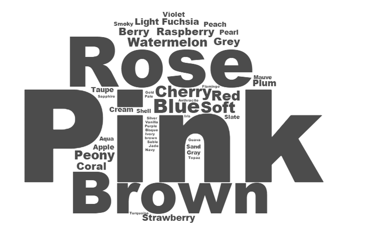
For the essential fragrance notes and fragrance families recommended for your style type, check out your Fragrance Guide. To search for fragrances by specific notes, try these sites: The Perfumed Court Fragrantica If you're not sure of your style type, try the Style ID Calculator, or consider a virtual style analysis. If you're not sure of your color season, try At-Home Draping Cards. If you've benefited from personal color analysis or personal style analysis, you know from experience that it's truly a gift that keeps giving. Years after my own color and style analyses, I get dressed with confidence literally every single morning. <3 It's hard to put a price on that! If you need a last-minute holiday gift for your sister or sister-in-law, your mom, your niece, a cousin, a aunt, a best friend, or a co-worker, a Truth is Beauty Gift Card is a thoughtful and unique gift that may well change a woman's life. For a woman who's color-confused, a $25 or $50 gift card will buy her the Six Season or 12 Season Home Draping Card Set so she can drape herself. For a woman who already knows her color season, a $40 gift card gifts her with her very own season in 40 jumbo-sized sheets. For a woman who struggles to know her own style, the $15 gift card will let her buy the the perennially popular Style Identity Calculator. The woman who already knows her own style will enjoy the $20 or $30 gift card, which will give her access to documents for her style type. To really treat someone you care about, try the $100 gift card, which buys the Style Identity Calculator and the full suite of documents for one's style type. Or the $110 gift card, which covers home draping cards, a seasonal color palette, and a seasonal makeup list. Happy holidays, dear ladies. I'm grateful to be a part of your lives, and to have you in mine. :-) <3 Note: f you'd like to treat someone you love to a Virtual Style Analysis, please contact me directly at [email protected]. Many of you will be very happy to see me continue my series of posts about the word clouds I've made from products in the seasonal makeup lists. :-) I apologize for the delay! To orient those just joining us, there are 12 color seasons, each with its own palette of colors that exist at precise points on each of these three spectra: light ............................... dark saturated..........................faded cool...................................warm Light Summer is a color season. Its colors are mostly cool-toned, a bit faded, and very light. The Light Summer seasonal makeup list has hundreds of products that have been precisely matched to the Light Summer color palette. (Because a Light Summer's perfect makeup is makeup that matches those colors.) Since the products on the list all occupy a small, defined area in color space, one tends to see the same color names over and over. Here's what happens when I feed all of the color names from the Light Summer makeup list into a word cloud generator. The size of the word represents how freqently the word appears in the list. Pink! Wow. Pink is important for Light Summer. That makes sense if you think about it; pink is technically just light, cool red, and Light Summer is a light, cool palette. Light Summer's "oranges" are peachy pinks, and Light Summer's "reds" are deep pinks. "Rose" is basically a synonym for pink, so it makes sense to see it feature so prominently in Light Summer's makeup word cloud.
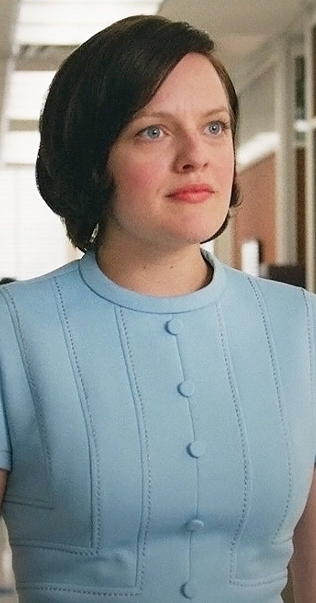
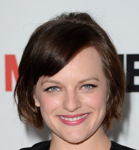
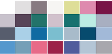
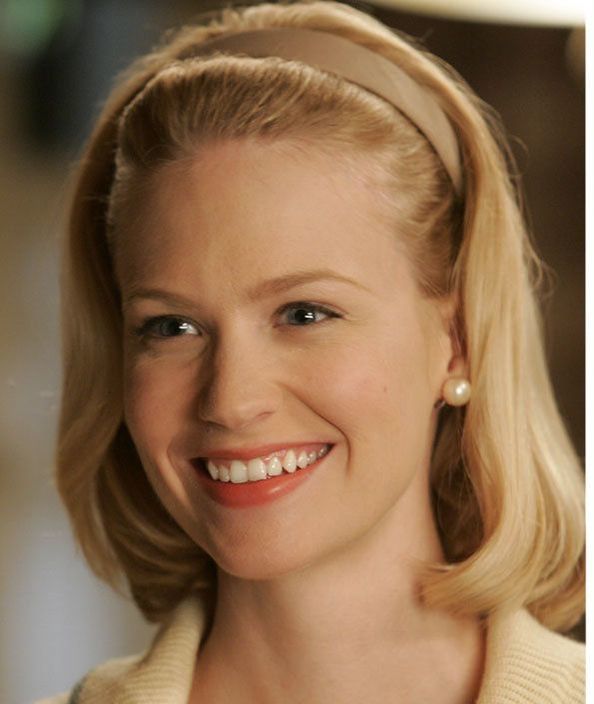
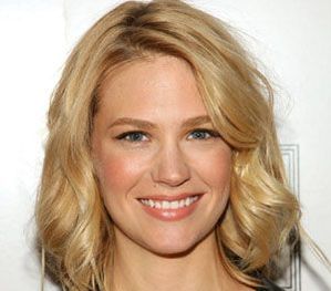
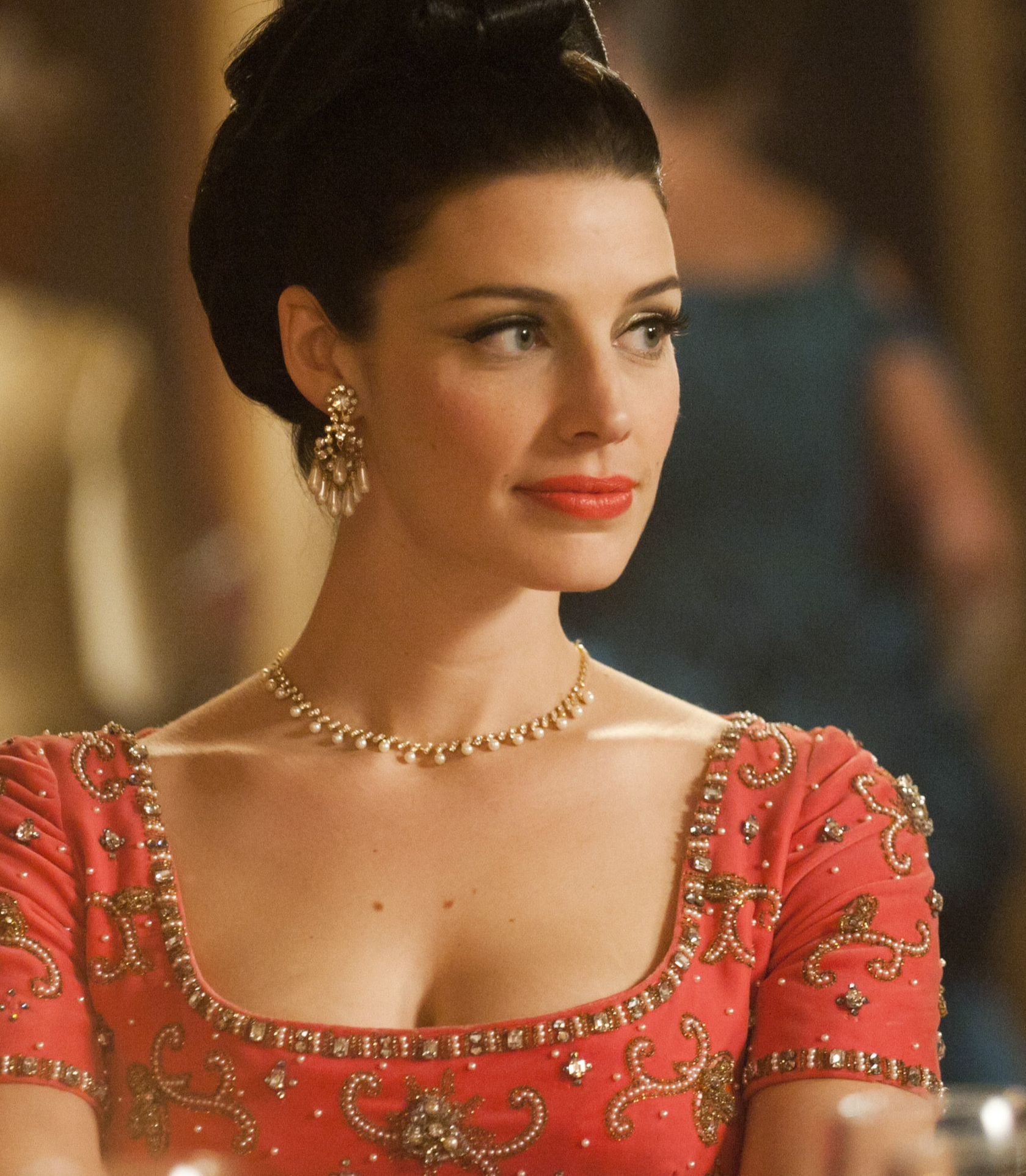
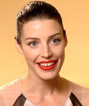
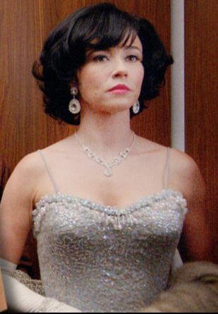
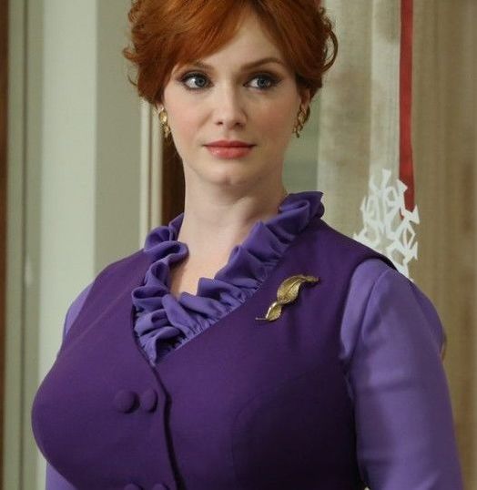
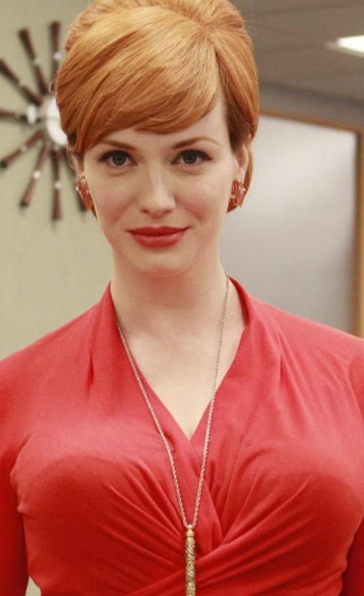
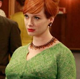
The importance of "brown" in Light Summer makeup reflects the fact that, for deep neutrals (like we typically use in eyeshadow and eyeliner), Light Summer will never get black or charcoal. It's just too light a season. Brown and grey are the neutrals that lighter seasons rely on in makeup. Light Summer's browns will always be cool browns: pinkish browns or purplish browns or greyish browns or silvery browns. You'll see words like "cocoa," "mink," "taupe," and "stone" use to describe these cool browns. In the background of the word cloud, we have many more forms of pink: fuchsia, watermelon, cherry, berry, and raspberry. We also see coral, which is a peachy pink; Light Summer borders light and warm Light Spring, and has a hint of warmth. (Light Summers, but not True Summers, look gorgeous in a buttery yellow.) If you have cool undertones, and you see the makeup that flatters you reflected in this word cloud, you may be a Light Summer. If you're not sure which of the 12 color seasons is your perfect fit, consider trying the home draping cards. They're precisely matched to original Sci/Art colors, the gold standard of seasonal color palettes. Yes, I know I'm late to this party! But I don't have network TV, and I have two kids. I'm just now catching up with the rest of the world TV-wise. Anyway, here are the color seasons of several of the actors on Mad Men, as best I can tell. Elisabeth Moss: True Summer Her best colors aren't particularly dark, but they're very cool. Soft Summer is also a possibility for her, but what really convinced me of True Summer was seeing how pink her lipstick can get. The pinker it is, the prettier she looks. Most seasons can't wear those super-pink lippies. Jon Hamm: Dark Winter His best colors are certainly cool, and quite dark. They're not vivid enough to be Bright Winter colors, and they have the "sooty" quality (as Christine Scaman puts it) that characterizes Dark Winter colors. January Jones: Light Spring Her best colors are warm, clear, and rather light and delicate. I don't think True Spring is impossible for her, but I think it's unlikely; it's telling to me that her very worst colors are dark (remember when Betty dyed her hair black?) I also find some colors to be too clear and warm for her; pure orange and bright red are not great. Jessica Pare: Bright Spring This woman was obviously a Bright from her first moment on screen. I decided on Bright Spring rather than Bright Winter because so many warm, clear colors are glorious on her, and because too-cool colors can make her look a bit goth. I love how often she's costumed in her best colors. It's a joy to behold. Linda Cardellini: True Winter What a gorgeous example of a True Winter. The way black, white and grey make this skin look amazing -- it's just beautiful. Although I know it will disappoint some people, I have to say that I can't accurately type Christina Hendricks. :-( You might be thinking, "She's obviously a Bright, or a True Spring!" But don't let yourself get distracted by the colors she's costumed in as Joan -- they're generally very bright colors, but they're also brighter than she is. Your best colors should let us see you; Joan's colors force us to just see lips, hair, and curves. Which is probably the point.: the colors make her into a cartoon. I suspect that, IRL, Christina Hendricks is probably a Soft Autumn, or just maybe a True Autumn; warmth seems to be good for her, but she needs less saturation than she's given on Mad Men.
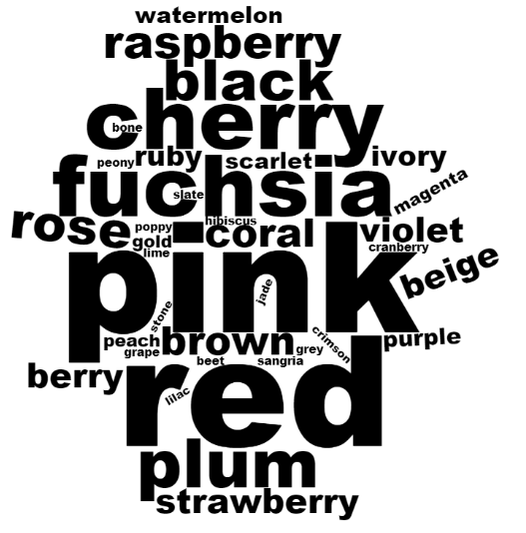
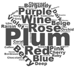
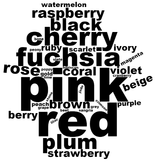
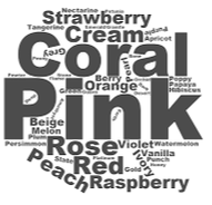
What do you think? Any ideas about Christina Hendricks' color season? Do you think I've missed the mark on any of the other characters? Let me know! I've been making word clouds from the color names on my seasonal makeup lists, to see what color words occur most frequently in the makeup for each season. This week, I've done Bright Winter. The Bright Winter Makeup List gives the names of several hundred products that have been matched to color swatches from the Bright Winter palette. If you're a Bright Winter, your perfect makeup colors come from the colors in the Bright Winter palette. Let's see those makeup color names! Wow -- a lot of pink! And red, and cherry, and fuchsia. Pink is a light, cool red; cherry is a dark, cool red; fuchsia is a red so cool it's almost purple. Cool red tones dominate here. Compare this word cloud to Dark Winter's: In Dark Winter's cloud, on the right, the combination of plum + purple + wine is, to me, quintessentially Dark Winter, and really distinguishes DW's makeup color's from Bright Winter's. Overall, Bright Winter colors feel lighter and brighter, as they should: both Winter seasons are rather dark, vivid, and cool, but Dark Winter is particularly dark, and BRight Winter is particularly vivid. Let's compare Bright Winter makeup to Bright Spring: Both seasons prominently feature pink. But coral is essential for Bright Spring makeup, on the right, while it plays a relatively minor role for Bright Winter. That makes sense: coral is a warm, light red or orange. Bright Winter does have some warmer colors, and coral-y tones are among them, but they don't predominate.
Notice also how relatively important black is for Bright Winter as opposed to Bright Spring. The Bright Spring palette has a black, but black usually won't feature prominently on a beautifully made-up Bright Spring face -- it's just not a defining color of that warm, bright, joyful palette. Bright Winter, on the other hand, can be gorgeous with black mascara, black liner, and even (for certain women) blackish brows and eyeshadow. The overall palette is deeper and more dramatic. If you suspect you're a Bright Winter, the makeup list is a great resource. If you're not sure of your personal color season, try affordable at-home draping. |
About Me...I'm passionate about helping people become their most authentic and beautiful selves. Categories
All
|
- home
- Blog
-
-
- Book your virtual style analysis
- ♂ DRAMATIC style type
- ♂ NATURAL style type
- ♂ GAMINE style type
- ⚥ CLASSIC style type
- ♀ INGENUE style type
- ♀ ROMANTIC style type
- ♀ ETHEREAL style type
-
- ⚥ ♂ Classic Gamine -- The Prep Schooler
- ⚥ ♀ Classic Ingenue -- The Class President
- ⚥ ♂ Dramatic Classic -- The Art Critic
- ♂ ♂ Dramatic Gamine -- The Punk Rocker
- ♀ ♂ Dramatic Ingenue -- The Childlike Czarina
- ♂ ♂ Dramatic Natural -- The Amazon Queen
- ⚥ ♀ Ethereal Classic -- The Delicate Sophisticate
- ♀ ♂ Ethereal Dramatic -- The Sorceress
- ♀ ♂ Ethereal Gamine -- The Sprite
- ♀ ♀ Ethereal Ingenue -- The Fairy
- ♀ ♂ Ethereal Natural -- The Earth Goddess
- ♀ ♂ Gamine Ingenue -- The Girlish Mod
- ⚥ ♂ Natural Classic -- The Prep
- ♂ ♂ Natural Gamine -- The Tomboy
- ♀ ♂ Natural Ingenue -- The Outdoorsy Sweetheart
- ⚥ ♀ Romantic Classic -- The Sexy Sophisticate
- ♀ ♂ Romantic Dramatic -- The Vamp
- ♀ ♀ Romantic Ethereal -- Aphrodite
- ♀ ♂ Romantic Gamine -- The Firecracker
- ♀ ♀ Romantic Ingenue -- The Demure Seductress
- ♀ ♂ Romantic Natural -- The Babe Next Door
-
- ⚥ ♀ ♂ Classic-Gamine-Ingenue
- ⚥ ♂ ♂ Dramatic-Classic-Gamine
- ⚥ ♀ ♂ Dramatic-Classic-Ingenue
- ♂ ♂ ♀ Dramatic-Gamine-Ingenue
- ⚥ ♂ ♂ Dramatic-Natural-Classic
- ♂ ♂ ♂ Dramatic-Natural-Gamine
- ♂ ♂ ♀ Dramatic-Natural-Ingenue
- ⚥ ♀ ♂ Ethereal-Classic-Gamine
- ⚥ ♀ ♀ Ethereal-Classic-Ingenue
- ⚥ ♀ ♂ Ethereal-Dramatic-Classic
- ♂ ♂ ♀ Ethereal-Dramatic-Gamine
- ♀ ♂ ♂ Ethereal-Dramatic-Natural
- ♀ ♀ ♂ Ethereal-Dramatic-Ingenue
- ♀ ♀ ♂ Ethereal-Gamine-Ingenue
- ⚥ ♀ ♂ Ethereal-Natural-Classic
- ♂ ♂ ♀ Ethereal-Natural-Gamine
- ♀ ♀ ♂ Ethereal-Natural-Ingenue
- ⚥ ♂ ♂ Natural-Classic-Gamine
- ⚥ ♀ ♂ Natural-Classic-Ingenue
- ♂ ♂ ♀ Natural-Gamine-Ingenue
- ⚥ ♀ ♂ Romantic-Classic-Gamine
- ⚥ ♀ ♀ Romantic-Classic-Ingenue
- ⚥ ♀ ♂ Romantic-Dramatic-Classic
- ♂ ♂ ♀ Romantic-Dramatic-Gamine
- ♀ ♀ ♂ Romantic-Dramatic-Ingenue
- ♂ ♂ ♀ Romantic-Dramatic-Natural
- ⚥ ♀ ♀ Romantic-Ethereal-Classic
- ♀ ♀ ♂ Romantic-Ethereal-Dramatic
- ♀ ♀ ♂ Romantic-Ethereal-Gamine
- ♀ ♀ ♀ Romantic-Ethereal-Ingenue
- ♀ ♀ ♂ Romantic-Ethereal-Natural
- ♀ ♀ ♂ Romantic-Gamine-Ingenue
- ⚥ ♀ ♂ Romantic-Natural-Classic
- ♂ ♂ ♀ Romantic-Natural-Gamine
- ♀ ♀ ♂ Romantic-Natural-Ingenue
- Shop
- Book a Virtual Style Analysis!
- Contact me
Connect with me!

























 RSS Feed