|
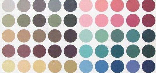
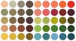
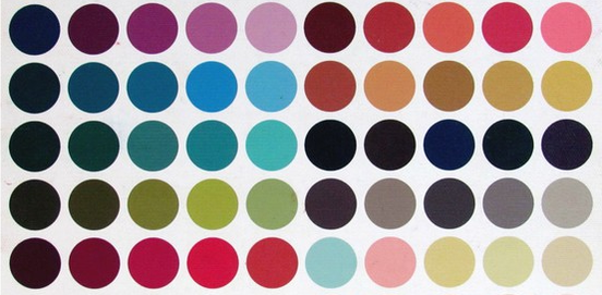
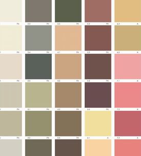
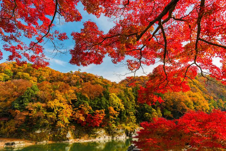
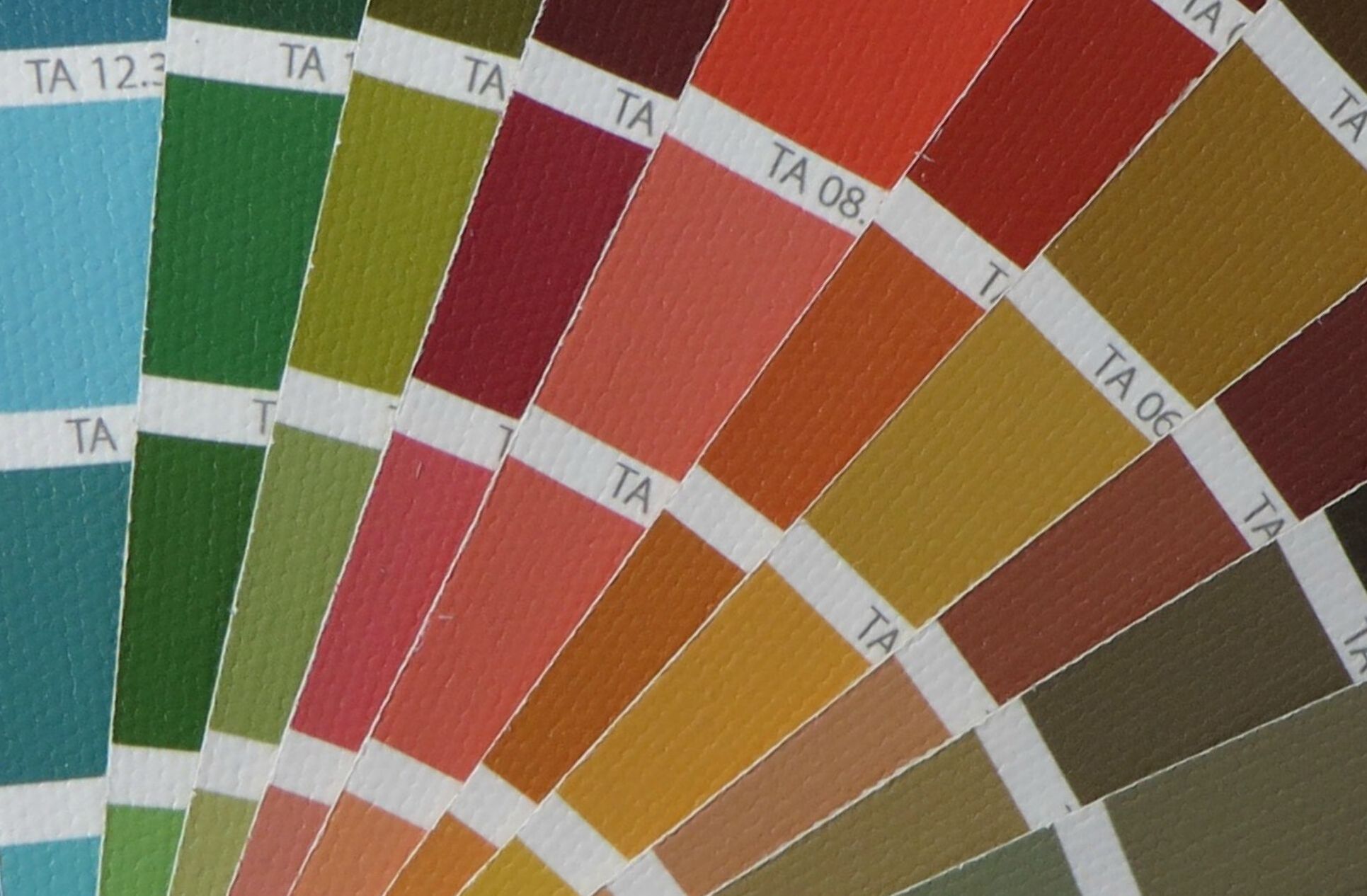
If your best colors are warm and earthy, you're an Autumn. But there are actually three Autumn palettes. Determining which Autumn you are can be tricky. At first glance, these palettes all look pretty similar.
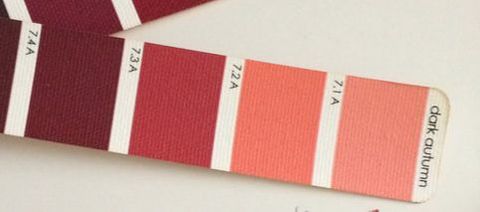
Soft Autumn is the most faded Autumn palette, and it's the lightest as well. Soft Autumn colors are faded earth tones -- desert colors, or safari colors. If you're a Soft Autumn, black is one of your worst colors, and you may feel that almost every color makes you look "blah." You may feel your natural coloring is rather mousy and boring. Any attempts you make to enliven your coloring with extreme makeup or hair dye will only make your actual skin look even more washed out and "blah." You'll only come to life in very subtle, very gentle colors. And they won't look subtle or gentle on you! When it comes to color, context is everything. (If you know your coloring is warm and gentle, but you also look good in lime green, you're probably a Light Spring, not a Soft Autumn.) Dark Autumn
I think of these colors as Halloween colors, or Byzantine colors. They're definitely warm, and definitely earthy, but they're intense too. Sort of charred and vivid at the same time. When I think of Dark Autumn, the combination of black and gold is one of the first things that comes to mind, (If your best colors are warm, and you know you can wear black, but you also look good in a light, bright fuchsia, you're probably a Bright Spring, not a Dark Autumn.) True Autumn
Are you an Autumn? How did you figure out your exact type? Share in the comments!
42 Comments
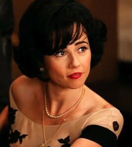
But in a previous post about the actors on Mad Men, I typed Cardellini as a True Winter. I thought she was gorgeous on that show in very dark hair and Winter colors. I especially liked her in black and white, which is excellent on True Winters.
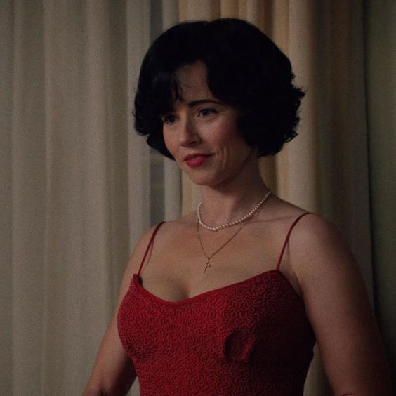
So I've been asking myself, was I wrong about Linda Cardellini?
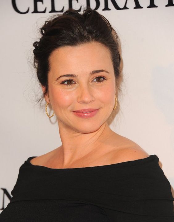
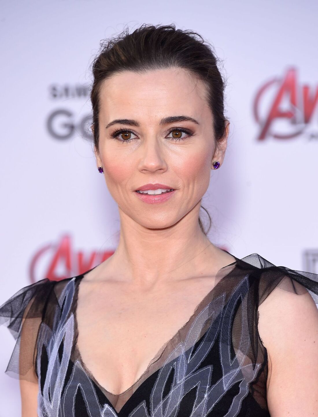
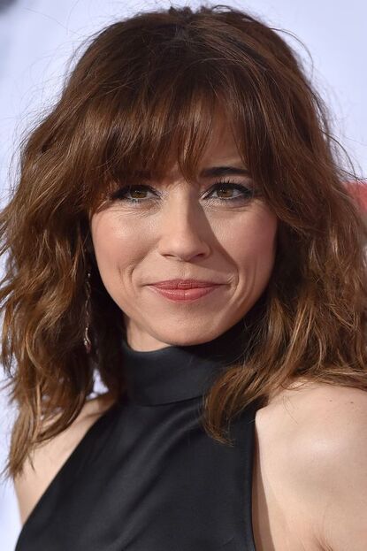
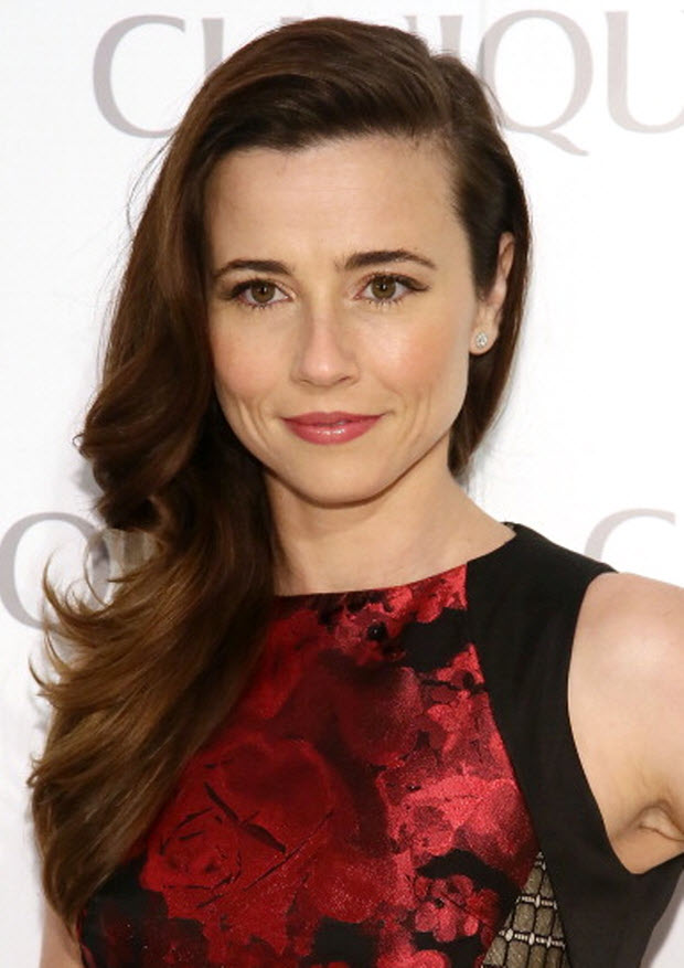
She's beautiful on both shows. But at least one of these shows is successfully presenting her in colors that aren't her best. (An actor can look lovely in the wrong colors if her costume, hair, makeup, and lighting work together to create the false impression; see Light Summer Cate Blanchett passing as an Autumn in The Aviator. Notice how orange the lighting is! That's necessary to make a cool-toned actor like Blanchett look warm.) To figure out actor Linda Cardellini's actual color season, we need to focus on real-life pictures of her. I like using pictures from premieres, because those pics are generally taken outdoors, with a lot of light. First, we find pictures where Cardellini looks healthy and alive, not tired and not overly made-up. Then we try to identify the color season of her clothes and makeup in the flattering pics. I think she looks really good here:
The first thing I notice as a color analyst is that she's not overwhelmed by this big block of black right under her face. Her skin looks healthy, not blurry or washed out. We're seeing her, not her dress. So I feel confident she's one of the five seasons that can handle black -- the three Winters, Bright Spring, and Dark Autumn. All three Winter seasons are cool-toned, while Dark Autumn and Bright Spring are warm-toned. (You can see this more easily if you just look at the reds and pinks.)
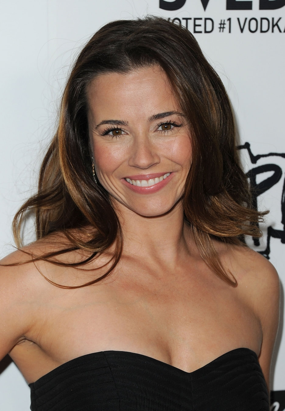
I really like her here in a cool-toned pink lippie and a black, white, and grey dress. That makes me think Winter. Here she is again in black, but with warmer makeup and warmer hair. Are these pictures as good?
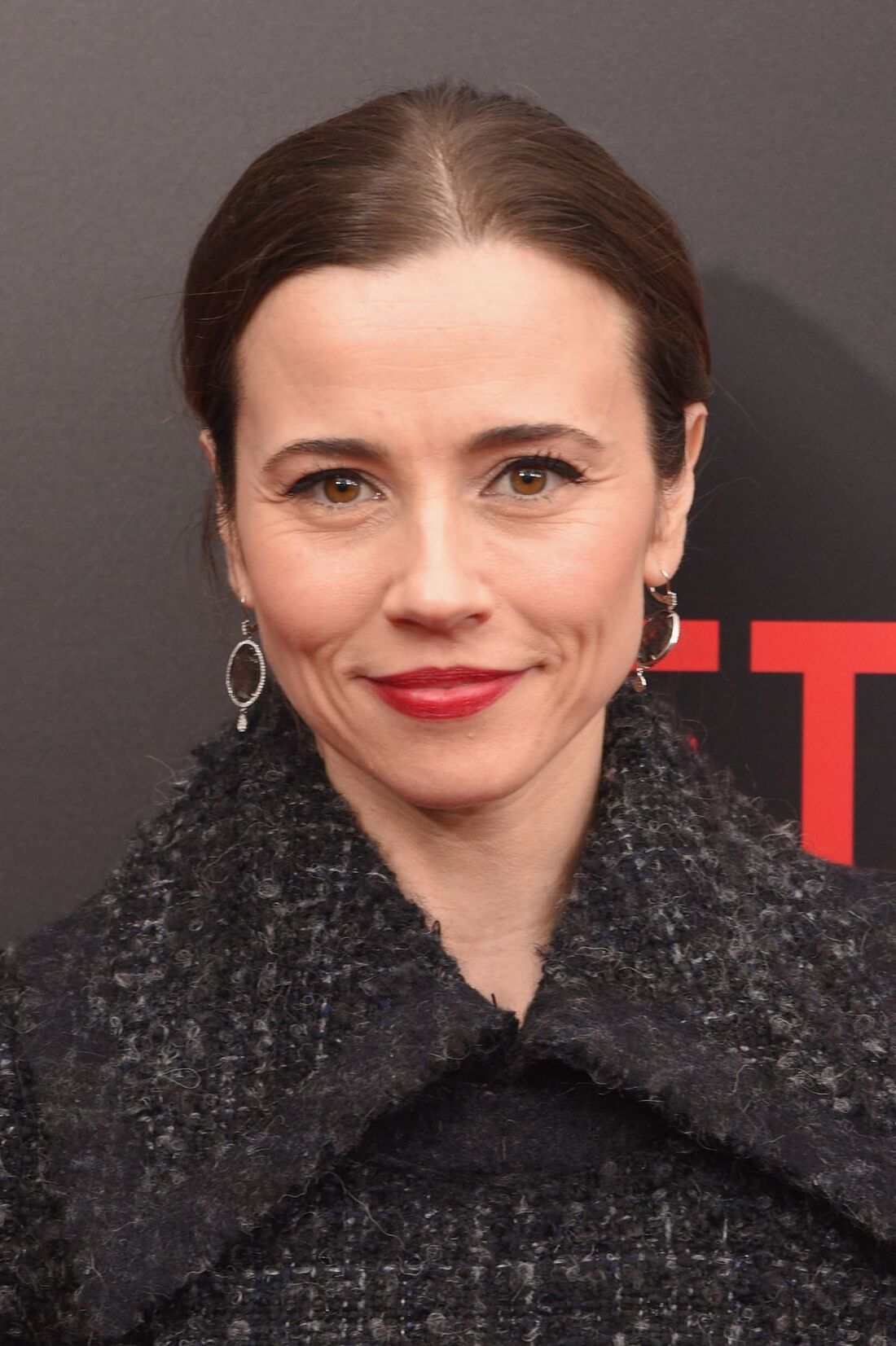
I do think she's a Winter. Perhaps she's a Dark Winter instead of a True Winter; sometimes Dark Winters can look almost right in the colors of neighboring Dark Autumn.
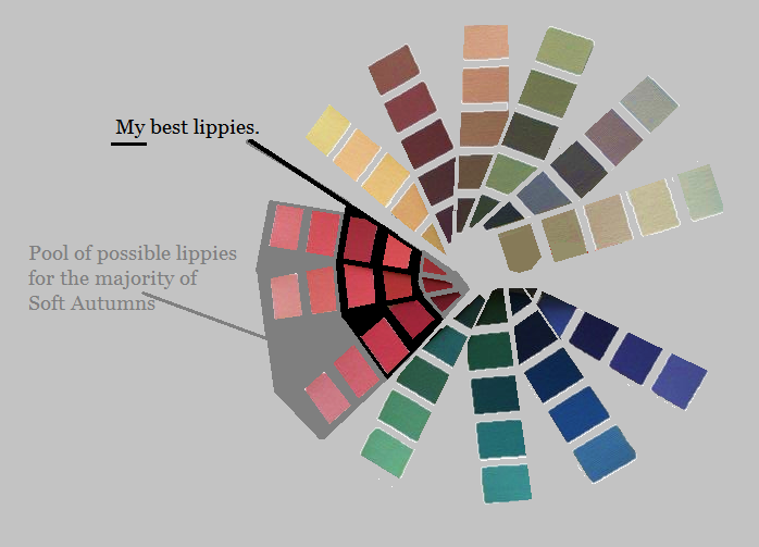
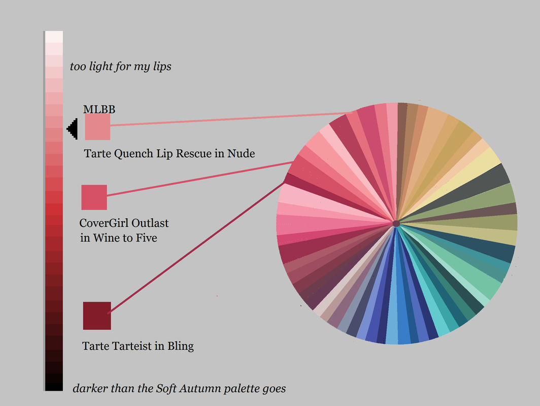
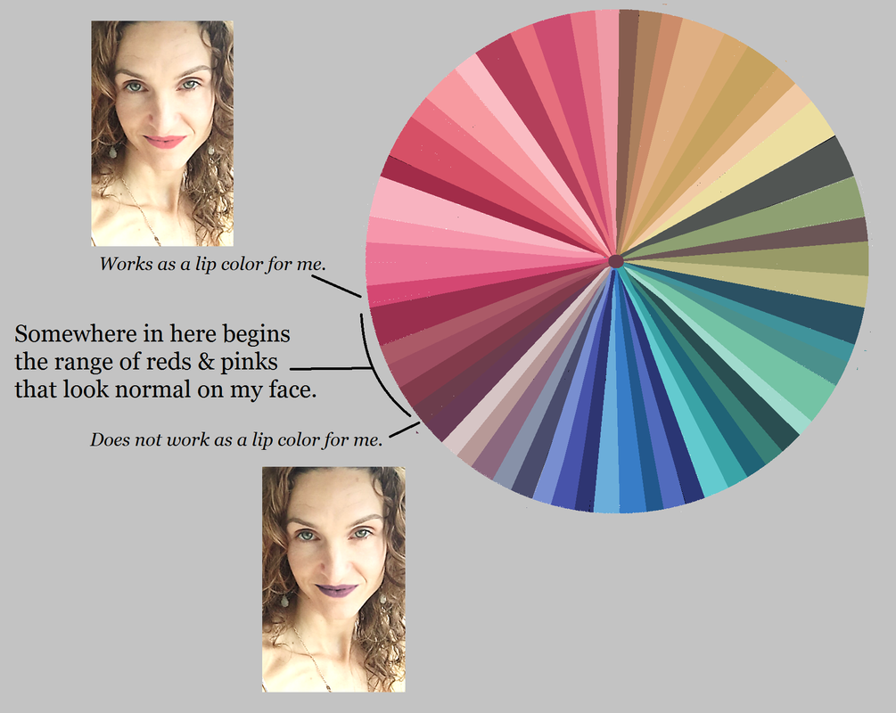
Here are more pics of Cardellini that I think are color harmonious. What do you think? Is she a Winter? If so, which one? If not, what do you think is her correct season? Last week I talked about the fact that, though all of your palette colors are gorgeous on you somewhere, they don't all look natural on your lips. Now I want to describe a good way to figure out which of your palette colors are best on your lips. In a nutshell, the colors that will look most natural on your lips are - your MLBB, - darker versions of your MLBB, and - a handful of colors very close in hue and value to these Your MLBB is your "my lip but better" lip color. You may already have a lippy in your stash that you know is your MLBB. If you don't, stand in front of a mirror with your palette and locate the peach, pink, red, or violet that is precisely as dark as your lip and the closest to it in warmth or coolness. (Your natural lip color will be less saturated than any of these palettte colors; you're basically finding the more saturated version of your natural lip.) A lippy that's an MLBB will always look natural on you. Additionally, colors that are the same hue as your MLBB but darker will also look natural on you. Going very dark within your MLBB hue might be your evening lip, but it won't look unnatural. In general, avoid opaque colors that are lighter than than your MLBB. This usually looks unnaatural. The other colors that will look most natural on your lips will be the colors closest in hue to your MLBB, and as dark or darker. So if you're a Bright Spring whose MLBB is on your fuchsia strip, you may indeed be able to wear one of Bright Spring's violets as a lippy; the violets are close in hue to the fuchsias. You will find less luck with one of BSp's orange lippies, because orange is pretty far from fuchsia. My MLBB is a neutral Soft Autumn pink that's medium-dark. I'll wear other pinks and reds that are very close to this color in hue, but I won't go all the way to a Soft Autumn brown -- even though those lippies exist. Also, I'll go darker than my MLBB, but not lighter. A lippie lighter in than your natural lip rarely looks natural.
Tarte Quench Lip Rescue in Nude is an MLBB for me. It's easy to throw on when I want some moisture but I don't feel like bothering too much with makeup. CoverGirl Outlast in Wine to Five is a slightly darker version of my MLBB. It's been my staple daytime lippy for about five years; I order it in bulk on eBay or Amazon. My sexy lippy these days is Tarte Tarteist in Bling, which is a very deep version of my MLBB. It's a Soft Autumn red lip -- which means it's striking on me, and would be rather blah on most other seasons. :-) Though they vary quite a bit in value, all three of these lippies are similar in hue. If I feel like it, I''ll go somewhat warmer or somewhat cooler within my palette. But I won't stray super-far from this central MLBB hue, and I won't go lighter in value, unless it's a gloss.
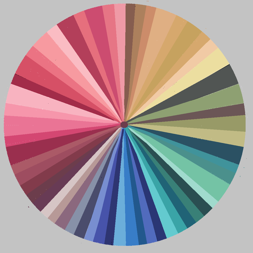
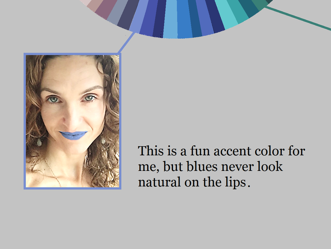
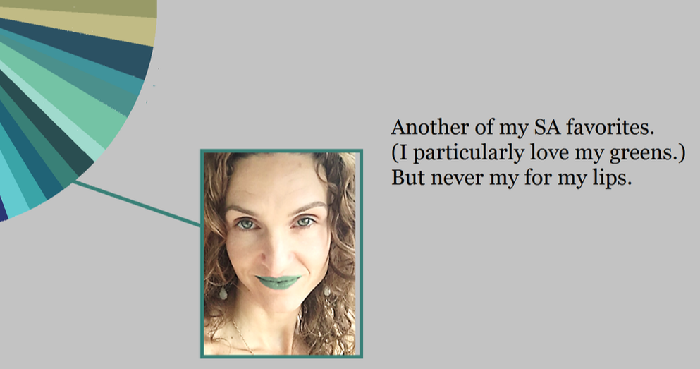
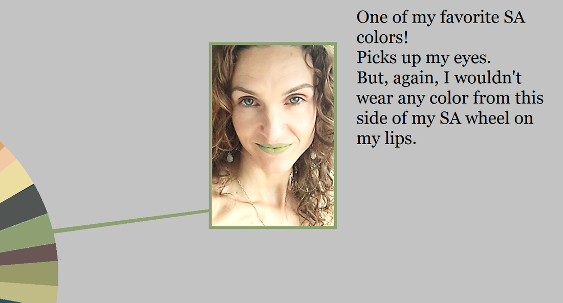
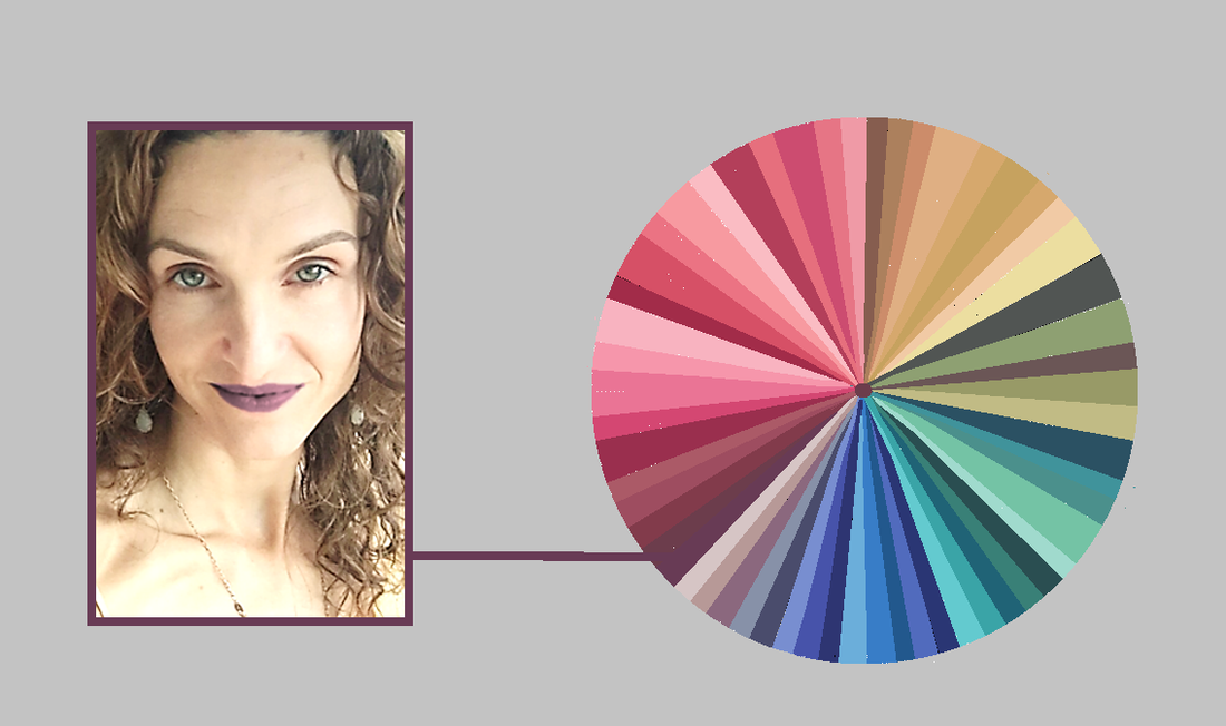
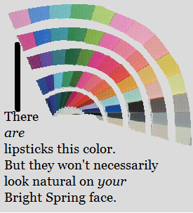
And this is what I recommend you do as well: Find the hue that looks most natural on your lips, and choose lippies that stay relatively close to that hue. For example, if your MLBB is an orange, experiment with your reds -- but don't stray all the way to a violet, unless you want to make a statement. :-) And if your MLBB is a violet, experiment with your reds and purples -- but don't stray all the way to orange. When you know your MLBB, use your seasonal makeup list and a computer to find the lippies from the list that will look the most natural on your face. (Computer images aren't completely color-accurate, but you don't need them to be if you have the seasonal makeup list; if it's on the list, it's a color from your season.) Just check the computer image to make sure the hue and value of the lippy seem right for your lips. Then buy it! This post was originally published in March of 2017. In seasonal discussion groups, women spend a lot of time working out which palettte-matching lipsticks and glosses are their best colors. Why should they have to spend time answering this question? Aren't all of the peaches, pinks, reds and violets in your palette automatically good lip colors for you? Not exactly. Every color in your palette is a color that harmonizes with your natural coloring somehow. But not every color will actually look good on your lips. Your right colors look right because they look natural. So if you wear them in an unnatural way, they won't look right. Consider my Soft Autumn palette: All of these colors look amazing on me. But not every one of these colors would look natural on my lips. Would I wear the greens or blues on my lips? No way. It would look completely unnatural. That goes without saying, right? So far, these decisions seem self-evident. But let's move around the wheel into the range where we expect to find our lip colors: the purples, pinks, peaches and reds. Here's me wearing one of my dark purple-browns as a lippie: This color, though gorgeous on me as an evening gown, still isn't natural on my lips... despite the fact that I can find lippies in the drugstore that swatch this color. Now, if I want to make a statement with my lippy, this could be a good choice for me... but most of the time, I just want to look like the most beautiful verison of myself. And this lippy's not helping me do that. Every peach, pink, red and purple in your palette looks natural on you somewhere. But not every peach, pink, red and purple in your palette looks natural on your lips. This is where many of us -- Winters and Bright Springs in particular -- can get lost. For example, there are plenty of lipsticks that match Bright Spring's violets. But a Bright Spring who expects a BSp violet lippy to look natural on her lips may be disappointed. (Soft Autumn's dark purple sure doesn't look natural on my lips!) The peaches, pinks, reds and purples in your palette that will look natural on your mouth are a smaller subset of your total set of peaches, pinks, reds and purples. It can be tough to know where the line is. My unnatural-looking brownish- purple isn't really that far away from my natural-looking pink: So you're probably wondering, "How can I know which of my peaches, pinks, reds and purples will actually look natural on my lips?"
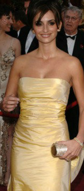
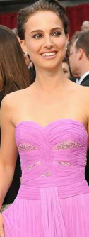
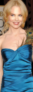
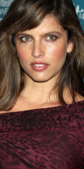
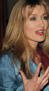
It's not too difficult. This post is getting long, so I'll publish the second half, in which I describe how to find the best colors for your lips, next week. :-) This post was originally published in February of 2017. Not all of the colors in your correct seasonal palette will be your absolute favorites. Depending on your depth of coloring, your level of contrast, and the specific colors of your body, some will be more useful to you than others, and in different ways. A dark-skinned Winter, for example, might use black as an accent, while a fair-skinned Winter might wear it in large blocks. But no color in your palette will be awful on you. The colors in your palette are all harmonious with each other, and if it's your proper palette, they'll all be harmonious with you too. So for those of you still searching for your season, I give you colors that are seasonal deal-breakers. If the given color absolutely doesn't work for you, the deal's off. Move this season to the end of the list. You can't use this list to identify your single best season. But you can use it to rule seasons out. If you can't rock hot pink, rule out Bright Spring. Bright Spring has a handful of pinks in this general vicinity. You may not associate pink with Spring. But moving Spring reds toward Winter means making them both darker and brighter. Reds that are both deep and very bright are purple-reds. So in Bright Spring, we find hot pinks. If you think you're a Spring but hot pink is no good for you, True Spring may be your home. If you're not fabulous in lime green, rule out Bright Winter. Taking True Winter's greens lighter and brighter, all the way into Bright Winter, moves them toward yellow. One of the results is a sort of fluorescent lime. On Bright Winters, this color is amazing. It contrasts beautifully with both very dark and very light skin. If this color's not right for you, but you think you're a Winter, try Dark Winter next. If you can't wear clear lemon yellow, rule out True Winter. Be careful applying this one. I'm not talking about a golden yellow, or a pastel yellow, or a yellow-orange. True Winter's few yellows don't show a bit of brown or orange or grey. They're the pure, clear complements of TW's vivid sapphire blues. If you need a more moderated yellow that's still vivid, try Dark Winter. If you don't look great in mint green, rule out True Summer. A handful of the seasons have some sort of mint. True Summer's is not a pure, saturated mint that's close to aqua. Instead it's a delicate and slightly hazy mint. It's lovely with a delicate fuchsia lip. If this feels all wrong to you, perhaps vivid mint is beter? You might be a Winter. If you wouldn't call your good yellow "goldenrod," rule out Dark Winter. Dark Winter yellows are tricky. They're not clear and pure like True Winter's. They're not blindingly bright. They're just slightly warmed, a little rich - but not Autumn rich. Penelope Cruz is lovely here in what looks like one of Dark Winter's elusive yellows. If you need your yellows purer, try one of the other Winters. And if you need a more delicate yellow, try one of the Summers. If you can't wear this medium warmed violet, rule out Dark Autumn. This Dark Autumn color always surprises me. Call it orchid or begonia perhaps. It's not a color I would label Dark Autumn if I saw it in a pile of a hundred other colors. Yet it's gorgeous with the intense dark olives and vivid teals of the season. Dark Autumn Natalie Portman's been photographed in three or four dresses in something like this color. They're all great on her. If it's not great on you, perhaps try True Autumn or Bright Spring. If a light olive-khaki is not a good neutral for you, rule out Light Spring. Was it Christine Scaman who said Light Spring colors are popsicle colors? It's true. But every season has neutrals, of course. This unusual Light Spring color is like your usual khaki, but with a suggestion of green and gold. On a Light Spring, it may pick up tones in the eye or hair. If this color's a no-go on you, perhaps look at Light Summer instead. If you're not flattered by light pinky coral, rule out Light Summer. Light Summer doesn't get very warm, but in the pinks it does go as far as a pinky coral. It's a bit pinker than what you see here, but still warmish. On a Light Summer it picks up healthy color in the face. If you think you're a Summer but can't wear this light, delicate, warm tone, look at True Summer. If you're not beautiful in bright blue, rule out True Spring. True Spring's colors are Crayola colors. You can see them in this picture of Nicole Kidman: blue dress, yellow hair, red-orange lips. In these simple primaries, True Spring is gorgeous. If you struggle to articulate the names of your best colors, they're not True Spring's. You might consider Summer or Autumn. If rich burgundy isn't gorgeous on you, rule out True Autumn. True Autumn has a few beautiful burgundies that go beautifully with the rich greens and oranges of the season. You can see all those colors here, in Noa Tishby's face. Those burgundies make good lippies too. If this burgundy overwhelms you, try something from Soft Autumn. If you're not lovely in cocoa brown, rule out Soft Summer This is not a warm golden brown or a milk chocolate brown. If you're a Summer, none of those browns will work for you. Browns are generally bad for Summers, as a rule. But if you're a Soft Summer, you will be lovely in cocoa brown. It's a brown that looks both slightly greyed and slightly purpled. It may pick up tones in your hair. If this color just isn't right for you, try True Summer next. If you can't do dusty medium blue, you're not a Soft Autumn. This blue feels both rich and muted, and quite medium - neiher purpley nor greenish. I's similar to the color you get if you Google "French blue." Though it's a subtle color, on Soft Autumn skin it's just as powerful as it needs to be. Notice how rich it looks on Natascha McElhone. If you need a blue that's much richer than this, you might try a Winter or a Spring. * * *
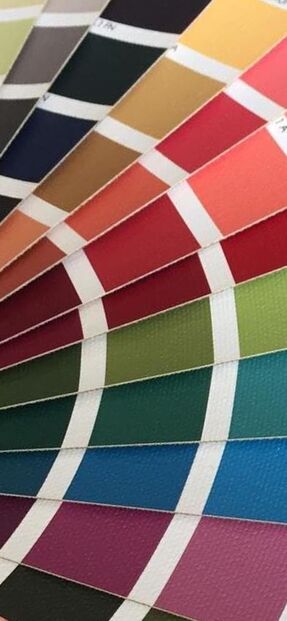
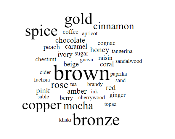
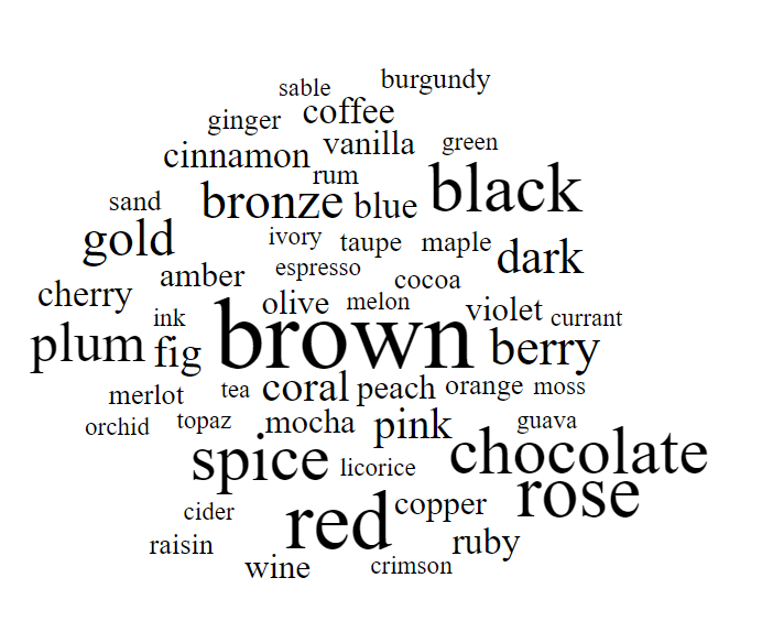
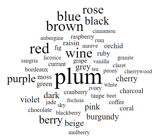
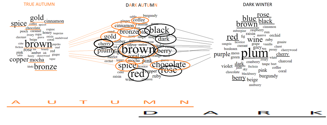
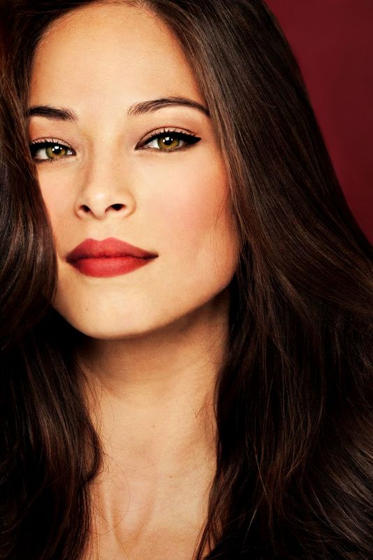
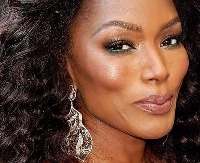
For any of these seasons, Google the season's name in quotes to see images of the palette. Images that say "Sci/Art" are usually quite accurate. Or order sheets of color from all 12 seasons to try the seasons out in person. As always, I hope this helps you find your correct season. :-) This post first ran in April of 2013. Where I live, the trees are still an Autumny orange and red, but the nights are cold, and it's dark more of the day than not. It's the perfect time of year to talk about Dark Autumn, one of my favorite seasons. Dark Autumn is Autumn verging on winter. Still Autumn, but darker and colder. Dark Autumn colors are mostly warm and rich, because it's an Autumn season. But they have a bit of added coolness, and they're also very dark. In fact, these colors are dark first and foremost; their warmth is a secondary quality. (Hence the name: Dark Autumn, sometimes known as Deep Autumn) (The light colors you see in Dark Autumn's palette actually make sense as darks as well: they're deepened versions of what would be a tinted white in another palette. Dark Autumn gets a white too; it's an ivory, though, not a pure white.) When you're a Dark Autumn, your makeup colors all come right from your color palette. For years now, I've been keeping a list of makeup products that are precisely matched to the Dark Autumn color palette. If you want to spare yourself the trouble of rubbing makeup on white paper and comparing it to the Dark Autumn palette, my list is a good investment. It has hundreds of products on it. Because this palette (like all seasonal palettes) occupies a very precise section of color space, we see the same color words appear over and over on the makeup list. Here's the Dark Autumn makeup word cloud, which shows the most common color words. The size of the word indicates how often it appears on the list. What I love about Dark Autumn is its contradictions. Somehow, it seems more complicated than other neutral (not purely warm or cool) seasons. How do you put together pink, rose, and violet with brown, red, and chocolate? Dark Autumn, that's how. I love seeing gold, cherry, and plum right next to each other. Or amber, ink, and fig. So unexpected, yet Dark Autumn makes it work. Last week, I did the True Autumn makeup word cloud, and I did Dark Winter a while back. Here is True Autumn on the left, Dark Autumn in the middle, and Dark Winter in the right. (I actually redid the Dark Winter word cloud in font that's consistent with my more recent clouds.) I find it really interesting how Dark Autumn represents a middle place between a season that's very rich and warm, and a season that's coolish and very dark. Autumn foliage plus jewel tones! I had fun making this graphic showing how Dark Autumn color words combine important words from both True Autumn and Dark Winter. Isn't that fun to look at? This season makes more sense when you see it on a human being. These Dark Autumns beautifully combine warmth and coolness. You see greys, blacks, navies, and purples with oranges, browns, olives, and rusts. You who are Dark Autumns, do you enjoy the contradictions of your palette? Or do you even experience your palette that way? Maybe this is your normal! :-)
Having trouble making this decision? These two seasons are often confused -- probably because people in both seasons are flattered by warmer colors and can take a lot of saturation.
There are a few colors that will distinguish them, though. If you're a Dark Autumn, you will look good in some light golden browns, while Bright Spring can't do any kind of brown. As a Dark Autumn, you'll also look good in dark rust red, while Bright Spring doesn't have anything close to that. If you're a Bright Spring, you can wear a whole value range of fuchsias, from pretty deep to very light. (Dark Autumn has some coolish reds, but they're very dark -- more like wine.) As a Bright Spring, you can also wear a light, sunshiney yellow, while Dark Autumn's yellows are more like gold. Still can't figure out your season? Try at-home draping. Every one of the 63 style identities can be manifested within every seasonal palette. (Though your coloring may play a small role in your style ID.)
The trick is to read each recommendation for your style identity's color schemes and adapt it by adding your color season's name somewhere in the sentence. For example, I would recommend deep reds and purples to create a Romantic look; if you're a Dark Autumn Romantic, you would think to yourself, "Choose the deep reds and purples from my Dark Autumn palette." To create a Classic look, head-to-toe-conservative neutrals is effective; in the case of a Dark Autumn, she would choose from the most conservative neutrals from her Dark Autumn palette. You can find more information about your style identity's palette recommendations in the shopping guide for your type. Erin writes,
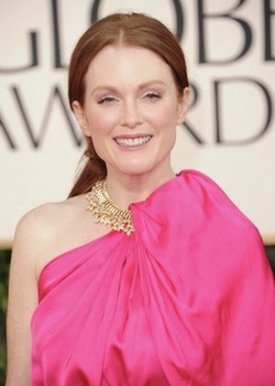
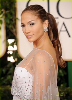
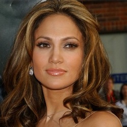
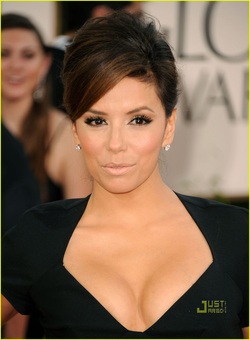
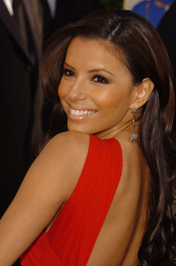
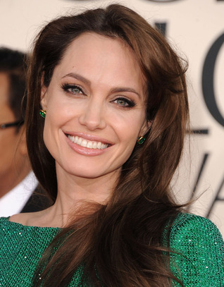
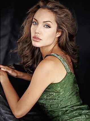
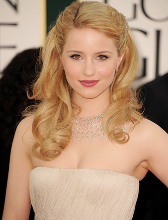
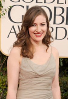
My mom and I went makeup shopping yesterday and I was looking for a good, every day lipstick. We were looking at Maybelline Summer Sunset and Hooked on Pink. The latter did a better job of clearing the skin, so we went with that one. Once in the car, I tried it on and it did seem to clear some blotchy-ness away. It also seemed to whiten my teeth (always a good thing). I decided to look in your blog to see if the colour had been mentioned and it had, to my surprise, in Dark Autumn. Would it work for any other season? I've never really considered Dark Autumn before (or any dark season). I do indeed have Hooked on Pink on my list of recs for Dark Autumn. But I don't know where I got the rec from. :-( Erin adds, "Since I sent the question, my mom and I are also considering that I could be a Bright Spring as well." Feedback, readers? Any experience with Hooked on Pink? What's your season, and how did it work for you? All of the lippies in this series are recs from the ladies of the 12 Blueprints Facebook page, Christine Scaman, or my own swatches. If you're a Dark Autumn, most of these colors will work on your lips - and your cheeks too, if you use them as blush. Some may be a touch too warm, too cool, too light or dark. This is normal, because the variation of human coloring within a season means that not all women in a season wear the same colors on the face equally well. Some of these are discontinued. Check eBay. Try before you buy, if possible. Please do share feedback on the recs, or additional recs, in the Comments section. :-) Cover Girl Toasted Almond long-lasting Clinique Bronze Star Lancôme Color Fever Gloss in Hotspell Lancôme LaLaque in TechnoBrick MAC Shag MAC Brickola MAC Coconutty MAC Honey Flower MAC Pro Longwear Extended Play MAC Strength (but may be better for TA?) MAC Touch Revlon ColorBurst Lipstick Plum Clinique Merlot Clinique Quickliner in Honeystick Dior Brun Tumulte Estee Lauder Autumn Estee Lauder Double Wear Stay Mocha Estee Lauder Stay Ruby Laura Mercier Bronzed Berry lip plumper MAC Fresh Moroccan MAC Taupe YSL Rouge Pur in Ultra Flame Revlon Ripe Raisin Revlon Spicy Cinnamon YSL #131 Opium Red YSL Rouge Pur FARD À LÈVRES Wet n Wild Penny 225B MAC Viva Glam I MAC Dubonnet? MAC Dare You? MAC Del Rio? Covergirl Bistro Burgundy 430 Revlon Rum Raisin Clinique Go Fig Clinique Rum Kiss Clinique Surprise Clinique Sassy Spice Clinique Rosette Maybelline Hooked on Pink Loreal Everlasting Plum Clinique Cider Berry Revlon Peony lip gloss Loreal Naturally Nude Maybelline Tinted Taupe Dior Addict Rouge Podium NARS Gipsy At the 2011 Golden Globes, Autumn celebrities did not miss the color mark as widely as their Winter colleagues (see my earlier post below) - but the hits were few and far between. Here, some of the evening's biggest Autumn let-downs, along with a few pleasant surprises. Julianne Moore I adore Julianne Moore, as an actress and as a great beauty. She's an interesting Autumn; her coloring's warm, deep, vivid and delicate at the same time. When she gets it right - which is often - she's startlingly lovely: So it was sad to see her get it so very, very wrong at the GGs. All her redheaded loveliness wiped out by this totally wrong color: Now, Julianne can take a fair bit of brightness, though perhaps not this much. The biggest problem is with the hue itself. There's nothing in her skin, eyes or hair that this color calls to. We see Julianne and her natural colors up top, and we see the color of the dress below, and never the twain shall meet. It's Julianne vs. the dress, and the dress wins. Just sad. Another example of an Autumn existing on a different plane than her garment was Jennifer Lopez. There's glorious, golden Jennifer. Then there's this icy white ensemble. Nothing connects them. JLo is lost. Surely you've seen how gloriously golden this Autumn girl can look! - - even with those darn icy earrings. I'd include a pic of her in a beautiful Autumny gown, but they're very hard to find. JLo seems irresistibly drawn to cool, pale looks that are disconnected from her natural beauty. Maybe she wants to look interesting rather than beautiful... who knows? I personally think beautiful is interesting. Eva Longoria was a let-down. And not because Deep Autumns can't wear black. After all, the hair often has black tones. But Deep Autumns need contrast, and they certainly need some warmth. This look provides neither. On a person with black already in the hair and eyes, the black gown doesn't create much contrast. And once again, the irrepressible warmth of this Autumn's skin (even the black dress reduces but doesn't eliminate it) seems totally detached from her dress. It's as if they're from different photos. Here's Eva looking more like herself in a dramatic, warm and powerful color: The bright, warm red contrasts strongly with Eva's natural colors while calling out to them at the same time. The gown emanates from her. (But is the blush a bit too orange? Methinks so...) Of course I couldn't spare Angelina, having devoted an entire blog post to convincing everyone that she's a Soft Autumn. Now, to see what I'm seeing in this pic, you have to remind yourself that Angelina is incredibly, amazingly beautiful, and will never, ever look truly bad in anything. Ever. So when you see her here and think "She looks pretty good!" - well, of course she does. But I don't think it's her best. Always, I'm looking for balance: balance of saturation, balance of value, balance of temperature. In other words, I'm asking "Are Angelina and the gown the same brightness? The same lightness? The same warmth?" In this case, I feel strongly that the gown's much brighter than she is. A Soft should be able to glow with subtle luminosity in the correct soft color. Here, we notice the shine of the dress much more than we notice any shine from Angie. For a green that balances her instead of outshining her, how about this? An older photo, and a different setting, but still. The dress is more matte than shiny, and the color's much more muted (not to mention more warm), and I'm looking at Angelina's face. That's the real test. On a very, very happy note, I was delighted to see this on the GG red carpet: Dianna Agron Talk about balance! Everything is equally soft, warm and medium-light. I'm usually loathe to praise any look that includes very unnatural hair color, but Dianna Agron is just gorgeous here. (The natural hair would have been even more glorious, imho, but moving on...) Note that Warm and Deep Autumns won't be flattered by this kind of monochromatic look. On a Soft Autumn, though, it can be heavenly. And for one more Soft Autumn who got it right, check out Kelly MacDonald. Again, balance. Gown and makeup are soft, warmish and medium-light, as she is. I'm loving the natural hair color, of course.
I couldn't find good examples of Warm and Deep Autumns who nailed it, sorry to say. But that could just be my natural Soft Autumn bias noticing my SA ladies more. If you spotted some great WAs and DAs at the GGs, please share them with me. If I agree, I'll put them up. |
About Me...I'm passionate about helping people become their most authentic and beautiful selves. Categories
All
|
- home
- Blog
-
-
- Book your virtual style analysis
- ♂ DRAMATIC style type
- ♂ NATURAL style type
- ♂ GAMINE style type
- ⚥ CLASSIC style type
- ♀ INGENUE style type
- ♀ ROMANTIC style type
- ♀ ETHEREAL style type
-
- ⚥ ♂ Classic Gamine -- The Prep Schooler
- ⚥ ♀ Classic Ingenue -- The Class President
- ⚥ ♂ Dramatic Classic -- The Art Critic
- ♂ ♂ Dramatic Gamine -- The Punk Rocker
- ♀ ♂ Dramatic Ingenue -- The Childlike Czarina
- ♂ ♂ Dramatic Natural -- The Amazon Queen
- ⚥ ♀ Ethereal Classic -- The Delicate Sophisticate
- ♀ ♂ Ethereal Dramatic -- The Sorceress
- ♀ ♂ Ethereal Gamine -- The Sprite
- ♀ ♀ Ethereal Ingenue -- The Fairy
- ♀ ♂ Ethereal Natural -- The Earth Goddess
- ♀ ♂ Gamine Ingenue -- The Girlish Mod
- ⚥ ♂ Natural Classic -- The Prep
- ♂ ♂ Natural Gamine -- The Tomboy
- ♀ ♂ Natural Ingenue -- The Outdoorsy Sweetheart
- ⚥ ♀ Romantic Classic -- The Sexy Sophisticate
- ♀ ♂ Romantic Dramatic -- The Vamp
- ♀ ♀ Romantic Ethereal -- Aphrodite
- ♀ ♂ Romantic Gamine -- The Firecracker
- ♀ ♀ Romantic Ingenue -- The Demure Seductress
- ♀ ♂ Romantic Natural -- The Babe Next Door
-
- ⚥ ♀ ♂ Classic-Gamine-Ingenue
- ⚥ ♂ ♂ Dramatic-Classic-Gamine
- ⚥ ♀ ♂ Dramatic-Classic-Ingenue
- ♂ ♂ ♀ Dramatic-Gamine-Ingenue
- ⚥ ♂ ♂ Dramatic-Natural-Classic
- ♂ ♂ ♂ Dramatic-Natural-Gamine
- ♂ ♂ ♀ Dramatic-Natural-Ingenue
- ⚥ ♀ ♂ Ethereal-Classic-Gamine
- ⚥ ♀ ♀ Ethereal-Classic-Ingenue
- ⚥ ♀ ♂ Ethereal-Dramatic-Classic
- ♂ ♂ ♀ Ethereal-Dramatic-Gamine
- ♀ ♂ ♂ Ethereal-Dramatic-Natural
- ♀ ♀ ♂ Ethereal-Dramatic-Ingenue
- ♀ ♀ ♂ Ethereal-Gamine-Ingenue
- ⚥ ♀ ♂ Ethereal-Natural-Classic
- ♂ ♂ ♀ Ethereal-Natural-Gamine
- ♀ ♀ ♂ Ethereal-Natural-Ingenue
- ⚥ ♂ ♂ Natural-Classic-Gamine
- ⚥ ♀ ♂ Natural-Classic-Ingenue
- ♂ ♂ ♀ Natural-Gamine-Ingenue
- ⚥ ♀ ♂ Romantic-Classic-Gamine
- ⚥ ♀ ♀ Romantic-Classic-Ingenue
- ⚥ ♀ ♂ Romantic-Dramatic-Classic
- ♂ ♂ ♀ Romantic-Dramatic-Gamine
- ♀ ♀ ♂ Romantic-Dramatic-Ingenue
- ♂ ♂ ♀ Romantic-Dramatic-Natural
- ⚥ ♀ ♀ Romantic-Ethereal-Classic
- ♀ ♀ ♂ Romantic-Ethereal-Dramatic
- ♀ ♀ ♂ Romantic-Ethereal-Gamine
- ♀ ♀ ♀ Romantic-Ethereal-Ingenue
- ♀ ♀ ♂ Romantic-Ethereal-Natural
- ♀ ♀ ♂ Romantic-Gamine-Ingenue
- ⚥ ♀ ♂ Romantic-Natural-Classic
- ♂ ♂ ♀ Romantic-Natural-Gamine
- ♀ ♀ ♂ Romantic-Natural-Ingenue
- Shop
- Book a Virtual Style Analysis!
- Contact me
Connect with me!






























 RSS Feed