|
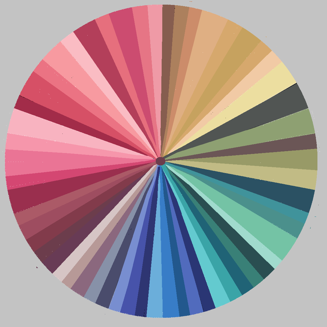
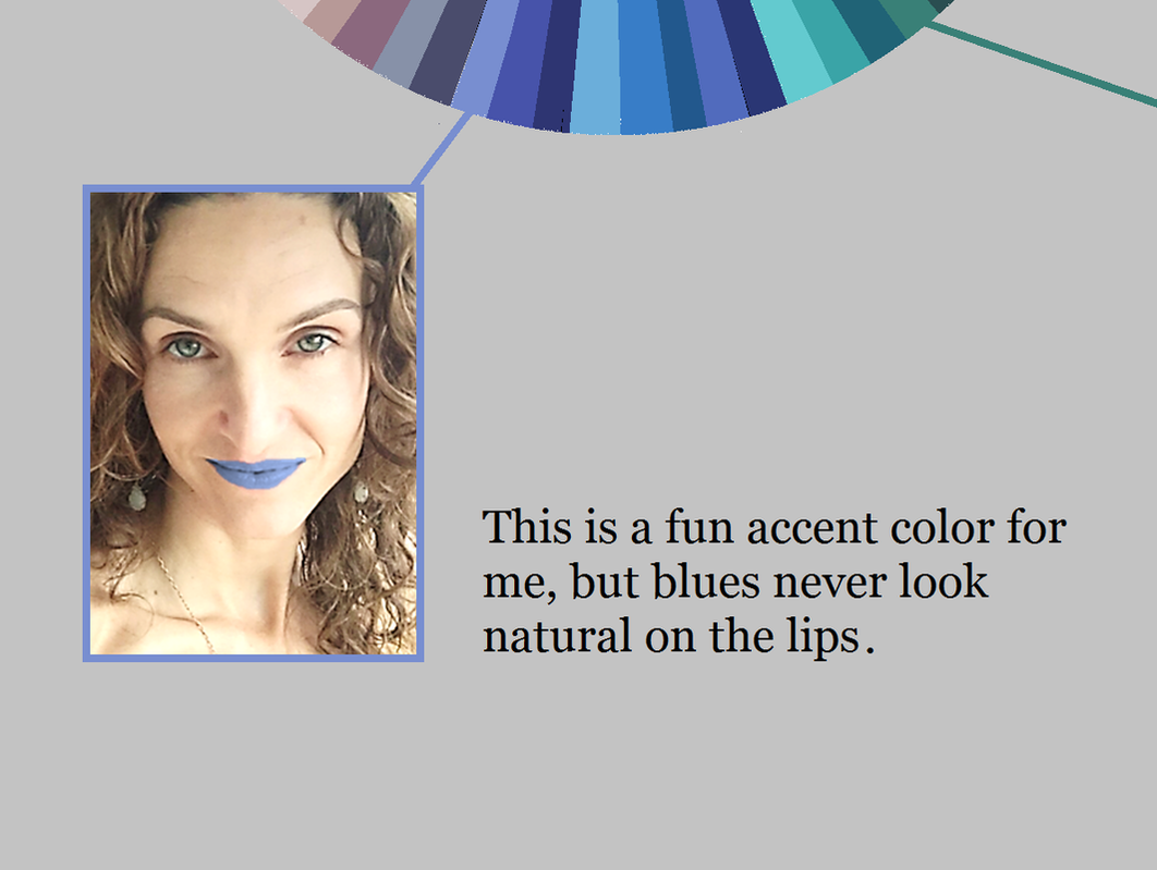
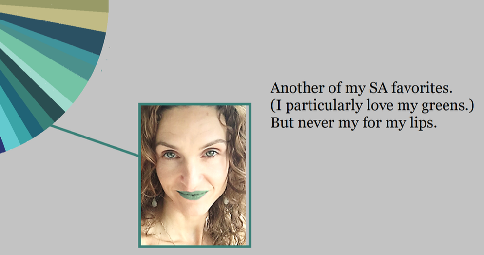
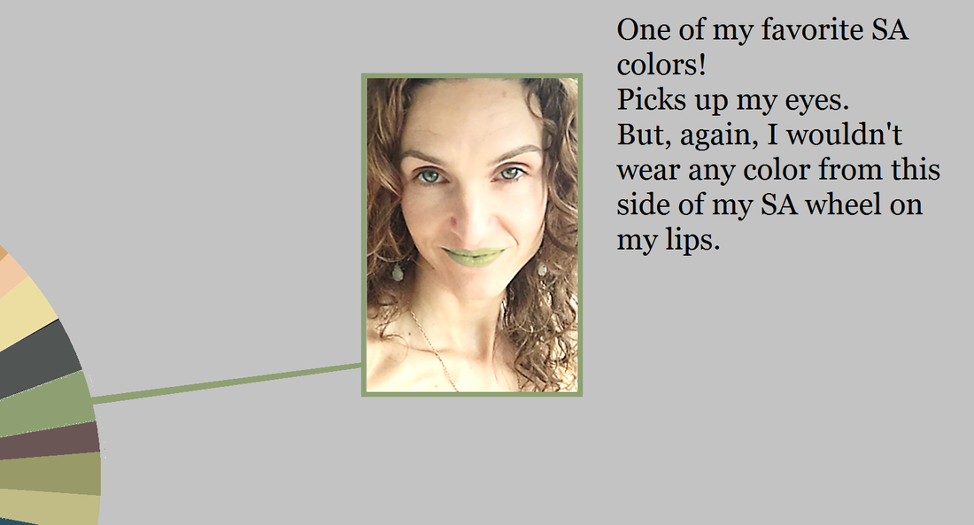
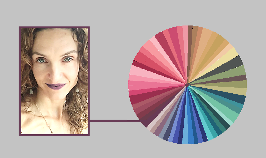
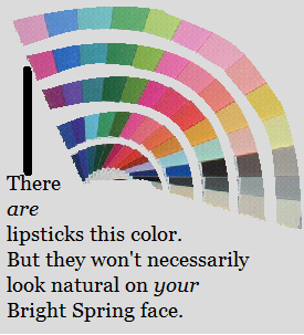
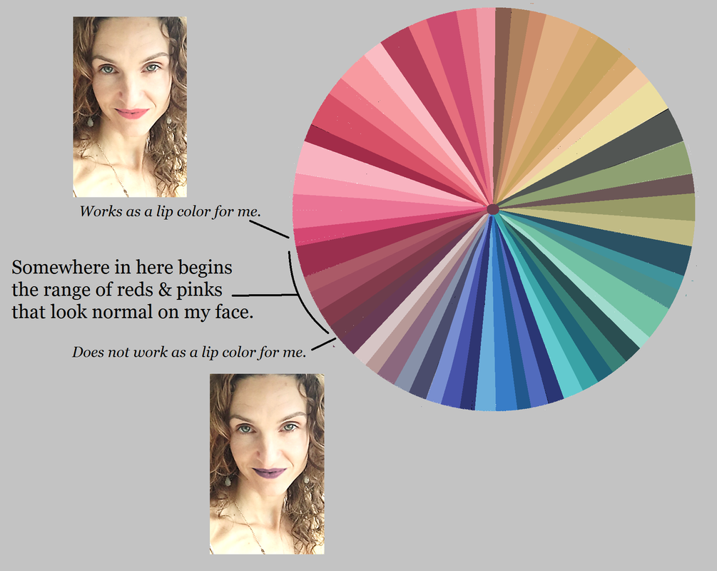
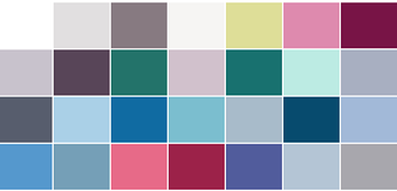
In seasonal discussion groups, women spend a lot of time working out which palettte-matching lipsticks and glosses are their best colors. Why should they have to spend time answering this question? Aren't all of the peaches, pinks, reds and violets in your palette automatically good lip colors for you? Not exactly. Every color in your palette is a color that harmonizes with your natural coloring somehow. But not every color will actually look good on your lips. Your right colors look right because they look natural. So if you wear them in an unnatural way, they won't look right. Consider my Soft Autumn palette: All of these colors look amazing on me. But not every one of these colors would look natural on my lips. Would I wear the greens or blues on my lips? No way. It would look completely unnatural. That goes without saying, right? So far, these decisions seem self-evident. But let's move around the wheel into the range where we expect to find our lip colors: the purples, pinks, peaches and reds. Here's me wearing one of my dark purple-browns as a lippie: This color, though gorgeous on me as an evening gown, still isn't natural on my lips... despite the fact that I can find lippies in the drugstore that swatch this color. Now, if I want to make a statement with my lippy, this could be a good choice for me... but most of the time, I just want to look like the most beautiful verison of myself. And this lippy's not helping me do that. Every peach, pink, red and purple in your palette looks natural on you somewhere. But not every peach, pink, red and purple in your palette looks natural on your lips. This is where many of us -- Winters and Bright Springs in particular -- can get lost. For example, there are plenty of lipsticks that match Bright Spring's violets. But a Bright Spring who expects a BSp violet lippy to look natural on her lips may be disappointed. (Soft Autumn's dark purple sure doesn't look natural on my lips!) The peaches, pinks, reds and purples in your palette that will look natural on your mouth are a smaller subset of your total set of peaches, pinks, reds and purples. It can be tough to know where the line is. My unnatural-looking brownish- purple isn't really that far away from my natural-looking pink: So you're probably wondering, "How can I know which of my peaches, pinks, reds and purples will actually look natural on my lips?"
It's not too difficult. This post is getting long, so I'll publish the second half, in which I describe how to find the best colors for your lips, next week. :-) This post was originally published in February of 2017.
43 Comments
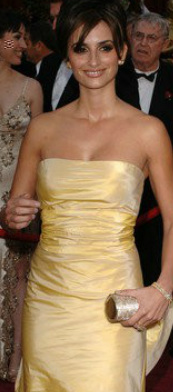
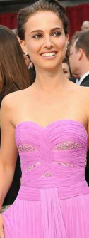
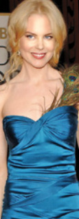
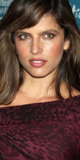
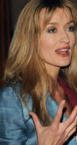
Not all of the colors in your correct seasonal palette will be your absolute favorites. Depending on your depth of coloring, your level of contrast, and the specific colors of your body, some will be more useful to you than others, and in different ways. A dark-skinned Winter, for example, might use black as an accent, while a fair-skinned Winter might wear it in large blocks. But no color in your palette will be awful on you. The colors in your palette are all harmonious with each other, and if it's your proper palette, they'll all be harmonious with you too. So for those of you still searching for your season, I give you colors that are seasonal deal-breakers. If the given color absolutely doesn't work for you, the deal's off. Move this season to the end of the list. You can't use this list to identify your single best season. But you can use it to rule seasons out. If you can't rock hot pink, rule out Bright Spring. Bright Spring has a handful of pinks in this general vicinity. You may not associate pink with Spring. But moving Spring reds toward Winter means making them both darker and brighter. Reds that are both deep and very bright are purple-reds. So in Bright Spring, we find hot pinks. If you think you're a Spring but hot pink is no good for you, True Spring may be your home. If you're not fabulous in lime green, rule out Bright Winter. Taking True Winter's greens lighter and brighter, all the way into Bright Winter, moves them toward yellow. One of the results is a sort of fluorescent lime. On Bright Winters, this color is amazing. It contrasts beautifully with both very dark and very light skin. If this color's not right for you, but you think you're a Winter, try Dark Winter next. If you can't wear clear lemon yellow, rule out True Winter. Be careful applying this one. I'm not talking about a golden yellow, or a pastel yellow, or a yellow-orange. True Winter's few yellows don't show a bit of brown or orange or grey. They're the pure, clear complements of TW's vivid sapphire blues. If you need a more moderated yellow that's still vivid, try Dark Winter. If you don't look great in mint green, rule out True Summer. A handful of the seasons have some sort of mint. True Summer's is not a pure, saturated mint that's close to aqua. Instead it's a delicate and slightly hazy mint. It's lovely with a delicate fuchsia lip. If this feels all wrong to you, perhaps vivid mint is beter? You might be a Winter. If you wouldn't call your good yellow "goldenrod," rule out Dark Winter. Dark Winter yellows are tricky. They're not clear and pure like True Winter's. They're not blindingly bright. They're just slightly warmed, a little rich - but not Autumn rich. Penelope Cruz is lovely here in what looks like one of Dark Winter's elusive yellows. If you need your yellows purer, try one of the other Winters. And if you need a more delicate yellow, try one of the Summers. If you can't wear this medium warmed violet, rule out Dark Autumn. This Dark Autumn color always surprises me. Call it orchid or begonia perhaps. It's not a color I would label Dark Autumn if I saw it in a pile of a hundred other colors. Yet it's gorgeous with the intense dark olives and vivid teals of the season. Dark Autumn Natalie Portman's been photographed in three or four dresses in something like this color. They're all great on her. If it's not great on you, perhaps try True Autumn or Bright Spring. If a light olive-khaki is not a good neutral for you, rule out Light Spring. Was it Christine Scaman who said Light Spring colors are popsicle colors? It's true. But every season has neutrals, of course. This unusual Light Spring color is like your usual khaki, but with a suggestion of green and gold. On a Light Spring, it may pick up tones in the eye or hair. If this color's a no-go on you, perhaps look at Light Summer instead. If you're not flattered by light pinky coral, rule out Light Summer. Light Summer doesn't get very warm, but in the pinks it does go as far as a pinky coral. It's a bit pinker than what you see here, but still warmish. On a Light Summer it picks up healthy color in the face. If you think you're a Summer but can't wear this light, delicate, warm tone, look at True Summer. If you're not beautiful in bright blue, rule out True Spring. True Spring's colors are Crayola colors. You can see them in this picture of Nicole Kidman: blue dress, yellow hair, red-orange lips. In these simple primaries, True Spring is gorgeous. If you struggle to articulate the names of your best colors, they're not True Spring's. You might consider Summer or Autumn. If rich burgundy isn't gorgeous on you, rule out True Autumn. True Autumn has a few beautiful burgundies that go beautifully with the rich greens and oranges of the season. You can see all those colors here, in Noa Tishby's face. Those burgundies make good lippies too. If this burgundy overwhelms you, try something from Soft Autumn. If you're not lovely in cocoa brown, rule out Soft Summer This is not a warm golden brown or a milk chocolate brown. If you're a Summer, none of those browns will work for you. Browns are generally bad for Summers, as a rule. But if you're a Soft Summer, you will be lovely in cocoa brown. It's a brown that looks both slightly greyed and slightly purpled. It may pick up tones in your hair. If this color just isn't right for you, try True Summer next. If you can't do dusty medium blue, you're not a Soft Autumn. This blue feels both rich and muted, and quite medium - neiher purpley nor greenish. I's similar to the color you get if you Google "French blue." Though it's a subtle color, on Soft Autumn skin it's just as powerful as it needs to be. Notice how rich it looks on Natascha McElhone. If you need a blue that's much richer than this, you might try a Winter or a Spring. * * *
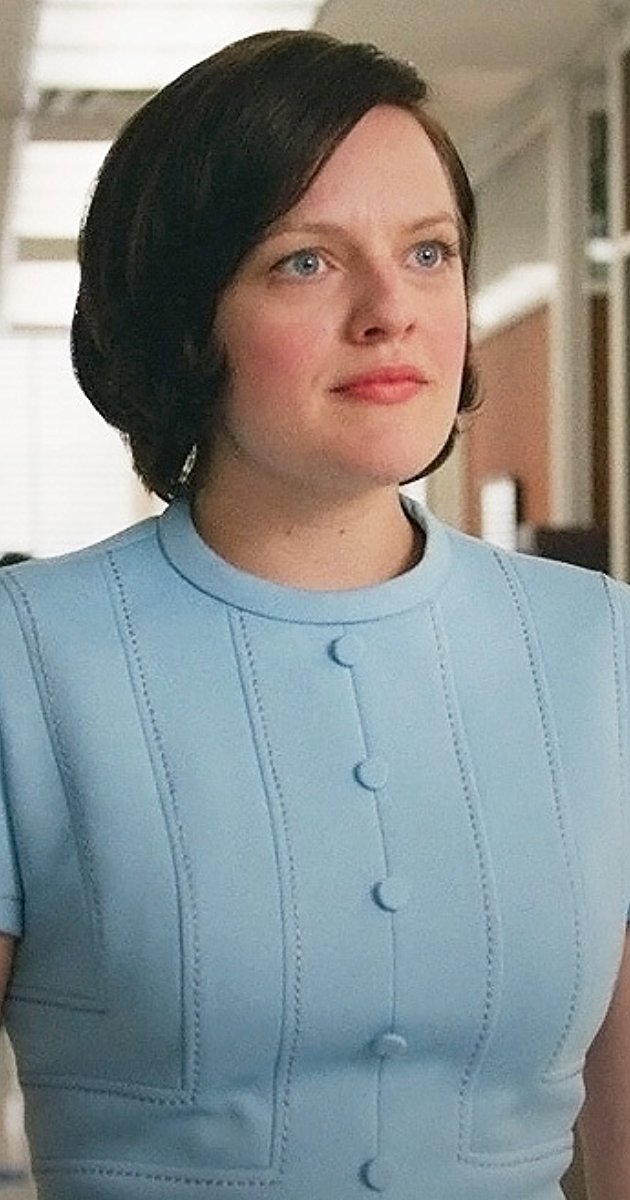
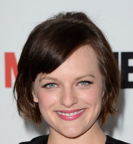
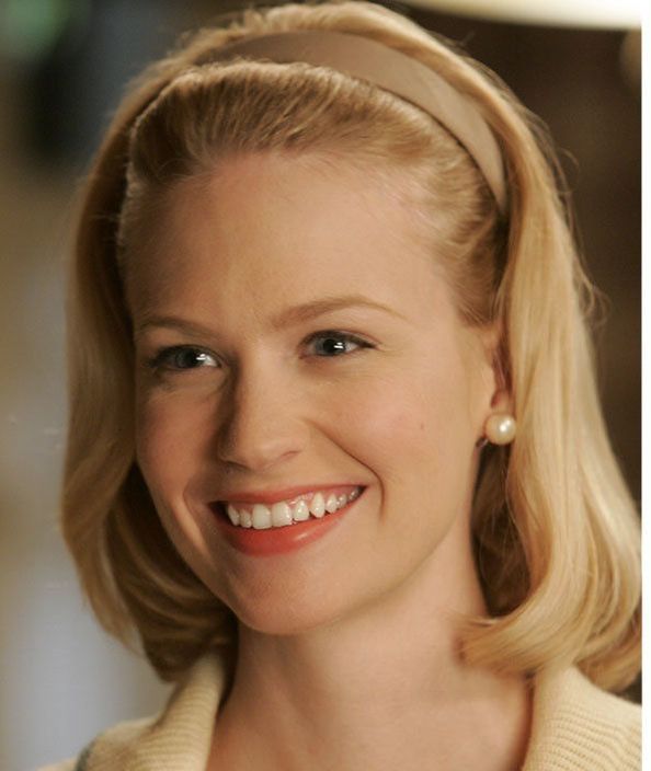
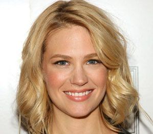
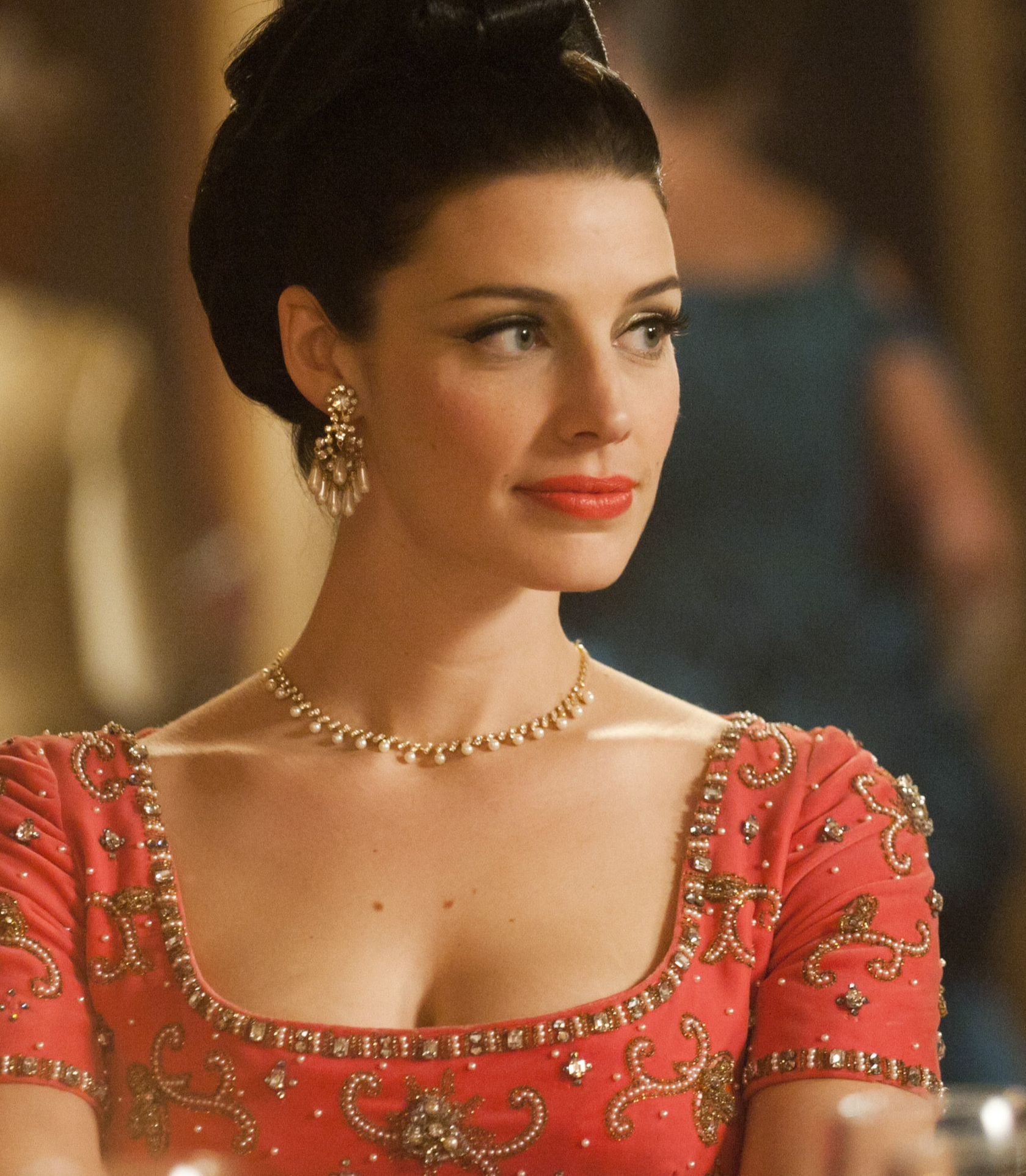
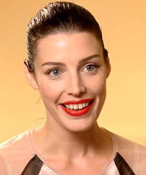
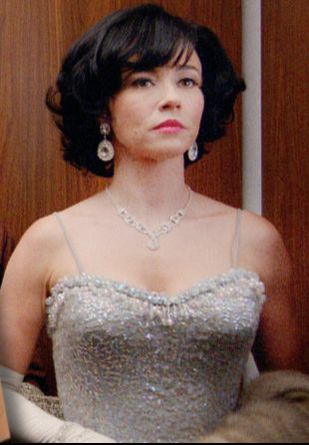
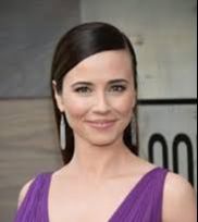
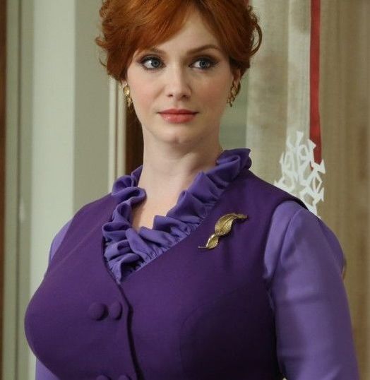
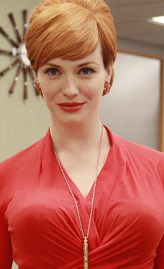
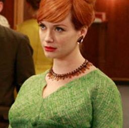
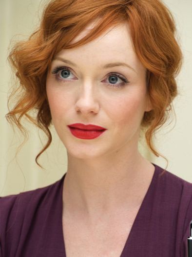
For any of these seasons, Google the season's name in quotes to see images of the palette. Images that say "Sci/Art" are usually quite accurate. Or order sheets of color from all 12 seasons to try the seasons out in person. As always, I hope this helps you find your correct season. :-) This post first ran in April of 2013. Yes, I know I'm late to this party! But I don't have network TV, and I have two kids. I'm just now catching up with the rest of the world TV-wise. Anyway, here are the color seasons of several of the actors on Mad Men, as best I can tell. Elisabeth Moss: True Summer Her best colors aren't particularly dark, but they're very cool. Soft Summer is also a possibility for her, but what really convinced me of True Summer was seeing how pink her lipstick can get. The pinker it is, the prettier she looks. Most seasons can't wear those super-pink lippies. Jon Hamm: Dark Winter His best colors are certainly cool, and quite dark. They're not vivid enough to be Bright Winter colors, and they have the "sooty" quality (as Christine Scaman puts it) that characterizes Dark Winter colors. January Jones: Light Spring Her best colors are warm, clear, and rather light and delicate. I don't think True Spring is impossible for her, but I think it's unlikely; it's telling to me that her very worst colors are dark (remember when Betty dyed her hair black?) I also find some colors to be too clear and warm for her; pure orange and bright red are not great. Jessica Pare: Bright Spring This woman was obviously a Bright from her first moment on screen. I decided on Bright Spring rather than Bright Winter because so many warm, clear colors are glorious on her, and because too-cool colors can make her look a bit goth. I love how often she's costumed in her best colors. It's a joy to behold. Linda Cardellini: True Winter What a gorgeous example of a True Winter. The way black, white and grey make this skin look amazing -- it's just beautiful. Although I know it will disappoint some people, I have to say that I can't accurately type Christina Hendricks. :-( You might be thinking, "She's obviously a Bright, or a True Spring!" But don't let yourself get distracted by the colors she's costumed in as Joan -- they're generally very bright colors, but they're also brighter than she is. Your best colors should let us see you; Joan's colors force us to just see lips, hair, and curves. Which is probably the point.: the colors make her into a cartoon. I suspect that, IRL, Christina Hendricks is probably a Soft Autumn, or just maybe a True Autumn; warmth seems to be good for her, but she needs less saturation than she's given on Mad Men.
What do you think? Any ideas about Christina Hendricks' color season? Do you think I've missed the mark on any of the other characters? Let me know! If you're a Bright Spring or a Bright Winter, you've probably been advised to go for super-shiny finishes and sparkly jewelry.
But if your style identity consists only of Natural, Dramatic, and/or Gamine, you know that these masculine essences ask for matte finishes. (Sparkly and glittery finishes read as feminine.) How do you reconcile these two realities? Bright seasons need, above all, an overall impression of brightness and high contrast. Blingy jewelry is of course one way to achieve that, but it's not the only way – – otherwise Bright season men, who generally very very little jewelry, would never be able to fully manifest their Bright selves! Right? You can stick with matte and enamel finishes in your jewelry and still look amazingly Bright by focusing on value contrast (light-dark contrast) and color contrast in your clothes and accessories. Here are some examples of women and men in Bright-looking ensembles with little or no shiny jewelry. I hope they inspire you! This is an interesting issue that Bright Spring and Bright Winter women often discuss -- whether the makeup can possibly be right, translated literally from the palette to the face. Women draped as Bright sometimes say the colors feel too saturated on the face. If this is you, I think there are a couple of things possibly going on: 1. A given color might be right in clothing, but not on a person's face. How far does a color have to be from red for it to no longer be a lip or cheek color? Bright Spring and Bright Winter have a lot of reds and pinks. They also have many purply pinks and orangey-reds. For some women, some of the pinks and reds are so close to purple or orange that they're no longer good as lippies (though they'd be fine as shirt colors, for example.) You can't wear every single palette color on your lips. Goodness knows not all True Autumns can wear pumpkin orange in a blush. 2. For some Brights, the intensity of the color just feels weird, even if it's objectively flattering. This is often true for women who are totally new to the palette. If you're accustomed to wearing very muted lippies, the reds and pinks of Bright Spring and Bright Winter might feel odd to you. The only cure for this is time. As weeks and months go by, you'll slowly grow accustomed to your palette, and you'll come to see how natural these supposedly bright colors look on you. 3. Unfortunately, some women draped as Bright aren't actually Bright. Draping is an art, and analysts do get it wrong sometimes. If you're a Bright, your reds and pinks should look natural on your face. They shouldn't look startling. I hate to sow the seeds of doubt! I know we are all looking for peace of mind. But if your reds and pinks consistently jump out of your face, that's not color harmony. 4. Some colors are too bright for anyone to wear as a lippie. The colors in your Bright Winter and Bright Spring palette aren't the brightest possible colors. There's a limit, it seems, to how saturated human coloring can get. There are definitely lippies for sale that are brighter than any Bright Spring or Bright Winter color. They won't look harmonious on anyone. (Color harmony isn't everyone's aesthetic.) Having trouble making this decision? These two seasons are often confused -- probably because people in both seasons are flattered by warmer colors and can take a lot of saturation.
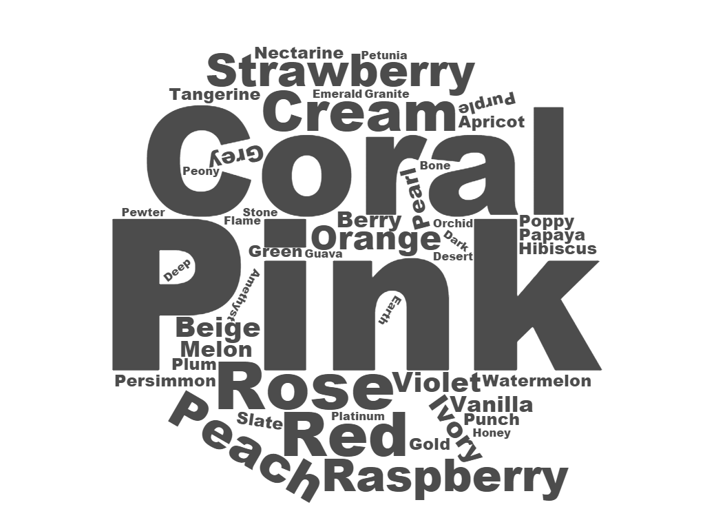
There are a few colors that will distinguish them, though. If you're a Dark Autumn, you will look good in some light golden browns, while Bright Spring can't do any kind of brown. As a Dark Autumn, you'll also look good in dark rust red, while Bright Spring doesn't have anything close to that. If you're a Bright Spring, you can wear a whole value range of fuchsias, from pretty deep to very light. (Dark Autumn has some coolish reds, but they're very dark -- more like wine.) As a Bright Spring, you can also wear a light, sunshiney yellow, while Dark Autumn's yellows are more like gold. Still can't figure out your season? Try at-home draping.  Each of my 12 seasonal makeup lists features hundreds of individual products that have been matched to color-accurate palettes. I thought it would be fun and instructive to create a word cloud for some of the makeup lists, using all the words from the list that are color names. Here's the word cloud for the Bright Spring makeup list: Neato, right!? If you don't yet own a Bright Spring makeup list, seacrhing for cosmetics with these words in the title might help you increase the odds of choosing a product that will work for your Bright Spring face. Notice that "pink" and "coral" are the two most frequently occuring color words in the names of Bright Spring cosmetics. Pinks (both cool and warm) and orangey-pinks are so important for Bright Spring. Bright Spring makeup colors are pure, warm-toned, and generally not very dark. (Thought Bright Spring can wear black, particularly as a liner or mascara, other colors on her face tend to be on the lighter side.)
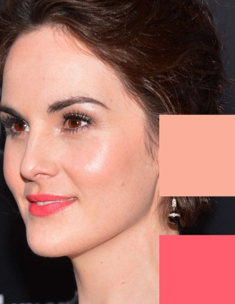
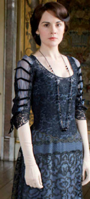
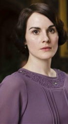
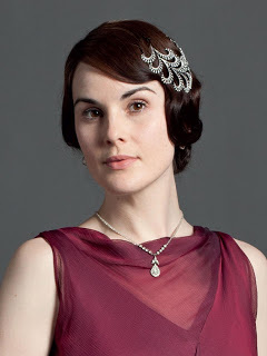
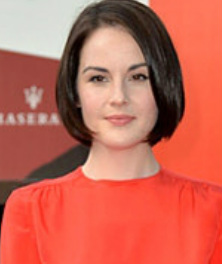
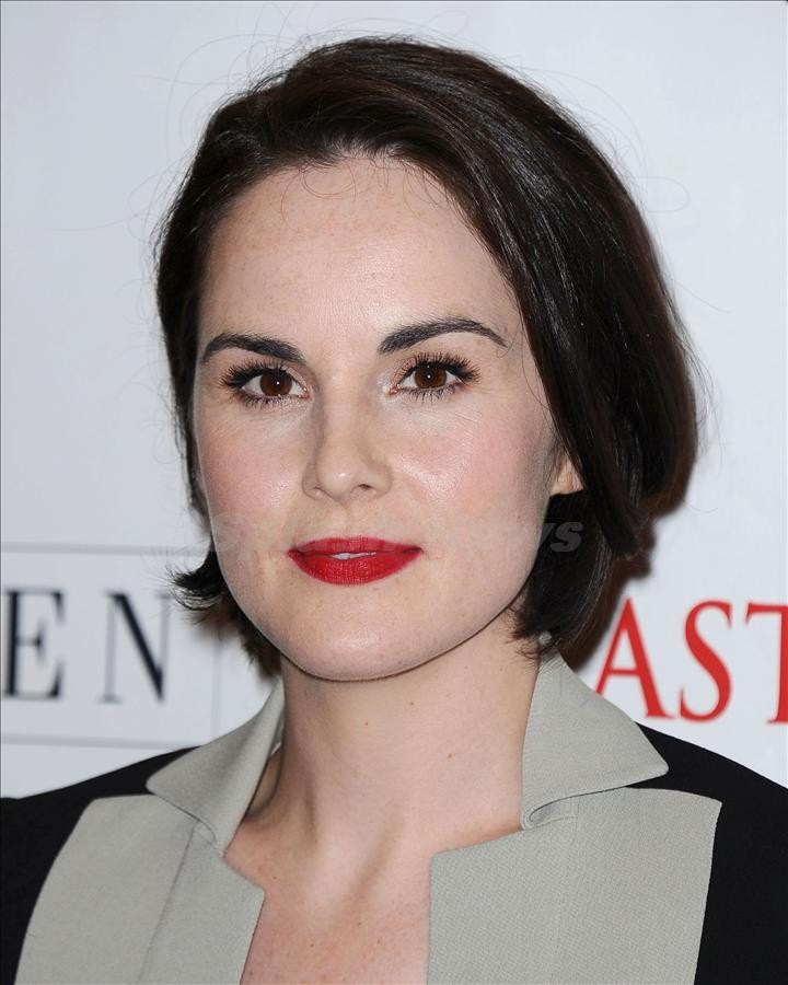
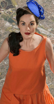
In your correct seasonal makeup, you'll look like the most gorgeous version of yourself. Not sure what your season is? Try the at-home draping cards -- they're an affordable way to figure out your color season. :-) Hi, everyone! Hope your summer was awesome. Mine was relaxing and rewarding. I'm sorry that it's over, but happy to have made a lot of memories for my kids. I also enjoyed a little extra time alone this summer. During which I was able to watch all three seasons of Downton Abbey on Netflix. In the first episode, Michelle Dockery as Mary declares "I hate black!" So of course I started wondering about her season. Now, Ms. Dockery's coloring - dark hair, ivory skin - had me immediately suspecting Summer or Winter. The saturation of her hair and eyes seemed to suggest Winter was more likely. But I had to agree with Mary that I didn't love her in all black. It just doesn't feel right, does it? I don't see it connecting to her. Since black wasn't lovely, I leaned away from Winter and started considering Summer for her. But I couldn't find any examples of her looking great in a Summery hue. For example, this dusty purple should work on a Summer, wouldn't you think? But it doesn't. Her hair and eyes are more intensely saturated than the dress, while her skin seems both colorless and waxy. As I got more and more sucked into the series, I'd periodically return to considering Ms. Dockery's season. I was stuck on the idea of a cool season for her, but couldn't find any examples of her looking fab in cool colors. They always seemed too meh for her. You would think that I would have gotten a clue at some point, but I was too absorbed by the drama to think myself out of the circles. "Must be Summer, but no... ok, must be Winter, but no... ok, must be Summer - wait, did Thomas really just do that?" After finishing the last episode of the third season (OMG!), I disn't consider the question again. Until Erin, a fan of my Facebook page and clearly a brilliant woman, posted a comment suggesting that Michelle Dockery of Downton Abbey might be a Bright Spring. ??? Well, that would explain a lot. Why Summer colors seem too muted but Winter colors don't bring out any healthy color. Why all black was more boring than overwhelming. And, hello, aren't Bright Springs often dark-eyed and dark-haired? Don't I love to point this out? Why didn't I think of this? Here's the pic Erin shared to support her case: Holy moly, that's good. A seriously bright red-orange, but the skin looks healthy, not deathly pale. Googling revealed that Ms. Dockery is almost always photographed in cool colors and Winter colors in particular. They're not great for her. As on the show, they make her skin seem colorless. But I was able to find a few shots of her in Bright Springy colors, and I thought they were fantastic. Here, the lip is too dark to be natural (better for Dark Winter, maybe), but I love the orange and the electric blue for her. That skin is alive, not pallid. This makeup is lovely; it's not a nude look, but it's harmonious, not jarring. And the colors on her cheeks and lips? Bright and warm. Just goes to show that even an outside-the-box color thinker like me can get led astray by lazily falling back on seasonal stereotypes. Dark hair + dark eyes + ivory skin does not always = cool season.
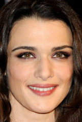
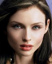
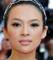
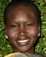
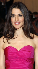
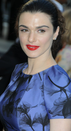
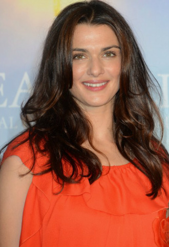
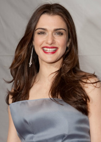
Thank you, reader Erin. :-) Don't have access to a color analyst? Try draping yourself at home. Perhaps just one color from each season isn't enough to help you Brights sort yourselves out. Perhaps it would be helpful to look at (people I believe are) real Bright Springs and Bright Winters, and notice what's different between the two groups? Yes, people with any hair color and any eye color can be any season... but people within a certain season sometimes share a certain overall look. I chose what I think are harmonious pictures of four Bright Springs and four Bright Winters. Let's compare. Four women I believe are Bright Springs. Look at these gals. Scroll down quickly and glance at the Bright Winters. Then scroll back up. See the difference in the skin? These four women seem to have a golden quality to their skin. The depth of the skin tone varies; Rachel's is very fair with just a drop of yellow, while Selita's is a deep golden caramel. Yet there's a flattering (not sallow) yellow-gold-orange glow in each of these complexions. Four women I believe are Bright Winters. What I notice in these four women, compared to the Bright Springs, is the absence of warmth. It's almost a silvery-grey cast. No yellow, no gold. Yet they look balanced, not pasty or ashy. Lauren is almost porcelain; Alek's skin is deep cocoa brown. In both, there's a hint of cool pink or peach that may be added by blush. But no golden glow.
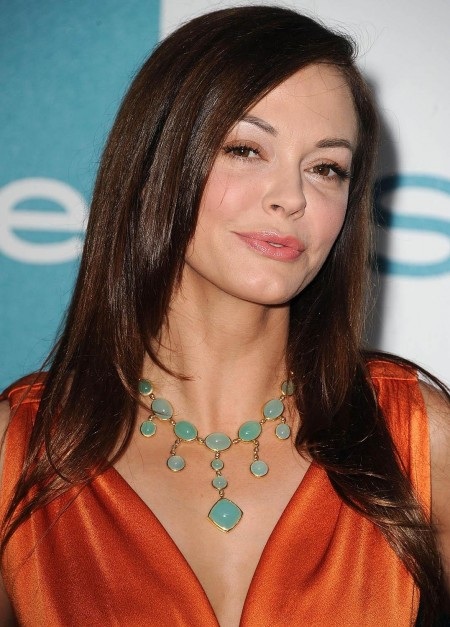
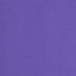
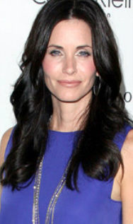
So: When Bright Springs look yellow-gold, it may seem right, not jaundiced. When Bright Winters lack warmth, it may seem healthy, not cadaverous. What I suppose we're getting down to is the fundamental temperature difference of the seasons. Yes, Bright Spring has a touch of Winter, but it's still primarily warm. Bright Winter has a touch of Spring but it's still primarily cool. I realize in this post I may sound like I'm contradicting what I normally say about seasonal analysis. But, to paraphrase myself from that post, there are patterns and tendencies in seasonal coloring. If you're trying to figure out your correct season, you'll use whatever means are available to you. In the case of choosing between Bright Winter and Bright Spring, it may help you to rely on some general truths about Bright skin. If you're having trouble diagnosing yourself, consider investing in color cards to drape yourself at home. You may also like: Distinguishing Bright Winter From Bright Spring, Part I Drape Yourself at Home The two palettes are clearly different. Look at them side by side and there's no doubt. Bright Winter is darker, crisper, bluer; Bright Spring is livelier, cheerier, yellower. But getting down to individual colors is tricky. There aren't many hues that are found only in one palette but not in the other. Both have pinks, yellows, greens, blues, purples... The differences are mainly in the temperature of the hues - cool or warm? - and it can be hard to convey those differences in a blog. I will focus on just two colors, two that are inarguably distinct in hue - one from each palette. First is Bright Spring's very saturated adobe orange. Think rust or pumpkin, but clear, not dull. The Bright Spring palette has a few colors like this, and they're nothing like anything in Bright Winter's palette. Here's Rose McGowan in such a color: If you are lovely in some version of this warm, deep, but clear orange, you're more likely Bright Spring than Bright Winter. The colors that most easily distinguish Bright Winter from Bright Spring, in my opinion, are its periwinkles. Periwinkle is purple-blue. Bright Winter's are like this: Now, Bright Spring has several colors you might call purple. Some are crayon purple; others are quite magenta-ish, almost red. But none of them are purple-blue. Here's Courtney Cox in a similar color: If you suspect you're a Bright but aren't sure which one, compare these two colors. Make sure both versions are very saturated, not faded or grayed or dull.
For more help figuring out your season, see here. Good luck! So... - Her best colors are bright, and not too dark. - Her best makeup is not too heavy and not too dark. - I think her best colors are warmer rather than cooler. But not all the way warm. I am pretty sure she's a Bright. I'm going with Bright Spring over Bright Winter. Here, a warm, light lip is lovely. The peachy cheeks are pretty darn good, perhaps a hair too warm. The melon color on the side is connecting to her skin. The eyeliner is the only jarring note; it's too cool. Look at those gorgeous eyes! Don't you want to set them free from that eyeliner? You should see Christine Scaman's excellent article on Spring skin finishes. And to find your own season, try draping yourself at home.
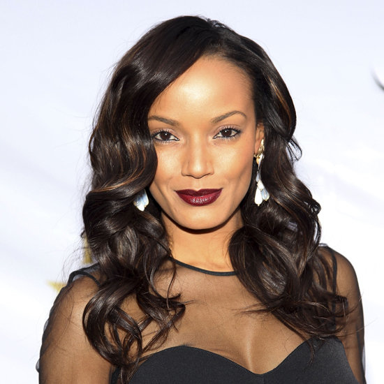
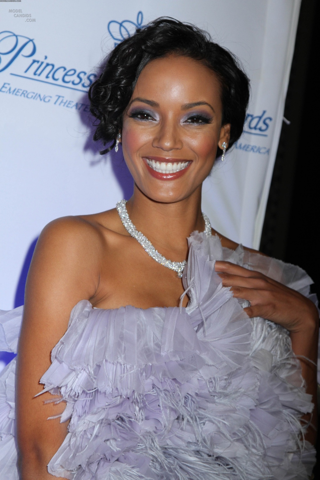
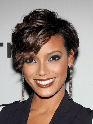
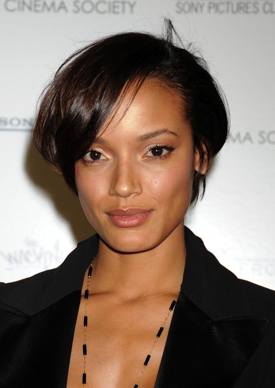
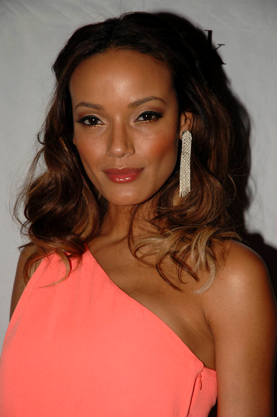
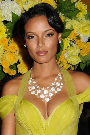
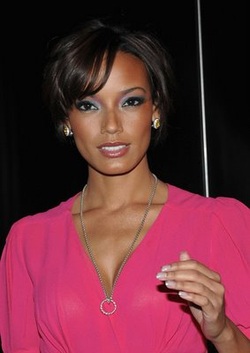
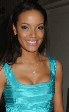
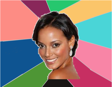
While searching the interwebs for other stuff in the last few days, I stumbled across photos of a beautiful woman I hadn't heard of before. She's a model named Selita Ebanks. Her season stumped me. So I started looking through pics of her, trying to solve the mystery. As I look at pics of her, or any celeb, I'm thinking "No... no... yes... no..." and trying to figure out what the yeses have in common. No. The black seems blah, not balancing. It's not bringing her to life. And that lippy is too dark. It's jumping out of the pic at me. Would a Winter look this obviously wrong in these colors? Tentative no to Winter. No. This whole summery getup is too cool. The eye shadow is just sitting on her eyes. OK, I'm thinking she's not a Summer. No to this lip - too dark and muddy. She's perhaps not an Autumn. No and yes. I love the peach colors on her face. But, again, the all-black seems blah on her. It's connecting to her eyes, but I feel that she could be much more special than this. Hmm, that sounds like something I've said about the Brights. Could she be a Bright Spring? Can she do Bright Spring's melons and peaches? Here, I think certainly yes. Mentally erase the too-cool earring and I believe we have glorious harmony. How about Bright Spring's lime greens? I think she's gorgeous in these colors. (Minus the necklace.) So I say yes. What about Bright Spring's bright pinks? I think this pink is fantastic for her skin. The contrast of the black background adds to the effect. How about Bright Spring's beautiful aqua? I find this a very telling photo because the makeup here is comparably minimal, yet I don't see the bright color overwhelming her. (I'm mentally erasing the very light pink lip.)
I'm pretty convinced. I'm calling model Selita Ebanks a Bright Spring. :-) Erin writes,
My mom and I went makeup shopping yesterday and I was looking for a good, every day lipstick. We were looking at Maybelline Summer Sunset and Hooked on Pink. The latter did a better job of clearing the skin, so we went with that one. Once in the car, I tried it on and it did seem to clear some blotchy-ness away. It also seemed to whiten my teeth (always a good thing). I decided to look in your blog to see if the colour had been mentioned and it had, to my surprise, in Dark Autumn. Would it work for any other season? I've never really considered Dark Autumn before (or any dark season). I do indeed have Hooked on Pink on my list of recs for Dark Autumn. But I don't know where I got the rec from. :-( Erin adds, "Since I sent the question, my mom and I are also considering that I could be a Bright Spring as well." Feedback, readers? Any experience with Hooked on Pink? What's your season, and how did it work for you? All of the lippies in this series are recs from the ladies of the 12 Blueprints Facebook page, Christine Scaman, or my own swatches.
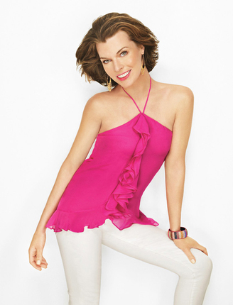
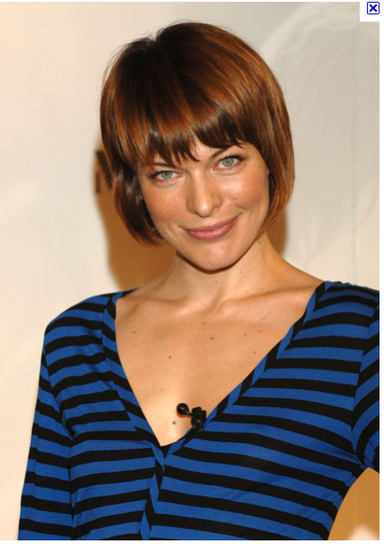
If you're a Bright Spring, most of these colors will work on your lips - and your cheeks too, if you use them as blush. Some may be a touch too warm, too cool, too light or dark. This is normal, because the variation of human coloring within a season means that not all women in a season wear the same colors on the face equally well. Some of these are discontinued. Check eBay. Try before you buy, if possible. Please do share feedback on the recs, or additional recs, in the Comments section. :-) * * * * * * * Burt's Bees All Natural in Rose Burt's Bees All-Natural Tinted Lip Balm in Hibiscus` Burt's Bees in Rhubarb Clinique AllHeart Clinique Bonfire Clinique Cabana Crush Clinique Fireberry Clinique Glazed Berry (or LSu?) Clinique Sugared Grapefruit Cover Girl lipstick Fairy Tale Covergirl Outlast Red Affair Elizabeth Arden Perfect Tulip. Estee Lauder Gloss Stick in Pop Pink Estee Lauder Gloss Stick in Summer Melon Estee Lauder Lush Rose Estee Lauder Pure Color Long Last in Apricot Sun Estee Lauder Pure Color Long Last in Chelsea Rose Estee Lauder Pure Color Long Last in Lotus Pink Estee Lauder Pure Color Long Last in Nectarine Estee Lauder Pure Color Long Last in Raspberry Pop Estee Lauder Pure Color Long Last in Spiced Coral Estee Lauder Pure Color Long Last in Wild Rose MAC Bombshell MAC Lady Danger (but might be closer to BW) MAC Sea Sheer MAC Sheen Supreme Insanely It MAC Speak Louder (also rec'd for BW) MAC Viva Glam Cindy Maybelline Coral Lustre 840 Maybelline Disco Pink 810 Maybelline Fruit Punch 825 Mercier’s Lip Pot in Hibiscus Merle Norman Persimmon Neutrogena Revitalizing Lip Balm in Healthy Blush Revlon Colorburst Carnation Revlon Colorburst Cherry Ice Revlon Colorburst Coral Revlon Colorburst Fuchsia (may work for TW too) Revlon Colorburst gloss in Papaya Revlon Colorburst Peach Revlon Coral Berry Revlon Ravish Me Red Revlon Strawberry Suede Revlon Superlustrous Kiss Me Coral Rimmel Moisture Renew Coral Shimmer Smashbox Afterglow Smashbox Fame Smashbox Starlit (may not be just right) Sonia Kashuk Azalea Sonia Kashuk Nectar The question was raised recently on 12 Blueprints' Facebook page whether Milla Jovovich is a Bright Spring. I think she is, but others believe she's a Summer. She's certainly not easy to type. Here are some pics I've gathered that I believe suggest Bright Spring; I'd love to hear what you readers see in these pics. Here's the picture I saw in Lucky magazine that made me first suspect Bright Spring for Milla. What I noticed in this pic, which I think is a flattering and harmonious look for her: warm highlights in the hair; bright gold jewelry near her face; pure hues; high color contrast; and a pink that looks to be a match for one in the Bright Spring book. 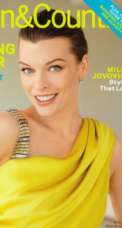 I find this look flattering as well. I think she's pulling off the super-bright, slightly warm yellow, and I think the warm makeup looks natural on her. (That lip may be a teensy bit off, but it's pretty good.) 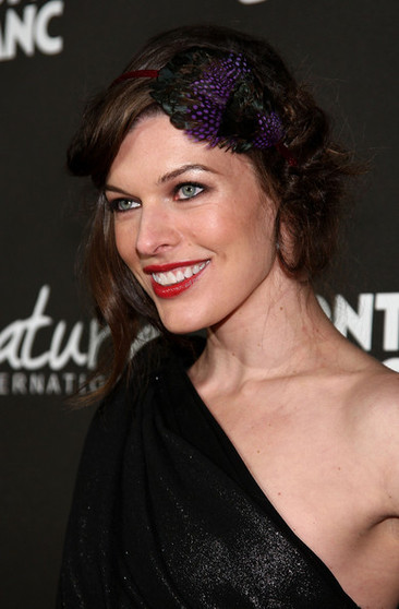 I don't love the purple hair-thingy. Nor do I love the black eyeliner. But I do notice here that the black in the dress doesn't seem to be overwhelming her - I think she's balancing it. I also think she's balancing the very intense warmish-red lip. So I think her season is one that can take a lot of color. 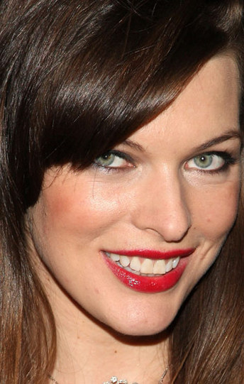 To my eye, this makeup looks right. It also looks warm and saturated (a.k.a. Springy). This close up, it does seem a little heavy, but I suspect that's for the cameras. The colors themselves look spot-on to me. Here, I almost think she could pull off this outrageous shirt, if she had a stronger lip. Even then the shirt colors might be too cool. But I do notice that the crazily saturated stripes aren't totally owning her. I still find myself looking at her eyes. Imagine this top, by comparison, on Soft Summer Miley Cyrus, or True Summer Kimberly Williams, or Light Spring Taylor Swift, or Warm Spring Cameron Diaz. Could any of them handle this? 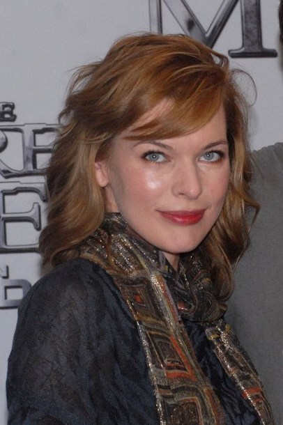 Here, what strikes me is that the hair's too light and she's dominating the shirt and scarf. The matchy-matchiness of eyes + shirt and hair + scarf may fool your gut into thinking something right is happening... but doesn't the skin of her face seem to be calling for much more intensity than it's surrounded with? There are many, many pics of Milla looking less than her best on the 'net. I won't post them here - you'll see them if you try to find good ones of her. But now, your turn: what do you see in these pics? Something different than what I see? Do you have links to pics that seem to suggest another season? As ever, I'm interested in truth - not in being right. So please, argue away.
|
About Me...I'm passionate about helping people become their most authentic and beautiful selves. Categories
All
|
- home
- Blog
-
-
- Book your virtual style analysis
- ♂ DRAMATIC style type
- ♂ NATURAL style type
- ♂ GAMINE style type
- ⚥ CLASSIC style type
- ♀ INGENUE style type
- ♀ ROMANTIC style type
- ♀ ETHEREAL style type
-
- ⚥ ♂ Classic Gamine -- The Prep Schooler
- ⚥ ♀ Classic Ingenue -- The Class President
- ⚥ ♂ Dramatic Classic -- The Art Critic
- ♂ ♂ Dramatic Gamine -- The Punk Rocker
- ♀ ♂ Dramatic Ingenue -- The Childlike Czarina
- ♂ ♂ Dramatic Natural -- The Amazon Queen
- ⚥ ♀ Ethereal Classic -- The Delicate Sophisticate
- ♀ ♂ Ethereal Dramatic -- The Sorceress
- ♀ ♂ Ethereal Gamine -- The Sprite
- ♀ ♀ Ethereal Ingenue -- The Fairy
- ♀ ♂ Ethereal Natural -- The Earth Goddess
- ♀ ♂ Gamine Ingenue -- The Girlish Mod
- ⚥ ♂ Natural Classic -- The Prep
- ♂ ♂ Natural Gamine -- The Tomboy
- ♀ ♂ Natural Ingenue -- The Outdoorsy Sweetheart
- ⚥ ♀ Romantic Classic -- The Sexy Sophisticate
- ♀ ♂ Romantic Dramatic -- The Vamp
- ♀ ♀ Romantic Ethereal -- Aphrodite
- ♀ ♂ Romantic Gamine -- The Firecracker
- ♀ ♀ Romantic Ingenue -- The Demure Seductress
- ♀ ♂ Romantic Natural -- The Babe Next Door
-
- ⚥ ♀ ♂ Classic-Gamine-Ingenue
- ⚥ ♂ ♂ Dramatic-Classic-Gamine
- ⚥ ♀ ♂ Dramatic-Classic-Ingenue
- ♂ ♂ ♀ Dramatic-Gamine-Ingenue
- ⚥ ♂ ♂ Dramatic-Natural-Classic
- ♂ ♂ ♂ Dramatic-Natural-Gamine
- ♂ ♂ ♀ Dramatic-Natural-Ingenue
- ⚥ ♀ ♂ Ethereal-Classic-Gamine
- ⚥ ♀ ♀ Ethereal-Classic-Ingenue
- ⚥ ♀ ♂ Ethereal-Dramatic-Classic
- ♂ ♂ ♀ Ethereal-Dramatic-Gamine
- ♀ ♂ ♂ Ethereal-Dramatic-Natural
- ♀ ♀ ♂ Ethereal-Dramatic-Ingenue
- ♀ ♀ ♂ Ethereal-Gamine-Ingenue
- ⚥ ♀ ♂ Ethereal-Natural-Classic
- ♂ ♂ ♀ Ethereal-Natural-Gamine
- ♀ ♀ ♂ Ethereal-Natural-Ingenue
- ⚥ ♂ ♂ Natural-Classic-Gamine
- ⚥ ♀ ♂ Natural-Classic-Ingenue
- ♂ ♂ ♀ Natural-Gamine-Ingenue
- ⚥ ♀ ♂ Romantic-Classic-Gamine
- ⚥ ♀ ♀ Romantic-Classic-Ingenue
- ⚥ ♀ ♂ Romantic-Dramatic-Classic
- ♂ ♂ ♀ Romantic-Dramatic-Gamine
- ♀ ♀ ♂ Romantic-Dramatic-Ingenue
- ♂ ♂ ♀ Romantic-Dramatic-Natural
- ⚥ ♀ ♀ Romantic-Ethereal-Classic
- ♀ ♀ ♂ Romantic-Ethereal-Dramatic
- ♀ ♀ ♂ Romantic-Ethereal-Gamine
- ♀ ♀ ♀ Romantic-Ethereal-Ingenue
- ♀ ♀ ♂ Romantic-Ethereal-Natural
- ♀ ♀ ♂ Romantic-Gamine-Ingenue
- ⚥ ♀ ♂ Romantic-Natural-Classic
- ♂ ♂ ♀ Romantic-Natural-Gamine
- ♀ ♀ ♂ Romantic-Natural-Ingenue
- Shop
- Book a Virtual Style Analysis!
- Contact me
Connect with me!
































 RSS Feed