|
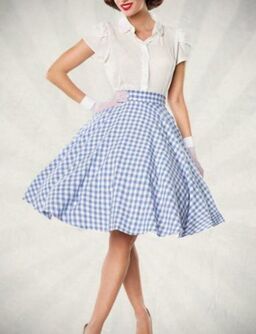
This post is part of a series exploring how to make the best use of your color palette. Two women with the same color season might wear their color palette very differently. Part of that will be because they manifest the colors differently within their own bodies. (For example, Light Spring Alicia Keys will probably choose different neutrals than Light Spring Scarlett Johansson.) But part of what determines a woman's best palette colors is her lines -- the qualities of her beauty you'd notice even in a black-and-white photo. In other words, her style type. I've talked about a Dramatic's intimidating palette, a Natural's easygoing palette, a Gamine's high-energy palette, and a Classic's reserved palette. Today, I'll talk about an Ingenue's sweet, innocent palette.
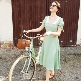
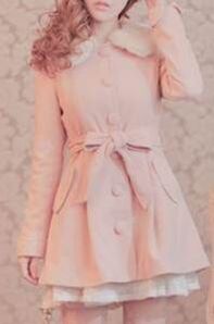
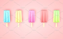
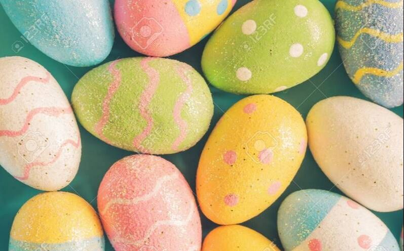
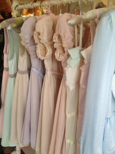
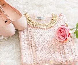
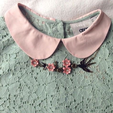
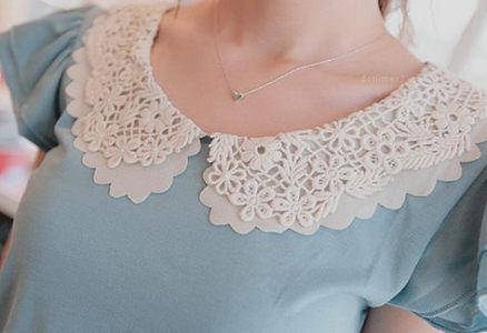
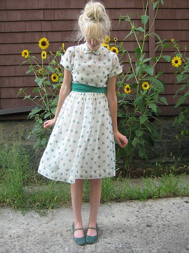
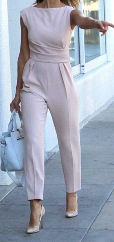
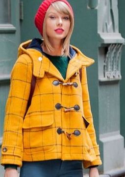
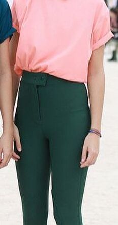
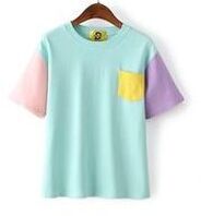
If you're an Ingenue, the colors you look right in are your palette's version of candy colors: your light pinks, light yellows, light blues, light purples, light peaches, and light greens. You could also think of these as popsicle colors, or Easter egg colors.
You might say "my season's pastels" as a simple shorthand for yourself. I avoid that terminology because, in the more saturated color seasons, the light colors technically aren't pastels; although they're light, they're still quite vivid, not soft. But on an Ingenue woman, those very light colors will give a soft, gentle, pastel-like impression, even if her color season is Bright; the effect of the colors exists relative to her own coloring.
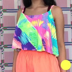
Ingenue has both a high-energy aspect and a gentle aspect to its color use. The gentleness is because Ingenue represents the qualities stereotypically associated with femininity. You can see the gentleness in the individual colors of the palette.
But because it's a youthful essence, Ingenue has a high-energy quality as well, and this comes across when you playfully combine your Ingenue colors. Feel free to combine any of your gentle Ingenue colors with any of the others. The effect is still feminine and sweet, because the palette is feminine and sweet. (If you were a Gamine, freely combining your palette's version of primaries, the effect would feel very different.)
Your palette whites and light grays are great neutrals for you; they communicate innocence. Mix in whites and light greys wherever it feels right.
Are you an Ingenue blend? How have you created Ingenue looks with your palette colors? Please share in the comments!
37 Comments
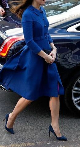
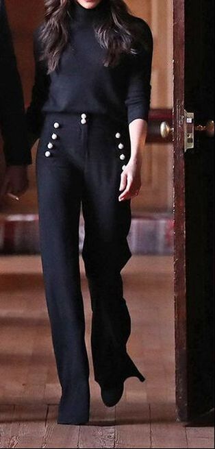
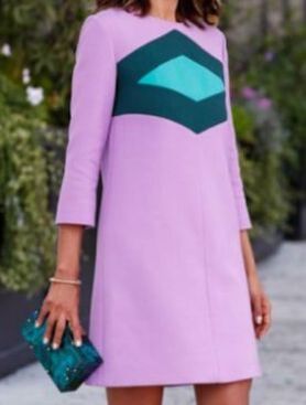
Every color in your seasonal palette looks beautiful next to your skin. But two women who are the same season might wear their palettes very differently, partly because of unique aspects of their coloring, and partly because of their style types. If your style type is predominantly Classic, which colors in your palette should you focus on?
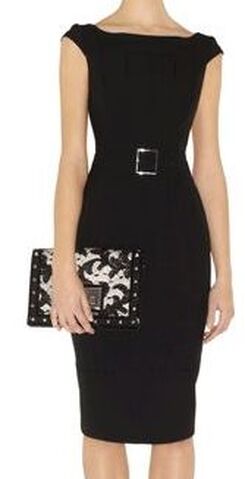
Classic is all about tasteful understatement. Because color makes a such a huge impression on the eye, a Classic will always want her colors to be toned down. The only aspects of a Classic look that are showy are the details one has to look closely to notice, such as fine tailoring, a discreet designer monogram, or an expensive fabric.
So your go-to colors will be "office colors" -- your blacks, your whites, your greys, your browns, your navies, and perhaps your darker greens.
Your use of color, even if it's monochromatic or highly contrasting neutrals, should never feel aggressive; it should always feel understated. (If your use of color feels intimidating; you're veering into Dramatic territory.)
When you combine colors, the effect should always feel coordinated. The viewer should be able to image the items were purchased as a set.
As a Classic or Classic blend, you might use other colors in your palette successfully; the guiding question should be whether the color stands out or blends in. (You're aiming for the latter.)
Are you a Classic or a Classic blend? How do you use the colors in your palette? Please share in the comments! If you're not sure of your style type, try the Style ID Calculator! Over the last few weeks, I've talked about how to combine your color palette with your style type. Because, although every color in your palette is flattering to your skin, your style type will affect how you combine colors to look your most beautiful. If you're strongly Gamine, which colors in your palette should you focus on? Gamine's vibe is fun, playful, and high-energy.
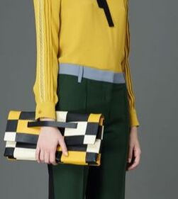
As a Gamine, aim to create unexpected combinations of your pallete's most vibrant colors. Colors that people would not normally expect to see together will look great on you. If your mom would have told you, "Those colors clash!", it's probably a Gamine color combination.
Color-blocking reads as Gamine, as long as it it feels playful and fun. (If it feels aggressive and intimidating, it will read as Dramatic, not Gamine.)
Your palette's version of primaries - - your reddest red, your yellowest yellow, and your bluest blue -- will also read as Gamine.
This is true even if you're a season with a soft or muted palette; your "soft" yellows, reds, and blues look plenty vivid on your soft coloring! For example, Autumn "primaries" would read as Gamine on an Autumn woman, and pastel Summer "primaries" would read as Gamine on a Summer woman.
Are you a Gamine or a Gamine blend? How have you combined your season with your style type? Please share in the comments! Not sure of your style type? Try the Style ID Calculator! |


About Me...I'm passionate about helping people become their most authentic and beautiful selves. 
Categories
All
|

- home
- Blog
-
-
- Book your virtual style analysis
- ♂ DRAMATIC style type
- ♂ NATURAL style type
- ♂ GAMINE style type
- ⚥ CLASSIC style type
- ♀ INGENUE style type
- ♀ ROMANTIC style type
- ♀ ETHEREAL style type
-
- ⚥ ♂ Classic Gamine -- The Prep Schooler
- ⚥ ♀ Classic Ingenue -- The Class President
- ⚥ ♂ Dramatic Classic -- The Art Critic
- ♂ ♂ Dramatic Gamine -- The Punk Rocker
- ♀ ♂ Dramatic Ingenue -- The Childlike Czarina
- ♂ ♂ Dramatic Natural -- The Amazon Queen
- ⚥ ♀ Ethereal Classic -- The Delicate Sophisticate
- ♀ ♂ Ethereal Dramatic -- The Sorceress
- ♀ ♂ Ethereal Gamine -- The Sprite
- ♀ ♀ Ethereal Ingenue -- The Fairy
- ♀ ♂ Ethereal Natural -- The Earth Goddess
- ♀ ♂ Gamine Ingenue -- The Girlish Mod
- ⚥ ♂ Natural Classic -- The Prep
- ♂ ♂ Natural Gamine -- The Tomboy
- ♀ ♂ Natural Ingenue -- The Outdoorsy Sweetheart
- ⚥ ♀ Romantic Classic -- The Sexy Sophisticate
- ♀ ♂ Romantic Dramatic -- The Vamp
- ♀ ♀ Romantic Ethereal -- Aphrodite
- ♀ ♂ Romantic Gamine -- The Firecracker
- ♀ ♀ Romantic Ingenue -- The Demure Seductress
- ♀ ♂ Romantic Natural -- The Babe Next Door
-
- ⚥ ♀ ♂ Classic-Gamine-Ingenue
- ⚥ ♂ ♂ Dramatic-Classic-Gamine
- ⚥ ♀ ♂ Dramatic-Classic-Ingenue
- ♂ ♂ ♀ Dramatic-Gamine-Ingenue
- ⚥ ♂ ♂ Dramatic-Natural-Classic
- ♂ ♂ ♂ Dramatic-Natural-Gamine
- ♂ ♂ ♀ Dramatic-Natural-Ingenue
- ⚥ ♀ ♂ Ethereal-Classic-Gamine
- ⚥ ♀ ♀ Ethereal-Classic-Ingenue
- ⚥ ♀ ♂ Ethereal-Dramatic-Classic
- ♂ ♂ ♀ Ethereal-Dramatic-Gamine
- ♀ ♂ ♂ Ethereal-Dramatic-Natural
- ♀ ♀ ♂ Ethereal-Dramatic-Ingenue
- ♀ ♀ ♂ Ethereal-Gamine-Ingenue
- ⚥ ♀ ♂ Ethereal-Natural-Classic
- ♂ ♂ ♀ Ethereal-Natural-Gamine
- ♀ ♀ ♂ Ethereal-Natural-Ingenue
- ⚥ ♂ ♂ Natural-Classic-Gamine
- ⚥ ♀ ♂ Natural-Classic-Ingenue
- ♂ ♂ ♀ Natural-Gamine-Ingenue
- ⚥ ♀ ♂ Romantic-Classic-Gamine
- ⚥ ♀ ♀ Romantic-Classic-Ingenue
- ⚥ ♀ ♂ Romantic-Dramatic-Classic
- ♂ ♂ ♀ Romantic-Dramatic-Gamine
- ♀ ♀ ♂ Romantic-Dramatic-Ingenue
- ♂ ♂ ♀ Romantic-Dramatic-Natural
- ⚥ ♀ ♀ Romantic-Ethereal-Classic
- ♀ ♀ ♂ Romantic-Ethereal-Dramatic
- ♀ ♀ ♂ Romantic-Ethereal-Gamine
- ♀ ♀ ♀ Romantic-Ethereal-Ingenue
- ♀ ♀ ♂ Romantic-Ethereal-Natural
- ♀ ♀ ♂ Romantic-Gamine-Ingenue
- ⚥ ♀ ♂ Romantic-Natural-Classic
- ♂ ♂ ♀ Romantic-Natural-Gamine
- ♀ ♀ ♂ Romantic-Natural-Ingenue
- Shop
- Book a Virtual Style Analysis!
- Contact me
Connect with me!


 RSS Feed