|
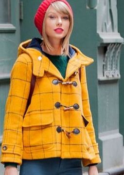
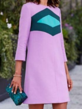
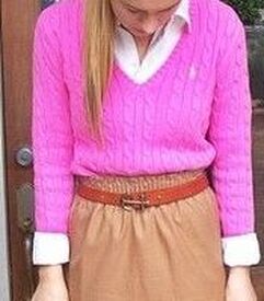
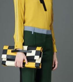
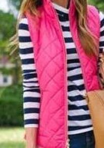
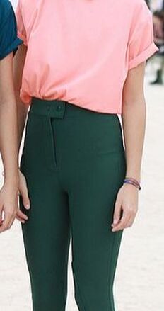
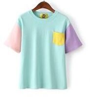
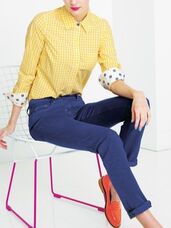
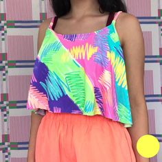
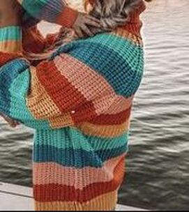
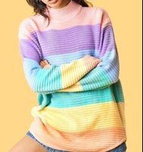
Over the last few weeks, I've talked about how to combine your color palette with your style type. Because, although every color in your palette is flattering to your skin, your style type will affect how you combine colors to look your most beautiful. If you're strongly Gamine, which colors in your palette should you focus on? Gamine's vibe is fun, playful, and high-energy. As a Gamine, aim to create unexpected combinations of your pallete's most vibrant colors. Colors that people would not normally expect to see together will look great on you. If your mom would have told you, "Those colors clash!", it's probably a Gamine color combination. Color-blocking reads as Gamine, as long as it it feels playful and fun. (If it feels aggressive and intimidating, it will read as Dramatic, not Gamine.) Your palette's version of primaries - - your reddest red, your yellowest yellow, and your bluest blue -- will also read as Gamine. This is true even if you're a season with a soft or muted palette; your "soft" yellows, reds, and blues look plenty vivid on your soft coloring! For example, Autumn "primaries" would read as Gamine on an Autumn woman, and pastel Summer "primaries" would read as Gamine on a Summer woman. Are you a Gamine or a Gamine blend? How have you combined your season with your style type? Please share in the comments! Not sure of your style type? Try the Style ID Calculator!
25 Comments
T.
12/3/2019 06:01:44 pm
Can’t wait for Ingenue Colors post!! I hope to see Ingenue examples featuring more saturated colors, like Warm Spring (or even Warm Autumn) colors. And HIGHER CONTRAST Ingenue color combinations at that! I’m a Spring and even I am overwhelmed at how many Light Spring colors and Light Spring colorschemes represent Ingenue. Warm toned ladies with medium-to-high contrast have no examples... let alone Deep Winter or Cool Winter Ingenues! Many of us Ingenues look our best in higher contrast or, at least, multicolored schemes- we just don’t look good in Gamine combinations/colorschemes! In our current culture, stylists seem to only think in Gamine when they want to combine colors but we Ingenues have some nice combos too! Across all 4 Color Seasons :) I would love to see examples of everyday Ingenue outfits styled in a MEDIUM TO HIGH contrast manner using Ingenue’s sweet feminine colors (rather than Gamine’s primary colors).
Reply
KC
12/6/2019 03:37:18 am
Rachel will doubtless have her own way of explaining Ingenue color schemes, but I've been wondering if taking cues from sweet desserts might inspire appropriate color combos for Ingenues in non-pastel palettes? For example, pairing a brown with a minty or appley green, like you'd find in a caramel apple, key lime pie, or mint chocolate. Or a neapolitan color scheme featuring your palette's brown, pink, and white shades (you could probably add or sub a light green for any of those three, too).
Reply
T.
12/6/2019 07:47:39 pm
Thanks, KC! I must admit, lime runs more of Gamine look, but caramel apple, neapolitan, and mint chocolate are a great ideas! Now you’ve really got me thinking- peaches & cream, hot cocoa & marshmallow, strawberry shortcake, maybe a dainty pale lemon chiffon pie :) Thanks again!
Another Rachel
12/3/2019 07:49:37 pm
Love this! I am a bright spring, and I’m sure I have some portion of gamine in my overall style ID... so this basically means I can go crazy with color! : D
Reply
Swi
12/5/2019 04:45:14 am
Rachel keeps repeating the same mistake. First theory about Dramatic being monochromatic, then trying to persuade us that breaking monochromatic colour scheme is Dramatic. What a mess and confusion.
Reply
Jonna Stone
12/5/2019 10:46:04 am
Each type manifests in more than one singular look. Imagine a black panther with an entirely black body. Now imagine a lion with starkly contrasting stripes. Both are identifiable as a dramatic looking animal, despite their different coats. If I’m reading this correctly, she suggests that Dramatics choose *either* an ensemble of entirely o e strong color *or* a look with sharp color&line contrast on a large scale. The difference with Gamine is that the contrast is small scale, more quirky and fun, less lethal and severe.
Reply
KC
12/6/2019 03:08:19 am
I think you meant tigers, not lions :).
Jonna Stone
12/5/2019 10:29:51 am
First of all, thank you for a Gamine post! Ingenue would be lovely too.
Reply
Miranda
12/5/2019 12:58:42 pm
I'm a Soft Summer REG. I've been doing mostly Romantic or Ethereal colors with strong color contrast for the Gamine element. I'm building a capsule wardrobe - basically from scratch, because I had very few clothes - where you pick two neutrals and three colors. My colors are teal, rose, and purple or violet. I wear teal and purple almost every day because I don't have much rose yet, but when I do, I'll either combine it with teal or violet to keep the color contrast strong.
Reply
T.
12/5/2019 05:36:13 pm
Hi Miranda! I completely understand wanting to express each of your essences through different manifestations of style (colors, color combining, structure, texture, shape, etc). That’s part of how we personalize our ID to make it OUR style (and keep ourselves from getting bored with our wardrobe :) At the moment, I can only think of Soft Autumn Deep Ashley Moore as REG. (Although I think she’s a Soft Autumn with spring influence rather than summer influences, so I’m not sure how helpful that is...) One really good tip I learned is to essentially work in reverse- find people who have similar coloring to your own and then find pick out the ones who share one, two, or all three of your essences! Rihanna is a Soft Summer Deep but she is RG (with some NI also). She’s really good at picking out her soft summery “jewel” tones and “brights”, while keeping a medium contrast to her overall look so she doesn’t get washed out or too overpowered. I recommend googling her or going through her Instagram. Because she’s a medium contrast soft summer, she looks her best when she adds her Soft Summer brights or contrasting Gamine color combinations in small doses (like lipstick, nails, shoes). Then she pairs it with her calmer colors for contrast (like summery white paired with Gamine pink or green). Here’s some examples of what I mean: tinyurl.com/s2p6eet , tinyurl.com/rkcm5gg , tinyurl.com/qr5ganb , tinyurl.com/sf485ec , tinyurl.com/suaj67z , tinyurl.com/ua9ruqz , and tinyurl.com/tta9ujo.
Reply
Miranda
12/5/2019 06:12:19 pm
Thank you, T! Those are great ideas. I love prints.
Melina
12/6/2019 04:15:42 am
"I don't know how one would do E lipstick aside from a shimmery finish" - sheer is very E, too! I don't like very shimmery finishes and pale lipstick is a big noooo for me too, but a sheer lippie (in your colour palette) often works, at least for me, and I do think it's the E in me. :)
T.
12/6/2019 05:49:56 pm
No prob! That’s funny you mention plum looking too Ingenue on you, b/c it was things like plum & apricot that made me begin to realize I was an Ingenue! I think women are particularly careful to match their makeup & hair to their ID, because it’s so close to our face. So I think makeup is great way for you to experiment & find your favorite colors/brights (which you can also translate into your wardrobe)! As for makeup, I think you may like to explore Girlactik Makeup, Unicorn Cosmetics, Urban Decay, and Pat McGrath. Dior recently released their “stellar shine” collection which has alot of REG type items. Colourpop has some Ethereal items and palettes too (look for their products with names like “Venus”,“pixie”, “Sprite”, “Taurus”, “third eye”, etc). Best wishes on your style ID journey!
Reply
Miranda
12/8/2019 08:28:26 pm
Melina, sheer finishes are a good idea!
Swi
12/5/2019 01:51:27 pm
Jonna Stone, thank you for your opinion, but it's difficult to agree with theory that on one hand monochromatic is recommended for D and on the other hand color combo is also recommended - that's contradicion. Panther is Dramatic in my opinion, lion is DN or only N and I can't imagine him with stripes,especially two color combo stripes. I was discussing about color combos that are not good for D and D blends. The two color combo ensemble is more DC (large scale) or DG (small scale). Not for pure Dramatic or D blended with other styles than C or G. Recomending D, DNG, ED, EDN, DNI color combos are big mistake. What do you think?
Reply
Jonna Stone
12/6/2019 10:09:41 am
As someone pointed out after my comment, I think I mixed up lions and tigers😂
Reply
Agnes
12/6/2019 02:26:29 pm
Greta is definitely Gamine!
Reply
Swi
12/7/2019 04:20:21 am
Jonna Stone, so in conclusion - theory that Dramatic is monochromatic and not monochromatic is misleading. This is what I've pointed out. Dramatic is monochromatic. As I said before,the pic of green-yellow & blue color combo should be recommended for DC, DG, saying it's for D is misleading.
Reply
Swi
12/7/2019 06:21:20 am
Miranda, I wonder which one would you choose from Dior stellar shine, '536 Lucky' looks like RI, '554 Diorsolar' might be ERI, '759 Diorlight-mirror red' and 'sparkle fuchsia 863D' looks like REG.
Reply
Miranda
12/8/2019 08:26:45 pm
Ooooo I'd love that sparkle fuchsia if it was muted - but I also really love that sparkle purple!
Reply
T.
12/8/2019 11:49:31 pm
Hello, Swi.! I’m no pro at this (and your natural coloring will help determine which colors particularly read as ED on you), but from the collection I think the most ED colors are: 514 imagination, 869 superstitious, 639 riviera star, & 612 sideral. It might be worth looking at 595 Dior stellaire, 891 diorcelestial, & 753 positivity as well. Definitely worth a trip to your local makeup counter to try ‘em on!
Reply
Gitte
12/7/2019 06:30:20 am
I am (I think) CGI, and a bright winter. Aka, I should wear neon colours, pretty much - with dustings of saturated neutrals like white, black and navy.
Reply
Marissa
12/7/2019 04:20:44 pm
I like this series about using color schemes to your color identity's advantage. Will you be doing all of the style identities. I'm an REI by the way :)
Reply
3/12/2020 09:36:01 am
Sparkle purple for me. It's very simple and stunning!!
Reply
7/21/2020 06:36:31 am
Since a gamine style is so playful and high energy. I suggest the combination of colors (yes I did not stutter, not just one but a combination of colors) would be vibrant and would easily match one another, like a separate palette of primary, secondary and tertiary colors.
Reply
Leave a Reply. |
About Me...I'm passionate about helping people become their most authentic and beautiful selves. Categories
All
|
- home
- Blog
-
-
- Book your virtual style analysis
- ♂ DRAMATIC style type
- ♂ NATURAL style type
- ♂ GAMINE style type
- ⚥ CLASSIC style type
- ♀ INGENUE style type
- ♀ ROMANTIC style type
- ♀ ETHEREAL style type
-
- ⚥ ♂ Classic Gamine -- The Prep Schooler
- ⚥ ♀ Classic Ingenue -- The Class President
- ⚥ ♂ Dramatic Classic -- The Art Critic
- ♂ ♂ Dramatic Gamine -- The Punk Rocker
- ♀ ♂ Dramatic Ingenue -- The Childlike Czarina
- ♂ ♂ Dramatic Natural -- The Amazon Queen
- ⚥ ♀ Ethereal Classic -- The Delicate Sophisticate
- ♀ ♂ Ethereal Dramatic -- The Sorceress
- ♀ ♂ Ethereal Gamine -- The Sprite
- ♀ ♀ Ethereal Ingenue -- The Fairy
- ♀ ♂ Ethereal Natural -- The Earth Goddess
- ♀ ♂ Gamine Ingenue -- The Girlish Mod
- ⚥ ♂ Natural Classic -- The Prep
- ♂ ♂ Natural Gamine -- The Tomboy
- ♀ ♂ Natural Ingenue -- The Outdoorsy Sweetheart
- ⚥ ♀ Romantic Classic -- The Sexy Sophisticate
- ♀ ♂ Romantic Dramatic -- The Vamp
- ♀ ♀ Romantic Ethereal -- Aphrodite
- ♀ ♂ Romantic Gamine -- The Firecracker
- ♀ ♀ Romantic Ingenue -- The Demure Seductress
- ♀ ♂ Romantic Natural -- The Babe Next Door
-
- ⚥ ♀ ♂ Classic-Gamine-Ingenue
- ⚥ ♂ ♂ Dramatic-Classic-Gamine
- ⚥ ♀ ♂ Dramatic-Classic-Ingenue
- ♂ ♂ ♀ Dramatic-Gamine-Ingenue
- ⚥ ♂ ♂ Dramatic-Natural-Classic
- ♂ ♂ ♂ Dramatic-Natural-Gamine
- ♂ ♂ ♀ Dramatic-Natural-Ingenue
- ⚥ ♀ ♂ Ethereal-Classic-Gamine
- ⚥ ♀ ♀ Ethereal-Classic-Ingenue
- ⚥ ♀ ♂ Ethereal-Dramatic-Classic
- ♂ ♂ ♀ Ethereal-Dramatic-Gamine
- ♀ ♂ ♂ Ethereal-Dramatic-Natural
- ♀ ♀ ♂ Ethereal-Dramatic-Ingenue
- ♀ ♀ ♂ Ethereal-Gamine-Ingenue
- ⚥ ♀ ♂ Ethereal-Natural-Classic
- ♂ ♂ ♀ Ethereal-Natural-Gamine
- ♀ ♀ ♂ Ethereal-Natural-Ingenue
- ⚥ ♂ ♂ Natural-Classic-Gamine
- ⚥ ♀ ♂ Natural-Classic-Ingenue
- ♂ ♂ ♀ Natural-Gamine-Ingenue
- ⚥ ♀ ♂ Romantic-Classic-Gamine
- ⚥ ♀ ♀ Romantic-Classic-Ingenue
- ⚥ ♀ ♂ Romantic-Dramatic-Classic
- ♂ ♂ ♀ Romantic-Dramatic-Gamine
- ♀ ♀ ♂ Romantic-Dramatic-Ingenue
- ♂ ♂ ♀ Romantic-Dramatic-Natural
- ⚥ ♀ ♀ Romantic-Ethereal-Classic
- ♀ ♀ ♂ Romantic-Ethereal-Dramatic
- ♀ ♀ ♂ Romantic-Ethereal-Gamine
- ♀ ♀ ♀ Romantic-Ethereal-Ingenue
- ♀ ♀ ♂ Romantic-Ethereal-Natural
- ♀ ♀ ♂ Romantic-Gamine-Ingenue
- ⚥ ♀ ♂ Romantic-Natural-Classic
- ♂ ♂ ♀ Romantic-Natural-Gamine
- ♀ ♀ ♂ Romantic-Natural-Ingenue
- Shop
- Book a Virtual Style Analysis!
- Contact me
Connect with me!




 RSS Feed