|
Because I have two young children and a job, I have very little time to watch TV. But my husband has gotten me into watching 30 Rock on Netflix. I catch it a couple of times a week, after the kids are asleep. I have mixed feelings about the show (very good points made here and here), but I enjoy trying to figure out these characters' seasons and noticing whether, and when, the characters are in their best colors. Kenneth is obviously a Spring. His beloved NBC page jacket is totally not his color - too cool, too faded, too dark - but here's a shot of him with a great Springy purple on underneath it.  Isolate the two colors and the purple's far superior. Fresh skin that's golden, not shadowed and haggard.  In my very first blog post, I observed that TV costumers use correct color to show characters as good/strong/dignified and incorrect color to show characters as evil/weak/silly. Perhaps the page jacket is that awful-for Kennth navy because that's actually what NBC pages wear? Kenneth is a sympathetic character who's often presented as the moral center of the show. So it makes sense that his customary rainbow-colored tie features many great Spring colors. It brings some life and health to his face.  Wild how that pink is the same color as his lips, right? Personal color analysis is magical that way. This was a tough one for me, but I'm going to go with True Spring over Light Spring for Kenneth. In this post, I identify some of the factors that distinguish Light Spring from True Spring. In Kenneth's (or rather, actor Jack McBrayer's) case, I notice that pale, delicate colors can seem a bit underwhelming on him, while stronger, deeper shades seem more balanced.  I find this light green not enough for him. His skin is more intensely colored than this shirt. (True Springs can seem to have "high color" that's tamed by their proper palette.) Next to this very light color, the skin looks much darker, but in an unnaturally uniform way that's unflattering - almost as if he's made of clay.  This much deeper, saturated blue is more balancing to him. The skin looks lighter and brighter but in an alive way, not in a washed-out way. We see some natural variation in the skin tone that signifies health. True Spring's colors are the closest of any season to the Crayola 8-pack. They are the stereotypical rainbow. Perhaps the NBC bikini Kenneth knitted is better for him than for his Nana. 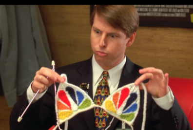
1 Comment
Amy
6/28/2013 07:56:09 pm
Hi! Long time lurker, first time commenter here. I've been debating whether I might be a True Spring or a Light Spring. Light Spring was winning—that light khaki olive and that greenish gold mentioned for LSp are both colors that are present in my eyes and work for me as neutrals (im subjective o, of course; I could be wrong). But on the other hand, Jack McBrayer's coloring is VERY similar to mine and he's the only celeb I've seen that has my natural hair color (which, btw, anyone out there, what would one call that? I'm tired of describing my hair as "hair-colored" :p) Hmm! Leave a Reply. |


About Me...I'm passionate about helping people become their most authentic and beautiful selves. 
Categories
All
|
- home
- Blog
-
-
- Book your virtual style analysis
- ♂ DRAMATIC style type
- ♂ NATURAL style type
- ♂ GAMINE style type
- ⚥ CLASSIC style type
- ♀ INGENUE style type
- ♀ ROMANTIC style type
- ♀ ETHEREAL style type
-
- ⚥ ♂ Classic Gamine -- The Prep Schooler
- ⚥ ♀ Classic Ingenue -- The Class President
- ⚥ ♂ Dramatic Classic -- The Art Critic
- ♂ ♂ Dramatic Gamine -- The Punk Rocker
- ♀ ♂ Dramatic Ingenue -- The Childlike Czarina
- ♂ ♂ Dramatic Natural -- The Amazon Queen
- ⚥ ♀ Ethereal Classic -- The Delicate Sophisticate
- ♀ ♂ Ethereal Dramatic -- The Sorceress
- ♀ ♂ Ethereal Gamine -- The Sprite
- ♀ ♀ Ethereal Ingenue -- The Fairy
- ♀ ♂ Ethereal Natural -- The Earth Goddess
- ♀ ♂ Gamine Ingenue -- The Girlish Mod
- ⚥ ♂ Natural Classic -- The Prep
- ♂ ♂ Natural Gamine -- The Tomboy
- ♀ ♂ Natural Ingenue -- The Outdoorsy Sweetheart
- ⚥ ♀ Romantic Classic -- The Sexy Sophisticate
- ♀ ♂ Romantic Dramatic -- The Vamp
- ♀ ♀ Romantic Ethereal -- Aphrodite
- ♀ ♂ Romantic Gamine -- The Firecracker
- ♀ ♀ Romantic Ingenue -- The Demure Seductress
- ♀ ♂ Romantic Natural -- The Babe Next Door
-
- ⚥ ♀ ♂ Classic-Gamine-Ingenue
- ⚥ ♂ ♂ Dramatic-Classic-Gamine
- ⚥ ♀ ♂ Dramatic-Classic-Ingenue
- ♂ ♂ ♀ Dramatic-Gamine-Ingenue
- ⚥ ♂ ♂ Dramatic-Natural-Classic
- ♂ ♂ ♂ Dramatic-Natural-Gamine
- ♂ ♂ ♀ Dramatic-Natural-Ingenue
- ⚥ ♀ ♂ Ethereal-Classic-Gamine
- ⚥ ♀ ♀ Ethereal-Classic-Ingenue
- ⚥ ♀ ♂ Ethereal-Dramatic-Classic
- ♂ ♂ ♀ Ethereal-Dramatic-Gamine
- ♀ ♂ ♂ Ethereal-Dramatic-Natural
- ♀ ♀ ♂ Ethereal-Dramatic-Ingenue
- ♀ ♀ ♂ Ethereal-Gamine-Ingenue
- ⚥ ♀ ♂ Ethereal-Natural-Classic
- ♂ ♂ ♀ Ethereal-Natural-Gamine
- ♀ ♀ ♂ Ethereal-Natural-Ingenue
- ⚥ ♂ ♂ Natural-Classic-Gamine
- ⚥ ♀ ♂ Natural-Classic-Ingenue
- ♂ ♂ ♀ Natural-Gamine-Ingenue
- ⚥ ♀ ♂ Romantic-Classic-Gamine
- ⚥ ♀ ♀ Romantic-Classic-Ingenue
- ⚥ ♀ ♂ Romantic-Dramatic-Classic
- ♂ ♂ ♀ Romantic-Dramatic-Gamine
- ♀ ♀ ♂ Romantic-Dramatic-Ingenue
- ♂ ♂ ♀ Romantic-Dramatic-Natural
- ⚥ ♀ ♀ Romantic-Ethereal-Classic
- ♀ ♀ ♂ Romantic-Ethereal-Dramatic
- ♀ ♀ ♂ Romantic-Ethereal-Gamine
- ♀ ♀ ♀ Romantic-Ethereal-Ingenue
- ♀ ♀ ♂ Romantic-Ethereal-Natural
- ♀ ♀ ♂ Romantic-Gamine-Ingenue
- ⚥ ♀ ♂ Romantic-Natural-Classic
- ♂ ♂ ♀ Romantic-Natural-Gamine
- ♀ ♀ ♂ Romantic-Natural-Ingenue
- Shop
- Book a Virtual Style Analysis!
- Contact me
Connect with me!
 RSS Feed