|
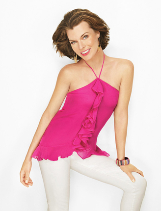
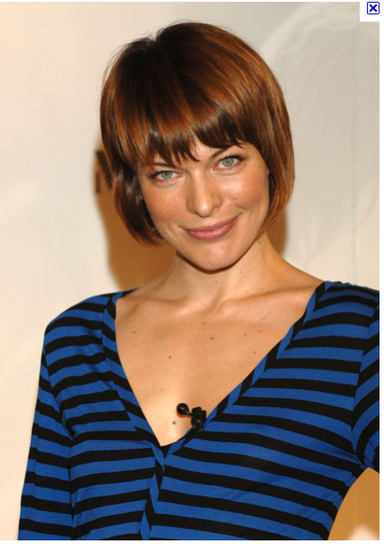
The question was raised recently on 12 Blueprints' Facebook page whether Milla Jovovich is a Bright Spring. I think she is, but others believe she's a Summer. She's certainly not easy to type. Here are some pics I've gathered that I believe suggest Bright Spring; I'd love to hear what you readers see in these pics. Here's the picture I saw in Lucky magazine that made me first suspect Bright Spring for Milla. What I noticed in this pic, which I think is a flattering and harmonious look for her: warm highlights in the hair; bright gold jewelry near her face; pure hues; high color contrast; and a pink that looks to be a match for one in the Bright Spring book. 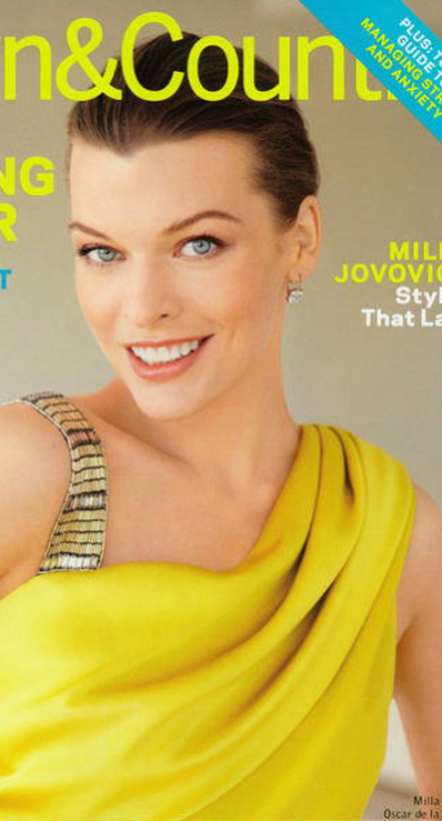 I find this look flattering as well. I think she's pulling off the super-bright, slightly warm yellow, and I think the warm makeup looks natural on her. (That lip may be a teensy bit off, but it's pretty good.) 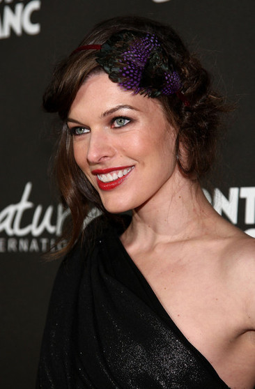 I don't love the purple hair-thingy. Nor do I love the black eyeliner. But I do notice here that the black in the dress doesn't seem to be overwhelming her - I think she's balancing it. I also think she's balancing the very intense warmish-red lip. So I think her season is one that can take a lot of color. 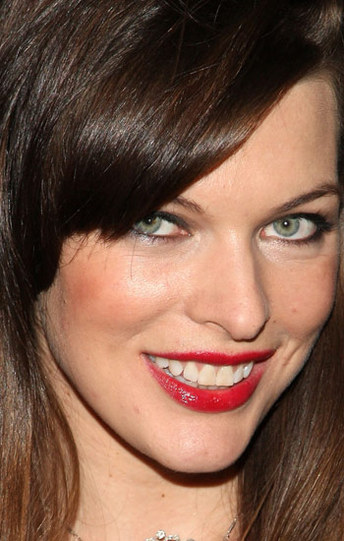 To my eye, this makeup looks right. It also looks warm and saturated (a.k.a. Springy). This close up, it does seem a little heavy, but I suspect that's for the cameras. The colors themselves look spot-on to me. Here, I almost think she could pull off this outrageous shirt, if she had a stronger lip. Even then the shirt colors might be too cool. But I do notice that the crazily saturated stripes aren't totally owning her. I still find myself looking at her eyes. Imagine this top, by comparison, on Soft Summer Miley Cyrus, or True Summer Kimberly Williams, or Light Spring Taylor Swift, or Warm Spring Cameron Diaz. Could any of them handle this? 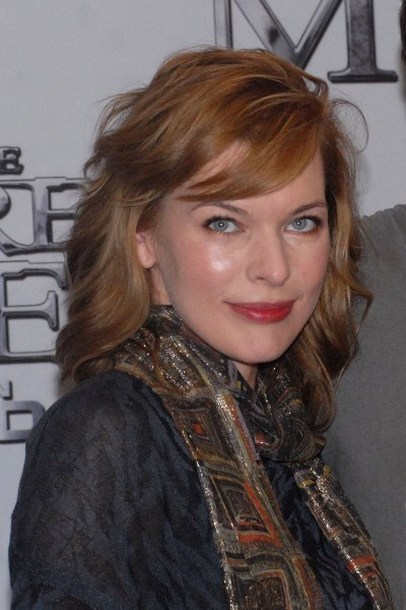 Here, what strikes me is that the hair's too light and she's dominating the shirt and scarf. The matchy-matchiness of eyes + shirt and hair + scarf may fool your gut into thinking something right is happening... but doesn't the skin of her face seem to be calling for much more intensity than it's surrounded with? There are many, many pics of Milla looking less than her best on the 'net. I won't post them here - you'll see them if you try to find good ones of her. But now, your turn: what do you see in these pics? Something different than what I see? Do you have links to pics that seem to suggest another season? As ever, I'm interested in truth - not in being right. So please, argue away.
27 Comments
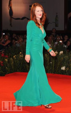
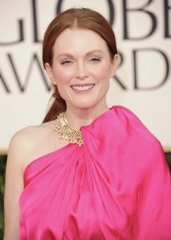
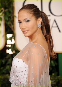
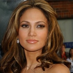
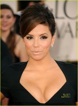
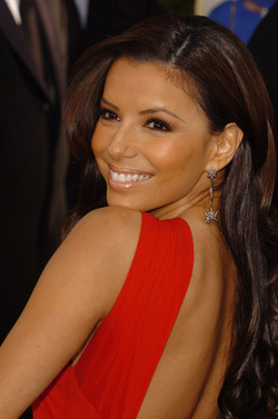
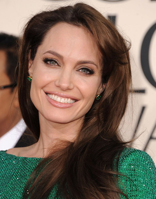
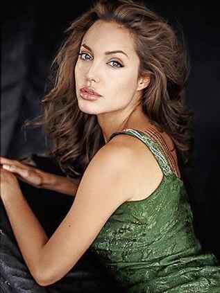
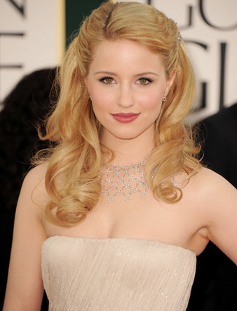
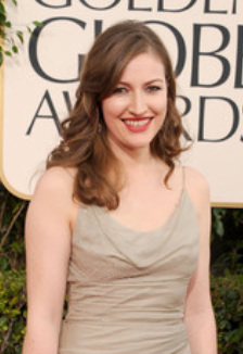
At the 2011 Golden Globes, Autumn celebrities did not miss the color mark as widely as their Winter colleagues (see my earlier post below) - but the hits were few and far between. Here, some of the evening's biggest Autumn let-downs, along with a few pleasant surprises. Julianne Moore I adore Julianne Moore, as an actress and as a great beauty. She's an interesting Autumn; her coloring's warm, deep, vivid and delicate at the same time. When she gets it right - which is often - she's startlingly lovely: So it was sad to see her get it so very, very wrong at the GGs. All her redheaded loveliness wiped out by this totally wrong color: Now, Julianne can take a fair bit of brightness, though perhaps not this much. The biggest problem is with the hue itself. There's nothing in her skin, eyes or hair that this color calls to. We see Julianne and her natural colors up top, and we see the color of the dress below, and never the twain shall meet. It's Julianne vs. the dress, and the dress wins. Just sad. Another example of an Autumn existing on a different plane than her garment was Jennifer Lopez. There's glorious, golden Jennifer. Then there's this icy white ensemble. Nothing connects them. JLo is lost. Surely you've seen how gloriously golden this Autumn girl can look! - - even with those darn icy earrings. I'd include a pic of her in a beautiful Autumny gown, but they're very hard to find. JLo seems irresistibly drawn to cool, pale looks that are disconnected from her natural beauty. Maybe she wants to look interesting rather than beautiful... who knows? I personally think beautiful is interesting. Eva Longoria was a let-down. And not because Deep Autumns can't wear black. After all, the hair often has black tones. But Deep Autumns need contrast, and they certainly need some warmth. This look provides neither. On a person with black already in the hair and eyes, the black gown doesn't create much contrast. And once again, the irrepressible warmth of this Autumn's skin (even the black dress reduces but doesn't eliminate it) seems totally detached from her dress. It's as if they're from different photos. Here's Eva looking more like herself in a dramatic, warm and powerful color: The bright, warm red contrasts strongly with Eva's natural colors while calling out to them at the same time. The gown emanates from her. (But is the blush a bit too orange? Methinks so...) Of course I couldn't spare Angelina, having devoted an entire blog post to convincing everyone that she's a Soft Autumn. Now, to see what I'm seeing in this pic, you have to remind yourself that Angelina is incredibly, amazingly beautiful, and will never, ever look truly bad in anything. Ever. So when you see her here and think "She looks pretty good!" - well, of course she does. But I don't think it's her best. Always, I'm looking for balance: balance of saturation, balance of value, balance of temperature. In other words, I'm asking "Are Angelina and the gown the same brightness? The same lightness? The same warmth?" In this case, I feel strongly that the gown's much brighter than she is. A Soft should be able to glow with subtle luminosity in the correct soft color. Here, we notice the shine of the dress much more than we notice any shine from Angie. For a green that balances her instead of outshining her, how about this? An older photo, and a different setting, but still. The dress is more matte than shiny, and the color's much more muted (not to mention more warm), and I'm looking at Angelina's face. That's the real test. On a very, very happy note, I was delighted to see this on the GG red carpet: Dianna Agron Talk about balance! Everything is equally soft, warm and medium-light. I'm usually loathe to praise any look that includes very unnatural hair color, but Dianna Agron is just gorgeous here. (The natural hair would have been even more glorious, imho, but moving on...) Note that Warm and Deep Autumns won't be flattered by this kind of monochromatic look. On a Soft Autumn, though, it can be heavenly. And for one more Soft Autumn who got it right, check out Kelly MacDonald. Again, balance. Gown and makeup are soft, warmish and medium-light, as she is. I'm loving the natural hair color, of course.
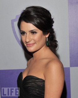
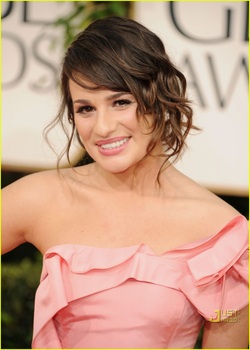
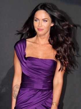
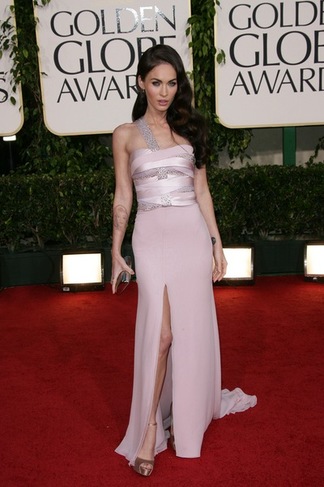
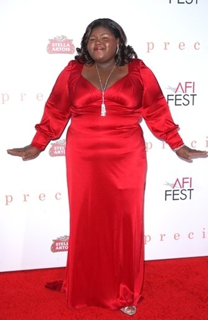
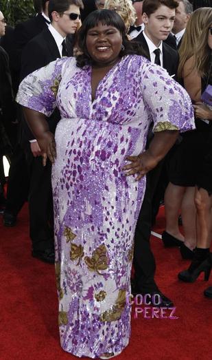
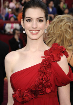
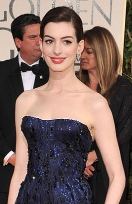
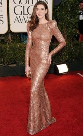
I couldn't find good examples of Warm and Deep Autumns who nailed it, sorry to say. But that could just be my natural Soft Autumn bias noticing my SA ladies more. If you spotted some great WAs and DAs at the GGs, please share them with me. If I agree, I'll put them up. Color-wise, Winter celebs at the 2011 Golden Globes weren't winners. Most of the beautiful Wintry women I saw failed to embrace the full drama and elegance that is their season's gift, and ended up looking bo-ring. Consider Lea Michele. Here she is, at last year's Golden Globes, in colors that bring her to life. And here she is this year, in wimpy pink that drains her spirit. The intensity in the eyes hints at what she's capable of, but everything else looks lifeless. The next big disappointment is the usually stunning Megan Fox. Here she is embracing her Winter colors in 2009: ...but at this year's GGs, she was barely recognizable. What the heck? Woman, why would you do this to yourself? You're entitled to the colors everyone else wants, and you steal from Summer? Like Lea, Megan has disappeared here. Next is Gabourey Sidibe. She may not be a size 4, but in her best colors she radiates undeniable charisma and power. So who convinced her that this wishy-washy palette flattered her? I'm not sure that dress would suit any season. Finally, Anne Hathaway - a woman who embodies a kind of delicate, exquisite beauty only found in Winter. At her best, she's almost unearthly: And here - incredible: So what was she thinking on the 2011 GG red carpet? Many fashionistas praised the gown, but notice how Anne's rare beauty is completely absent: Now, instead of looking like a moon goddess gracing mere mortals with her presence, she's just another pretty actress. Sure, the gown is elegant. But it belongs on Angelina.
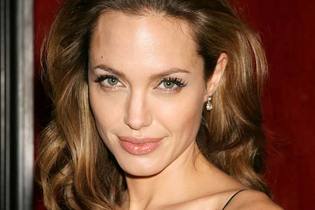
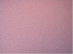
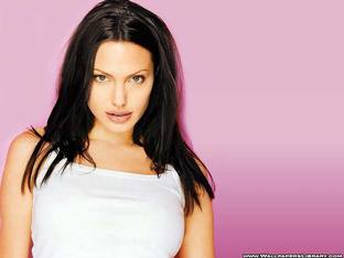
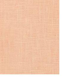
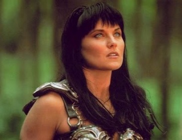
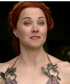
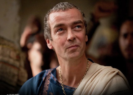
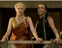
For me, the lesson is this: even women with more money than most of us will ever see, and access to the best stylists and the best clothes, may still lack either the information or the self-awareness needed to know what their own authentic beauty looks like. Next: Autumnal Errors. It makes sense that the woman many consider the most beautiful in the world would have the most hotly debated season. She's most frequently typed as a Summer or Autumn. The majority of observers, including the knowledgeable Lora Alexander, believe she's a Soft Summer. This website shows Jolie's picture under the heading "Notable Soft Autumns." Another site also includes Jolie under Autumns, with the subtype unspecified. Most people agree that Jolie is Soft, not Bright - hence the general consensus around Summer and Autumn. I also think that's true. I've been thinking about this for a long time, and I've come to a conclusion: I think Jolie is a Soft Autumn. (Yes, I am a Soft Autumn too. But I'm pretty sure that has nothing to do with my conclusion.) Lora Alexander's recent blog post made my mind up. In it, she identifies colors unique to Soft Summer and Soft Autumn. She calls Soft Summer's defining color "antique rose," a sort of dusty purplish-pink. It looks something like this: Alexander describes Soft Autumn's defining color as "somewhere between soft peach to topaz to honey," and her examples look like this color: Imagine Jolie in each of these colors, and it's obvious that the second one flatters her much more than the first. It's very difficult to find pictures of Jolie in that dusty purplish-pink. But I tracked down a few. Here, Jolie's appearance is somewhat unnatural. The photo looks overexposed. I suspect this was done deliberately to obscure the effects of the cool color on her skin. 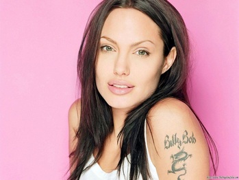 Same photo shoot? Again, the effect is not natural. Her skin is shown unusually bright and pale. 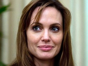 Here's a well-lit picture. The lip is antique rose-ish, and it seems to to emphasize pale and unhealthy-seeming colors in her face. 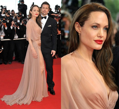 By contrast, Jolie's skin looks alive in this dusty peach. Yes, the lipstick is silly, but cover it with your finger and see how completely right the dress is for this coloring. 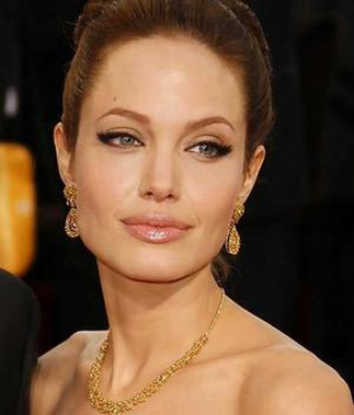 And in this well-lit pic, her very skin seems to match the dusty peach-topaz-honey color. Google images of Jolie, and notice how beautiful she looks in greens, browns and warm greys that are typical of Soft Autumn. Also notice how seldom she appears in Soft Summer's purples, pinks, or blues, and how pale these colors make her appear. So I'll say it again: Angelina Jolie is a Soft Autumn. Do you agree? I don't know whether many film & t.v. costume designers have studied personal color analysis. But they apply the principles when they make costuming decisions for characters. Characters are presented in their proper colors to make them seem strong, sincere, or likable. Characters are shown in the wrong colors to make them appear weak, uncertain, uncomfortable, or phony. One of my guilty pleasures of the last year was Spartacus: Blood and Sand on Starz. Lucy Lawless's character, the crafty Lucretia, was almost always shown in completely wrong colors to emphasize her phoniness. Here's Lucy Lawless in good colors (as virtuous Xena, Warrior Princess): ...and Lawless as the scheming, unhappy Lucretia in Spartacus: If you've watched Spartacus (and I really think you should!), you may be thinking "But her husband, Batiatus, is just as wicked, and he looks pretty good." I agree. This is a actually a great example of a costume designer using personal color as a characterization tool to brilliant effect. Yes, Lucretia and Batiatus are both (mostly) wicked. Yes, they both plot and scheme. Yes, they're both insincere. The difference, and the reason Batiatus appears in his correct colors, is that he is sincerely insincere. He is a fearless, plotting, power-hungry schemer inside and out, and he revels in it. No weakness, no self-doubt. He's totally centered in himself. Lucretia, though, worries. She frets. She's not happy. She wants something more... it's not clear what. (A clue: just about the only time she looks halfway real is in a scene at the end of the season, when she's lying in bed, having just discovered she's pregnant. Hair's still wrong, but the ivory robe, soft light & natural makeup create a less artificial effect:) So in addition to the contrast between these crafty characters and the virtuous characters in the series, the narrative is enhanced by dramatic contrast between husband and wife. Batiatus is strong, centered and authentic; Lucretia is scattered and false. Their colors communicate this to us, probably without us realizing it. The characters, and the overall narrative, are made more complex and effective by a costume designer's understanding of personal color.
|
About Me...I'm passionate about helping people become their most authentic and beautiful selves. Categories
All
|
- home
- Blog
-
-
- Book your virtual style analysis
- ♂ DRAMATIC style type
- ♂ NATURAL style type
- ♂ GAMINE style type
- ⚥ CLASSIC style type
- ♀ INGENUE style type
- ♀ ROMANTIC style type
- ♀ ETHEREAL style type
-
- ⚥ ♂ Classic Gamine -- The Prep Schooler
- ⚥ ♀ Classic Ingenue -- The Class President
- ⚥ ♂ Dramatic Classic -- The Art Critic
- ♂ ♂ Dramatic Gamine -- The Punk Rocker
- ♀ ♂ Dramatic Ingenue -- The Childlike Czarina
- ♂ ♂ Dramatic Natural -- The Amazon Queen
- ⚥ ♀ Ethereal Classic -- The Delicate Sophisticate
- ♀ ♂ Ethereal Dramatic -- The Sorceress
- ♀ ♂ Ethereal Gamine -- The Sprite
- ♀ ♀ Ethereal Ingenue -- The Fairy
- ♀ ♂ Ethereal Natural -- The Earth Goddess
- ♀ ♂ Gamine Ingenue -- The Girlish Mod
- ⚥ ♂ Natural Classic -- The Prep
- ♂ ♂ Natural Gamine -- The Tomboy
- ♀ ♂ Natural Ingenue -- The Outdoorsy Sweetheart
- ⚥ ♀ Romantic Classic -- The Sexy Sophisticate
- ♀ ♂ Romantic Dramatic -- The Vamp
- ♀ ♀ Romantic Ethereal -- Aphrodite
- ♀ ♂ Romantic Gamine -- The Firecracker
- ♀ ♀ Romantic Ingenue -- The Demure Seductress
- ♀ ♂ Romantic Natural -- The Babe Next Door
-
- ⚥ ♀ ♂ Classic-Gamine-Ingenue
- ⚥ ♂ ♂ Dramatic-Classic-Gamine
- ⚥ ♀ ♂ Dramatic-Classic-Ingenue
- ♂ ♂ ♀ Dramatic-Gamine-Ingenue
- ⚥ ♂ ♂ Dramatic-Natural-Classic
- ♂ ♂ ♂ Dramatic-Natural-Gamine
- ♂ ♂ ♀ Dramatic-Natural-Ingenue
- ⚥ ♀ ♂ Ethereal-Classic-Gamine
- ⚥ ♀ ♀ Ethereal-Classic-Ingenue
- ⚥ ♀ ♂ Ethereal-Dramatic-Classic
- ♂ ♂ ♀ Ethereal-Dramatic-Gamine
- ♀ ♂ ♂ Ethereal-Dramatic-Natural
- ♀ ♀ ♂ Ethereal-Dramatic-Ingenue
- ♀ ♀ ♂ Ethereal-Gamine-Ingenue
- ⚥ ♀ ♂ Ethereal-Natural-Classic
- ♂ ♂ ♀ Ethereal-Natural-Gamine
- ♀ ♀ ♂ Ethereal-Natural-Ingenue
- ⚥ ♂ ♂ Natural-Classic-Gamine
- ⚥ ♀ ♂ Natural-Classic-Ingenue
- ♂ ♂ ♀ Natural-Gamine-Ingenue
- ⚥ ♀ ♂ Romantic-Classic-Gamine
- ⚥ ♀ ♀ Romantic-Classic-Ingenue
- ⚥ ♀ ♂ Romantic-Dramatic-Classic
- ♂ ♂ ♀ Romantic-Dramatic-Gamine
- ♀ ♀ ♂ Romantic-Dramatic-Ingenue
- ♂ ♂ ♀ Romantic-Dramatic-Natural
- ⚥ ♀ ♀ Romantic-Ethereal-Classic
- ♀ ♀ ♂ Romantic-Ethereal-Dramatic
- ♀ ♀ ♂ Romantic-Ethereal-Gamine
- ♀ ♀ ♀ Romantic-Ethereal-Ingenue
- ♀ ♀ ♂ Romantic-Ethereal-Natural
- ♀ ♀ ♂ Romantic-Gamine-Ingenue
- ⚥ ♀ ♂ Romantic-Natural-Classic
- ♂ ♂ ♀ Romantic-Natural-Gamine
- ♀ ♀ ♂ Romantic-Natural-Ingenue
- Shop
- Book a Virtual Style Analysis!
- Contact me
Connect with me!




 RSS Feed