|
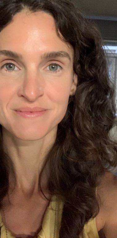
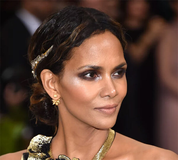
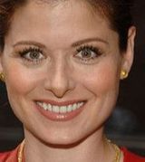
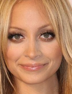
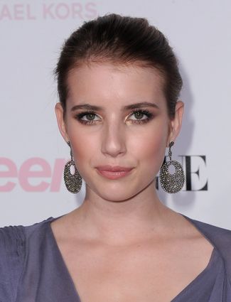
Last week I talked about the fact that, though all of your palette colors are gorgeous on you somewhere, they don't all look natural on your lips. Now I want to describe a good way to figure out which of your palette colors are best on your lips. In a nutshell, the colors that will look most natural on your lips are - your MLBB, - darker versions of your MLBB, and - a handful of colors very close in hue and value to these Your MLBB is your "my lip but better" lip color. You may already have a lippy in your stash that you know is your MLBB. If you don't, stand in front of a mirror with your palette and locate the peach, pink, red, or violet that is precisely as dark as your lip and the closest to it in warmth or coolness. (Your natural lip color will be less saturated than any of these palettte colors; you're basically finding the more saturated version of your natural lip.) A lippy that's an MLBB will always look natural on you. Additionally, colors that are the same hue as your MLBB but darker will also look natural on you. Going very dark within your MLBB hue might be your evening lip, but it won't look unnatural. In general, avoid opaque colors that are lighter than than your MLBB. This usually looks unnaatural. The other colors that will look most natural on your lips will be the colors closest in hue to your MLBB, and as dark or darker. So if you're a Bright Spring whose MLBB is on your fuchsia strip, you may indeed be able to wear one of Bright Spring's violets as a lippy; the violets are close in hue to the fuchsias. You will find less luck with one of BSp's orange lippies, because orange is pretty far from fuchsia. My MLBB is a neutral Soft Autumn pink that's medium-dark. I'll wear other pinks and reds that are very close to this color in hue, but I won't go all the way to a Soft Autumn brown -- even though those lippies exist. Also, I'll go darker than my MLBB, but not lighter. A lippie lighter in than your natural lip rarely looks natural. 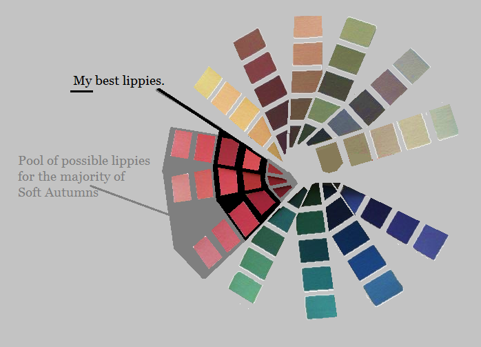
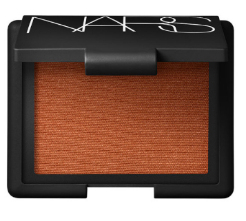
Tarte Quench Lip Rescue in Nude is an MLBB for me. It's easy to throw on when I want some moisture but I don't feel like bothering too much with makeup. CoverGirl Outlast in Wine to Five is a slightly darker version of my MLBB. It's been my staple daytime lippy for about five years; I order it in bulk on eBay or Amazon. My sexy lippy these days is Tarte Tarteist in Bling, which is a very deep version of my MLBB. It's a Soft Autumn red lip -- which means it's striking on me, and would be rather blah on most other seasons. :-) Though they vary quite a bit in value, all three of these lippies are similar in hue. 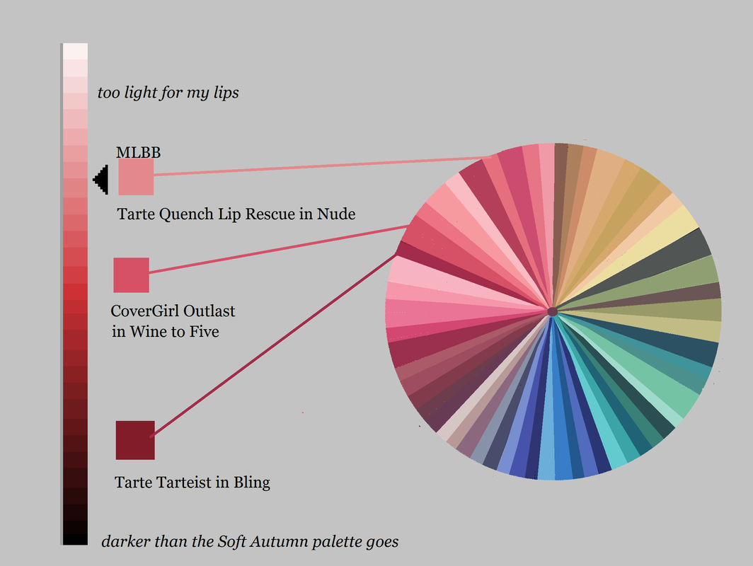 If I feel like it, I''ll go somewhat warmer or somewhat cooler within my palette. But I won't stray super-far from this central MLBB hue, and I won't go lighter in value, unless it's a gloss.
And this is what I recommend you do as well: Find the hue that looks most natural on your lips, and choose lippies that stay relatively close to that hue. For example, if your MLBB is an orange, experiment with your reds -- but don't stray all the way to a violet, unless you want to make a statement. :-) And if your MLBB is a violet, experiment with your reds and purples -- but don't stray all the way to orange. When you know your MLBB, use your seasonal makeup list and a computer to find the lippies from the list that will look the most natural on your face. (Computer images aren't completely color-accurate, but you don't need them to be if you have the seasonal makeup list; if it's on the list, it's a color from your season.) Just check the computer image to make sure the hue and value of the lippy seem right for your lips. Then buy it! This post was originally published in March of 2017.
22 Comments
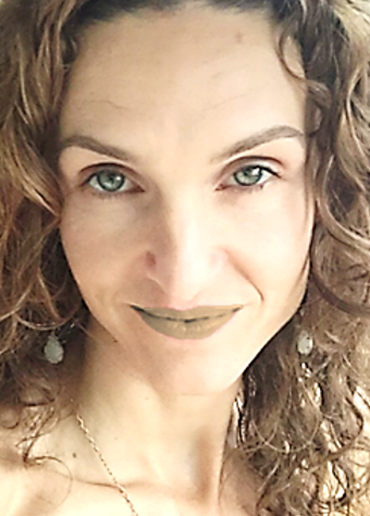
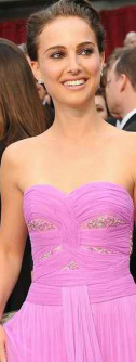
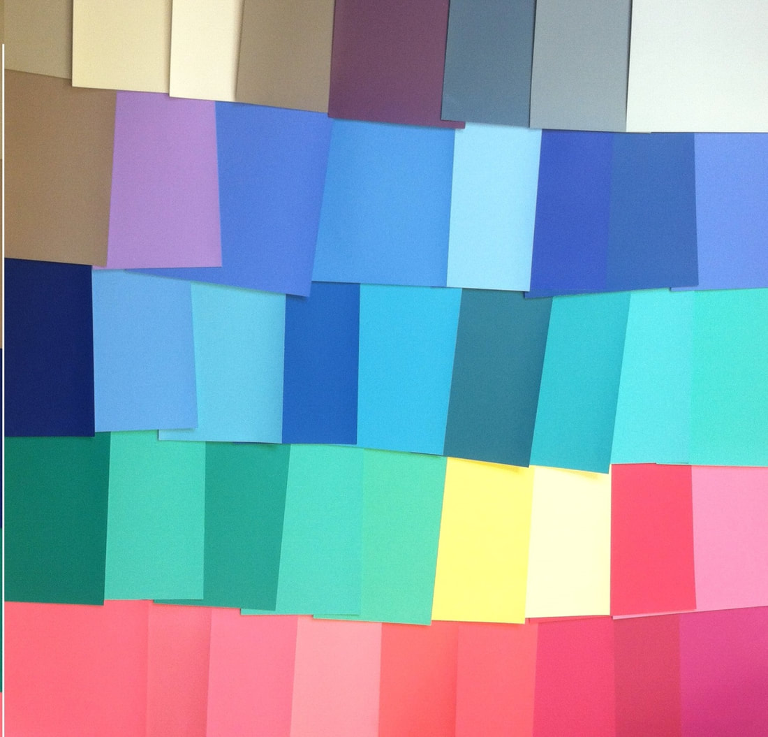
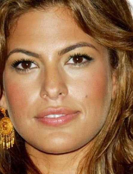
In seasonal discussion groups, women spend a lot of time working out which palettte-matching lipsticks and glosses are their best colors. Why should they have to spend time answering this question? Aren't all of the peaches, pinks, reds and violets in your palette automatically good lip colors for you? Not exactly. Every color in your palette is a color that harmonizes with your natural coloring somehow. But not every color will actually look good on your lips. Your right colors look right because they look natural. So if you wear them in an unnatural way, they won't look right. Consider my Soft Autumn palette:  All of these colors look amazing on me. But not every one of these colors would look natural on my lips. Would I wear the greens or blues on my lips? No way. It would look completely unnatural. That goes without saying, right? 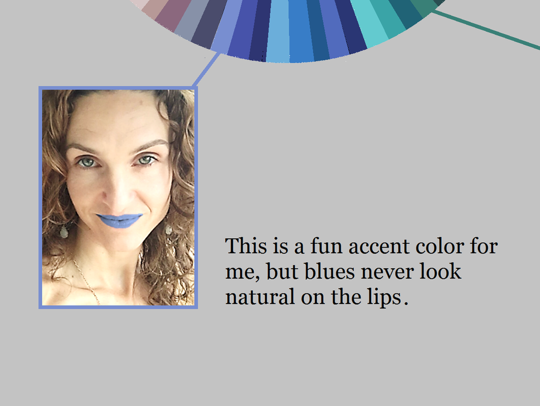 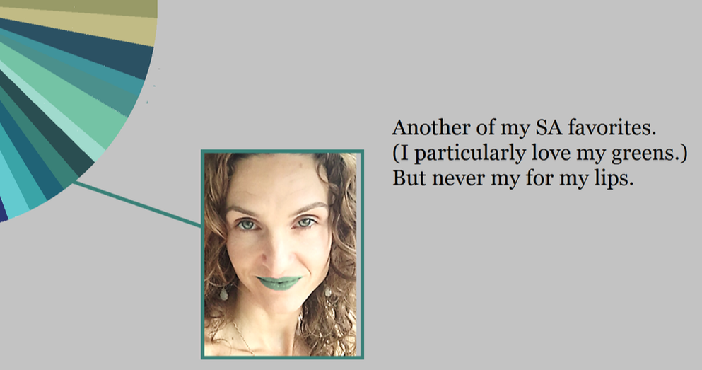 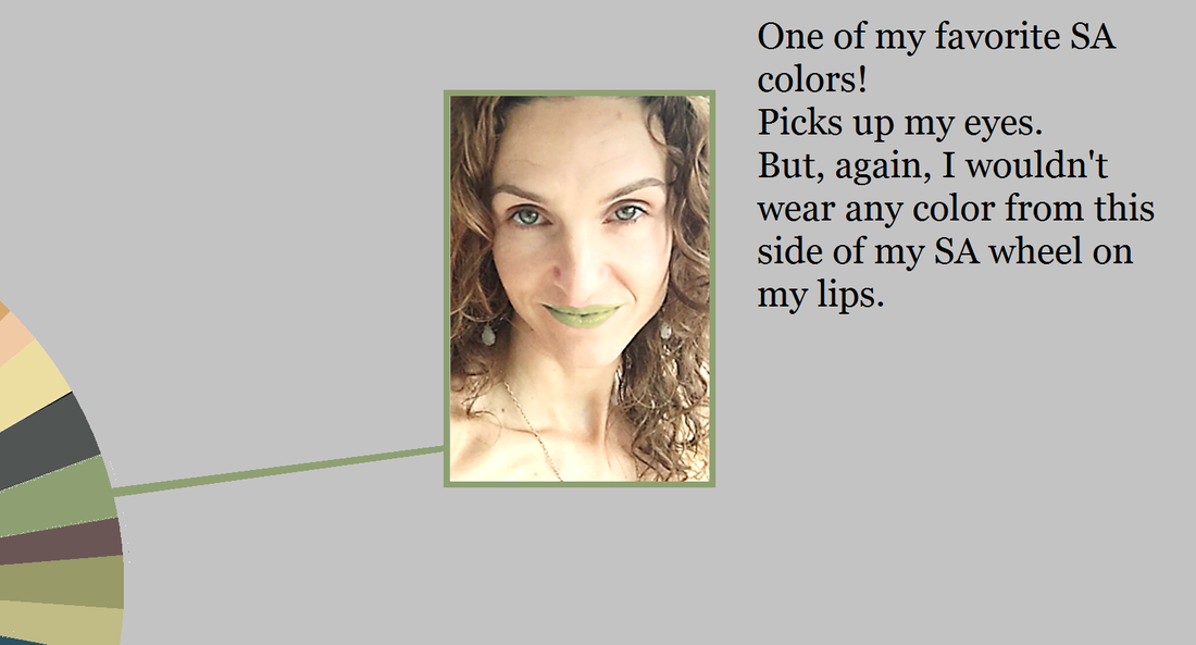
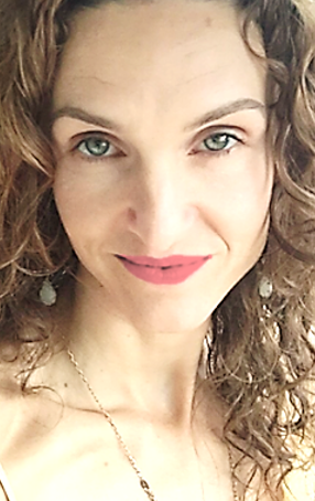
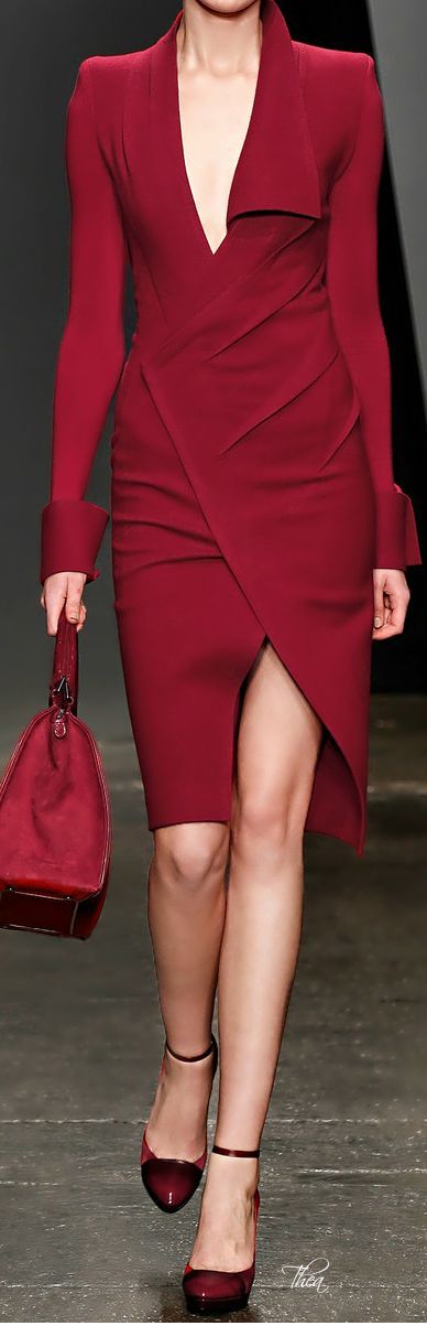
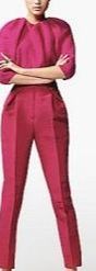
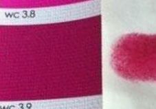
So far, these decisions seem self-evident. But let's move around the wheel into the range where we expect to find our lip colors: the purples, pinks, peaches and reds. Here's me wearing one of my dark purple-browns as a lippie: 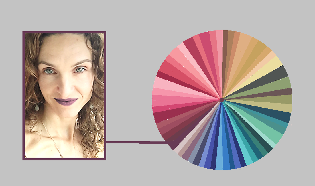 This color, though gorgeous on me as an evening gown, still isn't natural on my lips... despite the fact that I can find lippies in the drugstore that swatch this color. Now, if I want to make a statement with my lippy, this could be a good choice for me... but most of the time, I just want to look like the most beautiful verison of myself. And this lippy's not helping me do that.
Every peach, pink, red and purple in your palette looks natural on you somewhere. But not every peach, pink, red and purple in your palette looks natural on your lips. This is where many of us -- Winters and Bright Springs in particular -- can get lost. For example, there are plenty of lipsticks that match Bright Spring's violets. But a Bright Spring who expects a BSp violet lippy to look natural on her lips may be disappointed. (Soft Autumn's dark purple sure doesn't look natural on my lips!) 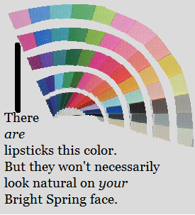 The peaches, pinks, reds and purples in your palette that will look natural on your mouth are a smaller subset of your total set of peaches, pinks, reds and purples. It can be tough to know where the line is. My unnatural-looking brownish- purple isn't really that far away from my natural-looking pink: 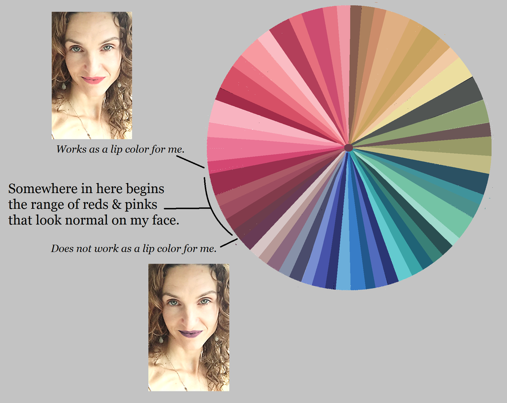 So you're probably wondering, "How can I know which of my peaches, pinks, reds and purples will actually look natural on my lips?"
It's not too difficult. This post is getting long, so I'll publish the second half, in which I describe how to find the best colors for your lips, next week. :-) This post was originally published in February of 2017. Hi, everyone! It somehow slipped my mind to offer a President's Day sale! So I bring you the Post-President' Day Sale. For the next 48 hours, take 20% off every order. Use discount code POSTPREZ20 at checkout. This is a good time to pick up an item you don't absolutely need but you're curious about, such as the Swimsuit Guide or the Fragrance Guide.
Consider getting a Truth is Beauty gift card for a friend! Some women are reluctant to give the gift of color and style analysis to a loved one because they feel they're implying a judgment... like, "Your style sucks -- here, use this gift card to fix it."
But you can introduce a gift card like this: "I think this whole color and style analysis thing is interesting and a lot of fun, and I thought you might have fun with it too!" Happy Belated President's Day, everyone! I hope your weekend was restful. I spend a LOT of time looking at outfits and answering the question, "What style types are represented here?" For the last few years, the answer that comes up the most often is "Gamine." Gamine style elements are having a moment in fashion. Everywhere I look, I see cropped pants, skinny pants, cropped tops, cropped sleeves, higher waistlines, shorts, mini dresses, stripes, boyish hats, contrast collars and cuffs, pattern mixing, color blocking, and ankle boots. SO. MANY. ANKLE. BOOTS. 
 If you're a Gamine blend, this is great! You have a lot of options in the stores right now. Classic and Ingenue blends can benefit too. Classics might find tailored Gamine pieces in more neutral (conservative) hues, and Ingenues won't have to hunt for shorter pant legs and sleeves. It's Ethereals, Dramatics, and Naturals -- the style types defined by elongation -- who will find the fewest options among today's Gamine-influenced clothes. Now, Naturals never struggle too much -- one can find loose, unstructured clothing almost anywhere these days, and it's been that way for about 40 years. But Ethereal and Dramatic looks are not easy to find in stores right now. As an Ethereal Natural, I do most of my clothes shopping online. (Have you tried ThredUp? I've used them twice now, and I really like the results. Future blog post.) I also find awesome pieces in thrift stores. Because of how we've been socialized, we all feel an urge to wear what's being promoted in stores and fashion magazines. But if you don't have Gamine features, Gamine clothes will not fully bring out your beauty. Knowing your style type makes it easier to resist falling for fashion fads. If you're not sure of your type, try the Style ID Calculator, or consider a virtual analysis from me. :-) With her permission, I'm sharing Danielle M.'s engrossing story: her personal style journey, and her experience with the Style Identity Calculator. Her story will be especially interesting to those of you with a Style ID Calculator result of more than three essences. I love her idea of "self-storytelling." :-)  Danielle writes:
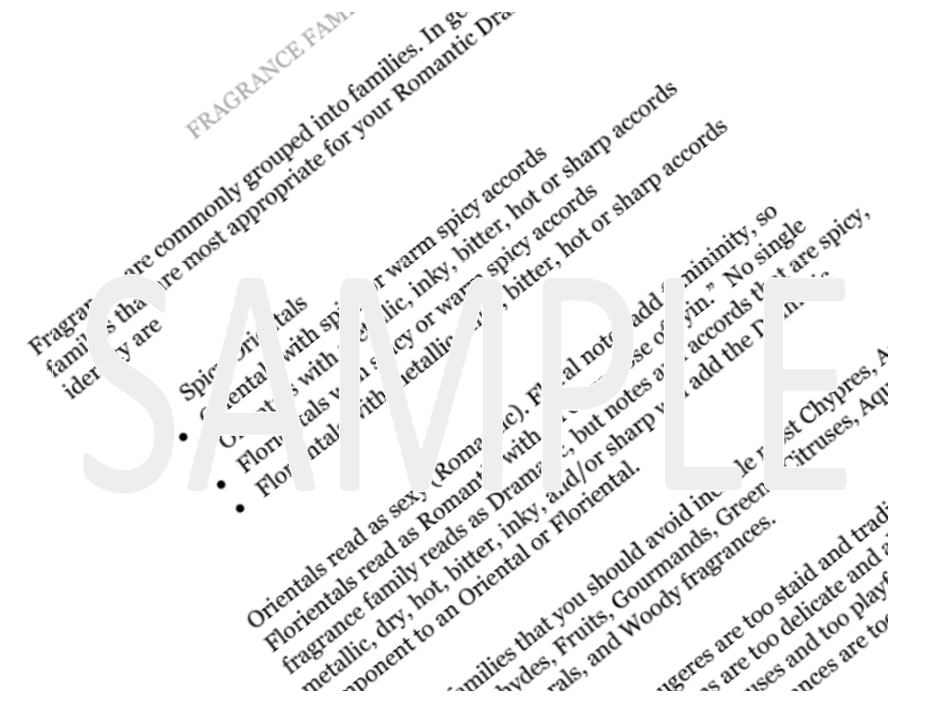
Growing up, I struggled a lot with confidence when it came to my clothes (though, I acknowledge that this is not an uncommon backstory). I just couldn't figure out why every outfit I tried on seemed to highlight what I believed were my worst flaws. As a young adult, I resigned myself to a life of never finding a way to dress myself that would allow me to express my most genuine self. My wardrobe evolved into a hodgepodge of fast fashion consisting of whatever the "influencers" were telling us to wear. Most frustratingly, on the rare occasion that I did feel wonderful in my clothes, I couldn't articulate why. Last May, I stumbled upon Kibbe's system, and for the first time in ages I felt a flicker of hope that I could develop a personal style that would feel true to me. I'm a very intentional person in most areas of my life, and I liked the idea of Kibbe's strict rules for different body types. Kibbe's system would've been fine for me, if I fit neatly -- or even messily! -- into one of his categories. But by the billionth exasperated sigh over being utterly unable to decide between classed as a Theatrical Romantic, a Soft Classic, a Soft Gamine, or a Soft Dramatic by my own eyes and by those of some very, very patient friends and family, I accepted that I do not fit into Kibbe's system. I purchased your *brilliant* Style ID Calculator with near certainty that it would return an even blend of Ingenue and Ethereal, convinced that because Kibbe dropped those two essences from his system, I just had to be a mix of both of them. Imagine my astonishment when upon arriving at the end of the 63rd board, I saw this: 30% GAMINE, 30% CLASSIC, 30% ROMANTIC. The first time I used the Style ID Calculator, I used a full body image from a few years ago when I was at a different weight. The second time, I used a full body photo of myself taken that very morning. The result: 10% DRAMATIC, 25% GAMINE, 25% CLASSIC, 25% ROMANTIC -- basically the same blend with a smidge of drama. Third time, I decided to actually follow your excellent instructions and use my face only. :) Result: 30% DRAMATIC, 30% CLASSIC, 30% GAMINE. From these results, it became crystal clear to me why I could've taken the Kibbe quiz again and again forever and never would've received an accurate result because he doesn't allow for a situation where someone is primarily a 50/50 fusion of a masculine/feminine "blend" (classic) ~AND~ a masculine/feminine "combination of opposites" (gamine) -- which consistently forms the basis of my particular makeup. Also, the results from your Style ID Calculator perfectly illuminate the reason why I bounced around four out of the five main Kibbe categories and why none of the guidelines for any of them would've supplied complete instructions for me. Thanks to your system, I'm finally deciphering my personal style's enigmatic code. I've already experimented with different looks, and I've learned that outfits work best for me if I actually attempt to incorporate all four essences. I went back to see how I answered the Romantic-Classic-Gamine and the Dramatic-Classic-Gamine boards on each of my three Style ID Calculator trials, and I was surprised that it was a "3" in all cases for both boards. However, I do notice that something feels super-slightly off unless all four essences are represented in my look. I hypothesize that this is due to the fact that I seem to be comprised of all four in relatively high and equal amounts. So, I've purchased both the Romantic-Classic-Gamine and the Dramatic-Classic-Gamine Shopping Guides and will probably end up purchasing absolutely everything in your store related to these two blends, haha! I know that at the end of the day, it is easy for many of us to dismiss personal style as a trivial matter. Indeed, I have done so myself in the past, mostly out of feigned-apathetic declarations that sartorial concerns were just not "for me". But over the course of my journey with body typing and color analysis (...whole other tome...), I've come to view this as a process of self-storytelling, through which a more honest version of self-love blooms. This is no small thing. Instead of feeling like I have to obscure any of my features that I bemoaned when I was younger, I've come to understand how I can celebrate the delightfully paradoxical characteristics that make me... me. Cheesy as all this sounds, I've fallen a little more in love with myself throughout this adventure, and I truly cannot thank you enough for providing a language through which I can tell my tale without speaking a word. Those I cross paths with will now know upon first glance that I'm a "Cheeky Duchess" who moonlights as a "Spunky Art Critic"! :) Eternally grateful to you for helping me to express my truth and my beauty. - Danielle If you're into perfume, chances are you have checked out my fragrance guides. Each guide describes the best fragrances for your style type.  You may have wondered, though, whether you should be even more selective about your fragrance, coordinating it not just with your style type but with your color season. 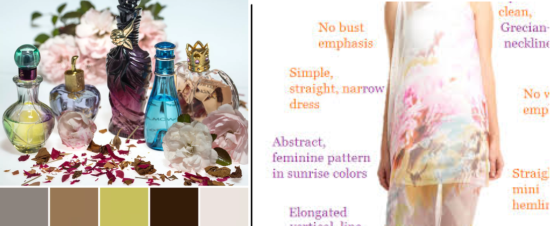 Now, I do believe the interaction between color season and style ID is somewhat variable: for example, an Ethereal Gamine who is a Bright Winter might choose to manifest more Gamine (vivid primaries!) in her palette, while an Ethereal Gamine who is a Soft Summer might reflect more Ethereal (sunrise and sunset hues!) in her palette. But I believe that, in general, your perfume profile is more useful if you keep it consistent with your style type, not your color season. My reasoning for this is as follows: your seasonal palette is already being strongly communicated to the eye of the viewer; color's the first thing we notice, right? So I feel an appropriate role for your fragrance is to reinforce the secondary message of the style type that's being communicated through your lines. Having said that... If you own your style type's fragrance guide, and you really want to bring your color season into your fragrances, I'll list some specific fragrance notes you may consider looking for. Perhaps start with a fragrance family recommended for your style type, and search within that family for fragrances containing these notes. To bring Bright Spring into a fragrance, try adding:
To bring True/Warm Spring into a fragrance, try adding:
To bring Light Spring into a fragrance, try adding:
To bring Light Summer into a fragrance, try adding:
To bring True/Cool Summer into a fragrance, try adding:
To bring Soft Summer into a fragrance, try adding:
To bring Soft Autumn into a fragrance, try adding:
To bring True/Warm Autumn into a fragrance, try adding:
To bring Dark Autumn into a fragrance, try adding:
To bring Dark Winter into a fragrance, try adding:
To bring True Winter into a fragrance, try adding:
To bring Bright Winter into a fragrance, try adding:
For the essential fragrance notes and fragrance families recommended for your style type, check out your Fragrance Guide. To search for fragrances by specific notes, try these sites: The Perfumed Court Fragrantica If you're not sure of your style type, try the Style ID Calculator, or consider a virtual style analysis. If you're not sure of your color season, try At-Home Draping Cards. One of the variables that differ from style type to style type is the amount of detail that is most flattering to that type. Some of us look beautiful with a ton of detail; some of us look beautiful in a minimalist context; and some of us can pull off both high-detail and low-detail looks. But what does "amount of detail" actually mean? The best way I have come up to explain "amount of detail" is this: Imagine that your image in the mirror is a pencil sketch. "Amount of detail" is the number of pencil strokes you'd need in order to accurately render that sketch.
A shift dress can be rendered with relatively few lines, while a dress with a sweetheart neckline, a pleated skirt, pleated sleeves, and sequins would require literally hundreds of pencil strokes. A flat piece of fabric is extremely low-detail. As soon as you gather that fabric into pleats or drapes or ruching, the image becomes much more detailed. Not coincidentally, pleats, draping, and ruching read as feminine. Detail always reads as feminine. I have a couple of theories about why this might be. One idea is that we view detail as feminine because detail holds the eye, and throughout history we have seen women, not men, as the sex that exists to be looked at. Another idea is that we associate detail with femaleness because a curving line is "busier" (more detailed) than a straight line, and the lines of female bodies, on average, curve more than the lines of male bodies. A third idea is that we associated a highly detailed ensemble with femininity because creating a highly detailed ensemble takes time and effort, and women, not men, are traditionally expected to put time and effort into their appearance. Regardless of why it's so, a high level of detail adds femininity, and minimalism adds masculinity. Women whose style types are mostly androgynous/masculine will usually find that too much detail makes them look mannish. Women whose style types are mostly feminine will usually find they are less pretty in minimalist looks. I'm an Ethereal Natural with tiny smidges of a few other essences. My feminine-masculine balance is about 60-40 in favor of feminine elements. If my fabrics are rough and my colors are restrained, I can handle quite a bit of detail, but if my fabrics and colors are already very feminine, I can easily get overwhelmed with detail, and end up looking mannish. My curly hair by itself adds a ton of detail (imagine making a pencil sketch of it!), so if I'm wearing my hair down I don't have a lot of room to add more detail. Most of my garment choices are pretty simple. 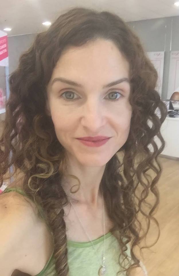 Those curls add about as much detail as I can tolerate before I start to look mannish. I usually skip earrings, and I wear a *lot* of tank tops. This sharply tailored suit could be drawn with very few pencil strokes. It's low-detail. 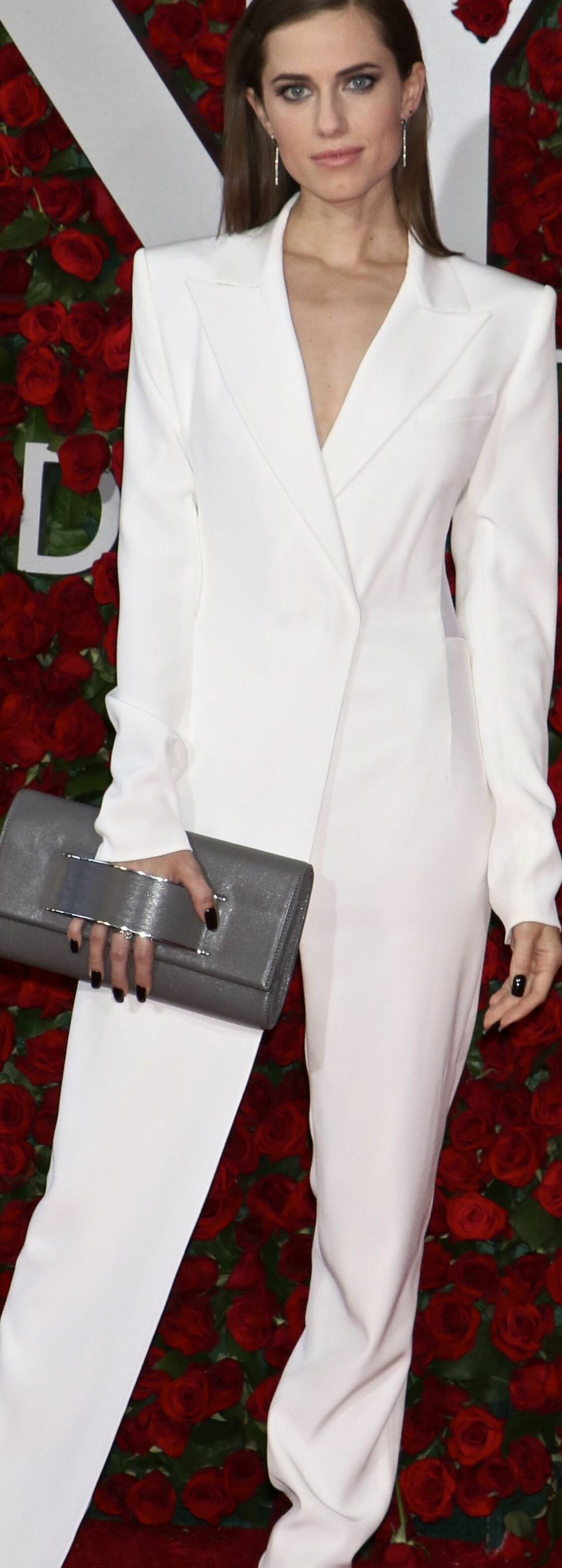 Alison Williams is stunning in it because her striking, masculine beauty calls for a very low amount of detail. (I think Williams is highly Dramatic.) Jennifer Aniston is another celebrity who looks her best in very low-detail looks. She has a ton of Natural (which, along with Dramatic, is a masculine style type that asks for very little detail.) 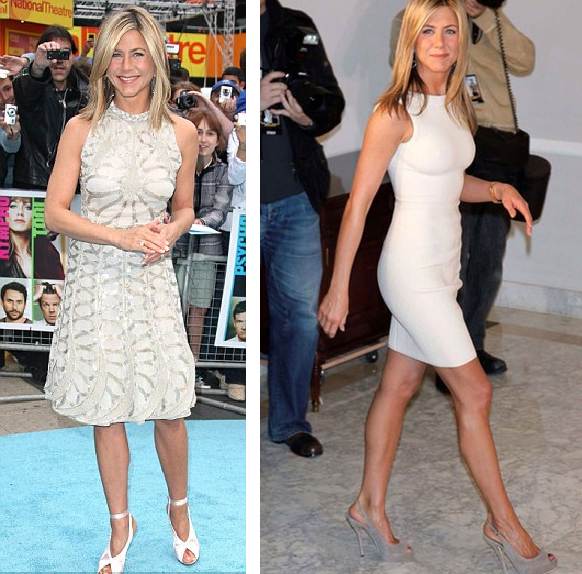 See how much better Aniston is in the low-detail dress on the right than she is in the high-detail dress on the left. For a strongly Natural woman (like Aniston and myself), a low-detail context, which is masculine, actually makes her look more feminine.
Most off-the-rack fast fashion is low in detail. If you're a predominantly feminine style blend, shop for items with more detail built in, like pleats, complicated lapels, visible stitching, and a sheeny finish (which adds visual detail as a result of the play of reflected light.) If your clothes are simple and you need to add detail, the easiest way to go is to add highly detailed accessories: for example, profusely detailed earrings, necklace, and scarf. Not all of the colors in your correct seasonal palette will be your absolute favorites. Depending on your depth of coloring, your level of contrast, and the specific colors of your body, some will be more useful to you than others, and in different ways. A dark-skinned Winter, for example, might use black as an accent, while a fair-skinned Winter might wear it in large blocks. But no color in your palette will be awful on you. The colors in your palette are all harmonious with each other, and if it's your proper palette, they'll all be harmonious with you too. So for those of you still searching for your season, I give you colors that are seasonal deal-breakers. If the given color absolutely doesn't work for you, the deal's off. Move this season to the end of the list. You can't use this list to identify your single best season. But you can use it to rule seasons out. If you can't rock hot pink, rule out Bright Spring.
Bright Spring has a handful of pinks in this general vicinity. You may not associate pink with Spring. But moving Spring reds toward Winter means making them both darker and brighter. Reds that are both deep and very bright are purple-reds. So in Bright Spring, we find hot pinks. If you think you're a Spring but hot pink is no good for you, True Spring may be your home. If you're not fabulous in lime green, rule out Bright Winter.
Taking True Winter's greens lighter and brighter, all the way into Bright Winter, moves them toward yellow. One of the results is a sort of fluorescent lime. On Bright Winters, this color is amazing. It contrasts beautifully with both very dark and very light skin. If this color's not right for you, but you think you're a Winter, try Dark Winter next. If you can't wear clear lemon yellow, rule out True Winter.
Be careful applying this one. I'm not talking about a golden yellow, or a pastel yellow, or a yellow-orange. True Winter's few yellows don't show a bit of brown or orange or grey. They're the pure, clear complements of TW's vivid sapphire blues. If you need a more moderated yellow that's still vivid, try Dark Winter. If you don't look great in mint green, rule out True Summer.
A handful of the seasons have some sort of mint. True Summer's is not a pure, saturated mint that's close to aqua. Instead it's a delicate and slightly hazy mint. It's lovely with a delicate fuchsia lip. If this feels all wrong to you, perhaps vivid mint is beter? You might be a Winter. If you wouldn't call your good yellow "goldenrod," rule out Dark Winter.
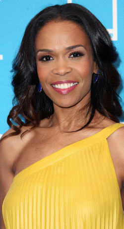
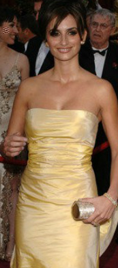
Dark Winter yellows are tricky. They're not clear and pure like True Winter's. They're not blindingly bright. They're just slightly warmed, a little rich - but not Autumn rich. Penelope Cruz is lovely here in what looks like one of Dark Winter's elusive yellows. If you need your yellows purer, try one of the other Winters. And if you need a more delicate yellow, try one of the Summers. If you can't wear this medium warmed violet, rule out Dark Autumn.
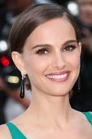
This Dark Autumn color always surprises me. Call it orchid or begonia perhaps. It's not a color I would label Dark Autumn if I saw it in a pile of a hundred other colors. Yet it's gorgeous with the intense dark olives and vivid teals of the season. Dark Autumn Natalie Portman's been photographed in three or four dresses in something like this color. They're all great on her. If it's not great on you, perhaps try True Autumn or Bright Spring. If a light olive-khaki is not a good neutral for you, rule out Light Spring.
Was it Christine Scaman who said Light Spring colors are popsicle colors? It's true. But every season has neutrals, of course. This unusual Light Spring color is like your usual khaki, but with a suggestion of green and gold. On a Light Spring, it may pick up tones in the eye or hair. If this color's a no-go on you, perhaps look at Light Summer instead. If you're not flattered by light pinky coral, rule out Light Summer.
Light Summer doesn't get very warm, but in the pinks it does go as far as a pinky coral. It's a bit pinker than what you see here, but still warmish. On a Light Summer it picks up healthy color in the face. If you think you're a Summer but can't wear this light, delicate, warm tone, look at True Summer. If you're not beautiful in bright blue, rule out True Spring.
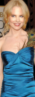
True Spring's colors are Crayola colors. You can see them in this picture of Nicole Kidman: blue dress, yellow hair, red-orange lips. In these simple primaries, True Spring is gorgeous. If you struggle to articulate the names of your best colors, they're not True Spring's. You might consider Summer or Autumn. If rich burgundy isn't gorgeous on you, rule out True Autumn.
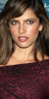
True Autumn has a few beautiful burgundies that go beautifully with the rich greens and oranges of the season. You can see all those colors here, in Noa Tishby's face. Those burgundies make good lippies too. If this burgundy overwhelms you, try something from Soft Autumn. If you're not lovely in cocoa brown, rule out Soft Summer
This is not a warm golden brown or a milk chocolate brown. If you're a Summer, none of those browns will work for you. Browns are generally bad for Summers, as a rule. But if you're a Soft Summer, you will be lovely in cocoa brown. It's a brown that looks both slightly greyed and slightly purpled. It may pick up tones in your hair. If this color just isn't right for you, try True Summer next. If you can't do dusty medium blue, you're not a Soft Autumn.
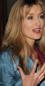
This blue feels both rich and muted, and quite medium - neiher purpley nor greenish. I's similar to the color you get if you Google "French blue." Though it's a subtle color, on Soft Autumn skin it's just as powerful as it needs to be. Notice how rich it looks on Natascha McElhone. If you need a blue that's much richer than this, you might try a Winter or a Spring. * * *
For any of these seasons, Google the season's name in quotes to see images of the palette. Images that say "Sci/Art" are usually quite accurate. Or order sheets of color from all 12 seasons to try the seasons out in person. As always, I hope this helps you find your correct season. :-) This post first ran in April of 2013. A few years ago, I had an idea to create a tool that would generate verbal descriptions of outfits for each of the style types. Last April, I returned to that idea. I'm ready now to roll out the Infinite Outfit Generator for each of the 63 style types! This is a great tool for you if you're a "word person" and you'd benefit from a written description of your best clothes. Every time you refresh the page, you'll get new ideas for tops, bottoms, and dresses. Here's a video of me using the Infinite Outfit Generator for Romantic-Dramatic-Gamine. In the video, I use an on-screen keyboard to show the keyboard shortcut for repeatedly refreshing the page. But you'll just use your regular keyboard. :-)
You'll need a desktop or laptop computer and internet access to use this tool. Your purchase gives you access to the generator as a view-only document. You'll receive a link by email. Take screenshots of your favorite outfit descriptions! There are hundreds of thousands of possible separates ideas, and (for most types) over a million distinct dress descriptions. I'm offering each Infinite Outfit Generator for 11.99, but you can have it for 20% off if you buy it this week! Use coupon code INFINITE20OFF . Click here to buy your Infinite Outfit Generator. - - - - Are you, or is someone you know, an app developer? I'd love to make the Infinite Outfit Generator into an app! Please contact me at rachel@truth-is-beauty.com! I'd really like to give this business to a reader. :-) In order to create a particular impression with your appearance, you have to put yourself in the shoes of a viewer, and work backward from what that person sees. This is easier to do if you notice what your own brain is thinking when you look at an outfit for the first time. An image like the one below contains a ton of information that a viewer processes almost instantaneously, and largely unconsciously. All of this information will register to the viewer's conscious mind as one, two, or perhaps three main emotions or ideas. 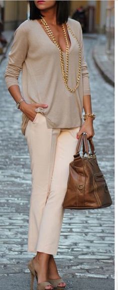 When I look at this outfit, I ask myself, "What's the first thing I think?" What I come up with isn't necessarily a single word; in this case, it's a single feeling or concept -- something like "polished/expensive/pulled-together." That impression tells me that this outfit has a lot of Classic. (If I challenge myself to identify which details are creating this response in my mind, I come up with these: the structured, expensive-looking bag; the gold jewelry; the neutral color scheme. But I'm not starting with the details and working outward to the Classic impression; I'm starting with the Classic impression, and only then figuring out which details are creating that impression.) I then ask myself, Is Classic the only impression I'm getting? What else do I immediately notice? Or, put another way: Is this a completely Classic outfit?  It's not! Now that I am looking at this outfit through a Classic lens, the baggy top, the elongation of the necklace, and the size of the bag really stand out. Baggy + elongated + oversized = Natural. So, this outfit has Natural and Classic. I'll go back one more time and ask myself, Is this completely a Natural Classic outfit? If I look at this outfit through the lens of Natural Classic -- "The Prep "-- there's one more element that stands out: sexiness. Check out the cleavage, the high heel, the peep toe effect. Those aren't preppy; those are sexy.  Sexy is Romantic. So, I call this ensemble Romantic-Natural-Classic.. Also known as "Alluring L.L. Bean," or "Sexy Prep," or "Today's Southern Belle." I'll double-check this determination by asking myself, "Is this outfit refined (Classic)? Is this outfit comfortable (Natural)? Is this outfit sexy (Romantic)?" Yes, yes, yes. I may take an extra moment to rule out the other four essences by asking myself, "Is this outfit otherworldly (Ethereal)? Is it innocent (Ingenue)? Is it avant-garde (Dramatic)? Is it playful (Gamine)?" No, no, no, no. * * * I find selfies really helpful; for me, and perhaps for many of you, it's very difficult to see a mirror image objectively. If I'm not sure what impression my ensemble creates, I take a selfie, sit down, open the picture on my phone, and ask myself, "What's the first thing I think when I look at this woman?" I'm an Ethereal Natural. Here I am in a top I recently bought and returned. I loved the top when I first saw it, and I wanted it to be right for me, but a little voice in my head told me something was off. I was only able to identify what was wrong after I took a selfie of the top and went through the mental exercise I describe above: "What's the first thing I notice?" "Loose and comfortable" -- that's Natural. Check. "Delicate and kind of Renaissance-y" -- that's Ethereal. Check Anything else? Oh, I see it: There is sweetness, a preciousness, a childlike quality. That is Ingenue. And Ingenue is what's not working for me. (I do have a tiny bit of Ingenue: enough for a single delicate necklace, as you see here, but not enough for a strongly Ingenue top.) 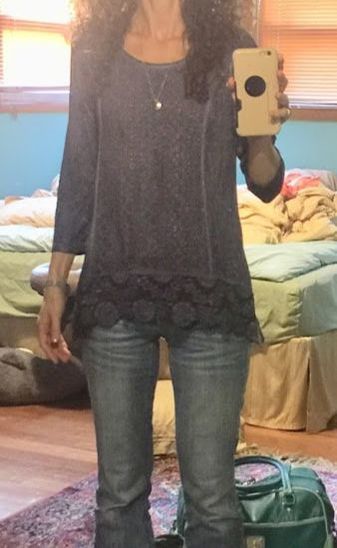 Is my room painted in Soft Autumn colors? You bet it is. If I press myself with the question, "What makes it sweet?", I can articulate that it's the flowers, the wrist emphasis, and the overall babydoll-dress-like impression. But I can say that this top is sweet and girly without being able to say why. Does an ensemble ever send more than three main messages? Occasionally, but it's very, very rare. The only time I ever encounter this is in some haute couture designs. Some designers are expert at sending multiple messages simultaneously in a single outfit. I can't remember encountering that effect in an outfit put together by a regular woman. So, if you're not sure whether an ensemble is creating the effect you want to create, take a picture of yourself in it and ask yourself, "What's the first thing I think?" If you're not sure what your style type is, check out the Style Identity Calculator, or consider a Virtual Analysis. If you've benefited from personal color analysis or personal style analysis, you know from experience that it's truly a gift that keeps giving. Years after my own color and style analyses, I get dressed with confidence literally every single morning. <3 It's hard to put a price on that! If you need a last-minute holiday gift for your sister or sister-in-law, your mom, your niece, a cousin, a aunt, a best friend, or a co-worker, a Truth is Beauty Gift Card is a thoughtful and unique gift that may well change a woman's life.  For a woman who's color-confused, a $25 or $50 gift card will buy her the Six Season or 12 Season Home Draping Card Set so she can drape herself.  For a woman who already knows her color season, a $40 gift card gifts her with her very own season in 40 jumbo-sized sheets. 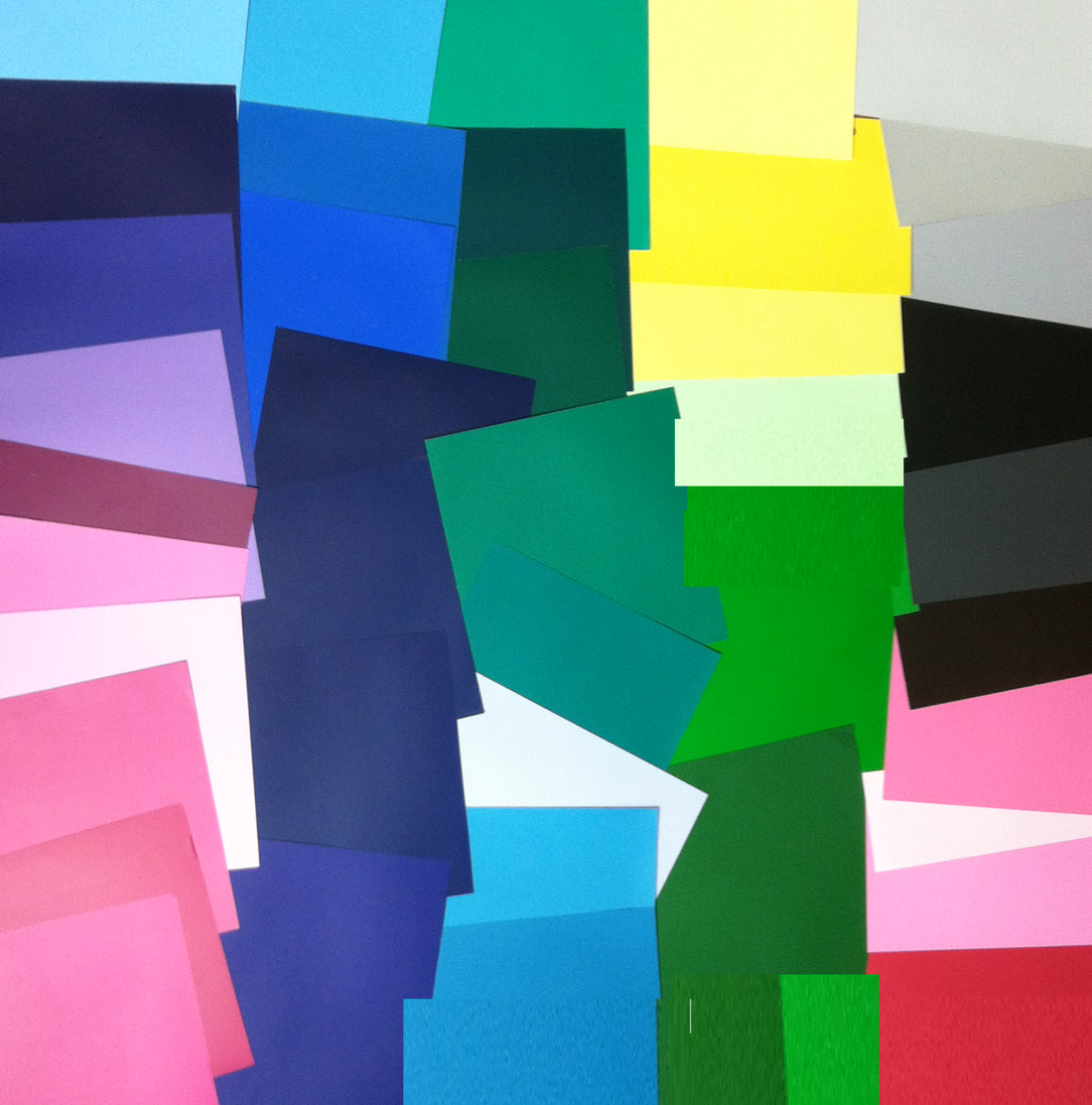 For a woman who struggles to know her own style, the $15 gift card will let her buy the the perennially popular Style Identity Calculator. 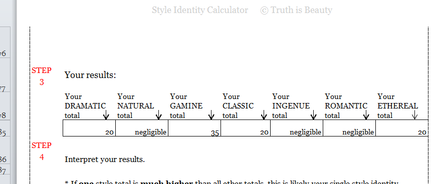 The woman who already knows her own style will enjoy the $20 or $30 gift card, which will give her access to documents for her style type.
To really treat someone you care about, try the $100 gift card, which buys the Style Identity Calculator and the full suite of documents for one's style type.
Or the $110 gift card, which covers home draping cards, a seasonal color palette, and a seasonal makeup list.
Happy holidays, dear ladies. I'm grateful to be a part of your lives, and to have you in mine. :-) <3 Note: f you'd like to treat someone you love to a Virtual Style Analysis, please contact me directly at rachel@truth-is-beauty.com. Most of us go to the internet to get hairstyle ideas. But how can you zero in on the best hair for your style type? Some of us aren't sure how to go about searching. You'll want to do a Google image search, of course. Here are some specific search strings I suggest you use to find visual inspiration for your style type's best hair. I use some search operators in my search strings, such as - and OR , so try pasting the exact search string. 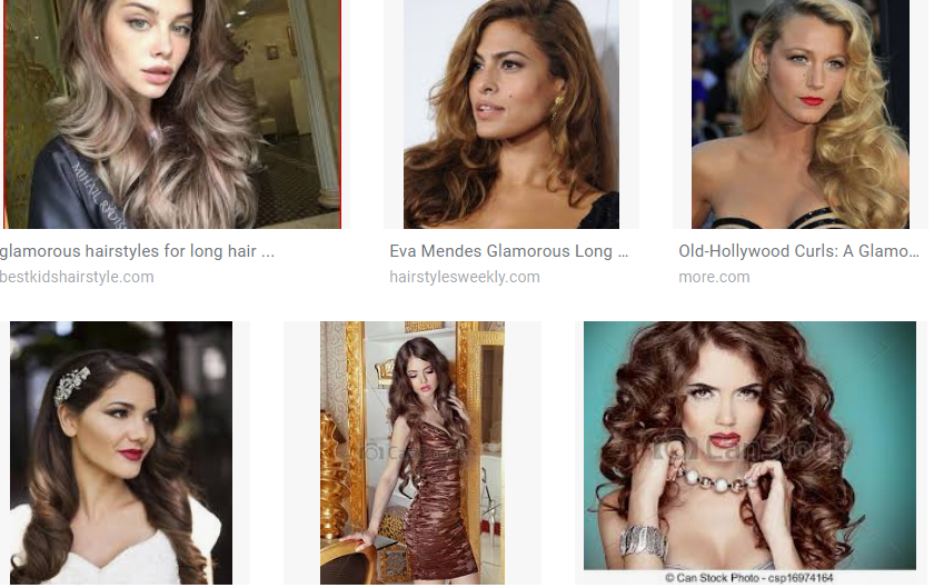  Other Ethereal keywords to try: flowy long curls 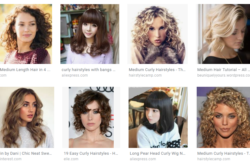 Other Ingenue keywords to try: sweet girlish ringlets 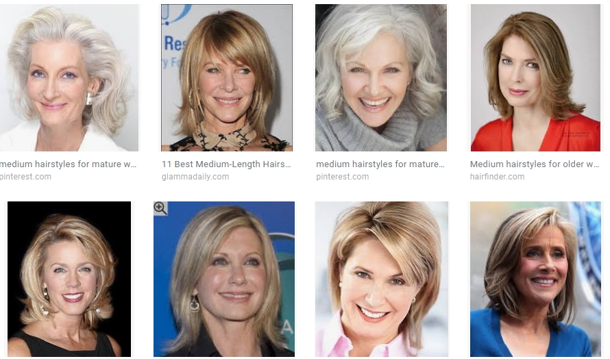 Other Classic keywords to try: elegant coiffed "first lady" 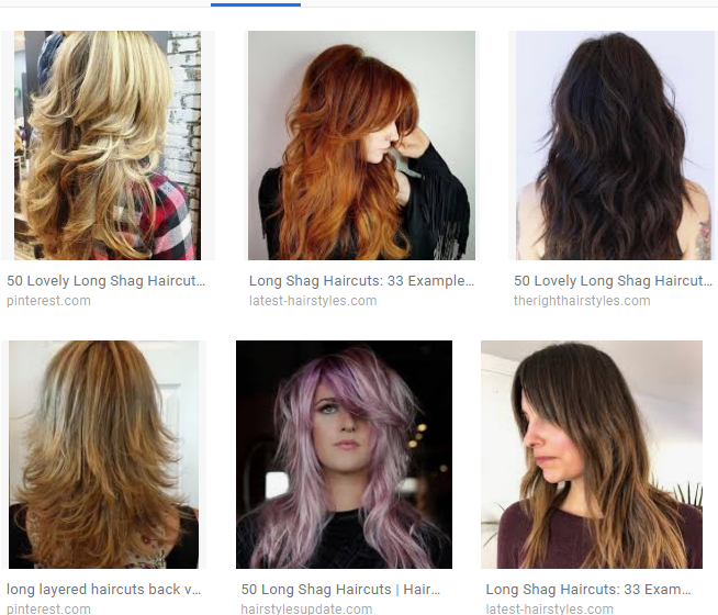 Other Natural keywords to try: natural mane messy 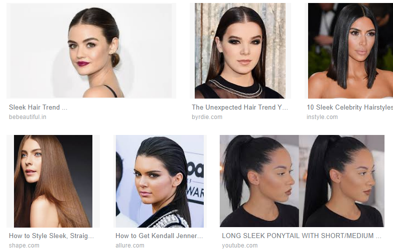 Other Dramatic terms to try: "slicked back" futuristic -men 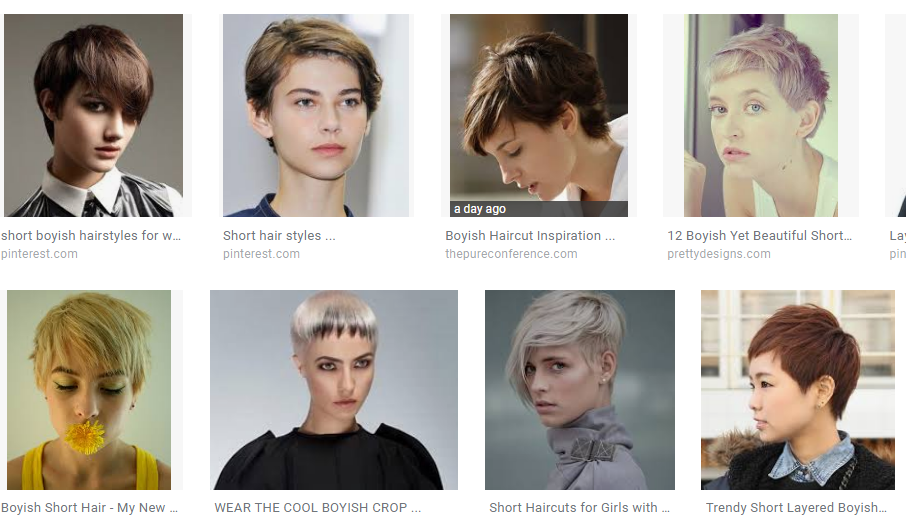 Other Gamine keywords to try: spunky tomboy You may have noticed that these search results are mostly white ladies. :-/ If you want hair styles specifically for women of color with specific hair textures, try adding, for example, "african american" or "asian" to your search string. For blends of the seven core types, try searching for a few key terms from each core type. For example, for Romantic-Dramatic-Classic, I used "glamorous" for Romantic, " sleek" for Dramatic, and "elegant for Classic. Here was my search string: hair glamorous sleek elegant I got some pretty good RDC ideas: 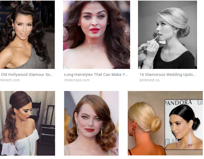 I'm an Ethereal Natural. Here's my favorite hair for myself, combining Natural and Ethereal search terms: hair layers long curls 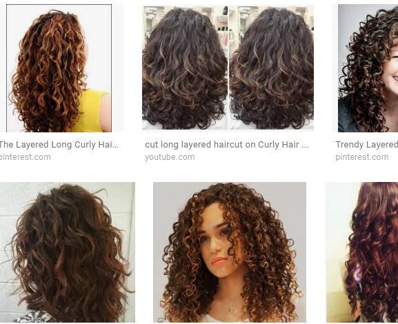 Pro tip: after you have your image results, click on Tools, then Type, then Face. That will eliminate photos you don't want, such as pictures of shampoo bottles. Also, if your hair has a particular texture that's non-negotiable, try adding that to your search string. For example, if you're predominantly Ethereal but you have straight hair, try searching straight hair long mermaid (If you don't want all the dyed hair results, try adding this to the end of the search string: -dye -ombre -pink -blue) Do you know some search terms that have worked well for your style type? Please share them in the comments! Not sure of your style type? Try the Style Identity Calculator, or consider a Virtual Analysis. In my style system, there are seven main types and 56 two-way or three-way type blends. Some of you have written me to ask what it signifies that I call a woman, for example, Natural-Classic-Gamine and not Gamine-Natural-Classic or CLassic-Natural-Gamine. What does the order of the words mean?
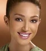
When I named each of the blended types, I wanted to come up with a consistent set of rules for word order -- in other words, either a woman with Ethereal and Romantic would be an Ethereal Romantic or a Romantic Ethereal, consistently. I did consider, but eventually reject, the idea of switching the word orders around based on the relative amounts of each essence in an individual woman. (In other words, calling a woman Romantic Ethereal if she's predominantly Romantic, and Ethereal Romantic if she's predominantly Ethereal.) I realize that many of you use this system among yourselves, and I'm all for that use! But it doesn't work when I'm writing about the types theoretically, without regard to a particular woman. I need something more consistent. I also considered but discarded the idea of beginning each combination with feminine type words first. "Ingenue Natural," for example, didn't sound as good to me as "Natural Ingenue." The fact that "Ingenue Natural" sounded weird to me, but "Natural Ingenue" did not, led me to consider the "adjectivity" or "noun-ness" of each word -- in other words, whether the word makes more sense used as an adjective or as a noun. This quality, in the end, is what drove my decision. I basically decided which of the seven words (Natural, Ethereal, etc.) worked best as an adjective, and which worked least well, and made rules for the word order based on that decision. For example, "Romantic" is easily understood as an adjective, so I made the rule that, in any combination type that features the word "Romantic," that word would appear first. The remaining six words always appear in this order: Ethereal Dramatic Natural Classic Gamine Ingenue The order reflects my subjective judgment about whether each word works better as an adjective or a noun. As I use it, the word order doesn't imply anything about the balance of essences for any person. For example, some Romantic Gamines might be 70 Romantic and 30 Gamine, while other RGs might have the reverse balance. As I mentioned above, if you prefer to refer to yourselves by listing your essences in order from greatest to least, I think that's awesome. I just thought it would be useful to you to understand why I put my essence words in a particular order. :-) Not sure of your style type? Try the Style ID Calculator. 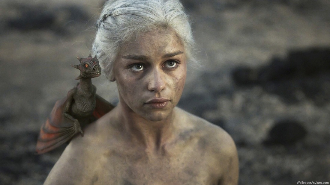 Game of Thrones! I'm a huge fan of the George R.R. Martin book series and I can't stay away from the TV show either. So, Emilia Clarke. You've been wondering too, right? I love Daenerys. But that white-blonde Targaryen hair is so not her. Her coloring's not delicate like that. It makes her seem ghostly. 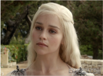 So probably no Light Spring or Light Summer here. The natural brown's so much better, isn't it? Just look at this. So real. So beautiful. 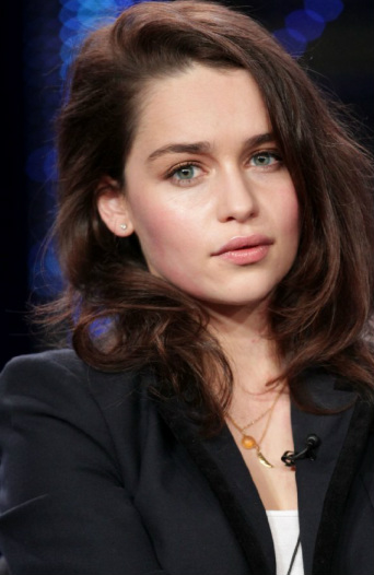 The black blazer isn't quite the thing, though. Much darker than she is. Ixnay on any palette that contains black. (That's all three Winters, Dark Autumn and Bright Spring.) 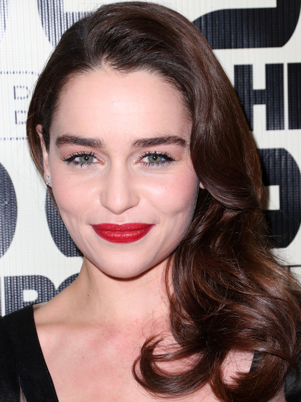 Just to belabor the point: NOT a Winter. My very first thought about her was Soft Summer. My first thought is often wrong, but in this case I think it may have been correct. 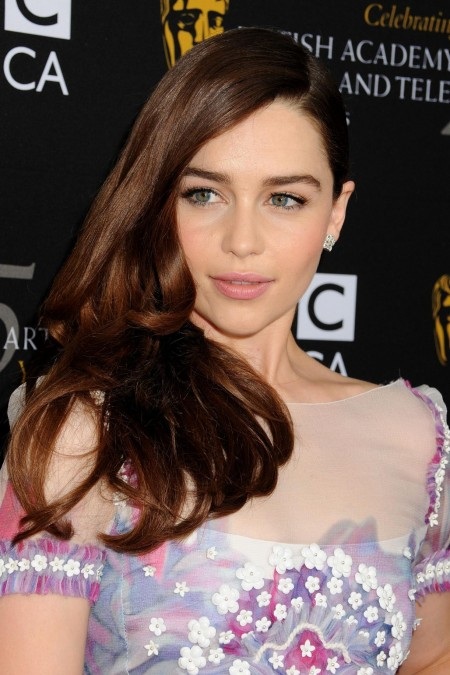 These Summery colors are not at all bad, but don't they need to be just a little deeper and warmer? Emilia's skin is a tad richer than these hues. 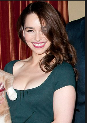 This is fantastic. Is that one of Soft Summer's teals? It looks like it could be. 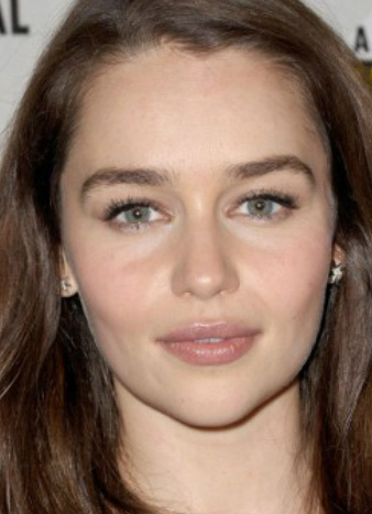 True and beautiful. These look like Soft Summer colors to me.
Soft Summers, what do you think? Is Daenerys Targaryen one of you? Try figuring out your own true colors at home. Happy Thanksgiving, beautiful women! It's a stressful time for many of us. I hope you can make time to reward yourself a bit with some goodies from the Truth is Beauty store. From Wednesday, Nov. 21st through the following Monday, everything on the site will be 30% off. That's 30% off of all Shopping Guides, Fragrance Guides, What Not To Wear Guides, Swimwear Guides, seasonal color palettes, seasonal makeup lists, and home draping cards. And, of course, 30% off the perennially popular Style Identity Calculator! Use the discount code TURKEYJOY ! Additionally, virtual analyses booked between now and next Monday will be $229, not $279. Enjoy!! Note: Due to the anticipated high order volume, please allow up to 2 days for any non-downloadable documents to appear in your inbox. I'll try to be faster than that, though. :-) Stripes can be Natural. They're especially likely to be Natural if they are irregular, or various in size, or if they read as relaxed, not aggressive. Vertical stripes, which elongate the vertical line, are usually better than horizontal stripes (which are good for Gamines.)  Irregular stripes.  Irregular stripes.  These striped feel relaxed, mainly because the garment itself is unstructured. Checks and plaids can be Natural if they read as something you would find on a fleece -- they should look farmer-ish, not preppy. (Preppy plaids are Classic.)  These checks feel country, not preppy.  This feels like a farmer plaid, not a preppy plaid. Large, stylized, somewhat abstract nature motifs read as Natural, as long as they're not aggressive-looking (which would add Dramatic) or neatly repeating (which would add Classic). 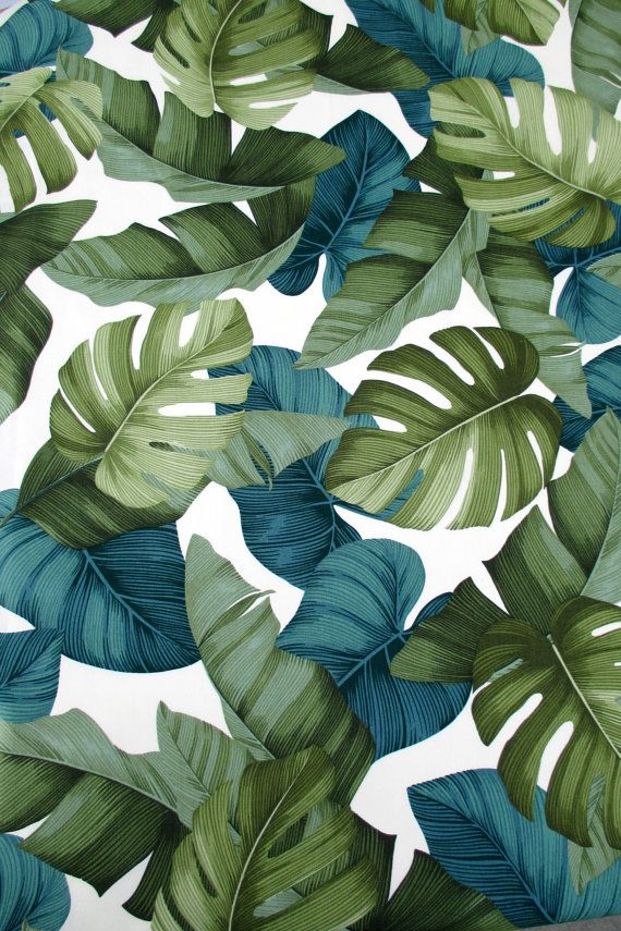 Nature prints that are more photorealistic read as Gamine or Ingenue. (The youthful essences get more literal images.) Nature prints that feature flowers will automatically bring in Romantic (if they're larger and stylized) or Ingenue (if they're smaller and more realistic.) Paisleys are often Natural, because they're stylized nature motifs that read as a little "tribal" (which is a word I don't love; what's a better word?) 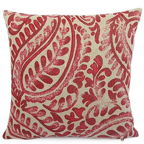 Stylized nature patterns are often Natural, so that includes many paisleys. A paisley that's very tiny or very detailed is less likely to read as Natural. Prints with abstract geometrics that seem to be randomly distributed and are largeish in size can be Natural. Go for blunt-edged geometrics; sharp-edged geomtrics will read as Dramatic (if they're large) or Gamine (if they're small.) 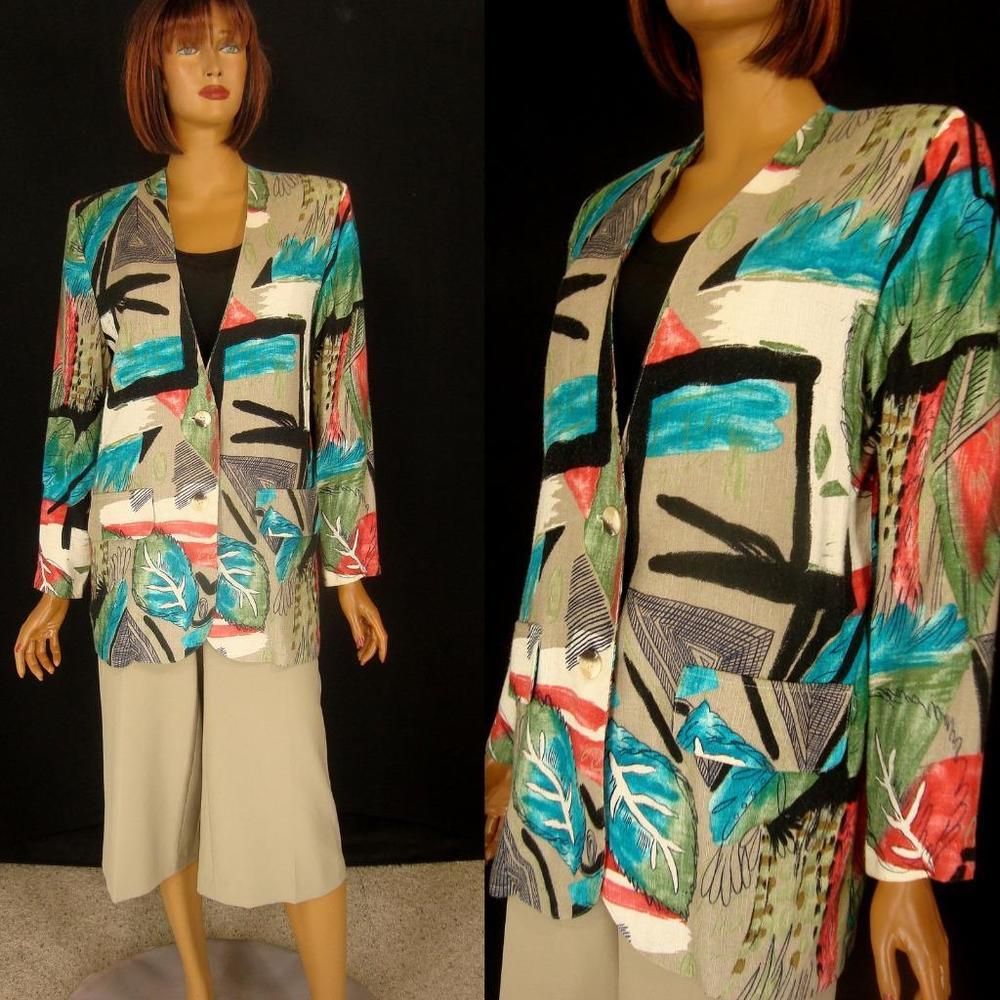 An oversized, abstract, blunt-edged print. (Notice the stylized nature motifs mixed in too.) Prints you find in textiles of indigenous peoples are often Natural. Again, the print is more likely to read as Natural if it's large and not incredibly detailed. A Natural print will not fee aggressive or high-energy.  Large shapes and a neutral color palette make this otherwise somewhat busy print read as rather Natural.  A print or pattern, by itself, adds a lot of detail to a look. And Natural style calls for a very low level of detail. So if you're a pure Natural and you're going for a print, keep your silhouette and garments extra simple, and your other details very, very plain.
Women who are pure Natural and Natural blends, what prints and patterns have you found work for you? If you're not sure of your style type, try the Style Identity Calculator or consider a Virtual Analysis.
Yet we live in an era of casual fashion. What used to be called "sportswear" is the expected everyday clothing for most of us. Dramatic asks for stiffness and tailoring, but most of what's available in department stores is unconstructed and soft, and the stiff, tailored pieces are expensive! Dramatic asks for avant-garde pieces, but some women who are Dramatic blends aren't comfortable with those looks, or don't have access to those items.  Dramatic asks for an aggressive energy, but some Dramatic types don't feel comfortable channeling aggression.  So if you are a Dramatic blend Dramatic, what are your easy options for creating a Dramatic impression?
You can buy pieces as a set... or you can create a visually unbroken line by simply matching your bottoms to your top. If the color is continuous, people will perceive the line as being elongated. The monochromatic look is also visually intense, which reads as Dramatic.
 Women who are Dramatic blends: what are some quick tips and tricks you can share for implementing Dramatic in an everyday wardrobe?
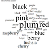
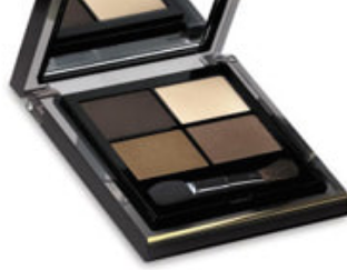
Not sure of your Style ID? Try the Style ID Calculator, or consider a Virtual Analysis. Every product on the True Winter makeup list has been swatched to match a color-accurate True Winter palette book. 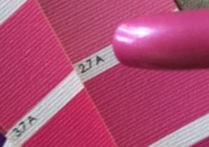 If you're a True Winter, these are your best makeup colors. They look natural and healthy on your skin.  These colors are very vivid and very cold (bluish). Even the yellows are as cold as yellow can be -- you can't detect a bit of orange.  On the makeup list, which has over 400 precisely matched products, you tend to see the same color names appear over and over. That happens on every list, because each color season represents a very specific section of color space. Here are the most frequently-occurring color words on the True Winter makeup list: 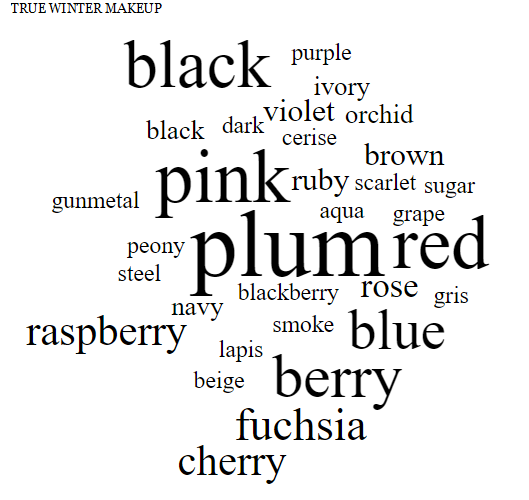 Last week I said I love Dark Autumn because it's so complex. This week I find myself thinking that I love True Winter because it's so focused! (I guess I love all 12 palettes. :-) )
Above, compare True Winter, which is in the center, to True Summer on the left. They're both cool-toned, but see how important grey is for True Summer, while black is True Winter's biggest makeup neutral. Red is also very important for True Winter, but only shows up for True Summers as shades of berry. Also, compare True Winter to Dark Winter, on the right. Notice how Dark Winter stays intense, but brings in warmth with colors like brown, chocolate, moss, coral, and cinnamon. On True Winter skin, this makeup doesn't look shocking or extreme; it looks natural and healthy. Looking at these faces, you'd never guess how saturated and cold the makeup appears on a piece of white paper.
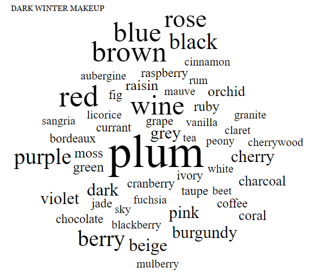
Where I live, the trees are still an Autumny orange and red, but the nights are cold, and it's dark more of the day than not. It's the perfect time of year to talk about Dark Autumn, one of my favorite seasons.
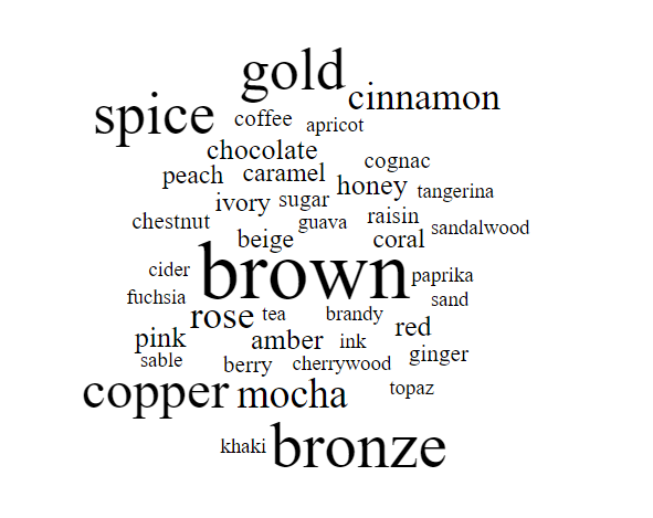
Dark Autumn is Autumn verging on winter. Still Autumn, but darker and colder. Dark Autumn colors are mostly warm and rich, because it's an Autumn season. But they have a bit of added coolness, and they're also very dark. In fact, these colors are dark first and foremost; their warmth is a secondary quality. (Hence the name: Dark Autumn, sometimes known as Deep Autumn) 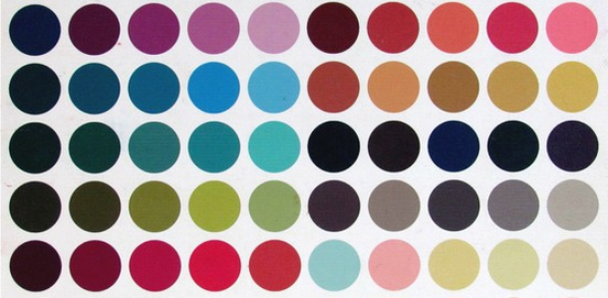 (The light colors you see in Dark Autumn's palette actually make sense as darks as well: they're deepened versions of what would be a tinted white in another palette. Dark Autumn gets a white too; it's an ivory, though, not a pure white.) When you're a Dark Autumn, your makeup colors all come right from your color palette.  For years now, I've been keeping a list of makeup products that are precisely matched to the Dark Autumn color palette. If you want to spare yourself the trouble of rubbing makeup on white paper and comparing it to the Dark Autumn palette, my list is a good investment. It has hundreds of products on it.  Because this palette (like all seasonal palettes) occupies a very precise section of color space, we see the same color words appear over and over on the makeup list. Here's the Dark Autumn makeup word cloud, which shows the most common color words. The size of the word indicates how often it appears on the list.  Dark Autumn makeup What I love about Dark Autumn is its contradictions. Somehow, it seems more complicated than other neutral (not purely warm or cool) seasons. How do you put together pink, rose, and violet with brown, red, and chocolate? Dark Autumn, that's how. I love seeing gold, cherry, and plum right next to each other. Or amber, ink, and fig. So unexpected, yet Dark Autumn makes it work. Last week, I did the True Autumn makeup word cloud, and I did Dark Winter a while back. Here is True Autumn on the left, Dark Autumn in the middle, and Dark Winter in the right. (I actually redid the Dark Winter word cloud in font that's consistent with my more recent clouds.)
I find it really interesting how Dark Autumn represents a middle place between a season that's very rich and warm, and a season that's coolish and very dark. Autumn foliage plus jewel tones! I had fun making this graphic showing how Dark Autumn color words combine important words from both True Autumn and Dark Winter.  Isn't that fun to look at? This season makes more sense when you see it on a human being. These Dark Autumns beautifully combine warmth and coolness. You see greys, blacks, navies, and purples with oranges, browns, olives, and rusts.
 You who are Dark Autumns, do you enjoy the contradictions of your palette? Or do you even experience your palette that way? Maybe this is your normal! :-)
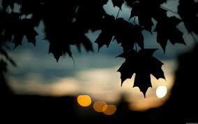
This was one of the few makeup word clouds that came out more or less exactly as I would have predicted. Maybe that's because the True Autumn palette is such an intuitive palette; it's very easy to explain. I mean, it's right there in the name.  True Autumn's colors are somewhat saturated, a bit on the darker side, and very, very warm. 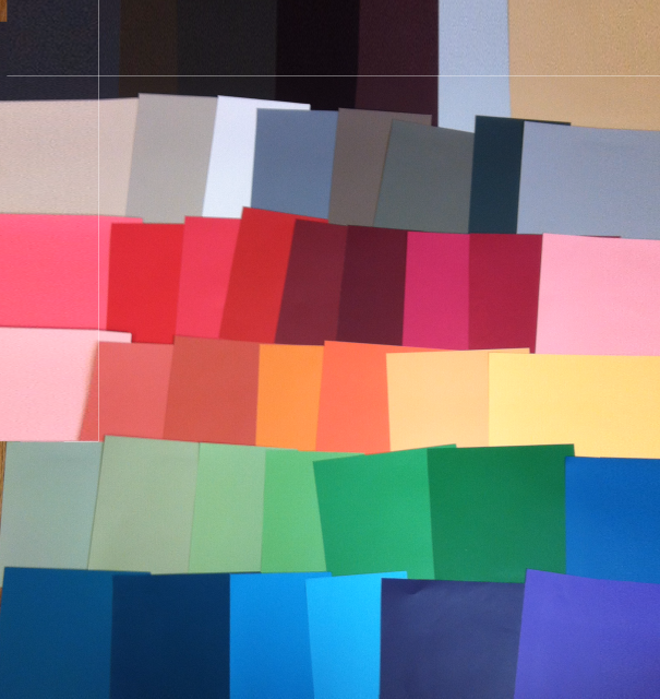 If you're a True Autumn, your best colors are also somewhat saturated, a bit on the darker side, and very, very warm. Your least flattering colors are probably very cool and very light -- True Summer and Light Summer are probably really bad for you. You avoid white, pale blue, and light pink for your face. 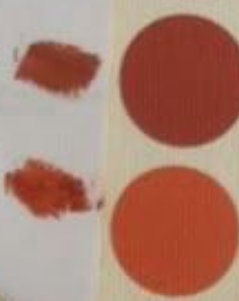 Here's the word cloud showing which color words appear the most often on a list of over 400 cosmetics matched to the True Autumn palette:  Brown, bronze, gold, copper, spice. No surprises here, right? I think this is what we all picture when we picture True Autumn. Except maybe that "fuchsia" floating over on the left. True Autumn does have a pinky red that edges into "hot pink" territory. But you know this fuchsia is "spiced fuchsia" or "golden fuchsia" or some other version that warms and deepens the color enough to make it True Autumn. Isn't it funny how so many of the food names -- which you find in lots of cosmetics -- are warming foods? Coffee, tea, paprika, ginger...?
Last week, after remarking on pink's importance for Soft Autumn, I predicted we'd see much less of it, and in fact pink's role in True Autumn makeup is small. By moving from Soft Autumn to True Autumn, our palette becomes both darker and warmer. Add enough warmth to pink, and you can't really call it pink anymore -- you have peach or coral instead. In True Autumn makeup, the role played by pink -- mainly lipstick and blush -- is often played instead by earthy reds and oranges.  Here are pics of beautiful True Autumn makeup. (Minus, of course, some obligatory black liner and mascara; when will Hollywood make-up artists give this up? Years from now, we'll look back at pictures from this era and see a sea of faces with tiny black eyes. True Autumns are better in brown liner and mascara.)
Based on sales of my makeup lists, I believe True Autumn is actually the rarest season. Are you a True Autumn?
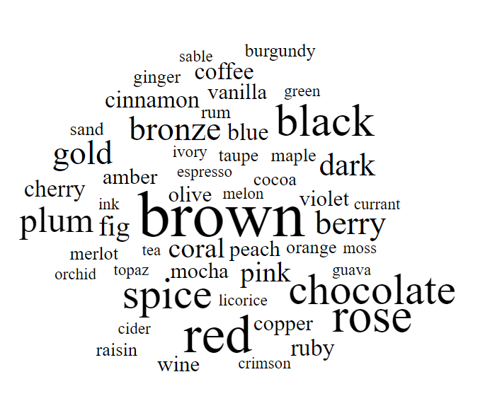
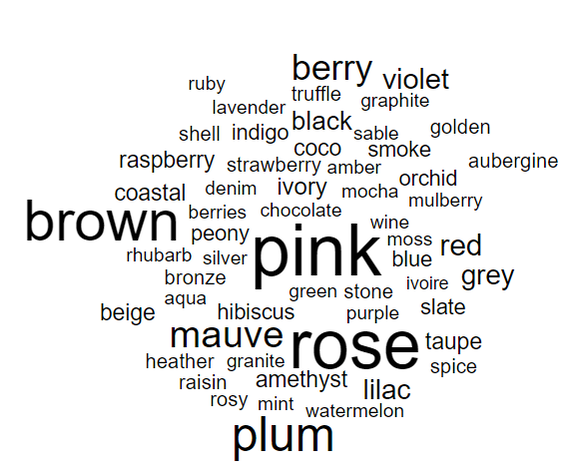
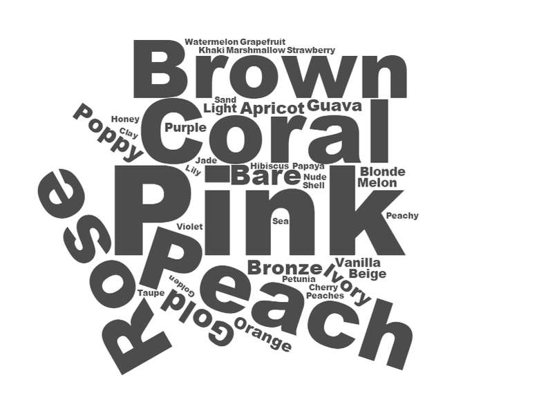
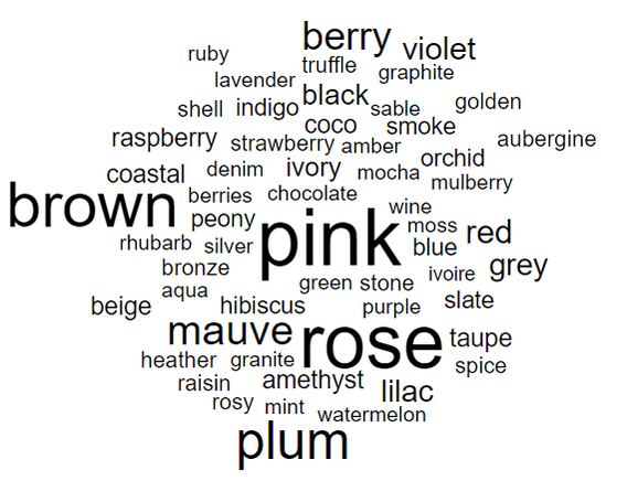
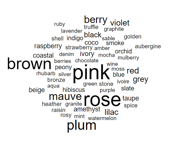
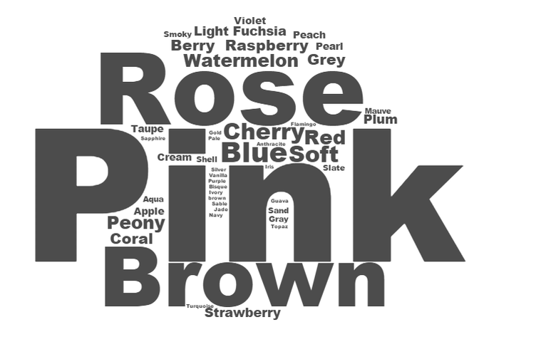
- - - - I want to take a moment to talk about something unrelated to True Autumn makeup, but absolutely related to empowering women: life coaching. In particular, a life coach named Alexandra Gould. I want to brag on her for no other reason than that she is a rock to me, and I would love for every woman to have her in their life as well. Alexandra is, hands-down, the most positive and inspiring person I know. She is wise, practical, results-oriented, and endlessly patient. If you feel stuck, Alexandra can help you get unstuck. She's on Instagram and Facebook -- check her out! :-) Today, I'm happy to continue my series on makeup list word clouds by writing about my own season, Soft Autumn. 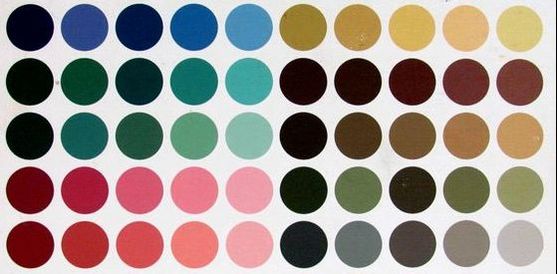 Like Soft Summer, which I wrote about last week, Soft Autumn is a very muted, faded palette. While Soft Summer is faded and cool-toned, meaning the colors lean bluish, Soft Autumn is faded and warm-toned, meaning the colors lean orangeish. Neither its softness nor its warmth is necessarily obvious when you look at the palette without any other context. Here are Soft Autumn color cards: you might not describe these, taken by themselves as particularly warm or soft.  It's only when you compare Soft Autumn to very saturated, very cool season, such as True Winter, that the warmth and softness of the Soft Autumn colors become apparent.  Above, you see True Winter color cards. Wow! See how much more vivid they are, and how much colder? It's particularly easy to see the hue difference when you look at True Winter's reds and pinks, which are violet- and purple-tinged. Soft Autumn's reds and pinks are warm and dusty. Color is context. On a Soft Autumn, these very muted colors look plenty vivid. If Soft Autumn colors look faded on you, you're not a Soft Autumn.  All of the makeup products on the Soft Autumn makeup list have been matched to SCi/Art - accurate color books. 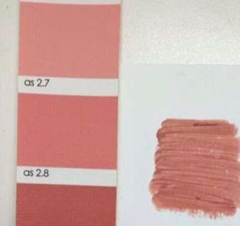 What are the color words that appear the most often in these product names? Let's find out. 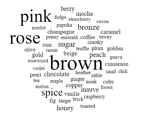 Soft Autumn makeup word cloud If you've read my posts from the last few weeks, you may remember that pink and rose (which just means pink) are important for the light, cool Summer seasons, and that this makes sense because pure pink is, by definition, a light, cool color. (Pure pink is a light red that leans toward purple.) So you may be surprised to see it feature so prominently among Soft Autumn's makeup color words, given that Soft Autumn is a warm season. The fact that it's here, though, reflects that Soft Autumn, unlike its neighbor True Autumn, is not purely warm; it's just warmish. In the same way that Soft Summer's color words include a few that suggest warmth (such as moss), you'll see that some of Soft Autumn's color words suggest coolness. Mauve is up there, as is berry and raspberry.
Above, you see Soft Autumn's makeup word cloud on the left and Soft Summer's on the right. Weirdly similar, right? Pink, rose, and brown are important for both of these gentle, neutral-leaning seasons. (Do keep in mind that Soft Autumn pinks are mostly brown-pinks and peachy pinks -- light reds with only a hint of coolness. ) When colors are this faded, it can be hard to distinguish them with nomenclature, and that's part of why so many women with muted coloring can't decide between these two seasons. You have to dig deeper into the words to see the hue (warmth-coolness) differences: Soft Autumn has no "blue," the coolest color; no "mint" or "aqua"; no "gray," "stone," or "slate." And Soft Summer lacks "fig," "ginger," "brick," "chili," and "paprika." (Without having made it yet, I predict that the True Autumn word cloud will have a lot less pink than Soft Autumn. True Autumn is just too warm, and perhaps too dark as well.) Soft Autumn is the lightest Autumn palette. Let's look at it next to Light Spring, which is another palette that's light and warm. Light Spring is both lighter and more vivid than Soft Autumn -- popsicle colors versus desert colors -- but many women get stuck between these two seasons.
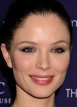
Here's Soft Autumn's makeup on the left, and Light Spring's on the right. You can see that Light Spring's makeup is more pure and clear because of the relative prominence of words like "coral," "peach," and "guava." You have more basic color words too, such as "purple" and "orange." Wait -- let's get back to brown, though! Because brown is obviously the most important word in Soft Autumn makeup. Do you remember Christine Scaman's article, "Three Great Colors on the 12 Seasons"? She didn't assign every season a neutral as one of its best colors, but she identified brown as a top color for Soft Autumns. No coincidence there. If you look at the smaller words in the Soft Autumn word cloud -- the words that occur less frequently on the makeup list -- you'll see other versions of brown: chocolate, sand, taupe, tea, coffee, caramel, mocha, fudge. Brown is exciting on Soft Autumns. Here are some gorgeous Soft Autumns in gorgeous Soft Autumn makeup. The makeup doesn't look washed-out, right? It just looks balanced. That's what happens when you put Soft Autumn makeup on Soft Autumn skin.
If you're not sure of your season, but you recognize your best makeup in the Soft Autumn word cloud, you may be a Soft Autumn. (In-person color draping is the best option for determining your season accurately, but if that's not practical, consider home draping cards. )
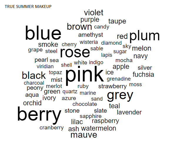
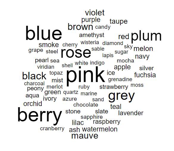
If you've been following my blog recently, you know I'm trying to complete my series on color words in the 12 makeup palettes. Last week, I wrote about True Summer's makeup, which is somewhat light, a bit faded, and very, very cool-toned. This week, I'm writing about True Summer's neighbor, Soft Summer. As we move from True Summer to Soft Summer, our colors become - a bit more dark, - even more faded, - and a bit warmer. Soft Summer's colors are still light, cool, and soft relative to the other seasons, because Soft Summer is Summer first and foremost. Soft Summer and Light Summer, its near-neighbor on the other side of True Summer, have in common that neither palette, unlike True Summer, is completely cool; Light Summer adds a bit of Spring's clear warmth to its palette, and Soft Summer adds a bit of Autumn's toasty warmth. The Soft Summer makeup list currently has about 650 products on it, every one of which has been matched to original the Sci/Art Soft Summer palette.  (You'll find many versions of the Soft Summer palette online, but only those that derive from Sci/Art palettes are truly accurate.)  Here are the color words that appear most frequently on the Soft Summer makeup list.  I'm not surprised to see pink appear so often: pink is light, cool red, and as such it is a defining color of all three light, cool seasons. And rose is just a synonym for pink. But notice the supplemental colors: brown, plum, mauve. The importance of these colors to a Soft Summer's makeup reflects this woman's need for slightly deeper and warmer colors on her face. If you look at the less-frequently-appearing color names, you'll see some that hint at Soft Summer's move toward Autumn richness: bronze, moss, spice. Compare the warm colors in Soft Summer's makeup to the warm colors in Light Summer's makeup. Both Summer subtypes have a touch of warmth, but Soft Summer's hint of warmth is deep and rich, while Light Summer's warmth is light and bright: peach, floral, and flamingo.
Soft Summer on the left, Light Summer on the right. It's also interesting to compare Soft Summer to its lighter, cooler neighbor, True Summer. Blue, the coldest hue, is more important for True Summer. Brown, which is warm, is much more important for Soft Summer.
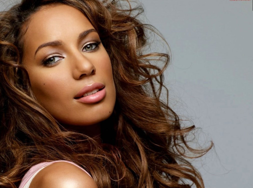
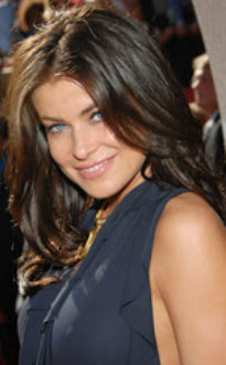
Soft Summer on the left, True Summer on the right. Soft Summer women can have any hair color, any eye color, and any apparent skin tone, but they are united by the fact that their best colors are mostly (but not completely) cool, a bit (but not a lot) on the light side, and very, very faded. These are cool pastels that are smudgy and smoky. Check out Soft Summers Leona Lewis, Carmen Electra, Emma Roberts, and Emilia Clarke looking like the most beautiful versions of themselves. No masks here.
If this makeup is your makeup, you may be a Soft Summer. You might consider trying the Soft Summer makeup list; compared to expensive in-person color draping, the list is a steal at $15. It could confirm your season.  You might also consider home draping cards; they are Sci/Art color-accurate, and at $24 or $48, much more affordable than in-person draping (which costs hundreds.) The True Summer (a.k.a. Cool Summer) makeup list has almost 800 products on it that have been precisely matched to original Sci/Art True Summer colors. (For those of you just joining us, if you're a True Summer, the colors in your True Summer palette are your most beautiful makeup colors.) 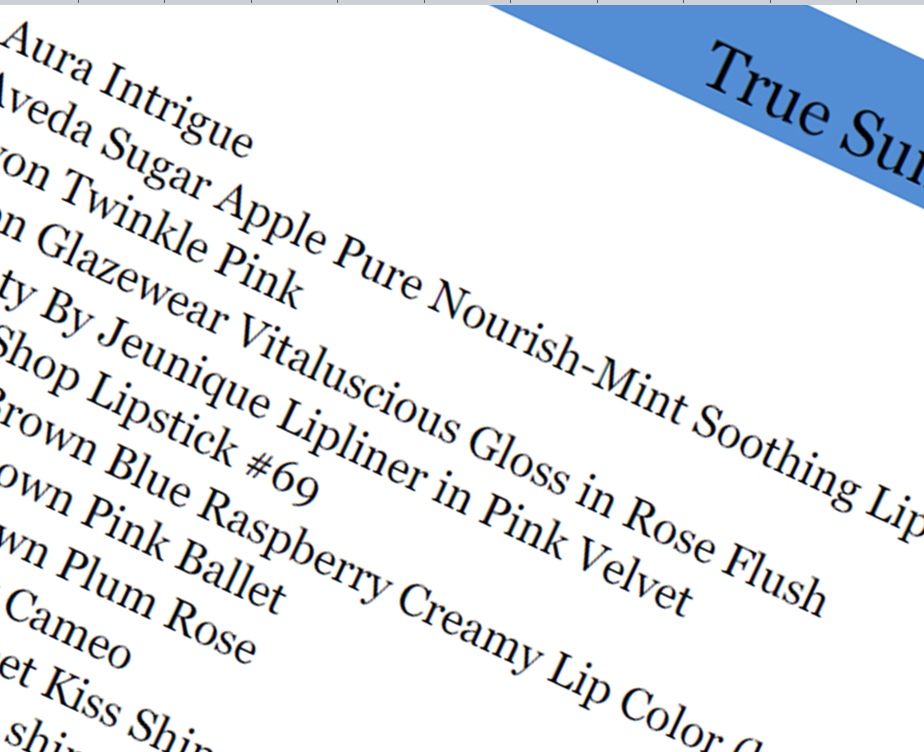 In terms of hue, value, and chroma, True Summer's colors, and therefore its makeup products, are - very cool (appearing blue-toned) - somewhat more light than dark - somewhat faded 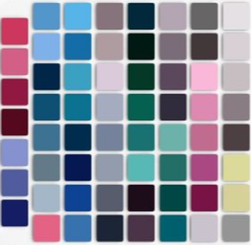 When you look at a list of makeup products that all match a very defined palette, you start to see certain color words over and over again. Let's look at the list of ~800 products that match the True Summer palette, and see which color words appear the most often.  Pink, blue, and grey. That pretty much sums up True Summer, actually.  Here's True Summer's makeup word cloud next to Light Summer's makeup word cloud, which I talked about last week:
Pink is super-important for True Summer, as it is for Light Summer. But as we move from Light Summer into True Summer, the colors become both cooler and darker. The increase in coolness explains why blue and grey suddenly become much more important, while brown almost disappears; the increase in darkness explains why plum is now making a huge showing. While we're on the subject of darker colors, you may be wondering why "black" appears in any True Summer makeup names, since True Summer technically does not contain black in its palette. (And True Summers are overwhelmed by black.) In the True Summer makeup list, you see "black" appear as a modifier indicating a darker shade: for example, Estee Lauder's Black Plum eyeliner, or CoverGirl's Black Sapphire mascara. True Summer neutrals don't go as dark as pure black, but True Summer does have some deep blues, purples, charcoals and purple-browns. (By contrast, there's no Light Summer makeup color that could be described as "black" anything.) Here are True Summers Ashley Green and Georgina Chapman in makeup that's great for their season.
If you're a confirmed or suspected True Summer, do you recognize your best makeup in these color names? Share in the comments!
(If you don't know your color season, consider trying the at-home draping cards.) Many of you will be very happy to see me continue my series of posts about the word clouds I've made from products in the seasonal makeup lists. :-) I apologize for the delay! To orient those just joining us, there are 12 color seasons, each with its own palette of colors that exist at precise points on each of these three spectra: light ............................... dark saturated..........................faded cool...................................warm Light Summer is a color season. Its colors are mostly cool-toned, a bit faded, and very light.  The Light Summer seasonal makeup list has hundreds of products that have been precisely matched to the Light Summer color palette. (Because a Light Summer's perfect makeup is makeup that matches those colors.) 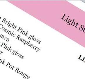 Since the products on the list all occupy a small, defined area in color space, one tends to see the same color names over and over. Here's what happens when I feed all of the color names from the Light Summer makeup list into a word cloud generator. The size of the word represents how freqently the word appears in the list.  Pink! Wow. Pink is important for Light Summer. That makes sense if you think about it; pink is technically just light, cool red, and Light Summer is a light, cool palette. Light Summer's "oranges" are peachy pinks, and Light Summer's "reds" are deep pinks. 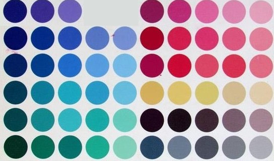 "Rose" is basically a synonym for pink, so it makes sense to see it feature so prominently in Light Summer's makeup word cloud.
The importance of "brown" in Light Summer makeup reflects the fact that, for deep neutrals (like we typically use in eyeshadow and eyeliner), Light Summer will never get black or charcoal. It's just too light a season. Brown and grey are the neutrals that lighter seasons rely on in makeup. Light Summer's browns will always be cool browns: pinkish browns or purplish browns or greyish browns or silvery browns. You'll see words like "cocoa," "mink," "taupe," and "stone" use to describe these cool browns. In the background of the word cloud, we have many more forms of pink: fuchsia, watermelon, cherry, berry, and raspberry. We also see coral, which is a peachy pink; Light Summer borders light and warm Light Spring, and has a hint of warmth. (Light Summers, but not True Summers, look gorgeous in a buttery yellow.) If you have cool undertones, and you see the makeup that flatters you reflected in this word cloud, you may be a Light Summer. If you're not sure which of the 12 color seasons is your perfect fit, consider trying the home draping cards. They're precisely matched to original Sci/Art colors, the gold standard of seasonal color palettes.
I can't say enough about this beautiful handmade jewelry. I'm writing about it because I had the opportunity this summer to see it in person.
I had no idea what went into making jewelry by hand. It's frankly awe-inspiring to hold one of these in your hand and think about the fact that the person sitting across from you made it. The silversmith who makes this jewelry, Linda Groom, is so talented. This is the kind of jewelry you own forever; it's flawlessly crafted, it's heavy -- it's real, you know? One of the things I really respect about Linda's jewelry is that she has a consistent aesthetic you can feel across all of her pieces. Blunt edges, earthy materials, organic shapes, and hammered finishes embody the Natural style type. If you're a Natural blend, there's a piece in Linda's collection that will resonate with you.
I love this bracelet for a Natural with Ethereal and Classic elements, a "Preppy Bohemian." The glow of the silver, the slender, gently curving lines, and the overall color scheme add Ethereal; the regularity and balance make it fitting for a Classic as well.
This gorgeous bracelet is good for a Natural with a strong Romantic influence -- a "Babe Next Door." Romantic comes in through the rounder shapes and the deep purple color. 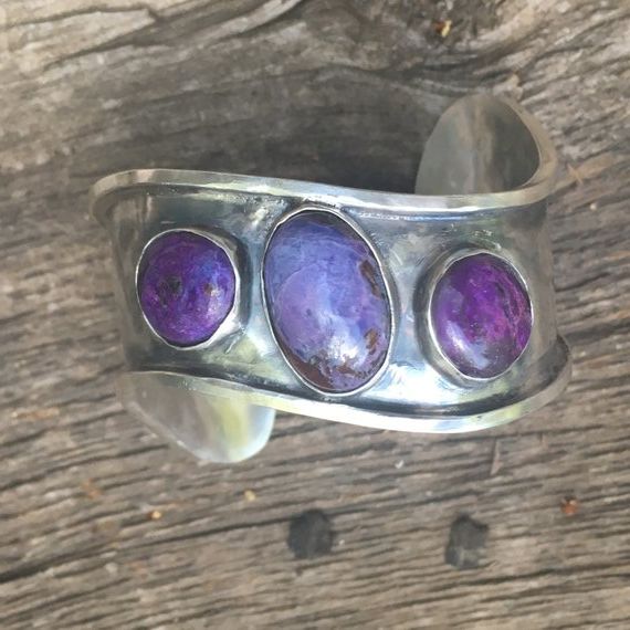
I love this bracelet. It's abstract, but dainty and playful too. It's great for a Natural with Ethereal and either Gamine or Ingenue essences. 
These are gorgeous earrings for a Natural with some Ethereal and Ingenue influences -- a"Flower Child." 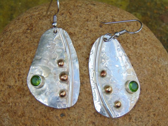
This is a beautiful bracelet for a Natural with Romantic and Classic -- "Today's Southern Belle." The cuff's overall symmetry adds the Classic element. 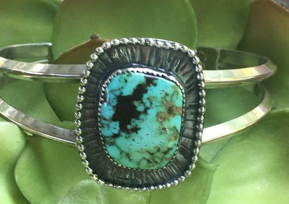
These earrings would be lovely for a Natural Gamine with some additional feminine influence (Romantic, Ethereal, or Ingenue). 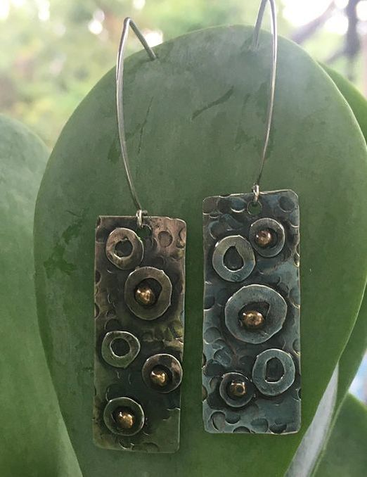
I love these for a Natural with Romantic and Ethereal -- a "Glamorous Gypsy." Romantics are great with big, round shapes; the cutout here adds a mystical quality. 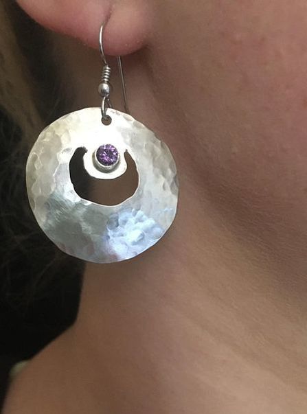
Linda makes knives too; can you believe it? So incredibly cool. I wonder what types you think her other pieces would suit? Check them out here, and let me know in the comments. |

About Me...I'm passionate about helping people become their most authentic and beautiful selves. 
Categories
All
|
- home
- Blog
-
-
- Book your virtual style analysis
- ♂ DRAMATIC style type
- ♂ NATURAL style type
- ♂ GAMINE style type
- ⚥ CLASSIC style type
- ♀ INGENUE style type
- ♀ ROMANTIC style type
- ♀ ETHEREAL style type
-
- ⚥ ♂ Classic Gamine -- The Prep Schooler
- ⚥ ♀ Classic Ingenue -- The Class President
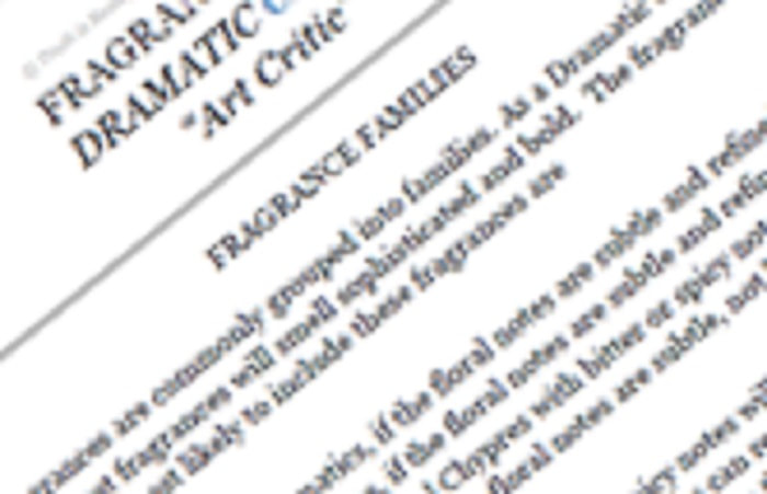
- ⚥ ♂ Dramatic Classic -- The Art Critic
- ♂ ♂ Dramatic Gamine -- The Punk Rocker
- ♀ ♂ Dramatic Ingenue -- The Childlike Czarina
- ♂ ♂ Dramatic Natural -- The Amazon Queen
- ⚥ ♀ Ethereal Classic -- The Delicate Sophisticate
- ♀ ♂ Ethereal Dramatic -- The Sorceress
- ♀ ♂ Ethereal Gamine -- The Sprite
- ♀ ♀ Ethereal Ingenue -- The Fairy
- ♀ ♂ Ethereal Natural -- The Earth Goddess
- ♀ ♂ Gamine Ingenue -- The Girlish Mod
- ⚥ ♂ Natural Classic -- The Prep
- ♂ ♂ Natural Gamine -- The Tomboy
- ♀ ♂ Natural Ingenue -- The Outdoorsy Sweetheart
- ⚥ ♀ Romantic Classic -- The Sexy Sophisticate
- ♀ ♂ Romantic Dramatic -- The Vamp
- ♀ ♀ Romantic Ethereal -- Aphrodite
- ♀ ♂ Romantic Gamine -- The Firecracker
- ♀ ♀ Romantic Ingenue -- The Demure Seductress
- ♀ ♂ Romantic Natural -- The Babe Next Door
-
- ⚥ ♀ ♂ Classic-Gamine-Ingenue
- ⚥ ♂ ♂ Dramatic-Classic-Gamine
- ⚥ ♀ ♂ Dramatic-Classic-Ingenue
- ♂ ♂ ♀ Dramatic-Gamine-Ingenue
- ⚥ ♂ ♂ Dramatic-Natural-Classic
- ♂ ♂ ♂ Dramatic-Natural-Gamine
- ♂ ♂ ♀ Dramatic-Natural-Ingenue
- ⚥ ♀ ♂ Ethereal-Classic-Gamine
- ⚥ ♀ ♀ Ethereal-Classic-Ingenue
- ⚥ ♀ ♂ Ethereal-Dramatic-Classic
- ♂ ♂ ♀ Ethereal-Dramatic-Gamine
- ♀ ♂ ♂ Ethereal-Dramatic-Natural
- ♀ ♀ ♂ Ethereal-Dramatic-Ingenue
- ♀ ♀ ♂ Ethereal-Gamine-Ingenue
- ⚥ ♀ ♂ Ethereal-Natural-Classic
- ♂ ♂ ♀ Ethereal-Natural-Gamine
- ♀ ♀ ♂ Ethereal-Natural-Ingenue
- ⚥ ♂ ♂ Natural-Classic-Gamine
- ⚥ ♀ ♂ Natural-Classic-Ingenue
- ♂ ♂ ♀ Natural-Gamine-Ingenue
- ⚥ ♀ ♂ Romantic-Classic-Gamine
- ⚥ ♀ ♀ Romantic-Classic-Ingenue
- ⚥ ♀ ♂ Romantic-Dramatic-Classic
- ♂ ♂ ♀ Romantic-Dramatic-Gamine
- ♀ ♀ ♂ Romantic-Dramatic-Ingenue
- ♂ ♂ ♀ Romantic-Dramatic-Natural
- ⚥ ♀ ♀ Romantic-Ethereal-Classic
- ♀ ♀ ♂ Romantic-Ethereal-Dramatic
- ♀ ♀ ♂ Romantic-Ethereal-Gamine
- ♀ ♀ ♀ Romantic-Ethereal-Ingenue
- ♀ ♀ ♂ Romantic-Ethereal-Natural
- ♀ ♀ ♂ Romantic-Gamine-Ingenue
- ⚥ ♀ ♂ Romantic-Natural-Classic
- ♂ ♂ ♀ Romantic-Natural-Gamine
- ♀ ♀ ♂ Romantic-Natural-Ingenue
- Shop
- Book a Virtual Style Analysis!
- Contact me
- home
- Blog
-
-
- Book your virtual style analysis
- ♂ DRAMATIC style type
- ♂ NATURAL style type
- ♂ GAMINE style type
- ⚥ CLASSIC style type
- ♀ INGENUE style type
- ♀ ROMANTIC style type
- ♀ ETHEREAL style type
-
- ⚥ ♂ Classic Gamine -- The Prep Schooler
- ⚥ ♀ Classic Ingenue -- The Class President
- ⚥ ♂ Dramatic Classic -- The Art Critic
- ♂ ♂ Dramatic Gamine -- The Punk Rocker
- ♀ ♂ Dramatic Ingenue -- The Childlike Czarina
- ♂ ♂ Dramatic Natural -- The Amazon Queen
- ⚥ ♀ Ethereal Classic -- The Delicate Sophisticate
- ♀ ♂ Ethereal Dramatic -- The Sorceress
- ♀ ♂ Ethereal Gamine -- The Sprite
- ♀ ♀ Ethereal Ingenue -- The Fairy
- ♀ ♂ Ethereal Natural -- The Earth Goddess
- ♀ ♂ Gamine Ingenue -- The Girlish Mod
- ⚥ ♂ Natural Classic -- The Prep
- ♂ ♂ Natural Gamine -- The Tomboy
- ♀ ♂ Natural Ingenue -- The Outdoorsy Sweetheart
- ⚥ ♀ Romantic Classic -- The Sexy Sophisticate
- ♀ ♂ Romantic Dramatic -- The Vamp
- ♀ ♀ Romantic Ethereal -- Aphrodite
- ♀ ♂ Romantic Gamine -- The Firecracker
- ♀ ♀ Romantic Ingenue -- The Demure Seductress
- ♀ ♂ Romantic Natural -- The Babe Next Door
-
- ⚥ ♀ ♂ Classic-Gamine-Ingenue
- ⚥ ♂ ♂ Dramatic-Classic-Gamine
- ⚥ ♀ ♂ Dramatic-Classic-Ingenue
- ♂ ♂ ♀ Dramatic-Gamine-Ingenue
- ⚥ ♂ ♂ Dramatic-Natural-Classic
- ♂ ♂ ♂ Dramatic-Natural-Gamine
- ♂ ♂ ♀ Dramatic-Natural-Ingenue
- ⚥ ♀ ♂ Ethereal-Classic-Gamine
- ⚥ ♀ ♀ Ethereal-Classic-Ingenue
- ⚥ ♀ ♂ Ethereal-Dramatic-Classic
- ♂ ♂ ♀ Ethereal-Dramatic-Gamine
- ♀ ♂ ♂ Ethereal-Dramatic-Natural
- ♀ ♀ ♂ Ethereal-Dramatic-Ingenue
- ♀ ♀ ♂ Ethereal-Gamine-Ingenue
- ⚥ ♀ ♂ Ethereal-Natural-Classic
- ♂ ♂ ♀ Ethereal-Natural-Gamine
- ♀ ♀ ♂ Ethereal-Natural-Ingenue
- ⚥ ♂ ♂ Natural-Classic-Gamine
- ⚥ ♀ ♂ Natural-Classic-Ingenue
- ♂ ♂ ♀ Natural-Gamine-Ingenue
- ⚥ ♀ ♂ Romantic-Classic-Gamine
- ⚥ ♀ ♀ Romantic-Classic-Ingenue
- ⚥ ♀ ♂ Romantic-Dramatic-Classic
- ♂ ♂ ♀ Romantic-Dramatic-Gamine
- ♀ ♀ ♂ Romantic-Dramatic-Ingenue
- ♂ ♂ ♀ Romantic-Dramatic-Natural
- ⚥ ♀ ♀ Romantic-Ethereal-Classic
- ♀ ♀ ♂ Romantic-Ethereal-Dramatic
- ♀ ♀ ♂ Romantic-Ethereal-Gamine
- ♀ ♀ ♀ Romantic-Ethereal-Ingenue
- ♀ ♀ ♂ Romantic-Ethereal-Natural
- ♀ ♀ ♂ Romantic-Gamine-Ingenue
- ⚥ ♀ ♂ Romantic-Natural-Classic
- ♂ ♂ ♀ Romantic-Natural-Gamine
- ♀ ♀ ♂ Romantic-Natural-Ingenue
- Shop
- Book a Virtual Style Analysis!
- Contact me
Connect with me!


 RSS Feed