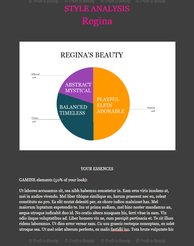
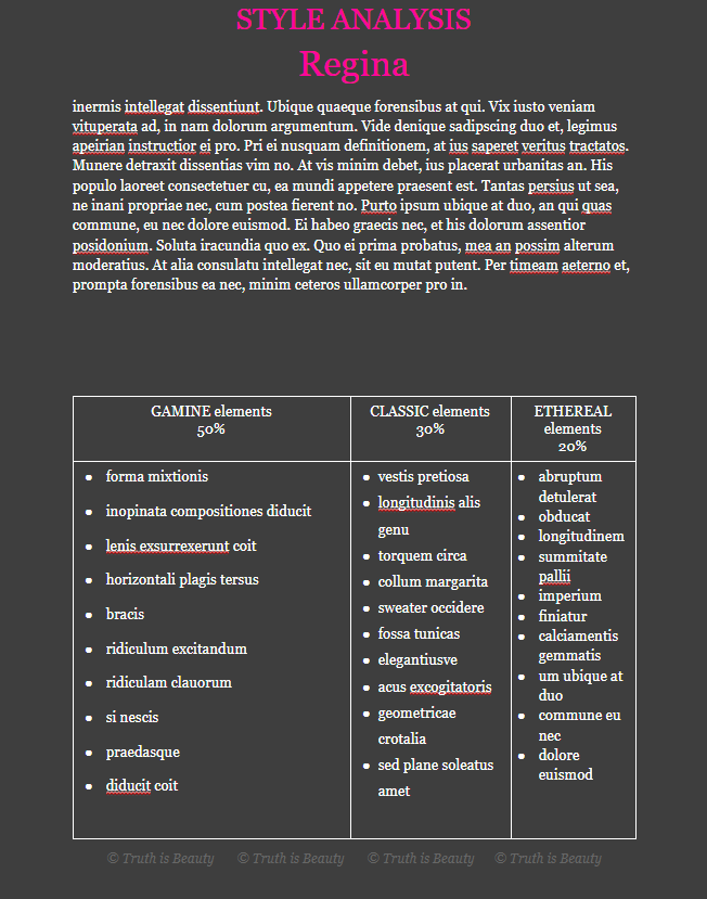
|
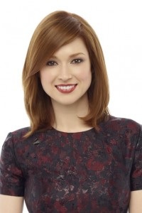
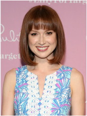
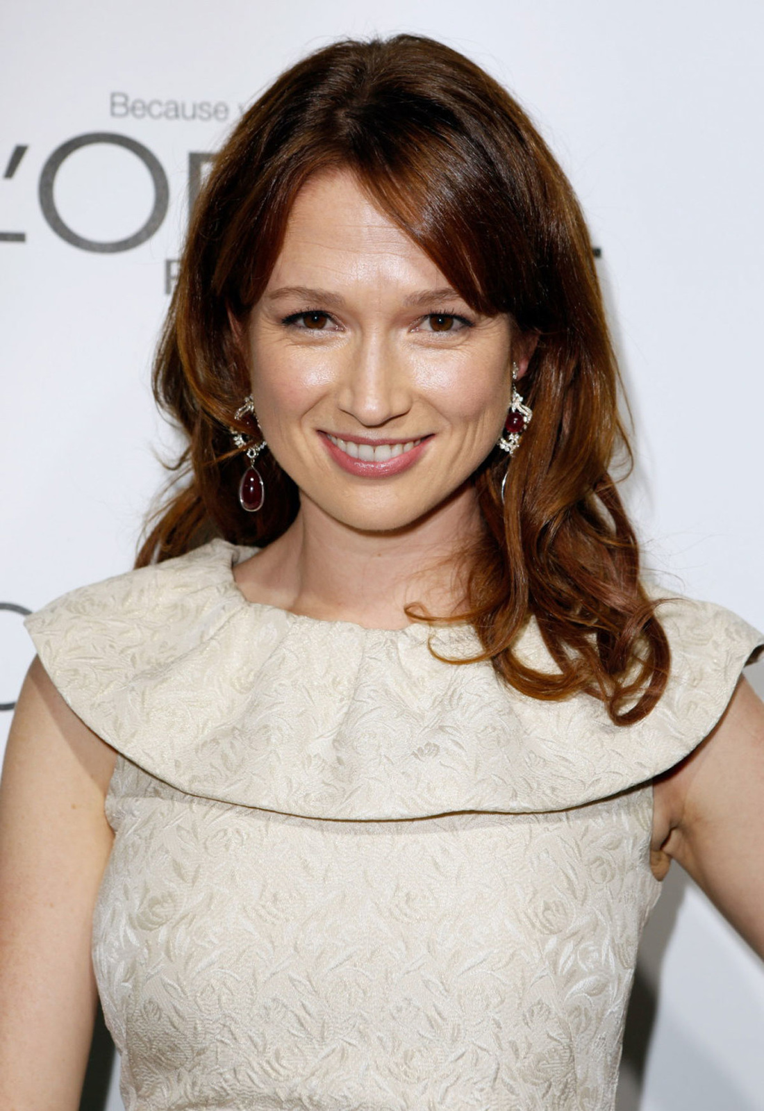
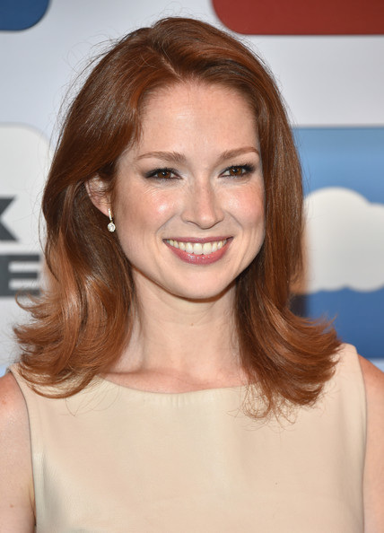
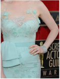
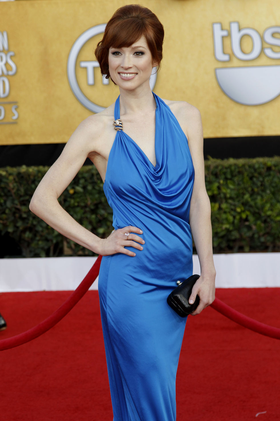
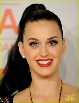
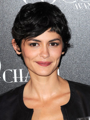
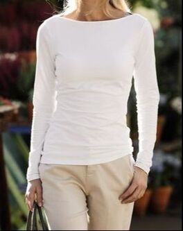
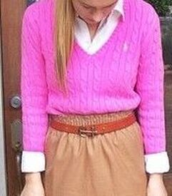
This is a revolutionary new way of thinking about style. All of the advice you've received, all of your life, has been about how to dress your body. "If you're petite, avoid long pants. If you're curvy, emphasize your waist. " As far as I can tell, every other style system advises you to dress primarily for your body. But your body isn't what people are mainly looking at. They spend the vast majority of their time looking at your face. And dressing for your body at the expense of your face means you end up looking all wrong. Let me offer you several examples to demonstrate this phenomenon. Here's Ellie Kemper: 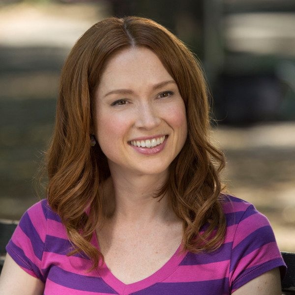 You might know her from "The Office" or "Unbreakable Kimmy Schmidt." She's adorbs, right? If you're guessing that she has a lot of Gamine and a lot of Ingenue (and maybe some Classic?), I'd agree with you. Those stripes are cute on her. (The palette is a separate issue, but never mind.) Another pic of her looking fantastic: 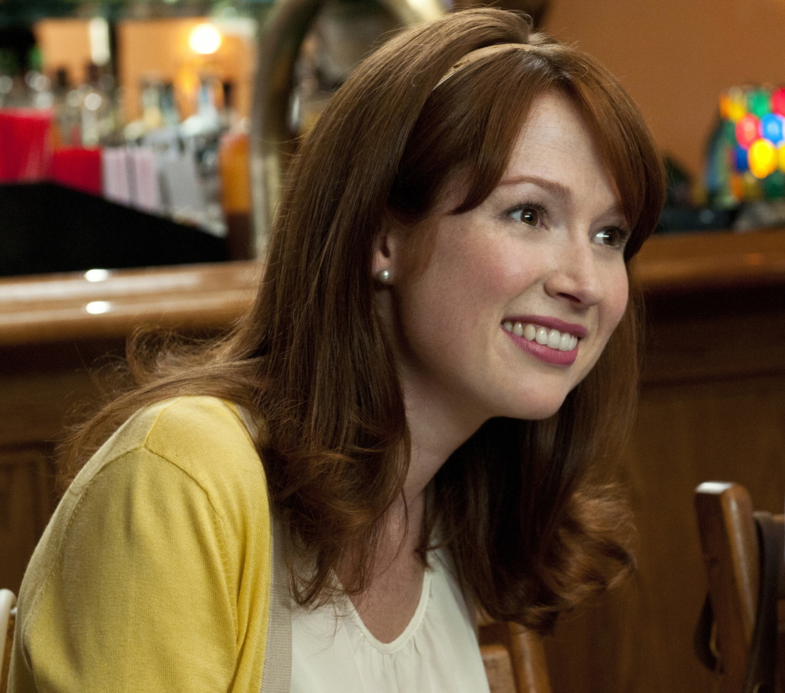 The headband! The bangs! The cardigan! The tiny earrings! The Nancy Drew hair! So, so right for her. So much Gamine and Ingenue. (And maybe some Classic.) Here, tiny ruffles, tiny necklace, yoke emphasis -- so Ingenue, and so good: 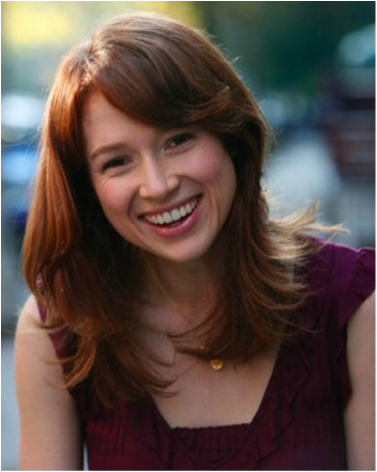 And here: adorable, face-framing curls, small geometric print, simple, round neckline, high waist -- again, lots of Gamine and Ingenue, very good: 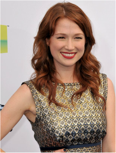 Just a few more images of her looking awesome with lots of Gamine and Ingenue (and some Classic):
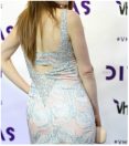
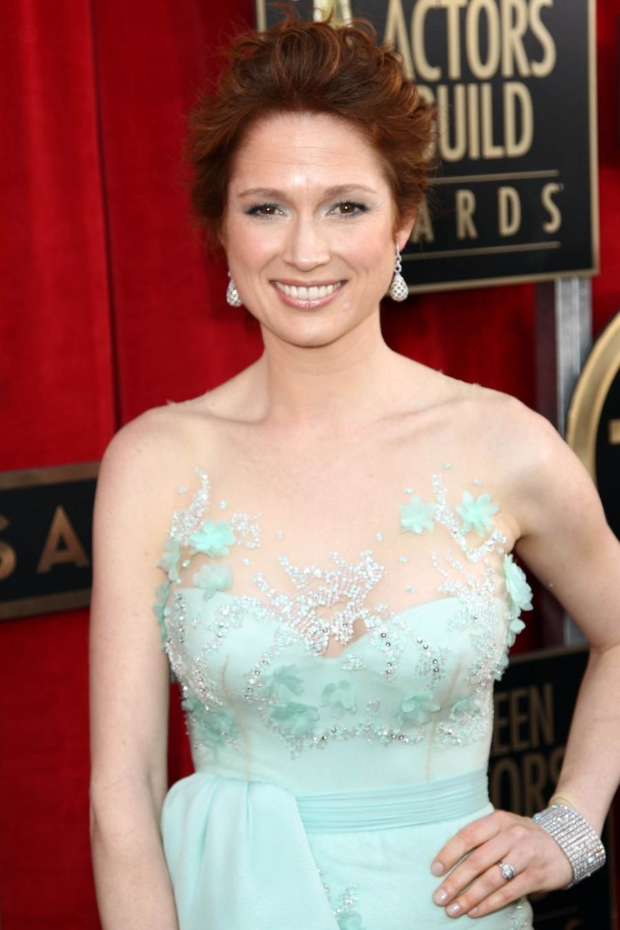
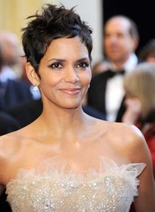
But let's imagine that Ellie Kemper's going to get style advice that considers her body as a significant factor. I don't know if you noticed, but Kemper actually has a super-curvy, very Romantic body.:
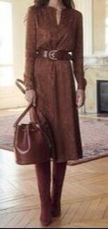
Most style systems will assign Ellie Kemper a style type that dresses her for her curvy body. But that would be all wrong. See how uncomfortable, how not-herself, this Gamine Ingenue (or Classic-Gamine-Ingenue) looks in Romantic styles:
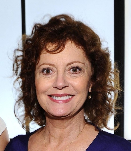
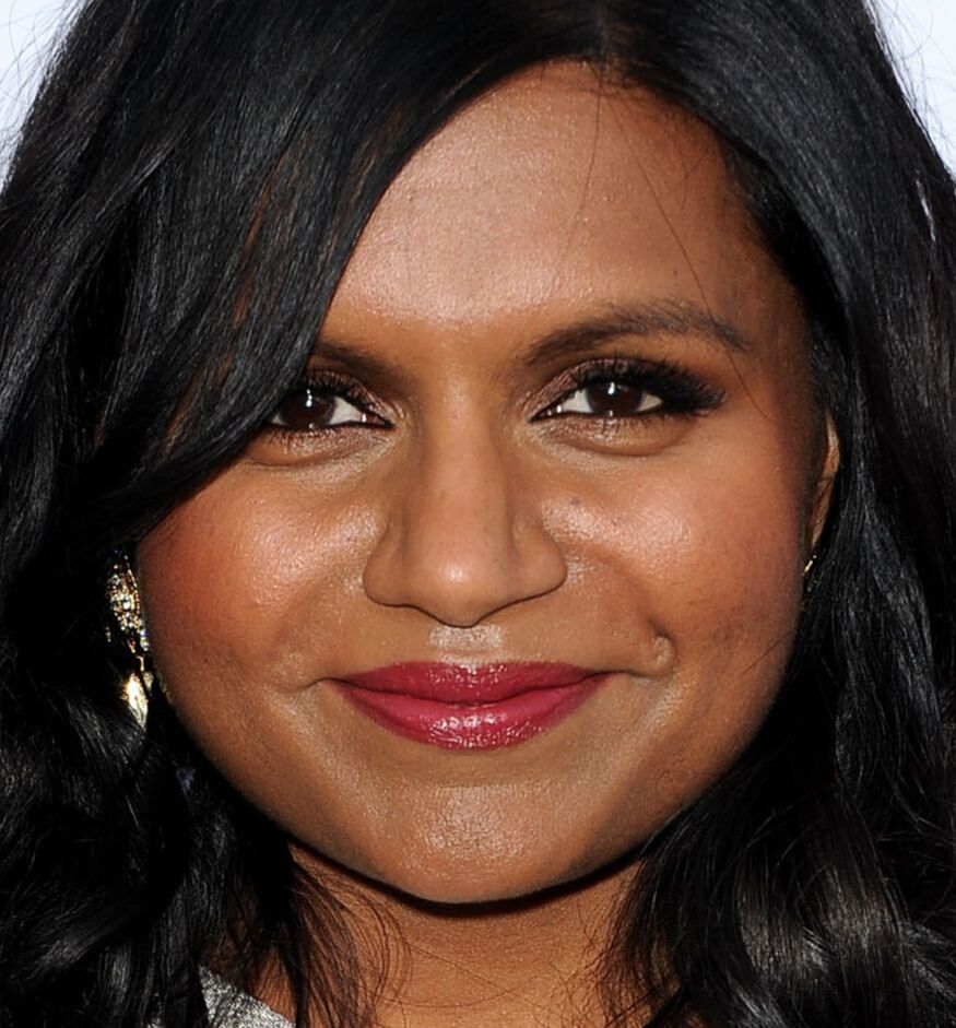
Thank goodness Kemper (or her stylist) usually understand that she needs to dress for her face, not her body. Here, Kemper's waist is obscured and her bust is unemphasized. And it's sooo much better! 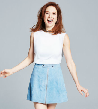 (Jenna Fischer, also from "The Office," is another example of a woman with a Romantic body but a very youthful face. Like Kemper, Fischer looks all wrong in overtly sexy clothes. By contrast, Mindy Kaling of "The Office" has quite a bit of Gamine, like Kemper and Fischer do -- but she also has enough sexy Romantic in her face to totally pull off figure-emphasizing clothes. ) "If you got it, flaunt it" is not a thing. Let it go. Only emphasize your curvy body if it also harmonizes with your face. Dress for your face. Other celebrity examples of dressing primarily for one's face, not one's body:
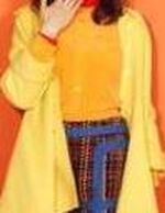
A rather Ingenue face (tiny chin, high forehead, big eyes.)  Is she better in Ingenue or Natural? Ingenue bows, ruffles, puff sleeves, cap sleeves, high waist, feminine hair, midi length skirt: so good.
Natural t-shirts, layers, separates, shaggy hair, undefined neckline, geometric shapes -- not great.
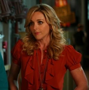
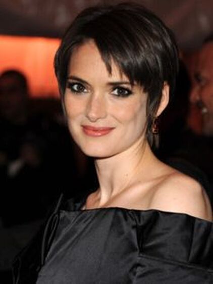
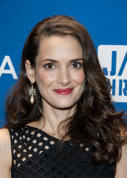
Jane Krakowski is lovelier when she dresses her face, not her body. I'm not saying to totally disregard your body. There are individual tweaks your body may call for that are consistent with a style your face doesn't manifest. For example, Jane Krakowski is flattered by open necklines; they elongate her rather short neck. That's consistent with Natural, not with Ingenue. But her open necklines are best when they're adorned with ruffles or bows. True Natural necklines are wrong for her.
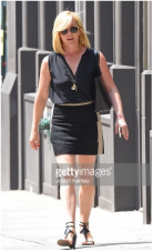
 extremely tall, mostly Dramatic body. Christie is so tall -- 6'3" -- and relatively narrow, most style systems would require her to dress as a Dramatic, or a Dramatic/Natural blend. But that's really wrong for her. Mostly Dramatic, and so not great:
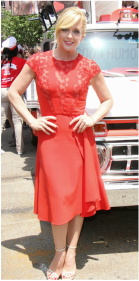
Much more feminine, and so much better for her:
Even more celebrity examples:
To sum up: 1. Identify your style identity based primarily on your face. 2. Make a few tweaks in the direction of a different style identity if you know your body calls for it. Dress for your face!
107 Comments
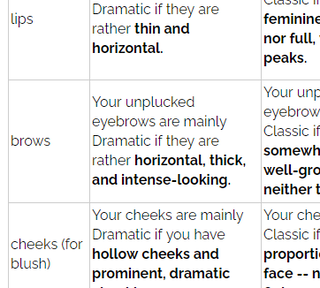
So many of you have requested color cards you can use to drape yourself at home and figure out your color season. I offered home draping cards years ago, and I'm finally able to offer them again! Edit: You can see a video of me using the cards on myself here: Each card is 4 inches by 6 inches and has four colors from a single season: a red or pink, a yellow, a green, and a blue. I've spent many hours making sure these colors are precise for each season. You can order as many or as few seasons as you like. 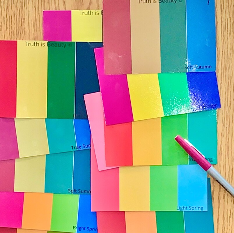 For example, if you simply want to confirm that you're a Bright Spring, you can order just the Bright Spring card. If you know you're a Summer, but you don't know which type, you can order all three Summer cards. If you know for sure that you can wear black, you can order the three Winter cards, Dark Autumn, and Bright Spring. (These are the fve seasons with a true black in their palette.) Figure out your color season at home. To test a card, remove all of your makeup and cover your hair. look at a mirror reflection or a photo of yourself with the card held under your chin. Your correct season will make your skin look healthy and alive. Seasons that are wrong for you can have a variety of negative effects on your skin, depending on what your correct season is.
Click here to download more specific home draping instructions. Please note: Right now, the drop-ship printer I'm using for color cards seems to be taking as long as three weeks to ship the cards. I'm using this printer because I think their cards are top-quality. But if three weeks is too long for you to wait, please don't order the cards. True Spring draping card
$4.99
A True Spring red, yellow, green, and blue on a thick, high-quality postcard. 4" x 6"
True Summer draping card
$4.99
A True Summer red, yellow, green, and blue on a thick, high-quality 4" x 6" postcard. True Autumn draping card
$4.99
A True Autumn red, yellow, green, and blue on a thick, high-quality postcard. 4" x 6".
True Winter draping card
$4.99
A True Winter red, yellow, green, and blue on a thick, high-quality postcard. 4" x 6"
Light Spring draping card
$4.99
A Light Spring red, yellow, green, and blue on a thick, high-quality postcard. 4" x 6". Light Summer draping card
$4.99
A Light Summer red, yellow, green, and blue on a thick, high-quality postcard. 4" x 6".
Dark Autumn draping card
$4.90
A Dark Autumn red, yellow, green, and blue on a thick, high-quality postcard. 4" x 6".
Dark Winter draping card
$4.99
A Dark Winter red, yellow, green, and blue on a thick, high-quality postcard. 4" x 6".
Bright Spring draping card
$4.99
A Bright Spring red, yellow, green, and blue on a thick, high-quality postcard. 4" x 6".
Bright Winter draping card
$4.99
A Bright Winter red, yellow, green, and blue on a thick, high-quality postcard. 4" x 6".
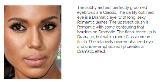
Discount code FAMILYTHANKS Happy Thanksgiving, beautiful women! I get to see family this Thanksgiving and I hope you do too. If you're like me, you're happy things are starting to feel a little more normal and you're seeing your loved ones again. Maybe you want to celebrate by spending a little money on yourself! From today through Cyber Monday, all tools and documents at Truth is Beauty are 30% off. That's 30% off of all Shopping Guides, Fragrance Guides, What Not To Wear Guides, Swimwear Guides, seasonal makeup lists, and the Infinite Outfit Generator. That's also 30% off the brand new, long-awaited Makeup Guides. You'll also get 30% off the best-selling Style ID Calculator. For many women, it's all they need to determine their style type.* Have a beautiful Thanksgiving and a fun shopping weekend! -- Rachel at Truth is Beauty *If the Style ID Calculator doesn't help you find your style type, you might consider investing in a personal style analysis. It costs a lot more, and my first openings aren't for another six months or so. But here's the link if you want to learn more about it. For several years, my readers have been asking for makeup guides for each of the 63 style types. I started doing the research necessary to create these guides in 2017, and I'm finally done! 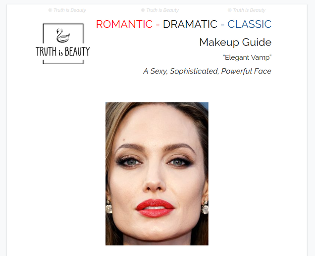 Your makeup's color palette comes from your color season. But two women with the same color season won't apply makeup the same way to look their most beautiful. Have you ever wondered why certain makeup trends -- a matte lip, a cat eye, contoured cheeks -- just don't work for you, even when you know that the colors you're using harmonize with your skin? The reason is that the lines of your face, which determine your style type, harmonize with certain makeup looks and not others. Not everyone looks harmonious with fuller lips. Not everyone looks harmonious with contoured cheekbones. Not everyone looks harmonious with a smoky eye. Not everyone looks harmonious with delicate, plucked brows. Here are two pics of me in two different makeup looks. In both pics, I'm wearing Soft Autumn colors. But I think you'll agree that I'm lovelier in the pic on the right than the pic on the left. 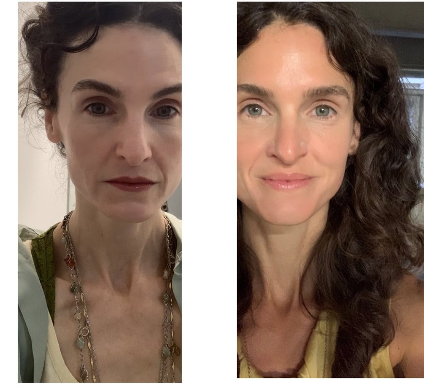 My style type is Ethereal Natural, and the pic on the right shows me in an Ethereal Natural makeup look. The pic on the left is a look with elements of Classic, Romantic, and Dramatic -- all essences that are unimportant for me. On the right, my skin finish is less powdery and matte, my eyebrows are less intense, I'm not wearing foundation, my makeup's overall level of contrast is lower, and my overall impression is less made-up. These are all features of an Ethereal Natural makeup look. Now, if I were a Romantic-Dramatic-Classic, chances are I would look gorgeous in a more matte, more made-up, higher-contrast look. Angelina Jolie is a Romantic-Dramatic-Classic, and that kind of makeup look is gorgeous for her: 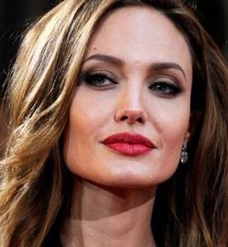 It's interesting to note that Jolie and I both have the same Soft Autumn color palette. Yet because the geometry of her face is Romantic, Dramatic, and Classic, her best makeup look is much more sexy, intense, and traditionally feminine than mine. My best makeup look combines Natural's no-makeup aesthetic with Ethereal's lightness and delicacy. The makeup guides are about 30 pages long. Here's what each guide includes:
 Since I expect a high volume of initial orders, please allow UP TO A WEEK for your makeup guide to be delivered by email. All guides will eventually be instant downloads; at that point, you won't have to wait. :-) For many years, I have not offered virtual color analysis, because I have not felt confident that I could guarantee a correct answer about colors based just on photos. Sometimes I felt I all I could offer was my best guess.
But the truth is, I do think my best guess is right most of the time. And I hear every day from women who would like my best guess. So I'm now offering a package of virtual color analysis and a seasonal makeup list... with a catch. The catch is that I'm only offering this to women I can pre-screen. Here's how it works: You'll send me a ton of pics of yourself in as many different colors as you can find. Send these to the email bestguesscoloranalysis@truth-is-beauty.com . If I believe I know your color season, I'll send you an invoice. You can choose whether to pay it. If you pay it, I'll send you your answer, along with a paragraph explaining how I arrived at my answer and your season's makeup list. At this point, I'm offering a bare-bones package: your season, plus the makeup list. It's $79. If you're looking for a color analysis that comes with info about your season, this isn't a good option for you. But if you just want a dang answer, this option may be what you've been waiting for. (And everything I would tell you about your season, I've already put here, on this website, for free!) If you're interested, send me lots and lots of pics of yourself at bestguesscoloranalysis@truth-is-beauty.com .The more pictures you send, and the more different colors I see you in, the more likely it is that I'll be able to find an answer for you. You may not hear back from me. But if you do, you'll have the option to learn your answer. Hi, beautiful people! Right now my virtual style analyses are booked out several months in advance. I know how hard it is to wait when you're on the quest to understand your unique beauty, because I've been there. :-) So I thought I would share some quick instructions for how to use the Style ID Calculator. The Style ID Calculator can put you on the road to finding your style type. It's $14.99 and you can get it here. I hope this tool helps you discover the true nature of your beauty. :-) I was recently honored by an invitation to analyze the lovely Audrey Coyne. Many of you will know and love her from Instagram and YouTube. Maybe you've wondered how my system differs from other style systems. Audrey has a new video revealing how four different style experts analyzed her, and in my opinion its's a great overview of how four different style analysts arrive at their conclusions. (I'm the last one.) My "dress for your face" philosophy is unique among style analysts, and in my opinion you can see that in the result I got for Audrey's delicate beauty. Check out the video. If you think my results for Audrey are accurate, try my Style ID Calculator! Or perhaps consider investing in a personal analysis like the one I did for Audrey. (I now include the full suite of style information guides as part of your analysis package!) I hope you and yours are well right now. <3 <3 Hey, beautiful women. It's March 2020 as I write this. I'm stuck indoors right now, and I'm guessing a lot of you are as well. Are you feeling nervous these days? I sure am! I am really appreciating activities that take my mind off of the scary stuff going on in the world right now. I thought it would be nice to give you a chance to get the Style ID Calculator for a reduced price. If you're stuck inside your house, this is a great time to finally figure out your style type. And if you're worried about your finances right now, $9.99 hopefully won't break your bank.
This sale will eventually end. But the Style ID Calculator also comes with a discount code that never expires. Once you discover your style type, and you're feeling a little bit more confident about the future, use it to buy products for your style type. :-) I'm scared too. But we;re going to get through this. <3 <3 <3
Many of us in the northern hemisphere are starting to think about swimsuits. If you find swimsuit shopping stressful, you're not alone! In this video, I talk about features of the best swimsuits for different style types.
Remember: Ignore all the advice about shopping for your body shape! There's a reason you've never felt like it really worked: it DOESN'T work. Dress for your face, not your body! Scarlett Johansson, Renee Zellweger, Cynthia Erivo, Florence Pugh -- what did you think of their Oscar looks? Here, I share my thoughts about their color and style choices.
I made a video!
Watch as I evaluate different outfits and talk through the process I use to decide whether they are appropriate for Gamine style blends. I'm looking forward to making more videos in the future!
An adult who seems always to have a youthful or childlike quality, regardless of age, likely has a strong dose of Ingenue or Gamine. Boyish Beauty
Big eyes, a large forehead, a small nose, and a round or square face all help to create an impression of youthfulness.
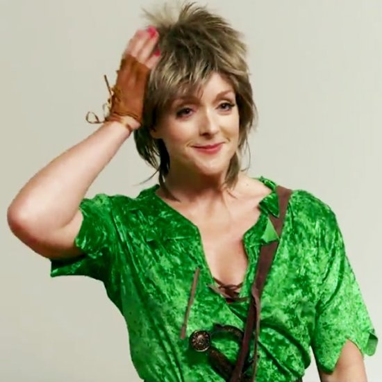
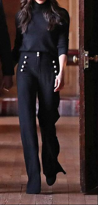
One way to think about the seven style types is to think about the words we use to describe the type of beauty each identity embodies. Which isn't to say Gamines aren't incredibly attractive. They are incredibly attractive. Women who have a "yang" or masculine quality to their beauty are no less attractive than their more "yin" counterparts. They only appear unlovely when they're placed in a clothing context that's more stereotypically feminine than they are. 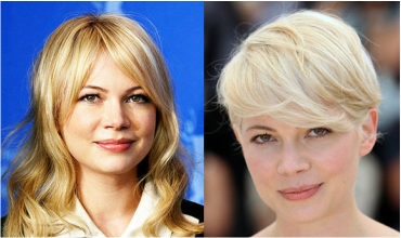 Michelle Williams. The boyish, short hair is so much better. You can see the boyish quality of a Gamine in the following ways:
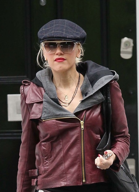 Gwen Stefani
Which isn't to say that Gamines need little detail. They look great with a lot of detail in the clothing -- pockets, buttons, cuffs, etc. But the jewelry is best when it's minimal. A lot of jewelry reads as feminine, and feminine context around a Gamine will make her look masculine. The effect of clothing context on our apparent masculinity or femininity is analogous to the effect of color on our skin. The apparent color of your skin changes, for better or worse, depending on what color is next to it. That's because of simultaneous contrast. And the apparent qualities of your face and figure, including the apparent masculinity or femininity, change depending on the context that surrounds it. If almost everything in the frame reads as boyish, then the viewer mainly notices what's not boyish - and so the Gamine's feminine qualities actually stand out more. The more boyish the context, the more beautiful Gamines look. Surround them with traditionally female decoration like long locks, ruffles, and lavish jewelry, and they become less lovely.
|


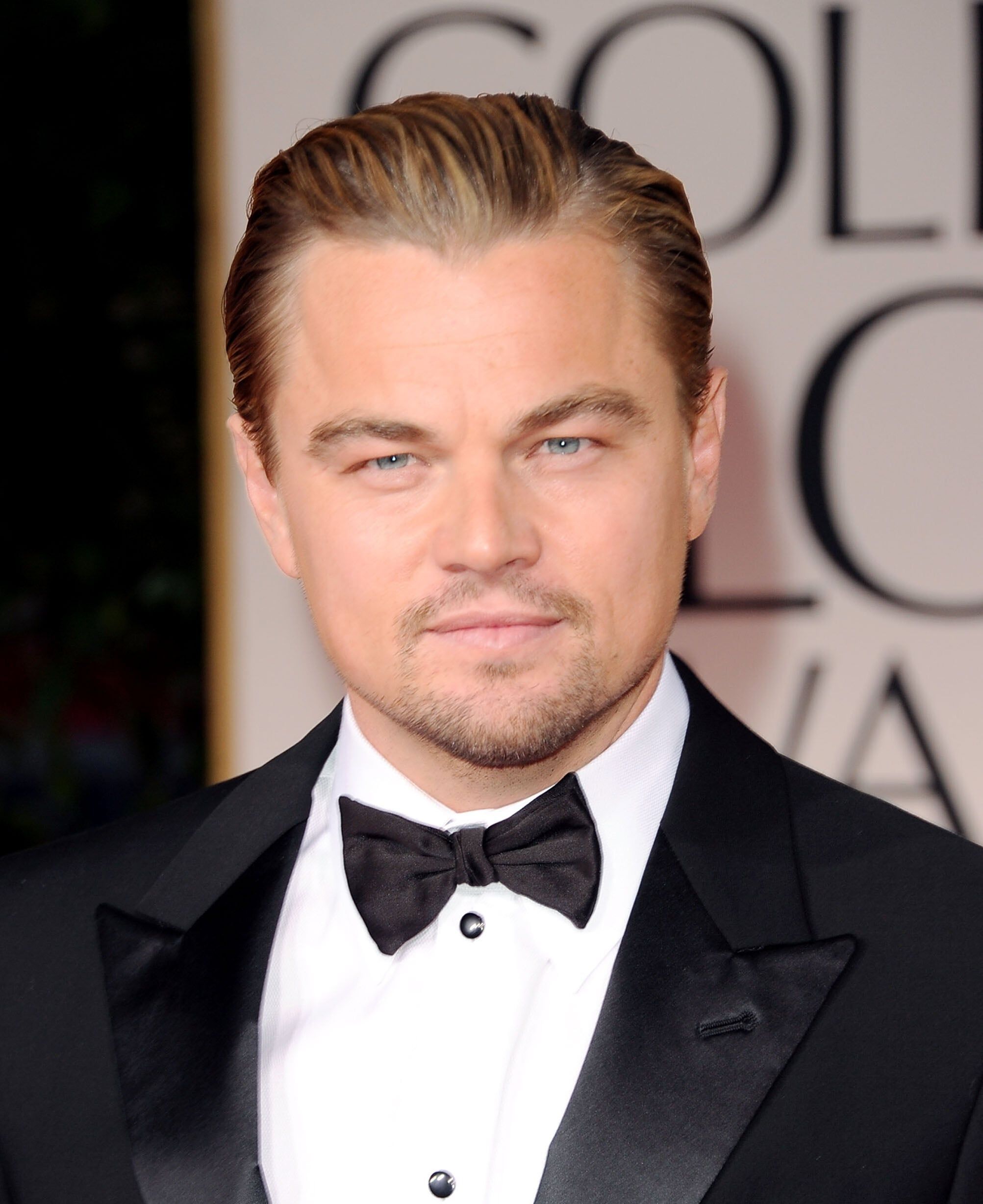 It doesn't matter that Leonardo DiCaprio is 6 feet tall; he looks better in youthful styles because he has a youthful face. |  A long tie is clearly not as good for Leonardo Dicaprio as a cute little bowtie. That's because his face is cute. His height is irrelevant. |
Leonardo DiCaprio is 5'11". (Some sources say 6'.) But that baby face looks better in a bowtie than in a standard necktie.
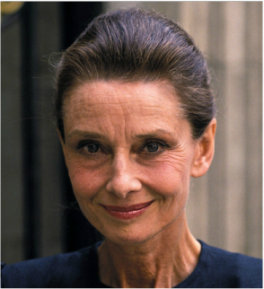
Audrey Hepburn - Gamine despite being 5 foot 7.
Isn't it surprising to learn that Audrey Hepburn, practically the definition of Gamine, was 5' 7"? She looks little.
Big eyes, high foreheads, round heads, slender necks, and heads that look large relative to the size of the body are characteristics of children. So these features read as youthful.
Dress a person with these features in similarly youthful clothes, and it will look right.
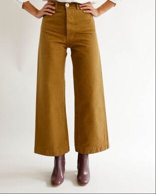
So if you're petite, you might consider Gamine and Ingenue first. For some reason that I don't yet understand, petite people seem often to have Gamine or Ingenue facial features.
But don't assume Gamine (or Ingenue) based solely on small stature, and don't rule it out just because you're not petite.
But don't assume Gamine (or Ingenue) based solely on small stature, and don't rule it out just because you're not petite.
Classic or Gamine?
Both Classics and Gamines need well-tailored clothes. Classics look their best with very little detail, and Gamines look their best without a lot of feminine frill. How do we tell them apart?
For one, Classics literally need every hair in place, while Gamines can pull off a little tousle.
(Tousle suggests motion in the hair. Details that makes us think of movement -- such as zigzag lines, nautical themes, running shoes -- are generally good on Gamines. That comes from the boyish quality. For better or worse, when think of boys, we traditionally think of bodies in motion.)
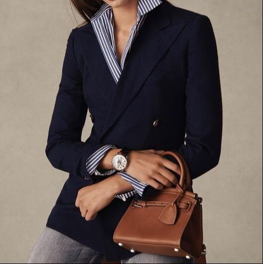
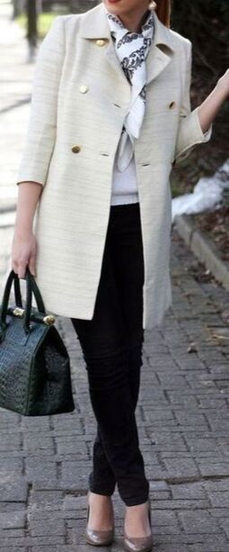
Both Classics and Gamines look good in fitted, tailored pieces. But the overall Classic vibe is elegant and ladylike, while the overall Gamine vibe is spunky and playful. A Classic isn't her best in sneakers, rolled-up jeans and a striped sweater. A Gamine isn't great in a sweater set, pearls and high heels.
And Classics are particularly lovely in their palette's neutrals and understated colors, while Gamines are particularly lovely in highly contrasting color combinations from their palette. (Again, it's about an impression of movement. Neutrals feel still; contrasting colors feel energetic.)
If you're not sure of your style type, try the Style ID Calculator! It's so affordable, you may as well!
A version of this post originally ran in May 2015.
Has color or style analysis changed you? Would you like your story to be part of the Truth is Beauty Website?
If the answer to both questions is "yes," I invite you to share your story here. I plan to publish the stories of women whose lives have been changed by color and style analysis. (The form is also embedded below.)
Write as much or as little as you like. Be sure to include your state or country; I'll include this information if I publish your story. Include an anonymous name or anonymous initials too. :-)
This is the last post in a series of posts exploring how to combine your personal color palette with your style type.
Each of the 12 color palettes has a unique rainbow of colors. When you know your own correct palette, you know dozens of colors that are gorgeous on your skin. But because different colors express feelings and imply different associations, particular colors within your personal palette will be particularly harmonious for you, depending on your style type.
If your beauty is Ethereal, it's a grown-up kind of beauty, and it's noticeably feminine, but not in a girly or sexy way. You may have been told that your beauty is "unusual" or "striking." You may have a long or oval face, a high forehead, a long nose, gently sculpted cheekbones, and wise, oval eyes.
  |  |   |
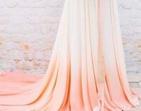
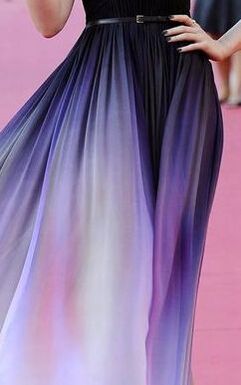
Ethereal beauty reads as supremely peaceful and gentle. Because of this, an Ethereal woman will look good in gentle gradations of color.
 |  |  |
(This is true even if her palette colors are very saturated; bright colors can still grade gently into each other, and the effect will feel gentle on a woman whose coloring can carry those bright colors.
 |  |
Ethereal beauty feels intangible, so if you're an Ethereal type, you'll also be flattered by your palest neutrals. Wearing them together helps to project a light-as-air feeling.
 |   |  |
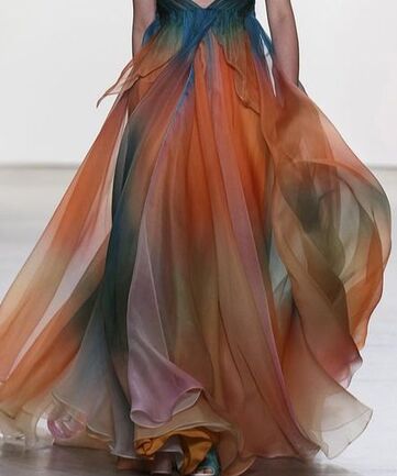
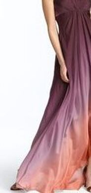
Dawn and dusk are magical, in-between times, so they belong to Ethereal. Combinations from your palette that suggest sunrises and sunsets will be good for you.
  |  |  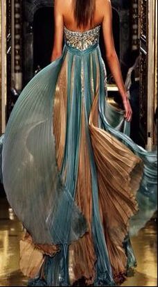 |   |
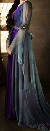
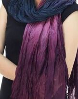
Ethereal beauty feels like it's from another world, and the sea and the sky are metaphors for the otherworldly. (They're the "other worlds" in this world!) So you'll feel right in combinations of your deep and mid-range greens, blue-greens, blues, and purples.
 |   |  |   |
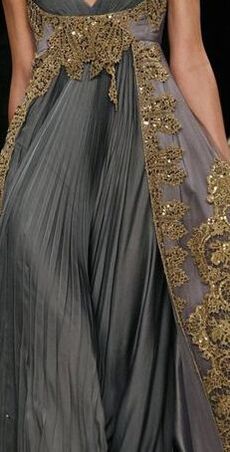
Shimmer is Ethereal, so sheeny silver and gold fabrics are great for Ethereals. The non-shimmery versions of those metals -- in other words, yellows, golds, tans, and grays -- can be beautiful on you too, especially when they're paired with other Ethereal colors.
 |  |  |
Almost all women are blended types, not pure types. (Based on my experience doing personal style analysis, I estimate about 2% of women are pure types.) So even if your beauty is strongly Ethereal, you likely have at least one other core essence playing a role in your overall impression. That gives you more options, color-wise. (Check out my posts from the last few weeks to read about colors for the other six core essences.)
If you don't love the Ethereal tones in your palette, focus on your second or third essence for your color schemes, and bring Ethereal into your look in other aspects
If you don't love the Ethereal tones in your palette, focus on your second or third essence for your color schemes, and bring Ethereal into your look in other aspects
I'm an Ethereal Natural, and I have always gravitated to blues and greens. It's interesting that blues and greens are two hues where Ethereal and Natural overlap!
If you're an Ethereal blend, how do you use color? Please share in the comments!
If you're an Ethereal blend, how do you use color? Please share in the comments!
In my last few posts, I've talked about how to combine your personal color palette with your style type.
There are 12 seasonal color palettes, and one of them is perfect for your skin. Every color in that palette will be harmonious on you. But some of them will be your personal go-to colors.
Part of that will have to do with the unique way your individual body displays that palette. And part of it will have to do with your personal style type. Certain hues and certain combinations will send a message that coordinates with your style type.
So if you're strongly Romantic, what colors in your palette should you focus on?
 |  |
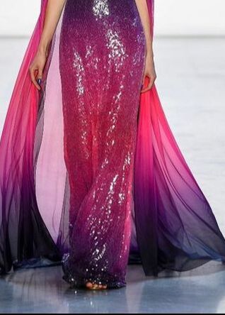
A woman who is strongly Romantic may have a heart-shaped face, sexy eyes, a high forehead, a delicate nose, and full lips, If this is you, you'll look like yourself in in the deeper versions of your reds, violets, red -violets, rusts, fuchsias, and purples.
 | 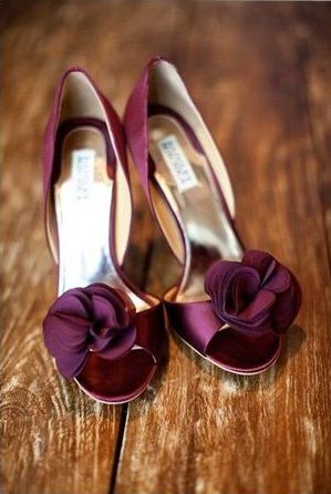 |  |
| You'll also look great in your palette's version of jewel tones -- your deepest, most pure-looking blues, greens, reds, and purples -- because jewel tones suggest opulence, and Romantic beauty is a luxurious beauty. It's uninhibited womanliness, in full bloom. |  |
 |  |  |
 |  |  |  |
Your season's version of black will usually be great on you as part of your overall ensemble, because it reads as mysterious. You can even pull off your season's black as a head-to-toe look, as long as the effect is mysteriously sexy, not intimidating or shocking. (Intimidating or shocking use of your black would read as Dramatic, not Romantic.)
   |   |
Making black look mysterious, not intimidating, won't be difficult if your garments are as detailed as Romantic garments ought to be; the profuse detail breaks up the black visually, so it doesn't feel like a huge block of startling color.
In my experience, Romantic blends are a bit less common than other blended types. Are you a Romantic blend? If so, how have you combined your palette with your style type? Please share in the comments!
This post is part of a series exploring how to make the best use of your color palette.
Two women with the same color season might wear their color palette very differently. Part of that will be because they manifest the colors differently within their own bodies.
(For example, Light Spring Alicia Keys will probably choose different neutrals than Light Spring Scarlett Johansson.)
But part of what determines a woman's best palette colors is her lines -- the qualities of her beauty you'd notice even in a black-and-white photo. In other words, her style type.
I've talked about a Dramatic's intimidating palette, a Natural's easygoing palette, a Gamine's high-energy palette, and a Classic's reserved palette. Today, I'll talk about an Ingenue's sweet, innocent palette.
 |  |  |
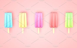
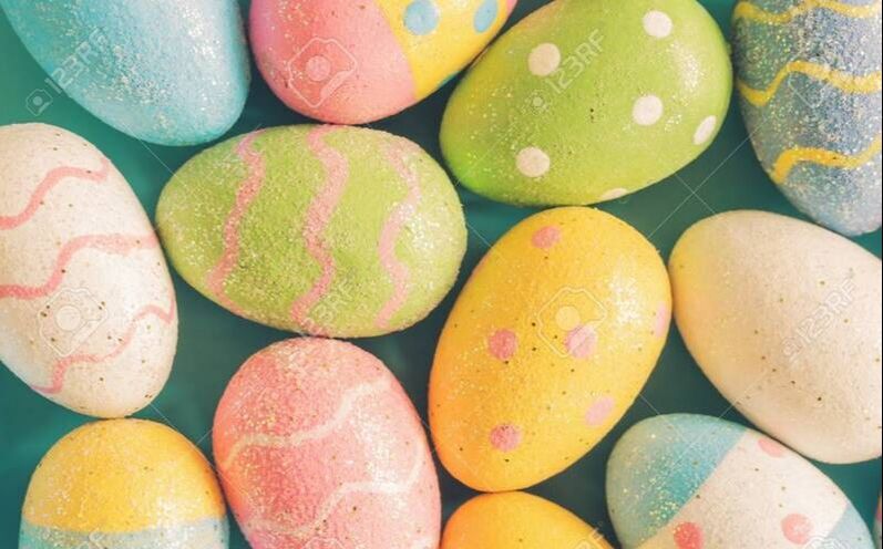
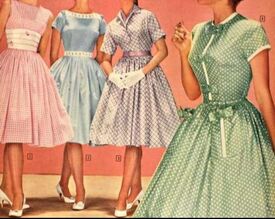
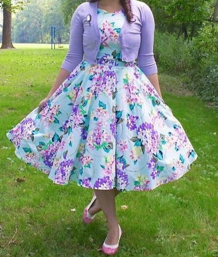
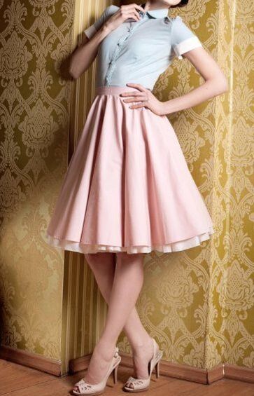
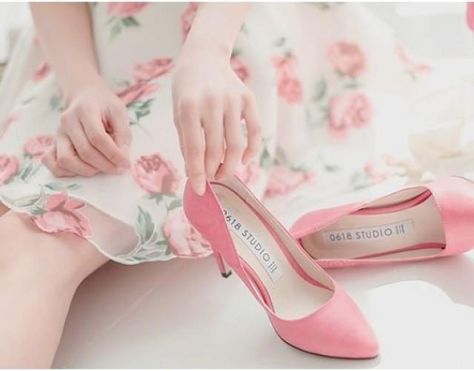
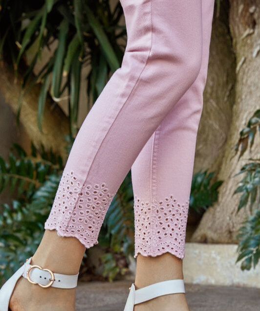
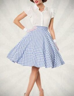
If you're an Ingenue, the colors you look right in are your palette's version of candy colors: your light pinks, light yellows, light blues, light purples, light peaches, and light greens. You could also think of these as popsicle colors, or Easter egg colors.
 |  |  |
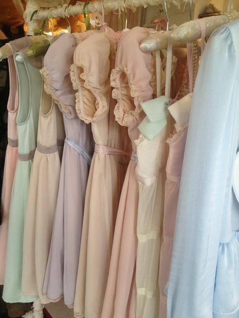
You might say "my season's pastels" as a simple shorthand for yourself. I avoid that terminology because, in the more saturated color seasons, the light colors technically aren't pastels; although they're light, they're still quite vivid, not soft. But on an Ingenue woman, those very light colors will give a soft, gentle, pastel-like impression, even if her color season is Bright; the effect of the colors exists relative to her own coloring.
 Actual pastels... | 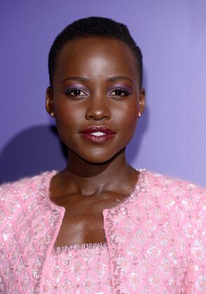 Lupita Nyong'o's a Bright Winter, and this pink is probably quite saturated in real life. But on her it reads as pastel-ish. (And so beautiful! She has a lot of Ingenue.) |
Ingenue has both a high-energy aspect and a gentle aspect to its color use. The gentleness is because Ingenue represents the qualities stereotypically associated with femininity. You can see the gentleness in the individual colors of the palette.
 |  |  |
But because it's a youthful essence, Ingenue has a high-energy quality as well, and this comes across when you playfully combine your Ingenue colors. Feel free to combine any of your gentle Ingenue colors with any of the others. The effect is still feminine and sweet, because the palette is feminine and sweet. (If you were a Gamine, freely combining your palette's version of primaries, the effect would feel very different.)
  |   |
Your palette whites and light grays are great neutrals for you; they communicate innocence. Mix in whites and light greys wherever it feels right.
  |   |
Are you an Ingenue blend? How have you created Ingenue looks with your palette colors? Please share in the comments!
Every color in your seasonal palette looks beautiful next to your skin. But two women who are the same season might wear their palettes very differently, partly because of unique aspects of their coloring, and partly because of their style types.
If your style type is predominantly Classic, which colors in your palette should you focus on?
 |  |
Classic is all about tasteful understatement. Because color makes a such a huge impression on the eye, a Classic will always want her colors to be toned down. The only aspects of a Classic look that are showy are the details one has to look closely to notice, such as fine tailoring, a discreet designer monogram, or an expensive fabric.
 | 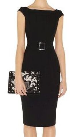 |  |
So your go-to colors will be "office colors" -- your blacks, your whites, your greys, your browns, your navies, and perhaps your darker greens.
 |  |  |
Your use of color, even if it's monochromatic or highly contrasting neutrals, should never feel aggressive; it should always feel understated. (If your use of color feels intimidating; you're veering into Dramatic territory.)
 |  |  |
When you combine colors, the effect should always feel coordinated. The viewer should be able to image the items were purchased as a set.
 |  |
As a Classic or Classic blend, you might use other colors in your palette successfully; the guiding question should be whether the color stands out or blends in. (You're aiming for the latter.)
 The way purple is used here makes it feel like a neutral, so the look works as a Classic look. |  Normally, red isn't a go-to Classic color. But here, the red reads as part of a red-white-and-blue color scheme, which is a very traditional (and therefore Classic) color scheme. |
Are you a Classic or a Classic blend? How do you use the colors in your palette? Please share in the comments!
If you're not sure of your style type, try the Style ID Calculator!
Over the last few weeks, I've talked about how to combine your color palette with your style type.
Because, although every color in your palette is flattering to your skin, your style type will affect how you combine colors to look your most beautiful.
Because, although every color in your palette is flattering to your skin, your style type will affect how you combine colors to look your most beautiful.
If you're strongly Gamine, which colors in your palette should you focus on?
Gamine's vibe is fun, playful, and high-energy.
Gamine's vibe is fun, playful, and high-energy.
 |  |
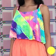
As a Gamine, aim to create unexpected combinations of your pallete's most vibrant colors. Colors that people would not normally expect to see together will look great on you. If your mom would have told you, "Those colors clash!", it's probably a Gamine color combination.
 |  |  |
Color-blocking reads as Gamine, as long as it it feels playful and fun. (If it feels aggressive and intimidating, it will read as Dramatic, not Gamine.)
 |   |
Your palette's version of primaries - - your reddest red, your yellowest yellow, and your bluest blue -- will also read as Gamine.
 |  |
This is true even if you're a season with a soft or muted palette; your "soft" yellows, reds, and blues look plenty vivid on your soft coloring! For example, Autumn "primaries" would read as Gamine on an Autumn woman, and pastel Summer "primaries" would read as Gamine on a Summer woman.
 Autumn "primaries." |  Summer "primaries." |
Are you a Gamine or a Gamine blend? How have you combined your season with your style type? Please share in the comments!
Not sure of your style type? Try the Style ID Calculator!
| Hi, beautiful women! If you're celebrating Thanksgiving this week, I hope you're not feeling too stressed out. |  |
I've shopped for myself a little this week, as a reward for how hard I've been working. I recommend you do the same for yourself!
From Wednesday, Nov. 27th through the following Monday, Dec. 2nd, every document on this site will be 25% off!
That's 25% off of all
and, of course, 25% off my best-selling item, the Style Identity Calculator!
Use discount code STRESSFREE
From Wednesday, Nov. 27th through the following Monday, Dec. 2nd, every document on this site will be 25% off!
That's 25% off of all
- Shopping Guides
- Fragrance Guides
- What Not To Wear Guides
- Swimwear Guides
- Infinite Outfit Generators
- Seasonal makeup lists
- Gift cards
and, of course, 25% off my best-selling item, the Style Identity Calculator!
Use discount code STRESSFREE
 |  |  |
I am thankful for all of you, my readers. :-) Enjoy the rest of your week!
Note: Due to the anticipated high order volume, please allow up to 2 days for any non-downloadable documents to appear in your inbox. I'll try to be faster than that, though. :-)
When you know your color season, you'll know dozens of colors that are gorgeous on you. But different women within the same color season will wear their colors different ways, depending both on their own coloring and on their style types.
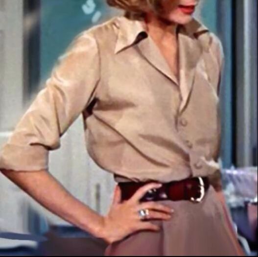
In my last post, I talked about how Dramatics can best use their color palettes. Today, I'll give you tips for how to use your palette as a Natural (or a Natural blend.)
In my last post, I talked about how Dramatics can best use their color palettes. Today, I'll give you tips for how to use your palette as a Natural (or a Natural blend.)
 |  |
Naturals look great in colors that feel simple and confident, and colors that suggest the outdoors.
As a Natural, your go-to colors will be your calm neutrals (relaxed greys, browns, whites, and blacks), your blues, your greens, and perhaps an occasional red, orange, or yellow for contrast.
 |  |  |
Natural color combinations feel unstudied -- like you didn't overthink the colors before you paired the items. They don't feel shocking, nor do they feel carefully planned or matchy-matchy.
 |  |
Even on a cool-season woman, greens, browns, blues, yellows, and neutrals can feel outdoorsy and earthy when worn in combination.
 |  |
The Natural use of color has a relaxed, easy heartrate. It shouldn't feel as still and silent as Ethereal's use of color, but it definitely shouldn't feel as high-energy as Dramatic's or Gamine's use of color.
 |  |  |
Are you a Natural or a Natural blend? How have you used your seasonal palette? Please share in the comments!
All of the colors in your seasonal palette will be harmonious on you. But some of them will work better for you than others.
Part of that will have to do with the unique way your individual body -- your skin, hair, and eyes -- displays your palette. And part of it will have to do with your style type. Different style types use colors differently to achieve their best looks.
So if you're a Dramatic or a Dramatic blend, how should you use the colors in your palette?
Bold color contrast reads as Dramatic -- one of your very light is colors with one of your very darkest colors, for example, or two colors that are far apart in hue.
| (Dramatic color contrast feels serious or intense, not playful; playful color contrast is Gamine. The difference here is sometimes just the size of the color blocks. The lines of the overall garment can push the effect one way or the other -- intense or playful -- as well.)  This color contrast feels playful -- that's Gamine. |  This color contrast feels more serious and intense -- that's Dramatic. |
Any head-to-toe monochromatic look generally reads as Dramatic.
 A monochromatic look in what may be a Soft Summer pink. |  A monochromatic look in what may be True Autumn green. |
A monochromatic look in one of your palette neutrals will feel particularly intense.
 |  |
 A monochromatic look from a gentle palette like Soft Summer still feels powerful. | Even if you're a Light Season or a Soft Season, color blocking and monochromatic schemes will look Dramatic on you. The colors have their effect relative to each other and to your skin tone. :-) 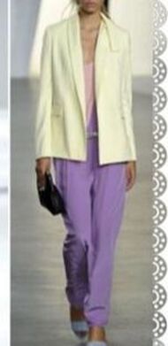 Extreme color blocking from a palette like Light Summer still looks Dramatic. |
Are you a Dramatic or a Dramatic blend? How have you combined your palette with your style type? Please share in the comments!
Most of us go to the internet to get hairstyle ideas. But how can you zero in on the best hair for your style type? Some of us aren't sure how to go about searching.
You'll want to do a Google image search, of course. Here are some specific search strings I suggest you use to find visual inspiration for your style type's best hair. I use some search operators in my search strings, such as - and OR , so try pasting the exact search string.
(Google recently removed some of its most helpful image search tools, such as the ability to get only faces as search results. To get this and other tools back, do an advanced image search here. )
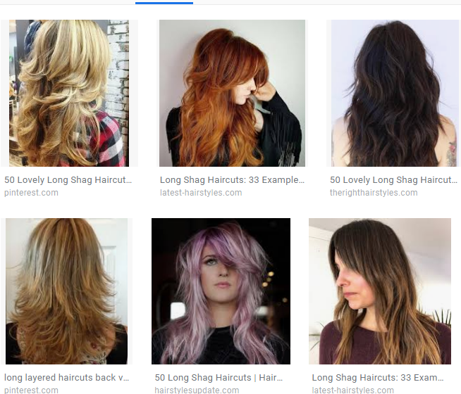
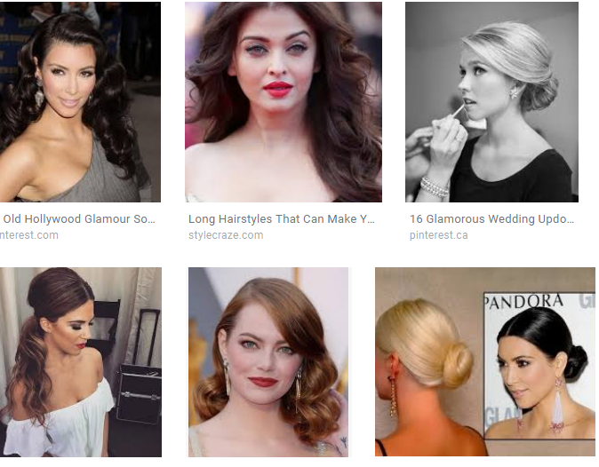
Romantic
hair glamorous long -wig -extensions
(The minus signs tell Google terms to exclude. If you're doing an advanced search, you can just type "wig" and "extensions" into the field for words you want to exclude.)
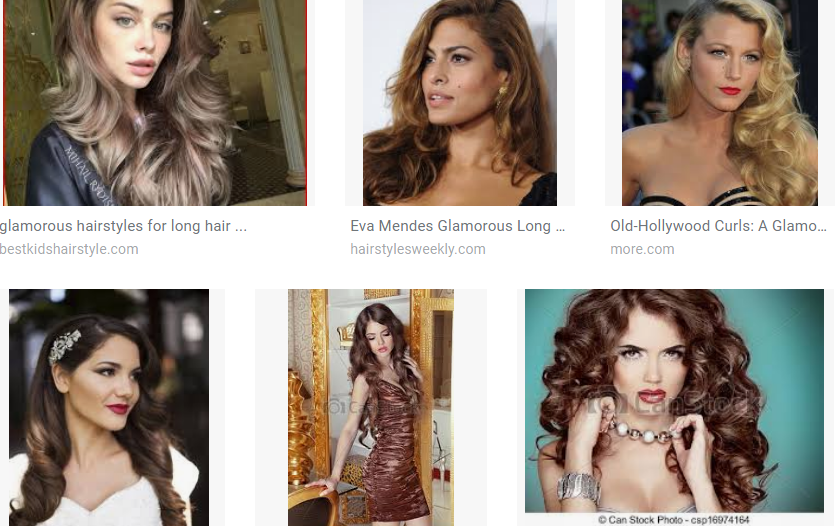
Other Romantic keywords to try: curls full sexy
Other Ethereal keywords to try: flowy long curls
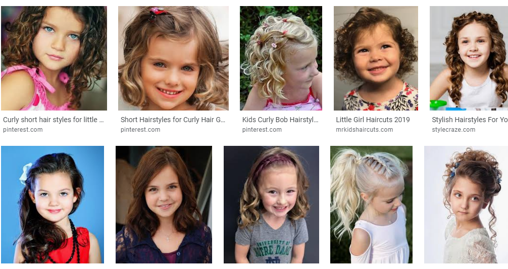
Other Ingenue keywords to try: sweet girlish ringlets
(I know it may seem odd, as an adult Ingenue, to search for pictures of little girls as hair inspiration. But many of the best pics online of Ingenue hair are pics of little girls.)
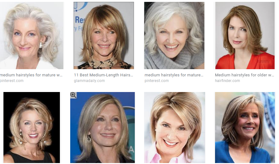
Classic
hair mature medium
Also, this one works well:
hair tv anchor
(I know it may seem odd, as an adult Ingenue, to search for pictures of little girls as hair inspiration. But many of the best pics online of Ingenue hair are pics of little girls.)
Classic
hair mature medium
Also, this one works well:
hair tv anchor
Other Classic keywords to try: elegant coiffed "first lady"
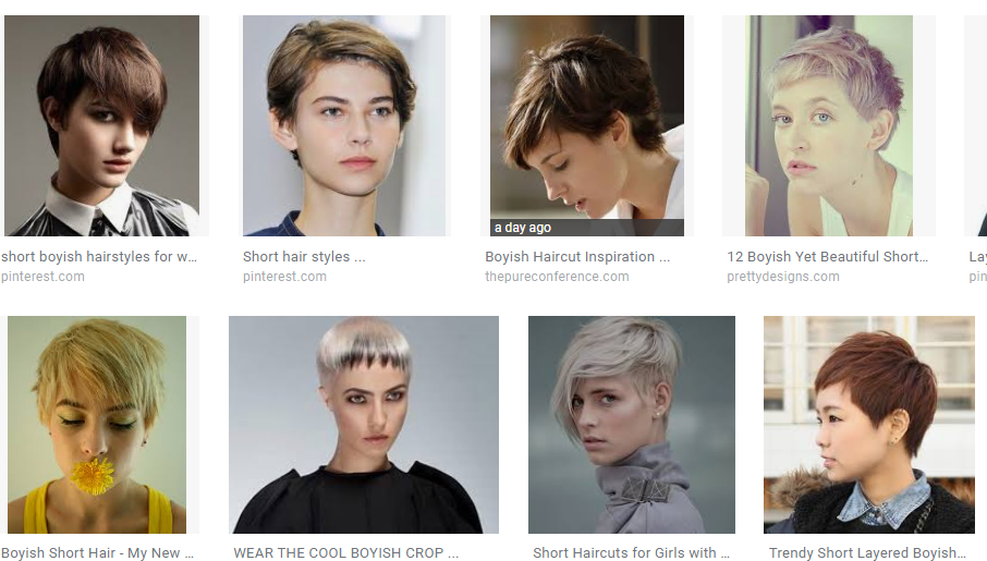
Other Gamine keywords to try: spunky tomboy
You may have noticed that these search results are mostly white ladies. :-/ That's obviously not helpful if you're a WOC with a specific hair texture! If you want hair styles specifically for women of color with specific hair textures, try adding, for example, "african american" or "asian" to your search string.
If you're a blend of two or more core types, try searching for a few key terms from each core type.
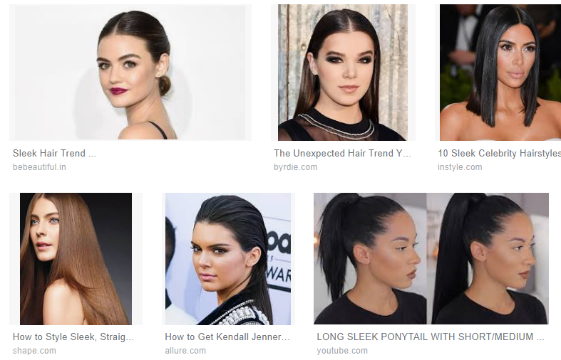
For example, for Romantic-Dramatic-Classic, I used "glamorous" for Romantic, " sleek" for Dramatic, and "elegant for Classic. Here was my search string:
hair glamorous sleek elegant
I got some pretty good RDC ideas:
You may have noticed that these search results are mostly white ladies. :-/ That's obviously not helpful if you're a WOC with a specific hair texture! If you want hair styles specifically for women of color with specific hair textures, try adding, for example, "african american" or "asian" to your search string.
If you're a blend of two or more core types, try searching for a few key terms from each core type.
For example, for Romantic-Dramatic-Classic, I used "glamorous" for Romantic, " sleek" for Dramatic, and "elegant for Classic. Here was my search string:
hair glamorous sleek elegant
I got some pretty good RDC ideas:
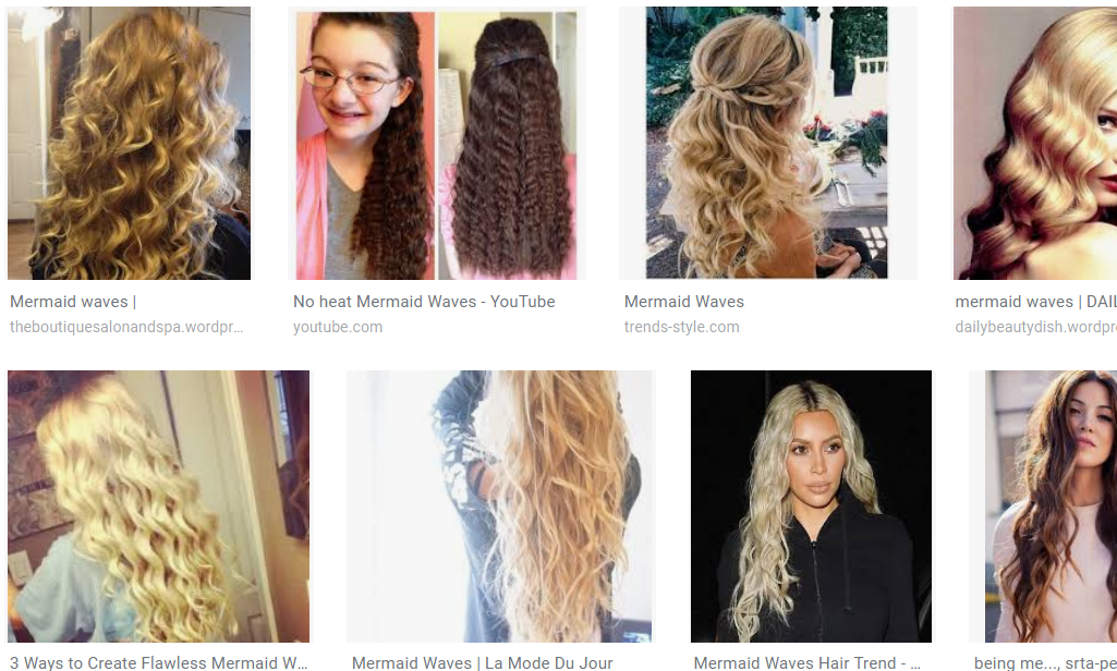
I'm an Ethereal Natural. When I combine Natural and Ethereal search terms, I get my favorite hair for myself:
hair layers long curls
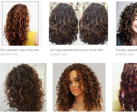 | 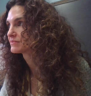 |
My best hair has Ethereal's mermaid curls, but Natural's layers and wildness.
Tip: if your hair has a particular texture that's non-negotiable, try adding that to your search string. For example, if you're predominantly Ethereal but you have straight hair, try searching
straight hair long mermaid
(If you don't want all the dyed hair results for 'mermaid', try adding this to the end of the search string: -dye -ombre -pink -blue)
Do you know some search terms that have worked well for your style type? Please share them in the comments!
Not sure of your style type? Try the Style Identity Calculator, or consider a Virtual Analysis.
A version of this article was first posted in December of 2018.
I didn't even think about separates before I knew my style type. But how you put separates together actually has a big effect on the impression you make.
Romantics, Ethereals, Classic, and Dramatics are each best in a head-to-toe look. If you think about it, this makes sense, because all four of these types are formal and grown-up in their own way: the Romantic is mature womanly sexiness, the Classic is a "ladylike" adult woman, the Dramatic is a powerful ruler, and the Ethereal is an immortal being. None of these pure types is youthful or casual enough to look her best in an obvious use of separates.
Romantics, Ethereals, Classic, and Dramatics are each best in a head-to-toe look. If you think about it, this makes sense, because all four of these types are formal and grown-up in their own way: the Romantic is mature womanly sexiness, the Classic is a "ladylike" adult woman, the Dramatic is a powerful ruler, and the Ethereal is an immortal being. None of these pure types is youthful or casual enough to look her best in an obvious use of separates.
 | Creating a head-to-toe look can seem difficult, because pretty much everything in the stores these days is separates. You'll occasionally have opportunities to purchase items as a set, but they can be hard to find. Often, the easiest way to create a head-to-toe look is to choose separates that are all the same color. When the color is a shocking hue, or pure white or pure black, this is an especially good look for Dramatics. |
| If you want to avoid the drama of a monochromatic look, you can also create a head-to-toe effect by repeating two main colors in different places. |  Two main colors repeated in different places in the outfit creates the impression that the garments were purchased as a set. |
Another easy way to do a head-to-toe look is to just wear a dress. Ethereals, Romantics, and Classics have a lot of great dress options.
 |  |  |
 Two fairly Ethereal separates, thrown together casually. | If you find it very difficult to create a head-to-toe look, the good news is that if even one of your essences is an essence that looks good in separates -- Natural, Ingenue, or Gamine -- you can bring in that essence through your use of separates. I'm an Ethereal Natural, and I tend to do this, because it's easy. I own a lot of very Ethereal separates, and when I throw them together casually, the effect reads as Natural. |
Speaking of which: the message a Natural sends with her use of separates is, "I own nothing but separates, and I basically just throw them together because that's how confident I am, but the effect is never weird, because I can't be bothered to put in enough effort to make it deliberately weird, because that's how casual I am."
| A Natural use of separates looks unplanned, but not attention-getting. If it were an attention-getting look, that would imply that a Natural cares what anyone thinks, and part of the Natural impression is the sense that she's not dressing for the viewer. | 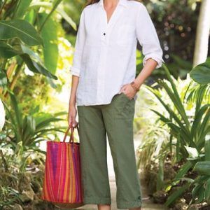 A Natural: not dressing for the viewer! She's dressing for comfort, and she's not overthinking it. |
 You can tell an Ingenue is wearing separates, but you can also tell she's paired them carefully to look harmonious and pretty. | An Ingenue's use of separates says, "Because of my childlike quality, I own mostly separates, but I am careful to put them together in a way that is harmonious and lovely to the eye, because I want to look pretty and finished." |
A Gamine's use of separates says, "I deliberately combine separates no one else would dare to put together, because that's how fun and quirky I am. I want you to notice!"
 Gamine's use of separates says, "You bet I did this on purpose. I want to make you chuckle!" | Like Naturals, Gamines don't aim to carefully coordinate separates. But unlike a Natural, a Gamine looks like she's definitely dressing for the viewer: she wants to make you smile and laugh. So the use of separates looks simultaneously carefully planned and really unusual. |
If you're a blend of two or three types, as most women are, and you manifest Natural, Gamine, or Ingenue through your use of separates, you'll want to lean a bit more heavily on your other essence (or two) to balance the effect. So, for example, A Natural-Classic-Ingenue combining separates in a casual, Natural way would take extra care to bring in Classic and Ingenue in other aspects of her look.
If you're not sure of your style type, try the Style ID Calculator!
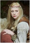
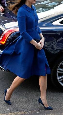
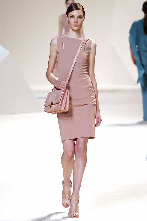
Romantic beauty is feminine beauty in its mature, womanly form.
It may be the easiest type of visual feminine to spot, because it's the kind of feminine beauty hetero men are most interested in -- so it's a beauty we often see portrayed in popular culture.
Other systems call this type Sensuous, Soft, or Alluring. They're beating around the bush.
The straight truth is this: Romantic beauty is sexy beauty.
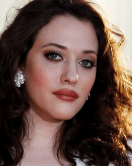 Kat Dennings | 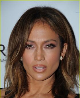 Jennifer Lopez. |
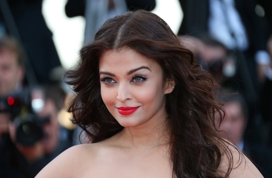
Aishwarya Rai
I've thought for months about a better way to word this, because I have been afraid of coming across as objectifying Romantic women.
Of course, it could be argued that Style Type Analysis is inherently objectifying, because it analyzes women based purely on their physical qualities. I don't believe this is true, though. We're not ranking women, or judging their inherent worth, based on their appearance -- we're analyzing appearance for the purpose of helping all women have tools to feel simultaneously authentic and beautiful, if that's something they want. The point of Style Type Analysis is to empower women in their own authentic beauty.
Yet talking about Romantic women's appearance is difficult for me because, traditionally, all women have been judged by how well we conform to the standard of Romantic beauty. And we're all pretty sick of it, aren't we?
Even the Romantic women, who "win" in that system of judgment, are probably tired of being valued for their sexiness.
Is it possible for us to celebrate Romantic beauty without implying that Romantic women's worth lies in that beauty?
I believe it is. I hope it is.
Because there's no way around it: Romantic women embody sex appeal.
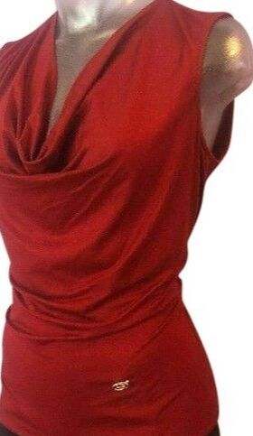
It goes without saying that Romantic women are no more or less sexual than any other women. But visually, they read as pure womanly sexuality.
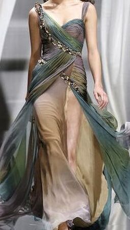
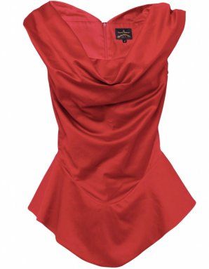
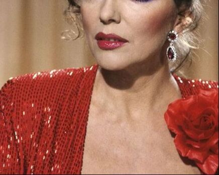
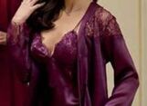
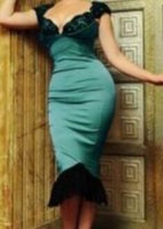
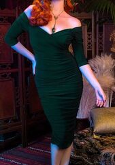
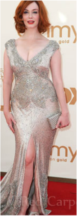
Romantic women tend to have sensuous mouths, smoldering eyes, narrow jaws, large foreheads, and full hair. A Romantic woman looks mature and powerful, not inappropriate, with boob and butt emphasis and a super-cinched waist.
Romantic women tend to have sensuous mouths, smoldering eyes, narrow jaws, large foreheads, and full hair. A Romantic woman looks mature and powerful, not inappropriate, with boob and butt emphasis and a super-cinched waist.
| 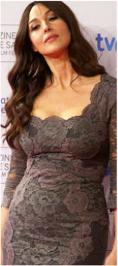 Monica Bellucci |
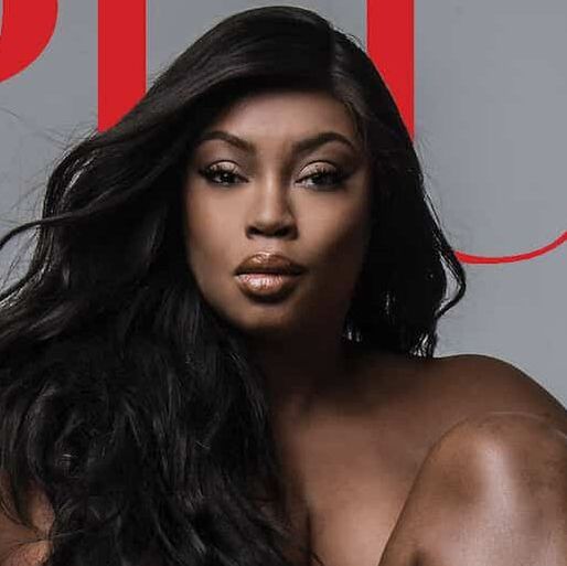
Dark hair reads as Romantic because human hair naturally darkens with sexual maturity. (Just as light hair reads as youthful because prepubescent children tend to have lighter hair than adults.)
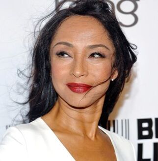 Sade | 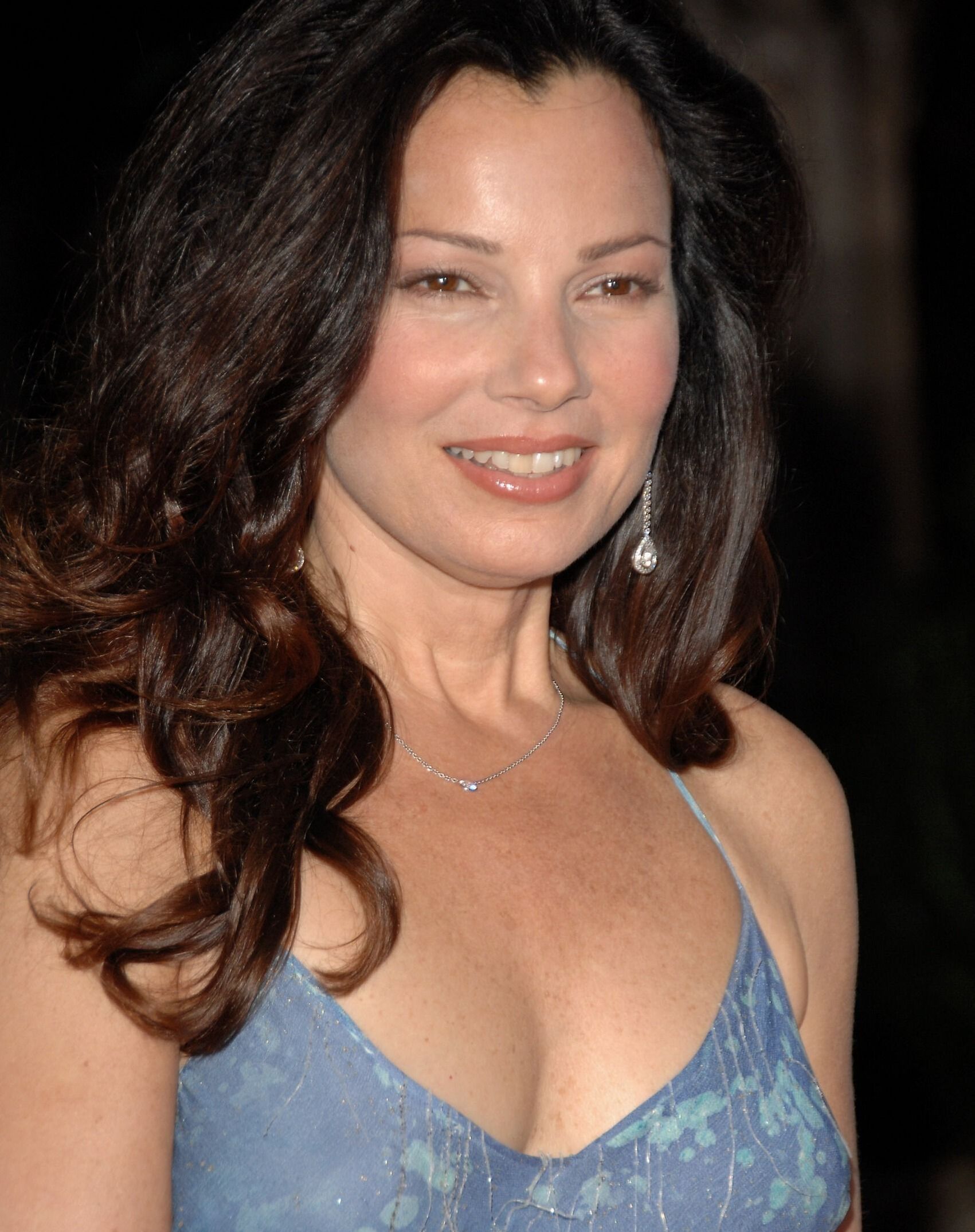 Fran Drescher |
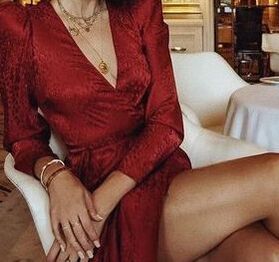
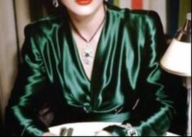
A flush in human skin is an indicator of sexual arousal. So palette-appropriate reds, which echo that flush, look perfect on Romantics.
Anita Marshall
Romantics look like themselves with half-closed eyes, a cocked eyebrow, and a knowing smile -- or no smile at all. This "come-hither" face is silly on pretty much everyone else, but on Romantics it's perfect. It looks wise and confident.
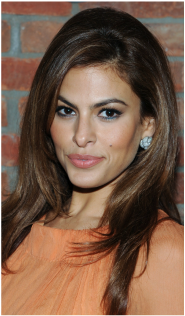 Eva Mendes | 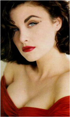 Sherilyn Fenn |
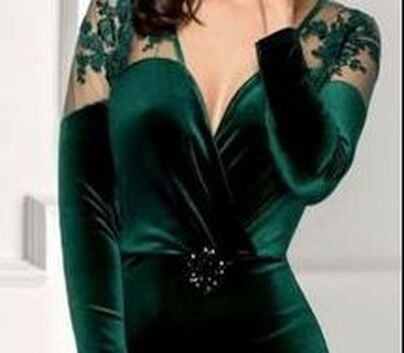
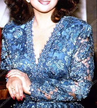
Romantics look great with the impression of cleavage, even if they're small-busted. (While some large-busted women, such as Gamines and Dramatics, look best with de-emphasized chests.)
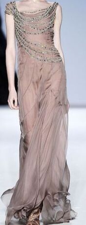
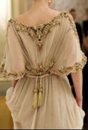
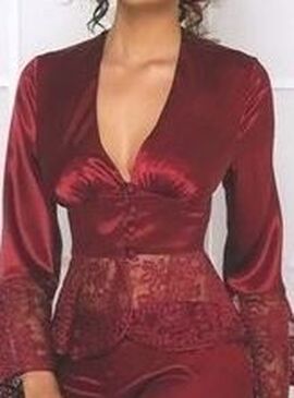
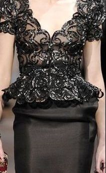
| Feminine beauty is defined by the curving line. Perhaps because a curved line is more visually complicated than a straight line, Ethereals and Romantics look great surrounded by a lot of detail. (While Naturals and Dramatics are unattractive in highly detailed contexts.) A Romantic looks gorgeous in ruffles, gathers, ruching, elaborate hair, and ornate jewelry. |  Kate Dillon | 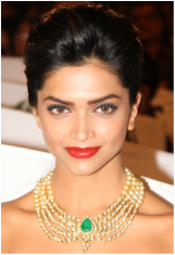 Deepika Padukone |
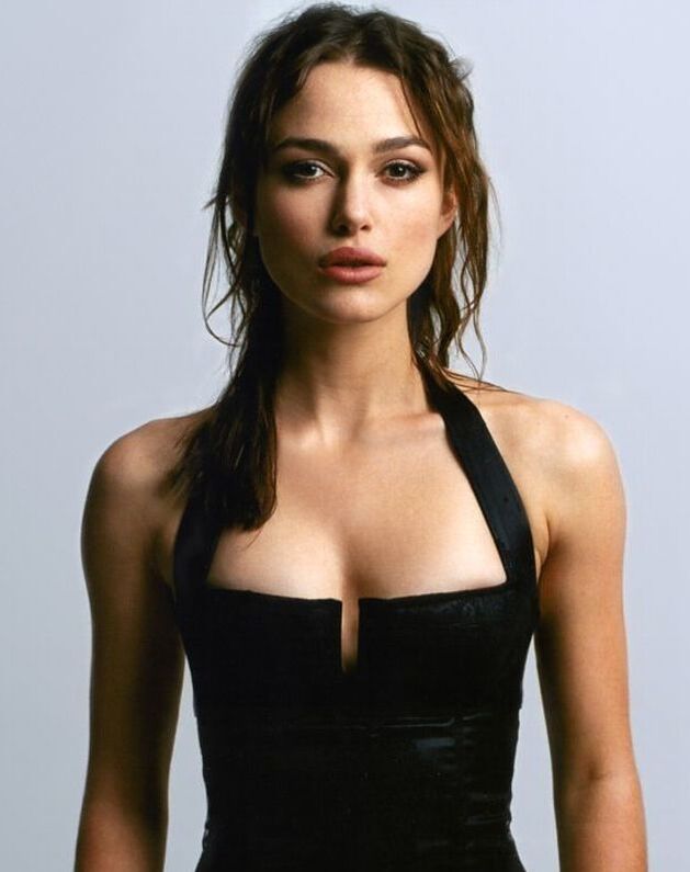
Keira Knightley is known for her lean physique, but because she has a lot of Romantic she's gorgeous with the *impression* of cleavage.
Red roses symbolize romance and sexuality, and a Romantic woman is like a red rose: beautiful, delicate, detailed, and composed entirely of curving lines.
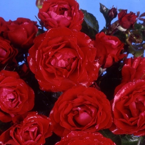
The ultimate Romantic flower: delicate, curved everywhere, and passionately red.
So you're a Romantic, but you don't want to be defined by your sexy appearance. As a woman, I completely get that.
But if you dress in a way that doesn't create an impression of softness, curves, and delicacy, the result will be that you look less dignified.
 | Stiff, structured clothes make your feminine, alluring features look out of place. It can actually create the impression that your intent is for people to stare at you. | 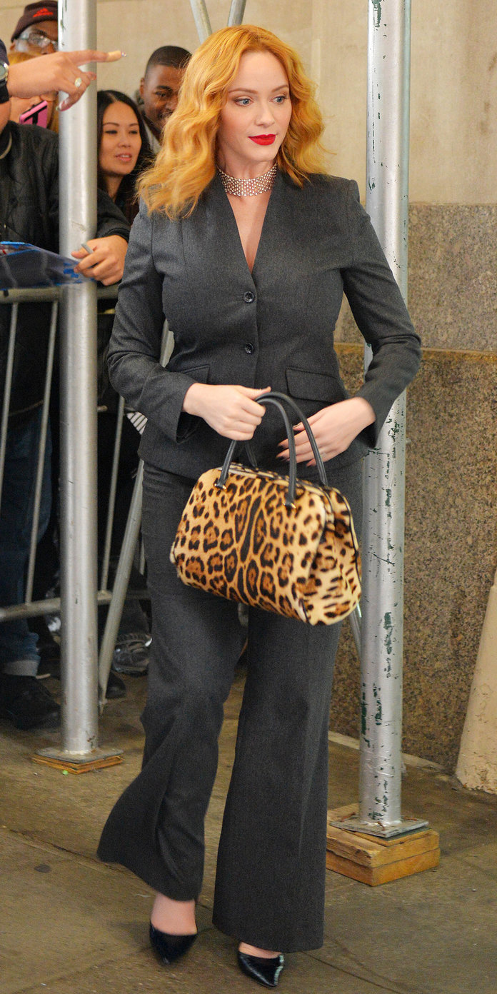 |
| And in shapeless clothes, you'll look insignificant and unprepared. (A Natural would look confident in the same clothes. ) | 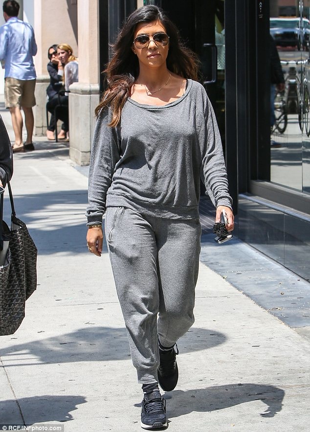 |
Honor your Romantic beauty by creating looks as feminine and sexy as you are. That reads as dignified and self-aware.
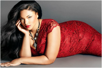
 |  Blogger Tanesha Awasthi has a lot of Romantic, and she's so beautiful in lush, draped, sexy, Romantic looks. |  |
If you know what looks good on you, but you don't know your style type, try the Style Identity Calculator.
A version of this post was published in May 2015.
A version of this post was published in May 2015.
A reader writes, "Your guides have been incredibly helpful to me. However, there is one part of your guides that confuses me. What exactly does it mean for a piece of clothing to be "constructed" or "unconstructed"?"
Great question!
Constructed garments have a defined shape that's not simply the shape of the body underneath the garment. You can't easily ball up a constructed garment in your hand; it wants to hold a shape.
Constructed garments have a defined shape that's not simply the shape of the body underneath the garment. You can't easily ball up a constructed garment in your hand; it wants to hold a shape.
  |   |
The way a garment is sewn can give it a defined shape. This is easier with heavy, stiff, or crisp fabrics.
Manufacturers also use lining, padding or interfacing to make garments have a defined shape.
Manufacturers also use lining, padding or interfacing to make garments have a defined shape.
Interfacing makes sections of garments more stiff.
Dramatics and Gamines are flattered by sharp-cornered squares and rectangles. These aren't the shapes of the human body, so Dramatics and Gamines usually need constructed garments to create those shapes.
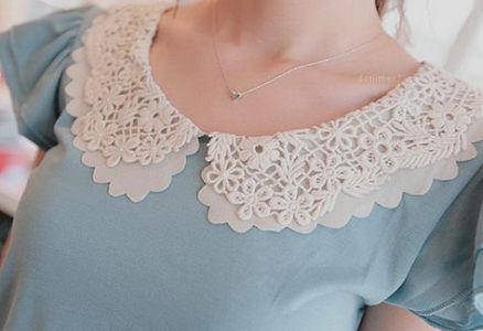
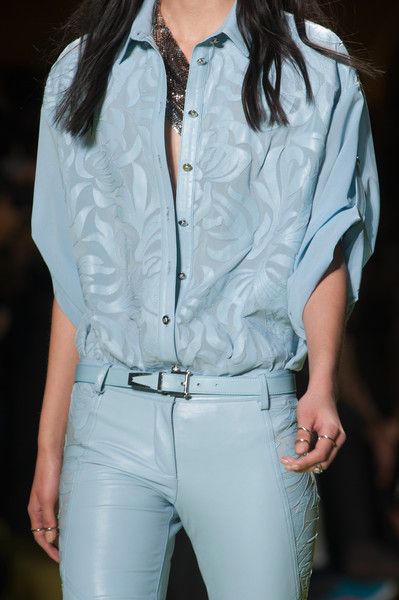
| Ingenues are also flattered by some structure in their clothes, though their shapes will be more rounded. | 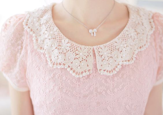 |
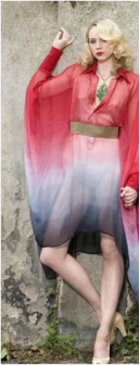
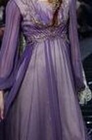
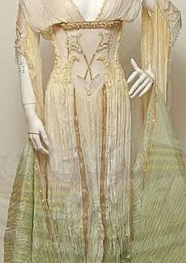
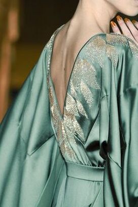
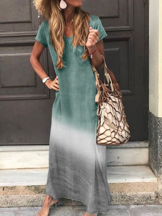
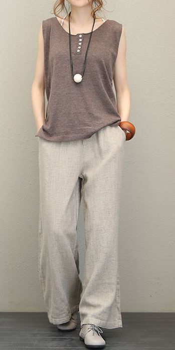
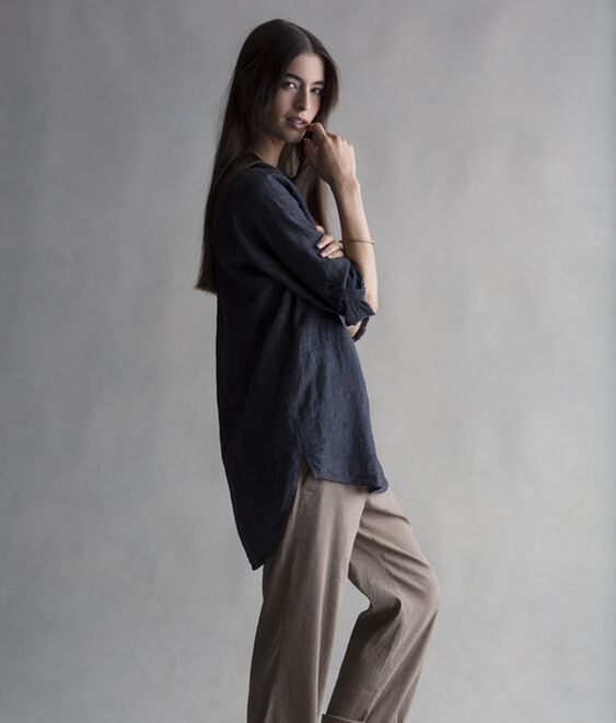
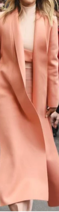
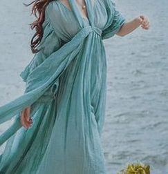
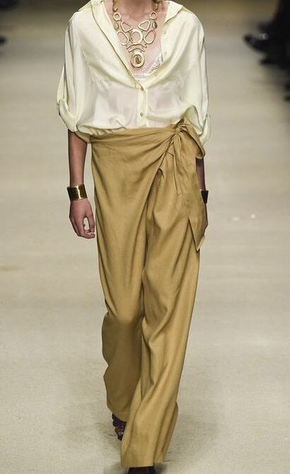
Romantics, Ethereals, and Naturals all look their best in unconstructed clothes. For Romantics, this means sexy draping that appears to hug the body. For Ethereals, this looks like floaty, trailing garments that seem about to take flight. For Naturals, this looks like garments that are supremely comfortable and unfussy.
 Romantic's lack of construction takes the form of draping that follows the shape of the body. | 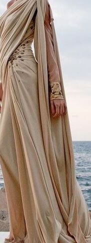 Ethereal's lack of construction is elongated, floaty, and flowy. | 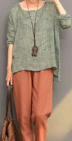 Natural's lack of construction is slouchy, roomy, and comfy. |
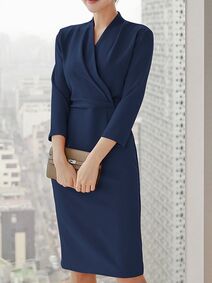 | Classics are lovely with a few sharp corners, but they shouldn't overdo it. Classics represent the beauty of balance, moderation, and perfect proportion. This means they are gorgeous in clothes that fit them perfectly, with a lot of tailoring that's precise but not dramatic, and some draping that's feminine without feeling excessive. |  |
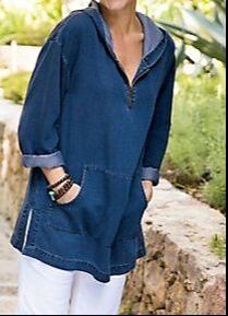
It's not as easy to find constructed clothes as it was 100 years ago. As a society, we've all mostly agreed to dress like Naturals most of the time. Which is great for us Naturals, but a challenge for everyone else.
Garments that are tailored into defined shapes are usually more expensive than unconstructed garments, because that kind of sewing is labor-intensive. If your style type calls for construction, you may choose to spend the money on those more expensive items. You might also save some money by focusing on clothes that are stiff not because of their tailoring but because they're made from stiffer fabrics.
If you're willing to buy second-hand, you'll find that a lot of vintage clothes are more structured than what you typically see in stores today.
Also, consider using spray starch to give your garments more stiffness! You don't hear much about it these days, because fashion is mostly so unconstructed, but clothing starch is still a thing.

About Me...
I'm passionate about helping people become their most authentic and beautiful selves.
I'm a Soft Autumn and an Ethereal Natural. Find out your color season and style type!

Categories
All
Bright-spring-color
Bright Spring Colors
Bright Winter Colors
Celebrities
Classic Style
Color Analysis
Color Analysis Theory
Dark Autumn Colors
Dark Winter Colors
Dramatic Style
Ethereal Style
Figuring Out Your Season
Fragrances
Gamine Style
Hair
Ingenue Style
Jewelry
Light Spring Colors
Light Summer Colors
Makeup
Men
Natural Style
Romantic Style
Soft Autumn Colors
Soft Summer Colors
Style Types
True Autumn Colors
True Spring Colors
True Summer Colors
True Winter Colors
Videos
 RSS Feed